The website parallax effect has been a preferred trend in website design for nearly a decade. E-commerce store owners, bloggers, and marketers are moving towards utilizing this amazing high UX web design feature. How about you? Are you considering using parallax scrolling animation or just merely learning about it?
Either way, this post is definitely for you. In this post, I’ll break down the meaning of the parallax effect meaning, well-explained examples, types of scrolling parallax effects, brilliant tips for using parallax movement on scroll, the good and bads, and highly recommended plugins for parallax scroll animation.
Let’s dive in, shall we?
Table of contents
- What Is the Parallax Effect in Web Design?
- Typical Parallax Effect Examples
- 10 Reasons Why Website Parallax Effect Is Awesome
- Limitations When Using Parallax Scrolling Animation
- 5 Styles of Scrolling Parallax Effects & Examples
- Best Practises and Tips for Parallax Movement on Scroll Effect
- 10 Best Plugins for Website Parallax Effect
- Sum Up
What Is the Parallax Effect in Web Design?
The website parallax effect is a computer graphics technique in which the website background moves slower than the foreground. This leads to a 3D effect as users scroll down the website, creating an optical illusion and a more profound and surreal browsing experience.
The parallax effect works on a principle of optical illusion: As human eyes perceive objects that are close to us as more significant than ones farther away, we feel distant objects moving more slowly.
The method of the parallax effect has been adopted in various mediums. It was first used in games like Super Mario and animation movies like Disney’s Snow White and the Seven Dwarfs.
With the development of HTML and CSS, parallax animation emerged in web design. Scrolling is much easier than clicking; a well-designed parallax effect on the website stimulates visitors to scroll for more information.
The question “What is parallax in web design?” has been answered. Does it satisfy you? If not, let’s have a look at some examples below. If it does, see the examples anyway because it does no harm, let alone do good to you in every way.
Typical Parallax Effect Examples
These parallax effect website examples below will shed some light on what a website with parallax scrolling animation looks like. Also, they’ll inspire you somehow so that you can be more confident to have your website designed with a parallax effect.
1. Ivy Chen
This portfolio website by designer and illustrator Ivy Chen is a fantastic example of parallax movement on a scroll. Her works are gradually uncovered as you scroll down, as in the gif, thanks to the magic of the background parallax effect on the mouse move.
Ivy’s use of the website parallax effect is highly artistic and highlights and explains the page’s content. Being a multidisciplinary designer, she works in both illustration and graphic design and their intersection. These two areas are integrated smoothly, with her fashion graphic illustrations gradually transforming into photos of real-life garments when we scroll.
2. Firewatch
The parallax scrolling animation on Firewatch’s website is one of the most incredible examples of the parallax effect. Six layers move separately, bringing to mind extra depth unusual for websites. Scrolling down is like playing a game or watching an animated movie. However, the effect on this page is not what you’d want to experience throughout the whole website, as the users might get seasick at some point.
Anyway, having something like that on the front page is undoubtedly enough to bring reputation and a sense of professionalism to the business.
3. New York Times: Tomato Can Blues
This webpage of a sports story in the NY Times is another example of a cartoon-style website parallax effect, like the one above. If you are not into long reads, this one might make you think twice. But if you want to read the story written by Mary Pilon, you’ll see that parallax movement on the scroll really does help to totally immerse yourself into the story.
It can be seen that the parallax movement on scroll on this webpage is not as intense as it is on Firewatch’s website. But this can be a plus as users won’t experience the feeling of seasickness like the other website.
4. Frankie Ratford
This bubbly, lively, and vivid website is by Frankie Ratford – a graphic designer and businesswoman.
The yellow fold features several layers of website parallax effect. A background-transparent photo of Frankie is the focus. And as you scroll, it remains static while her name slides upwards behind the photo, followed by a bio section gliding in front of the same picture.
5. Barco Sorriso
Digital illustrations and a vibrant color scheme aim for this website’s welcoming and joyful vibe. The top fold depicts a boat in the ocean, well-suited for an organization named ‘The Boat Called Smile’ in Portuguese.
As we scroll down this multilingual website, the ocean view is slowly covered by the greens of the second fold. This frictionless transition, achieved by parallax movement on the scroll, creates a sense of layers and depth like usually found in animated movies or video games.

Try FREE Magezon Page Builder demo today
Easily create your interactive Magento website in any style whenever you want without relying on developers or designers. Just by drag & drop.
10 Reasons Why Website Parallax Effect Is Awesome
Design
1. Parallax Movement on Scroll Makes Your Site Unique
With parallax scrolling animation, you can give your website a one-of-a-kind look and feel, setting it apart from other generic websites.
The agency Unfold gives a great example. This website does not stop at the common vertical parallax effect but also adopts a background parallax effect on mouse moves. This means that an image in the background goes wherever your cursor goes.
2. Even the Most Relaxing Design Catches the Attention
You can animate your site using a dynamic or a subtle style for your parallax scroll animation. They’ll bring some liveliness to the design in both ways or any way you like.
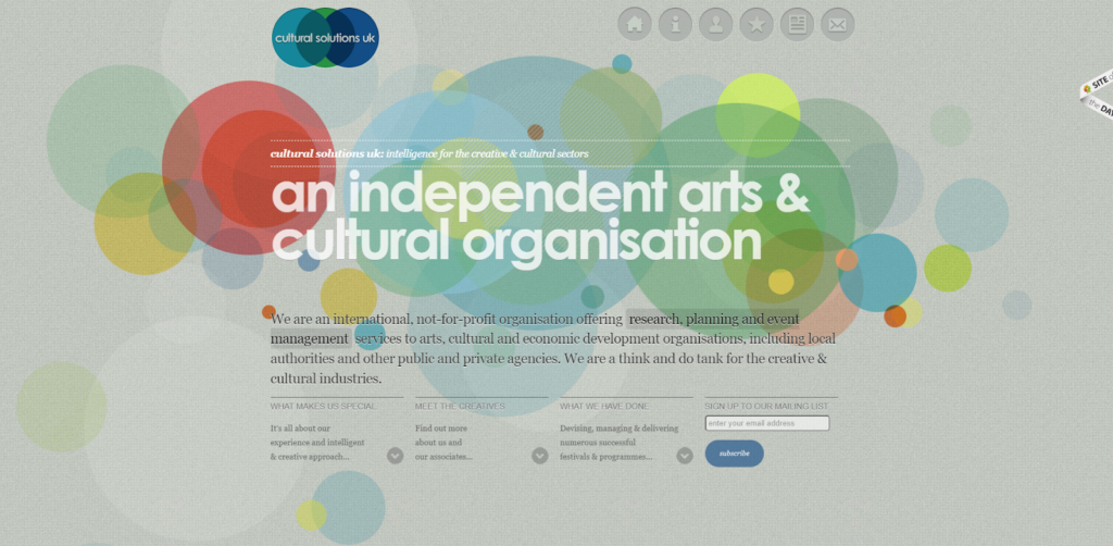
The website parallax effect of Cultural Solutions UK is a rather elegant one. The homepage is beautified with a calming color scheme and gentle parallax movement on the scroll. A website does not have to be vibrant and loud to offer an upper-class experience to its users.
Storytelling
3. Takes Your Users Through Time and Space
With the help of the parallax scrolling effect, users can travel through time (and maybe space) to see how your brand or products change. The Porsche Evolution website provides a great example of this. Click the link to listen to the audio, and the music changes, too.
The design stimulates users’ scrolling because it looks like a photo book or documentary film, making users want to see what the car will look like next. This technique can be in chronological order (as seen here) or reverse chronological order. And a key to perfecting it is to make sure this site works in both directions – even the music goes back – when you scroll up or down.
4. Grabs Users’ Attention
Of course, anything appealing, strange, and new catches our eye. The parallax effect on the website does this well because it saves websites from the commonly-seen static background and brings a tasteful sense. Please navigate to Some Typical Parallax Effect Examples for more examples and references.
5. Writes a Comic Book and Makes It Interactive
Visiting The Walking Dead Zombified homepage, you’ll see how creatively this site employs parallax scrolling animation. It tells a story, and as the users scroll, they are taken across the page, which is known as the horizontal parallax scrolling effect, and the character moves with them through comic-style panels.
Engagement
6. Piques Users’ Curiosity
Whether your site can pique users’ curiosity depends on how you use parallax movement on scroll. If you are looking for a reference, here’s one for you.
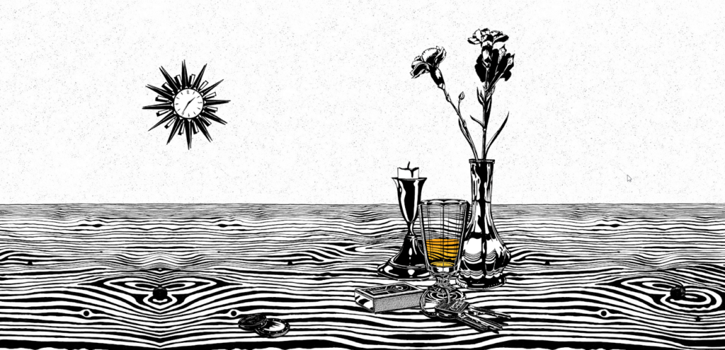
The F&B brand Michelberger Booze engages visitors in a very creative way.
When scrolling down the homepage, you see an artistic still-life setting. If you keep scrolling, two things happen. The watch starts to run, and the drink dries out gradually. Then a mask shows up, and clicking on it will take you to the booze – a stunning, animated illustration representing the drink’s sphere.
You can only get the complete information about the drink by coming to the end of the webpage. Still, you can hardly get there without interacting with the site first. The most fun part is when the scroll ends, you are automatically sent back to the top of the page, and the scroll starts again.
7. Creates Fun for Users
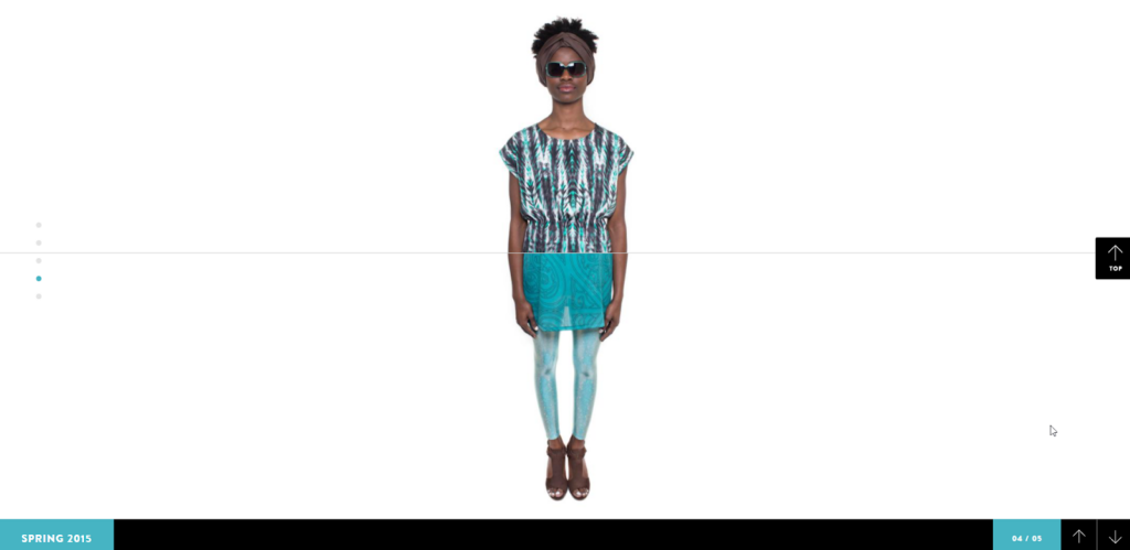
Some designs or effects may seem pointless initially, but they keep visitors interested. Krystalrae is a perfect sample. With the parallax movement on the scroll, visitors can enjoy the course of changing the model’s outfits just by scrolling up and down. The design is minimalistic to focus on the model, but the engagement it creates is maximized.
Action Trigger
8. Invites Your Visitors in
The website parallax effect can be an excellent way to invite people to visit your site. People have been discussing whether or not the most valuable asset of a website is, in fact, above the fold. And that’s right, this space is crucial, but only for it’s what your visitors get to see first. Therefore, it’s where you need to make them convinced that your site is worth entering.
All you need to do here is to hint that there are more exciting things to see if they go further.
→ You might be interested in 100+ ridiculously weird websites. But not all of them are pointless
9. Leads Users to CTAs
Using the parallax effect on the website, you can attract people and invite them to your site, walk them through a story, and eventually to your CTA buttons. This requires not only graphic design tactics but also a knack for storytelling.
Product Display
Last, the most practical use of the website parallax effect. No matter what you do: designing websites, creating content, encouraging users to click CTAs, etc. – everything boils down to one purpose: sell products. And parallax scrolling animation aids in doing this so well, as this is the most lively way to present your products.
Why? With common web techniques, you can only design webs in static blocks and content. But parallax effect on a website – an innovation in technical design- allows visitors to interact with your site, thereby exploring your products on their own.
Let’s see how.
10. Displays Your Products in 3D
The website Bagagia has been great at letting customers view their products in a new and brilliant way. Static photos of different product angles are no longer this brand’s choice.
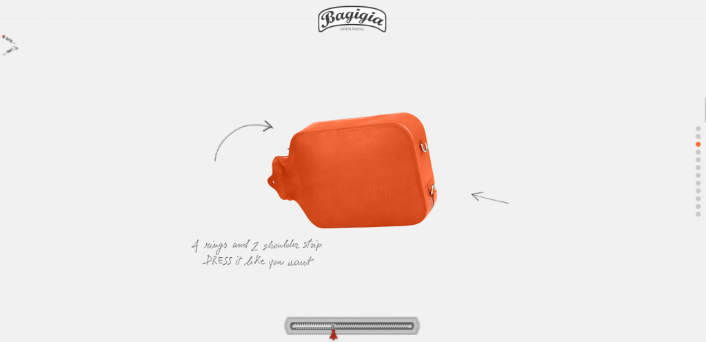
Instead, it has a 3D presentation controlled by your scrolling up and down. The design is straightforward, using a generous amount of white space to draw your attention to the unique 2-in-1 product: A leather hot water bottle and a bag simultaneously. The page amazingly signifies the exquisiteness of the product.
Limitations When Using Parallax Scrolling Animation
However excellent this design technique certainly is, it does entail side effects. Learn the disadvantages of using the parallax movement on scroll well to avoid them or reverse the situation.
- The website parallax effect cannot be applied to content-rich pages. Because using the impact on a content-heavy site can require too much scrolling, which can frustrate users and make it hard to read. Consequently, there would be a negative impact on organic SEO (i.e., a single page with only one H1 tag and rich homepage content that isn’t structured logically.)
- Users with motion sickness may feel unpleasant.
- Because parallax animation on the scroll is heavy, it can take pages longer to load, and it will not run smoothly on all browsers, especially older ones (i.e., Internet Explorer 8).
- It can be overly complicated and frustrating to find information for technophobic users.
- There can be more effort to optimize the responsiveness of parallax effect websites. To avoid significant compatibility problems, the web designer must know how to correctly interpret the effect from a PC to a mobile device.
- If the effect of parallax movement on the scroll is not used correctly, the page can be challenging to navigate.

Try FREE Magezon Page Builder demo today
Easily create your interactive Magento website in any style whenever you want without relying on developers or designers. Just by drag & drop.
5 Styles of Scrolling Parallax Effects & Examples
Now that you’ve learned what parallax’s meaning is and seen some parallax effect examples, you may wish to know which type is best to apply to your website. There are 5 most common and captivating styles of scrolling parallax effects for you to consider.
1. Animation to Show Change
Web designers use parallax movement on scroll to show changes in a project. Layers of movement can express a difference in time, space, or location.
Had you not skipped the example above, you’d already seen how Porsche Evolution shows differences over time with changes to the background and cars in the foreground of each image.
2. Encouraging to Scroll
The website parallax effect can create more engagement by stimulating users to scroll to enjoy or interact with the design longer.
Many designs featuring parallax scrolling animation include a “scroll/start/experience” button or cue on the homepage to encourage interaction from the beginning. (As in the previous example, there is a “scroll” instruction on The Walking Dead Zombified’s homepage.)
The Walking Dead website does a little differently with parallax to keep users engaged – it uses a horizontal parallax scrolling effect instead of a vertical one. This way, users scroll across the screen as the character moves through comic panels.
3. Simplify Information
The website parallax effect can help simplify information or wall of text to become more legible and easier to digest. You might think about this as a new moving type, but it actually involves moving containers holding the type.
The websites above exemplify two different applications of this concept.
Melanie David has a long introduction about her on-screen. The left side shows the navigation element About remains static while users can scroll through the text on the right. Once the text block ends, both sides of the page move to the next section. This is brilliant for a page containing longer text than the visual content area.
Le Duc restaurant uses individual blocks for various sections of the menu that show how customers read and order food items. The animations are simple with the artistic fish background – which reveals something about the menu base – and makes the menu visually easier to read and understand.
4. Movement and Colour
One of the most remarkable ways to use the website parallax effect is to integrate color into different content panels to exhibit elements. Colour transformation and animation lend a tasteful sense to the website.
If used wisely, color is a spell that can mesmerize users.
Werkstatt gives a great illustration of this kind of parallax movement on the scroll. It starts with a generous amount of white and grey space, with parallax layers between elements and text. But an additional hover action turns each white project into a colored one and completely brings them to life. The combined effects work like a charm as the rest of the design is simple on purpose, so users would feel urged to interact with every element.
5. Visualize ‘Digital’ Reality
The website parallax effect helps users visualize something they can’t see. Web designers use 3D combined with parallax animation to create more realistic browsing experiences.
These 3D designs move towards an experience of a more cartoon style, such as Madwell above, but can also have a more (Virtual Reality) VR feel when the design runs on specific types of devices.
Parallax scrolling animation moves the foreground as users move their mouse. Certain CTA (call-to-action) buttons also appear when users navigate certain page spots. The design is educational and adventurous and depicts what is hard to picture mind without the animated effect.
→ You might be interested in 25 proven CTA examples across all platforms
Best Practises and Tips for Parallax Movement on Scroll Effect
Getting the ball rolling is always the most challenging part. But don’t worry; here are some tips and practices from experts that you may want to follow.
- Tell a story: Visual storytelling is the best way to walk people through a story, as it is straightforward and spares people from the tediousness of a wall of text.
- Stick to your goal: While designing a website parallax effect, stick to the purpose of your website to make the navigation process easier. Make the web interactive but effective as well.
- Content over style: Content is king and is the first and foremost element of a site. So focus on creating quality content before having a stunning parallax website design. Because while the procedure is what attracts people to your site, the content truly makes them trust you and convert them totally.
- Make it responsive: Parallax is complex in designing techniques and coding. Therefore, it is not easily responsive on different types of devices. So when applying a website parallax effect, remember to optimize your site to be compatible with any device type. This ensures that users enjoy surfing your site and will return if needed.
- Use various layers to create depth: Use layering to bring about the feel of deep; place CTA buttons through the site and the most important information on the upper half of the page.
- Combine different design elements: Don’t just stop at parallax scroll animation. Go further, and adopt more design styles and elements to achieve a unique and personalized look.
- Use CTAs wisely: A website with a parallax effect is a golden egg if you know how to place CTAs properly. For example, after leading visitors through an interesting story, don’t forget to use the right CTA after the story ends. The CTA can be “Learn more,” “Continue the story,” “Visit our shop,” etc. Make use of the enjoyment of visitors when interacting with the website parallax effect and convert them into customers.
- Use parallax effect on website moderately: At its best, parallax scrolling animation will tactically draw users’ attention to all the right spots on a website. At its worst, it will distract the users from the necessary message and have them lost in a sea of content and graphics. Avoid overusing and underusing this website design effect to ensure your case is the former.
10 Best Plugins for Website Parallax Effect
When you’ve considered the good and bads and decided to use a website parallax effect, you may want to choose a plugin for your site (in case you don’t know to code). These are the best 10 plugins that help you design a perfect parallax scrolling website.
jQuery Website Parallax Effect Plugins
1. Parallax Slider
Parallax Slider is a responsive jQuery plugin with 4 versions. They are Classic, Mouse Interaction, Perpetuum Mobile & Ultra. Each slider version has 2 skins: bullets & thumbs. Moreover, it is optional to configure sliders as Full width or Fixed Dimensions.
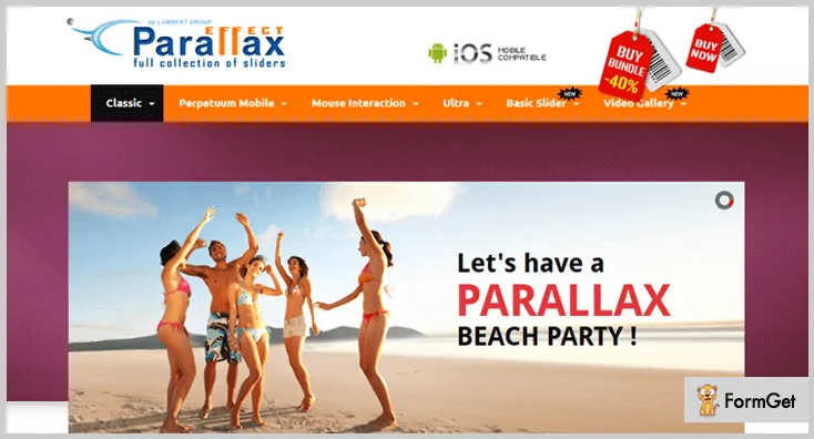
This solution allows users to live preview each slider version and its functionality. Also, each listing has extreme common as well as some very unique features.
Parallax Slider supports countless layering of elements over one another. This feature applies to all text blocks and pictures as well.
Pricing:
Regular license: $11 with 6-month support
Extendable license: $3.38 with 12-month support
Key features:
- Any YouTube, Vimeo video, or HTML5 can be embedded to the effect.
- In Perpetuum mode, users can set various backgrounds as constant or infinite moving. This function is available for every background.
- Mouse movement: Elements react as a cursor moves through.
- Continuous mode: Users can choose which layer moves continuously between the two fixed positions.
- Rotary motion mode: Users can rotate a layer by configuring the parameters.
- Asynchronous move: Users can set many background elements with different speed frequencies.
2. jparallax
With this website parallax effect tool, you can design an interactive and responsive parallax scrolling animation. jparallax transforms parallax elements into layers that move as users move the mouse. The animations and transitions of the elements are totally based on their set parameters in the back end.
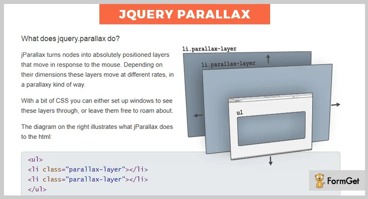
Pricing: Free on GitHub
Key features:
- The width of the parallax element is revealed when the cursor moves throughout the width.
- Users can create layers of parallax elements with pure CSS.
- Users can customize the size, transition, and speed of the parallax effect on a website.
3. Imagine
Imagine offers a host of functionalities for the parallax effect on a website. Its animations are highly applicable to any website element. Plus, they provide an amazing parallax background. This tool is developed with an effective combination of jQuery, GSAP & Animus.
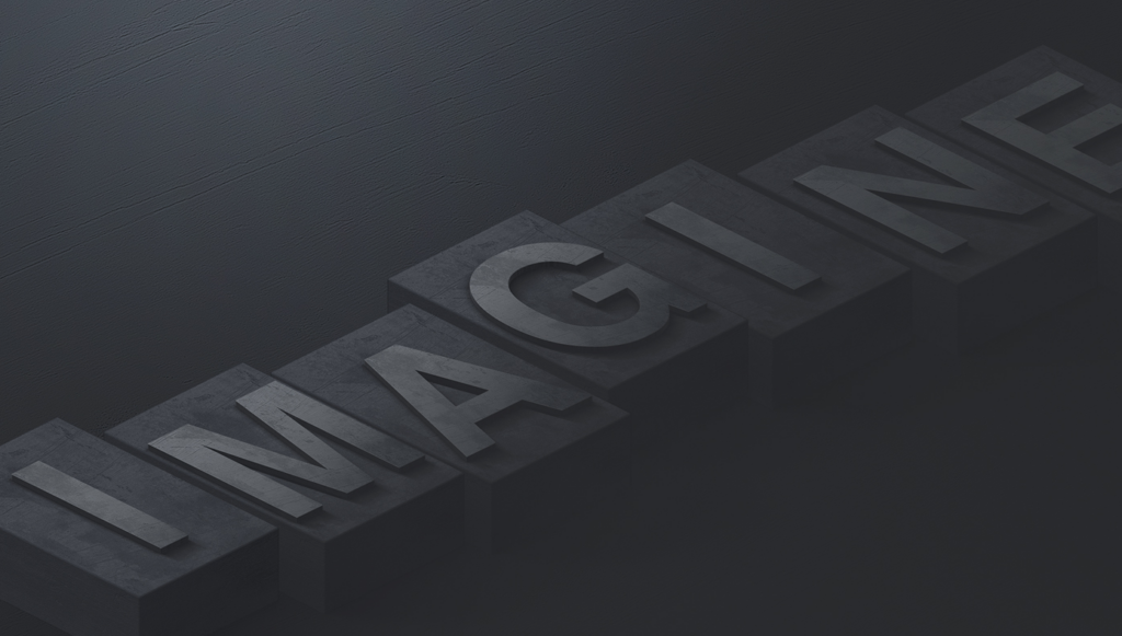
Moreover, Imagine is a well-developed and beginner-friendly solution. It is also compatible with almost every front-end framework. This plugin has been tested with Foundation & Bootstrap and has proven ideal.
Pricing:
Regular license: $12
Extended license: $35 with 6-month support
Key features:
- 5 ready-made templates, namely Imagine, Daydream, Portfolio, Misty Woods, and Storytelling.
- It applies advanced parallax animations to site elements. Plus, users can design and customize animations for themselves.
- A touch-enabled interface is available for mobile-friendliness.
- This plugin can animate almost everything. Users can apply stunning parallax scroll animation effects to your site elements.
4. ScrollMagic
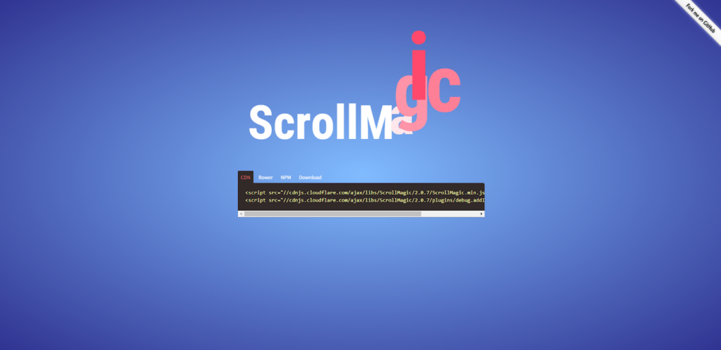
ScrollMagic is a jQuery plugin that enables users to use the scrollbar as a playback scrub control. It is a complete rewrite of its predecessor Superscrollorama by John Polacek.
This jQuery plugin offers easy and quick customizability and extensibility.
Pricing: Free on GitHub
Key features:
- Mobile responsive
- Optimized performance
- event management
- Responsive web design supported
- Legible, centralized code and intuitive development
- Vertical and horizontal scrolling (even different on one page) supported
- Scrolling inside div containers (even multiple on one page) supported
- Extensive debugging and logging capabilities
- Various application examples
5. Simple Parallax Scrolling
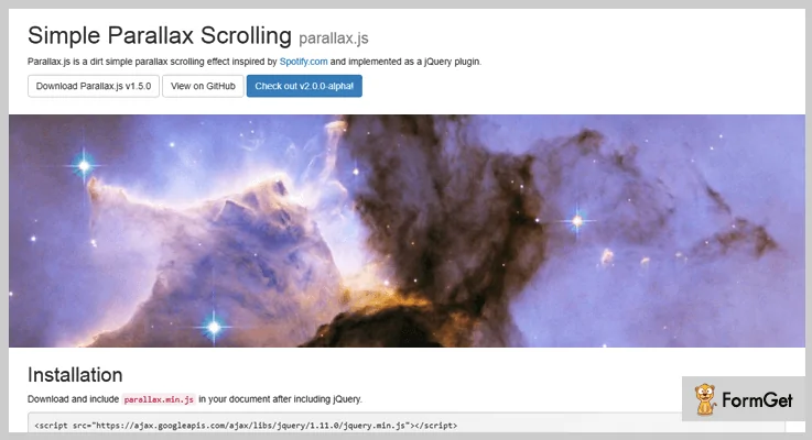
Simple Parallax Scrolling is a simple jQuery website parallax effect plugin. It provides basic functionality to elements of any simple parallax scrolling animation.
Pricing: Free on GitHub
Key features:
- Highly compatible with every screen size.
- Users can add any picture for the basic functionality.
- Demonstrations and documents are provided for a better setup.
- Simple Parallax Scrolling is a cross-browser-compatible plugin that supports common browsers.
Vanilla JS Parallax Scrolling Effect Libraries
6. locomotive-scroll
locomotive-scroll is a modern JS library that provides a smooth, elegant, easily configurable website parallax effect to elements when scrolled into view.
Price: Free on GitHub
More features:
- Seamless scrolling.
- Customized trigger offset.
- Sticky elements supported.
- Touch-enabled.
- Custom scrollbar.
- Horizontal or vertical parallax effect.
7. Universal Parallax

Universal Parallax is a JavaScript solution to implement a frictionless, mobile-responsive parallax scrolling effect on your website app.
Price: Free on GitHub
8. Lightweight Vanilla Javascript Parallax Library – rellax
rellax is a modest vanilla JavaScript library that offers a seamless website parallax effect on any DOM element.
Price: Free on GitHub
Pure CSS Parallax Scrolling Effects
9. Pure CSS Parallax Background Images
This easy-to-use CSS solution aids in applying parallax scrolling animation to users’ background images.
Price: Free on GitHub
10. Fixed-Position Parallax Scrolling Effect

This pure CSS solution helps users to implement a fixed-position website parallax effect on background images. It is responsive on both PC and mobile devices.
Price: Free on GitHub
Sum Up
Through this apparently in-depth article, we’ve learned that the website parallax effect is a web design technique that adds more vividity and liveliness to your website. If you’re about to apply this effect to your site, remember to use it moderately and its elements wisely to score some plus points in users’ impressions and help you sell better. Visit our series of Ecommerce Website frequently as it hosts valuable tips for web design and e-commerce.

Try FREE Magezon Page Builder demo today
Easily create your interactive Magento website in any style whenever you want without relying on developers or designers. Just by drag & drop.
 Magezon Blog Help Merchants Build Comprehensive eCommerce Websites

