
We have all heard the statement, ‘It is what’s on the inside that counts.’ But admit this: sometimes, the outside matters too. We are living in a world where people are so concerned about appearance. For this reason, products are made in a good-looking way to attract buyers. For example, customers usually are more attracted to books with exciting covers or artistic packaging. Similarly, when making a video, selling products online, or writing an article, there is a critical step apart from creating the content, which is to make unique thumbnails. A well-designed thumbnail is certain to capture attention and tease people to click, showing that 90% of high-performing Youtube videos use custom thumbnails.
In this post, we will give you a bunch of information regarding thumbnails, so you can realize their importance and take advantage of them.
Table of contents
| People also read: Use TikTok to Attract Gen Z: 8 Smart Tips for eCommerce Brands SaaS Content Marketing Strategy: 5 Tips to Make It Effective Everything You Need to Know About SEO for Small Businesses |
What Is a Thumbnail?
If this is the first time you have heard of the word ‘thumbnail’, that is not strange as people usually ignore its existence. The term ‘thumbnail’ refers to processing an image to a specific size so that viewers can easily recognize it. In other words, it is a miniature version of the original image, video, or page and represents the larger one. For example, when you search for a video on Google, you will find tons of results with small images. Those are thumbnail photos that are cropped from the original video/image.

What Are Thumbnails Used for?
Custom thumbnails play a more important role than you think. These reduced-sized images give the very first impression and partly determine the success of your videos, blog, or selling website. So, why do they matter?
An Attractive Thumbnail Draws Viewers’ Attention and Gains Clicks
In this day and age, millions of people around the world upload videos or write blogs every day. Do you want yours to stand out in the middle of exciting videos and articles about the same topic?
Designing an eye-catching thumbnail photo is the answer. This leads them to choose your content over others, increasing views and search traffic.
Does that mean media content without a good visual snapshot stands a smaller chance of piquing the viewers’ interest?
Literally yes. People tend to ignore a dull thumbnail image with a still shot cut from the video itself. In the same way, a plain article with nothing but text cannot get the readers’ notice.
2. Cool Thumbnails Clearly Convey Your Message
The text and the picture in a thumbnail photo which is often large and easy to read, represent the overall content of the video. By looking at it, viewers can get a quick idea of what your video is about and decide whether to click it or just move on. Before giving them detailed information about your topic, you should let them know if what you bring satisfies their needs. So wonderful just a single image is that it can contain a lot in a small space, isn’t it?
3. A Preview Image Reduces Loading Time
Internet users can be offered various media content simultaneously when searching for something on websites. Thumbnail pictures have smaller file sizes than the original videos, articles, and images. Therefore, when these media contents are presented in the form of thumbnails, the website can load much faster.
Thumbnails Across Platforms
People often refer to ‘thumbnails’ when making a video on Youtube. However, Youtube is not the only platform using thumbnails. There are several similarities among platforms’ thumbnails:
- They are all designed in the form of images.
- Their sizes are adjusted depending on each platform
- They are all noticeable and represent the content.
However, each platform requires different thumbnail standards. Let’s discover them now!
YouTube
The word ‘thumbnail’ is so common on this platform that you may not have to ask, ‘What is a thumbnail on Youtube?’. Do YouTubers need custom thumbnails instead of simply using the default thumbnails which YouTube provides them? Well, yes – if you do not want boring pictures cut from your own videos to put people off clicking. A cool snapshot can catch viewers’ eyes and inform them of your main topic, thus boosting viewership.
To make a top-quality thumbnail on YouTube, remember its correct size, ratio, maximum file size, and file type. 1280 × 720 pixels would be the perfect size for your video thumbnail if you want it to be easily seen on any device. Of course, you can use smaller or larger sizes than recommended, but you would fail to impress viewers. Besides, the thumbnail picture should be at least 640 pixels wide, and the ideal ratio is 16:9. Your thumbnail file size should not exceed 2 MB. Remember to save it as a GIF, JPEG, PNG, or BMP.
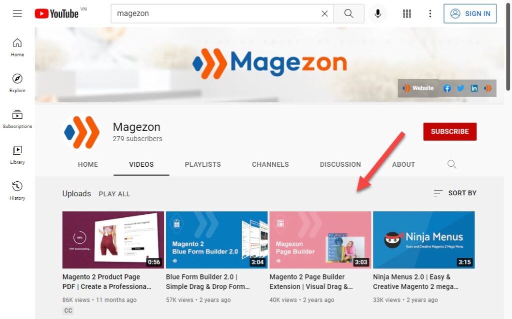
You may also want to visit this fun website to use auto-generated thumbnails or learn how to make a YouTube thumbnail here.
Amazon
Amazon has been the largest marketplace worldwide and has attracted millions of active sellers yearly. Many people make a large amount of money with their products on Amazon. To be successful like them, you have to convince purchasers to click on the image of your products. That is why you need an excellent Amazon thumbnail photo. The products in the preview image should be intriguing and straightforward to get to the buyer’s notice.
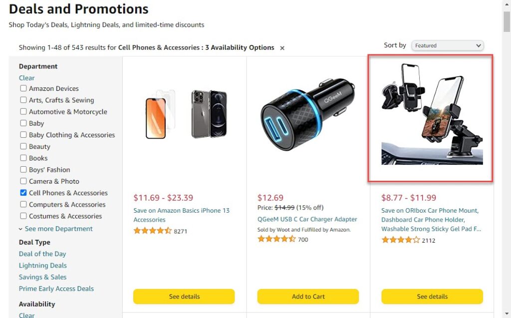
Amazon has different thumbnail image requirements for different applications.
On the home page, thumbnails should be 200 pixels high. On the category pages, the height of thumbnails should be 150 pixels. File formats can be JPEG, PNG, and GIF. But remember that Amazon prefers JPEG.
Google Search
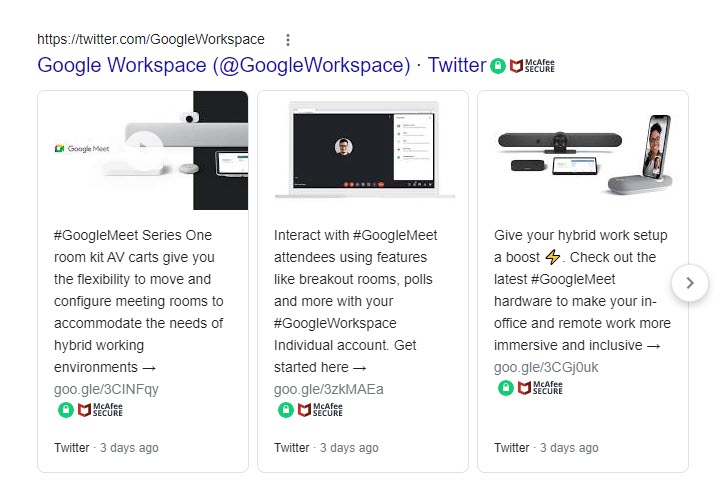
When looking at the image search on Google, you can see that it displays multiple different photos simultaneously. Those are the thumbnails of videos, articles, or websites. You can click on a thumbnail picture and see more detailed information about the content.
So, what are the standards of thumbnails for Google’s image search? 177 pixels is the suggested size for a thumbnail that can be seen on a desktop. You can also use a smaller thumbnail. The maximum size is 200×200 pixels.
Pinterest is a massive collection of images and a social media service. You can find nearly everything here, such as recipes, paintings, or fashion. This platform attracts over 400 million active users each month. To make your pinboards stand out, try to customize beautiful thumbnails.
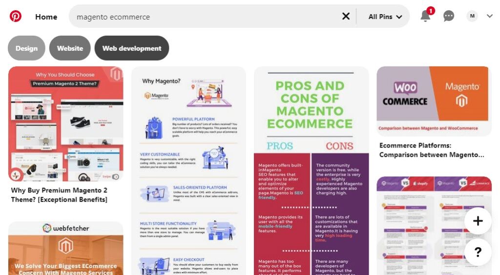
Pinterest’s image is as wide as 236 pixels. On Pinterest, a ‘pin’ is an image linked from a website or uploaded. You can save, collect and arrange your Pins on Boards. Boards save both large and tiny thumbnails below the cover image. The recommended size for large thumbnails is 222×150 pixels, while it is 55×55 pixels for smaller ones.
The display size for a thumbnail image on Instagram is 161 pixels by 161 pixels. This platform also stores thumbnails 1080 pixels wide, the same maximum as photos uploaded to Instagram. The ideal aspect ratio is 1:1.
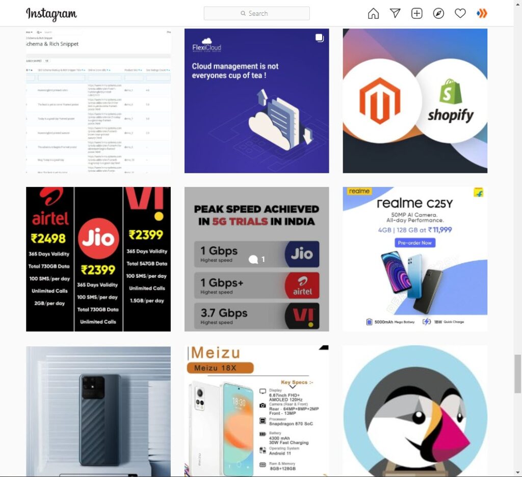
But, how about IGTV video thumbnails? IGTV is home to plenty of video content on Instagram. Strangers may not see your timeline, but they may see your videos on the IGTV Explore Page. Therefore, your video thumbnail must be captivating so that others will stop to watch instead of scrolling up. The perfect size for an IGTV thumbnail is 1240×1920 pixels and the aspect ratio is 1:1.55. You should keep the file under 4 MB and remember to process your thumbnail as a JPEG.
Facebook is one of the top social media used by billions of people worldwide. You can see a lot of Facebook users share links on their profiles. There is often a thumbnail attached to a link. The more exciting that thumbnail is, the more likely people click on the link. For this reason, images in thumbnails should be clear and big enough.
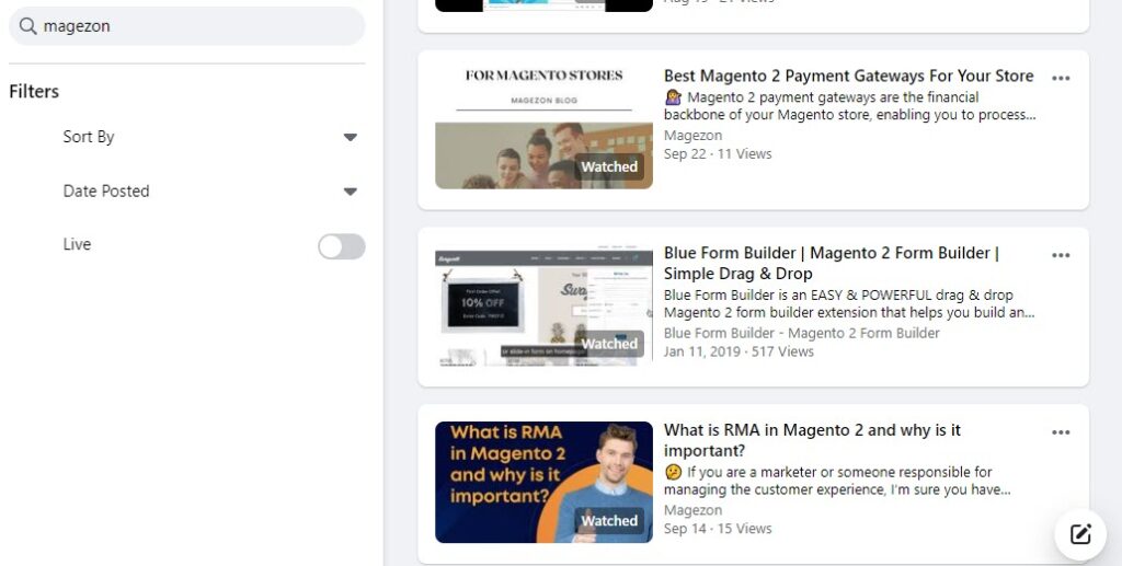
To have the best quality thumbnail on high-resolution devices, the recommended size is 1200×310 pixels. Your image should be at least 600×315 pixels. You can use a smaller size than that. But this is not the ideal size for the preview image for link posts as it won’t be large. The widely used aspect ratio for thumbnail Facebook link shares is 1.91:1.
Thumbnail Trends
There are some thumbnail trends in 2020 you can learn from. Let’s take a look at the six most popular below.
- Add emojis
Many famous YouTubers use several emotional icons (happy, sad, angry, etc.) and stickers in their thumbnail picture. Those animation images are highlighted and recognizable, so viewers may instantly look at them. In this way, they can understand the concept of the video and what emotions they expect to experience after watching it. For instance, when seeing a thumbnail with cry emojis, people immediately know that the video is about sad events.

2. Show faces
You may believe thumbnail designers should focus on the products or brands rather than people. In fact, individual faces work more than you think. Some content creators put a person’s closeup or facial expressions in their thumbnails. The face may be of the person appearing in the video. Sometimes, they use the video’s speaker’s hilarious reactions. Psychologists prove that human brains prefer faces over objects and characters. Therefore, using faces with emotions can trigger viewers’ curiosity, build human connection, and spread the speakers’ feelings.

3. Place visible logos
Professional content creators often have well-designed logos for their brands. To take full advantage of it, they pay attention to the logo’s size and position in the thumbnail. They try to keep it uncomplicated with simple colors and patterns so that it won’t be a distraction. Thus, guarantee the logo is not too big or too small.

So, how can you benefit from using logos? By seeing them, people recognize and remember your brand or channel; some can immediately click on your video/image if they are interested in your style and concept. For a business website owner, putting the shop’s watermark beside its image helps boost its popularity.
5. Try various perspectives
Perspective refers to representing three-dimensional objects on a surface. This strategy aims to impress the audiences by showing different positions or angles of the objects and – sometimes – people—for example, height, width, and breadth. Instead of the object’s frontal angle, you can try diverse setups, such as small-big or far-close. That causes visual illusions and shows how engaging your media content is.
6. Displaying progress
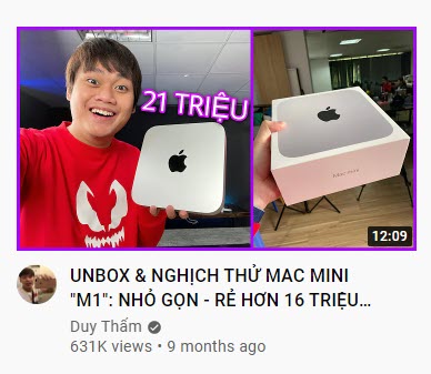
We can see this practice in many ‘Before – After’ videos and articles. Some content creators divide the thumbnail vertically into two equivalent parts. The left shows how things (or people) are before changing, while the right shows the results. For example, if you want to make a tutorial video about makeup, you can apply this idea: showing a woman’s face before and after wearing makeup in the thumbnail. People would be impressed at how things change for the better and want to see how you did it.

Best Practices for Thumbnails
What makes the difference between an expert and an amateur thumbnail designer? Well, it’s the way they make thumbnails special. Here are some ideas that help you to make a thumbnail and stand out from others.
1. Include relevant images
The primary function of thumbnails is to capture attention and gain clicks. But don’t focus on the outside so much that you forget how important the content is. Make sure the thumbnail picture connects with the text and presents the main topic. By contrast, if you put an intriguing yet irrelevant image, viewers will find your videos or blogs unreliable and never go back to see your content again. For example, some YouTubers throw photos of attractive women in the thumbnail of their videos to encourage people (especially men) to click. Still, their videos have nothing to do with these photos. That is a huge mistake because it leaves viewers with a sense of disappointment.

For example, the thumbnails of Roxette Arisa – a beauty blogger – always have several makeup products, such as lipstick, shadow palette, etc., which are closely relevant to her content.
2. Add clear text
An essential thing to remember is that the thumbnail photo’s words must be easy to read. You need a remarkable title to draw viewers’ eyes and impress them. Overlaying the background with bold and big text can make a difference. Never use a thin or small font size because people have to stretch their eyes to find the words.

As you can see in the above Instagram thumbnails, the designer uses a large font size for the texts, which helps to attract viewers’ attention immediately.
3. Keep your thumbnail simple
Sometimes, trying to make things more sophisticated will be counterproductive. Designing a charming thumbnail doesn’t mean you have to put too many things in it. The thumbnail is just the book’s cover as publishers never write the entire book on it. A thumbnail containing many unnecessary words, graphics, icons, or pictures is confusing and disorderly. For this reason, try to avoid overusing design elements. For example, Instead of adding the entire title of your video or article, you just need some highlighted keywords depicting the content best.
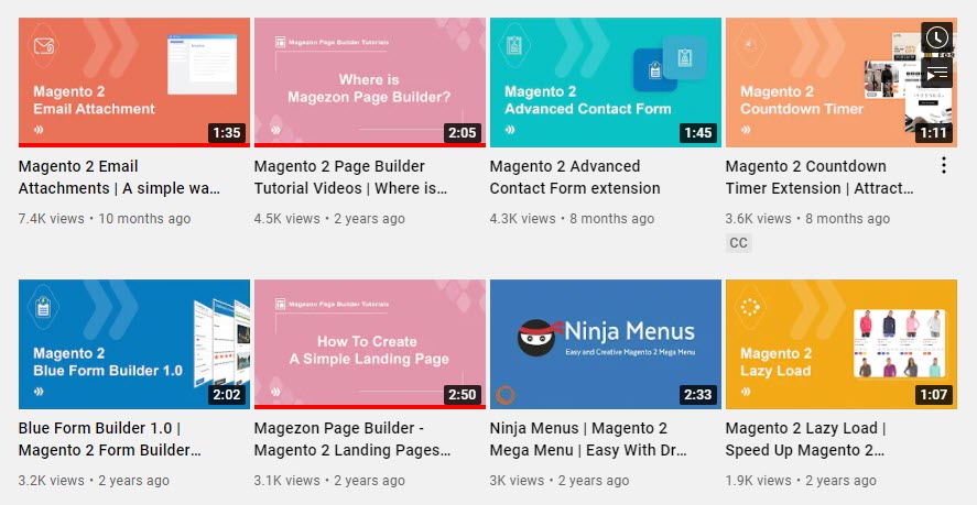
In the picture above, every thumbnail does not have many illustrations, but it still works, as sometimes, ‘Simplicity is an exact medium between too little and too much’ – Joshua Reynolds.
4. Use contrasting colors
Thumbnails are small images, so it is super crucial that Internet users can read the text on them. To make the words appear clear and recognizable on the thumbnail, you should put dark text on a bright background or vice versa. Say ‘no’ to the combination of the same tone colors if you don’t want the text to be faded out.

For instance, in these thumbnails above, the owner only uses contrast colors between the background and the text, so his/her viewers can easily read every word.
5. Apply the ‘rule of thirds‘
That is a common photography technique that involves dividing an image into nine parts by using four lines. Then, you need to place the most significant elements in your thumbnail along the lines or at the intersections. Those positions catch people’s eyes the most. This way, they can see what you want them to focus on when browsing the Internet and looking at your thumbnail.

With this composition guideline, viewers will know which part they should look at in the first place.
Best Tools to Make Thumbnails
Now you’ve learned several tactics to make easy thumbnails. Next, you need a tool to aid you in thumbnail design. Don’t worry if you don’t know which one to choose. Here is the information on the best five tools you can take an overview of.
1. Canva
Canva is a graphic design platform that has gained popularity recently. This tool is suitable for everyone, especially those new to graphic design. You can create eye-catching business cards, posters, invitations, Instagram posts, and thumbnails.
Canva provides over 50,000 designed templates with many illustrations, fonts, stock images, and icons. Those are all great materials for a stunning thumbnail.
Canva is free of charge. Without paying, there is still 1GB of storage and more than 8,000 free templates and images available. For more features and graphic elements, Canva has paid subscriptions, including Canva Pro, Canva for Enterprise, and Canva for Education. Do not worry; your money will certainly pay off!
2. Fotojet
Fotojet is another free online graphic design platform. It offers a wide range of thumbnail templates, images, clipart, icons, and fonts. In particular, over 600 collage templates, over 300 designs, and over 80 collage layouts are available for users.
Fotojet is accessible to all kinds of users, both professional and non-professional. You can use it in any browser without spending ages downloading it. Besides, you don’t have to create an online account to use Fotojet. Convenient, isn’t it?
Like Canva, this tool is free, but you must pay for advanced options. You can upgrade their Basic plan to Fotojet Plus for only $6.99 per month and $39.99 per year. Fotojet paid version provides users with 800+ templates, 30+ fonts, 300+ clipart, customer support, and removes annoying advertisements.
3. Adobe Spark
Adobe Spark is a web and mobile-based graphic design software developed by Adobe Systems in 2016. It consists of three apps: Spark Post, Spark Page, and Spark Video.
With numerous essential features and templates in Adobe Spark, users can easily make stories for social media, flyers, and YouTube video thumbnails. You can also share your visual content from any device.
You can use its Starter plan for free. However, if you want to remove its watermark, have additional features or manage various front-ends, you must upgrade to an Individual or Team plan. Adobe Spark also has Enterprise and Education plans if you wish.
4. BeFunky
BeFunky is a popular online graphic designing and collaging platform established in 2007. Users don’t need to be technical experts because BeFunky is super easy to use.
This platform offers two account types: BeFunky Basic and BeFunky Plus. The first one is free, but only 125 digital effects are available. You will have access to more effects and features when signing up for the second one with an $8.99 monthly fee.
What’s special about BeFunky? Apart from stickers, seasonal illustrations, icons, etc., you can adjust photo effects such as white balance, tonal contrast, shadows, and many more to create an impressive thumbnail image.
5. PicMonkey
Created in Washington in 2012, PicMonkey has been a fantastic photo editing and designing tool. Because of its helpfulness, there are over millions of people using PicMonkey now.
Unlike the platforms mentioned above, PicMonkey is not free. Users can create content without paying for seven days before starting a trial. But after seven days, they must sign up for paid subscription options.
There are three packages: basic, pro, and business. The basic plan costs you $72.00, and the Pro plan costs you $120.000 annually. Users must pay for the Business plan to have storage brand kits, team folders, etc.
Final Words
Thumbnails are indispensable when you want to post a video or an image on social platforms. This tiny yet powerful photo helps drive people to choose your content over others and increase your reputation. We hope you get useful tips and powerful tools to make a perfect preview image. Now, it’s time you got started designing a fascinating thumbnail!
 Magezon Blog Help Merchants Build Comprehensive eCommerce Websites


