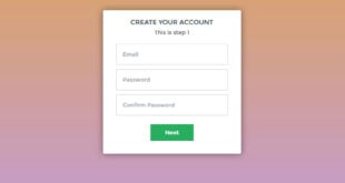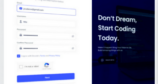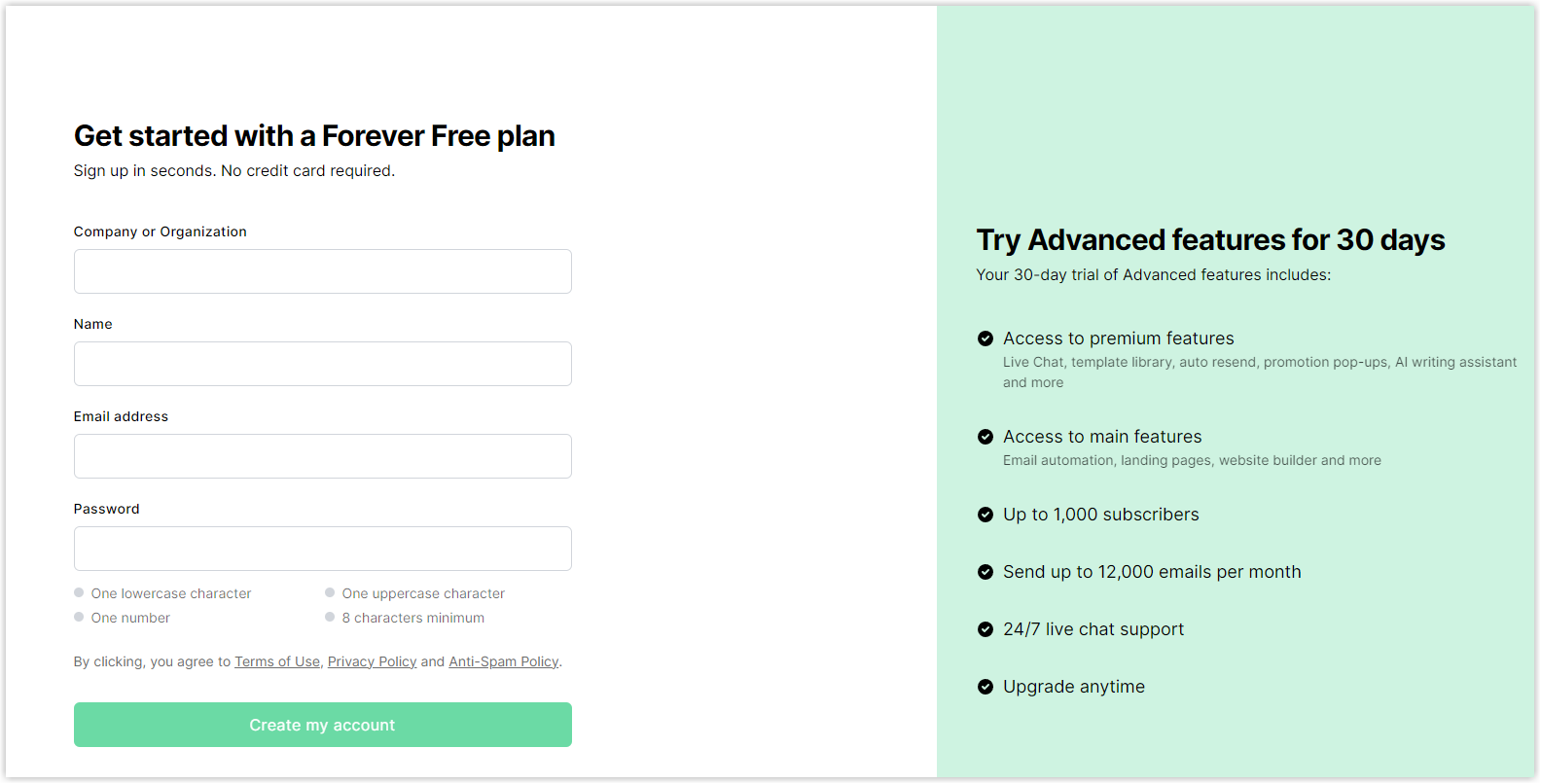
Source: MailerLite
Sign-up forms are a vital part of any website. They can help you acquire emails, leads and customers. However, many websites have forms that don’t get people to sign up. This often happens when forms are not well-optimized for users, such as being too long, difficult to understand, asking overly personal questions, or not explaining why some fields cannot be approved.
If you are reading this, chances are you are facing the similar situation. So this article will save you the trouble with 15 expert UX guidelines that positively change how you create and implement sign-up forms. And for more useful best practices, check out the article “How to Design Web Forms Users Love“. By combining the tips from both, you can create sign-up forms that increase user sign-ups, leave a good impression, and help your business grow.
No further ado, let’s get started.
Table of contents
- I. 15 Best Practices to Design an Effective Sign-up Form
- 1. Use one column
- 2. Stick to 4 fields or less
- 3. Use a clear and compelling sign-up title
- 4. Autofocus on the first field
- 5. Pay attention to input setups
- 6. Be careful with passwords
- 7. Create an effective CTA button design
- 8. Apply the errors validation
- 9. Save data the user already filled in
- 10. Switch between sign-up and login forms
- 11. Consider using one form for signing up and logging in (Also be careful)
- 12. Avoid using the terms “Sign in” and “Sign up” at once
- 13. Don’t ask for an upfront payment
- 14. Avoid asking for private information (e.g., Phone number)
- 15. Offer users multiple sign-up options
- 16. Offer an incentive to sign up
- II. Magento 2 Blue Form Builder: Create high-converting sign-up forms with ease
- Be Prepared to Build
I. 15 Best Practices to Design an Effective Sign-up Form
1. Use one column
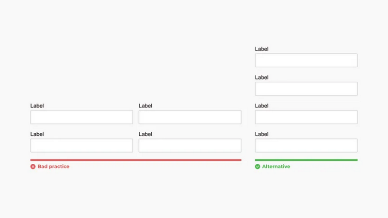
Sign-up forms should be designed as a single column because it makes them easier for all users, including older adults, to read and fill out the form. According to BayMard’s research on user experience, one column helps users not only fill out more quickly but also make fewer mistakes, making them happier overall.
By following a clear and straightforward path from top to bottom, users know for sure which fields to fill in next. Also, this helps avoid users overlooking fields, especially important ones.
Additionally, one-column forms look much better on mobile devices rather than multi-column ones. They are flexible and can adapt to different screen sizes, not just mobile phones but tablets, without looking strange.
2. Stick to 4 fields or less
To get more people to sign up, your form should be straightforward and quick to complete. In fact, having too many fields can make the form look messy and overwhelming. And it’s true because studies from JotForm show that forms with fewer fields tend to have more people completing them.
According to JotForm’s findings, sign-up forms with a maximum of 4 questions achieve the highest completion rate. So, if a question doesn’t encourage people to sign up, remove it from the form. Stick to the important questions so the form becomes brief. For example, if someone is signing up for an email newsletter, you don’t need to ask for their phone number.

We all know most visitors don’t want to spend much time filling out a sign-up form. But if you need more than four questions, choose a simple and clean design.
3. Use a clear and compelling sign-up title
It’s wise to start your sign-up form with a clear and attractive title. A proper title must communicate the benefits of completing the form and motivate users to act. To establish trust, include security badges that assure users their information is protected.

4. Autofocus on the first field
When people visit your registration form, they often click on the first field immediately. To make it easier for them and avoid problems, it’s a good idea to focus on that field automatically.
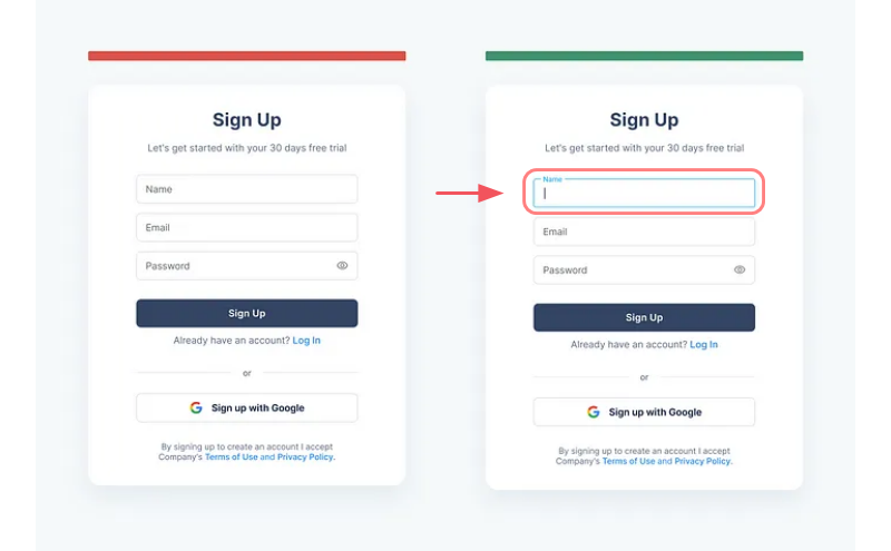
By automatically activating the first (or required) field, you show users where to start. This way, users can easily find the login area without any frustration. This applies not only to sign-up forms but also to other types of forms.
5. Pay attention to input setups
a. Field Labels
A helpful guideline is to use top-aligned labels in your forms as they are easier to read quickly. In shorter forms, use meaningful icons instead of labels. Besides, you can choose between sentence case or title case for your labels, but it’s crucial to maintain consistency throughout the form. Also, group related labels and fields by placing labels near their fields.
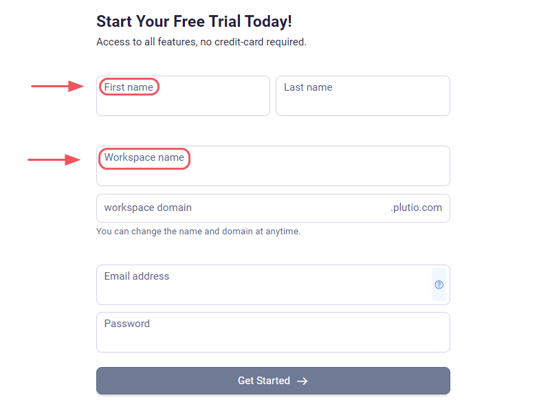
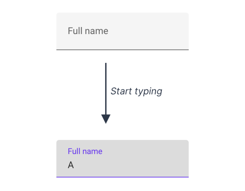
Another approach is using floating labels. It replaces traditional labels and allows them to flow inside the input field. When the user begins typing, the label moves up to accommodate the entered answer. However, floating labels do not effectively address 2 key issues: poor contrast and the potential for the label to be mistaken as an actual answer.
b. Input Fields
Avoid using text fields for all types of content. Instead, you should adapt the field type to match its specific content requirements.
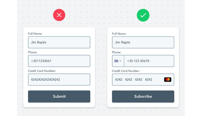
Different types of information have distinct characteristics and may need special treatment. Here are some examples:
- Phone number
- Credit cards
- Countries
- Dates
- Colors
- Website URLs
c. Placeholder
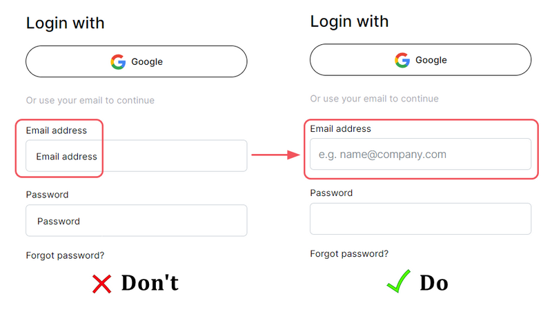
Hints in forms, known as placeholders, help users understand what type and format of data to enter. However, placeholders should not replace labels, which can make the form crowded. It works well for short forms with a few fields but not for longer forms. When users enter information, the placeholder disappears, making it hard to check if they entered the correct data.

Besides, when utilizing both field labels and placeholders, it’s important to distinguish the placeholder text from the user-filled text so that users can easily see and interact with the form fields. Otherwise, using the same style may lead to users ignoring the entry field.
6. Be careful with passwords
a. Show password requirements before submission
If your form has specific password rules, it’s essential to show them before users submit it. This helps users create a password that meets the exact criteria and saves valuable time. Furthermore, showing errors only after users click the submit button can be frustrating. It may lead to a higher likelihood of them giving up instead of fixing the problem.
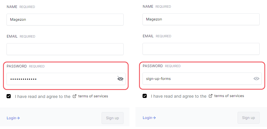
b. Mask password input for security
Showing the password helps prevent mistakes and frustration, however, users might not want others to see it on a public computer. Here’s the solution: hide the password by default while letting users reveal it if they’re going to. Users can choose to balance convenience, privacy, and security by doing this.
c. Offer a “show password” option instead of a “confirm password” field
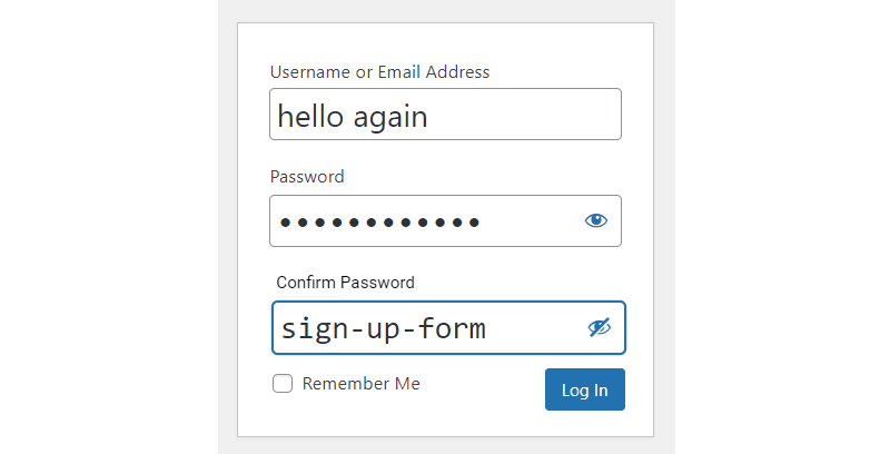
The Confirm Password field prevents users from mistyping their password during sign-up. However, it has been found that including this field can make fewer people complete the sign-up form.
Here’s why: Users have to enter their password twice, and if there’s a mistake, they must start over without help. This can happen multiple times, causing them annoyance.
A simpler and more effective solution is to offer a Show Password option next to the Password field. This allows users to click and see the password they are typing, so they can quickly correct any mistakes.
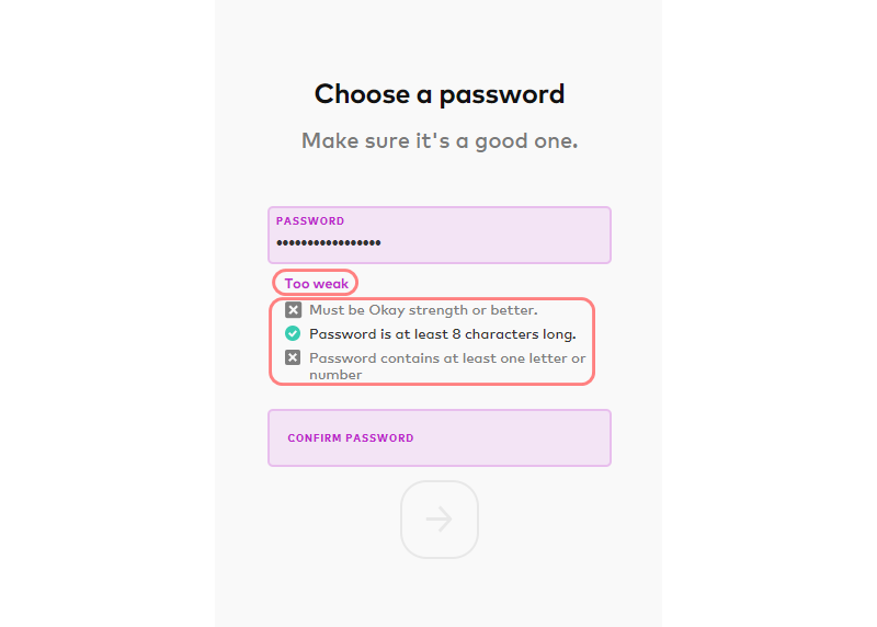
d. Show an indicator of password strength
It’s essential to educate users about creating strong and secure passwords. To this end, you should display their chosen password’s strength and security level and guide making it more complex. As a result, customers will better understand their password’s strength and can take steps to increase its security if necessary.
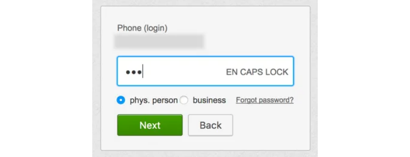
e. Warn the user if the caps lock is on
To prevent the common error of accidentally pressing the Caps Lock or Shift key, give users an alert when the Caps Lock is ON. This ensure users can avoid unintentional capitalization.
7. Create an effective CTA button design
a. Apply a clear button copy
Rather than using a generic “Submit” label, it is preferable to use form buttons that accurately describe the user’s task, such as “Create Account” or “Sign up.” Thus, users can understand their action and precisely what it entails.
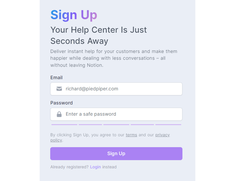
b. Use an outstanding CTA button
The Call-to-Action (CTA) button should be broad and bold to ensure it is easily visible and user-friendly. Such a CTA button enhances the overall user experience, making it clear and reassuring that their actions are directed toward the right individuals.
c. Use primary and secondary buttons properly
When you have two buttons, a primary and a secondary button, it is crucial to distinguish them to minimize visual errors. Given that the primary button holds more importance, it should appear more prominent and noticeable.

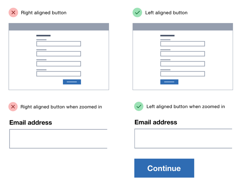
d. Left-align primary button for a clean layout
We recommend aligning the primary button with the left side of the input field, as this helps users quickly understand the form flow and know where to click to proceed. In addition, this layout is helpful for people who use screen magnifiers because they can see the button without having to scroll horizontally.
→ You might like: 11 Most Common Website Layout Ideas (+ How to Choose)
e. Do not disable the submit button
Some forms have a button that is not clickable (disabled) until all the required fields are filled out. However, this approach has a couple of issues. Firstly, it is not easy for everyone to use, especially older people. Secondly, it gives no feedback when you click the disabled button.
Thus, it’s better to keep the button clickable so that users can see any errors and make corrections if needed. The only case to have a disabled button is when there’s only one field, and you can’t proceed without filling it.
8. Apply the errors validation
Web form validation aims to ensure that users have filled in all the required information in the correct format to complete the form successfully. A decent validation message should clearly state the following:
a. Show errors instantly
When users fill out forms for signing up or logging in, it’s helpful to show instant validation. This means that as soon as users enter their information, you should highlight errors or mistakes immediately. Don’t make your potential customers wait until they finish the whole form to know if something’s wrong.
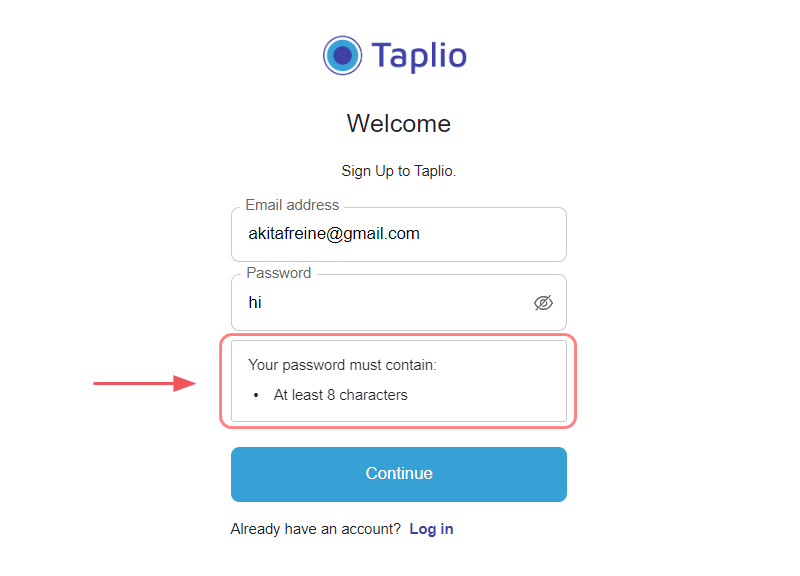
b. Use clear, concise, and positive error messages
In addition, these messages should clearly explain the problem and provide instructions on how to fix it. Ideally, they should be highlighted in a noticeable red color to draw attention. Also, keep error messages in a positive tone so users feel understood and supported.
9. Save data the user already filled in
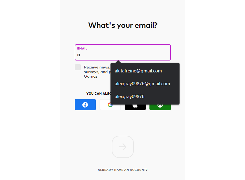
One of the helpful features of forms is the ability to remember the information a user has previously entered. With this useful feature, the user doesn’t have to fill in all the details again. Saving entered data is particularly beneficial for long forms and forms on small screens.
10. Switch between sign-up and login forms
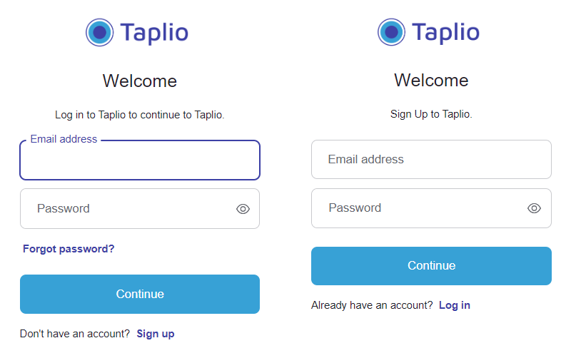
To improve the user experience on your site or app, you should allow users to switch between the login and sign-up forms. As a result, users can easily find the login option when they are on the sign-up page and the sign-up option when they are on the login page. If users can’t find the sign-up option on the login page, or vice versa, it can hurt their experience.
11. Consider using one form for signing up and logging in (Also be careful)
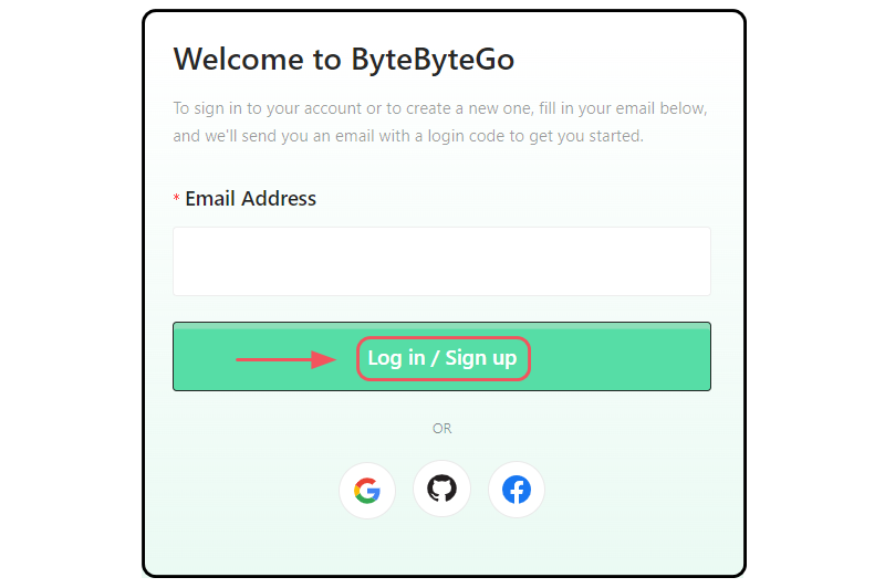
Creating a single form for both signing up and logging in can be a good approach. You enter your email and password, and the service checks if the email is registered in its database. If it’s already registered, you will be logged in. If not, a new account will be created for you.
However, this approach has some drawbacks. For instance, if your users accidentally enter a wrong but valid email, the service will create a new account using that email. Therefore, you must be cautious with this method to avoid unintentionally creating accounts with incorrect email addresses.
12. Avoid using the terms “Sign in” and “Sign up” at once
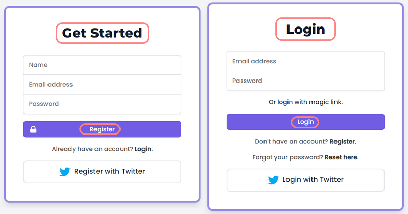
Similar terms like “Sign in” and “Sign up” can cause mix-ups. That’s why it’s better to distinguish between these two actions by using different terms for each page.
For instance, instead of “Sign In,” use “Login,” you can consider using alternative phrases like “Register” or longer expressions like “Create an account.” This approach clarifies the sequence of actions: first, sign in, then sign up. Further, make them bigger and bolder to be easily noticed.
→ Want to boost your conversions? Learn 8 essential characteristics of irresistible CTA buttons (+Examples)
13. Don’t ask for an upfront payment
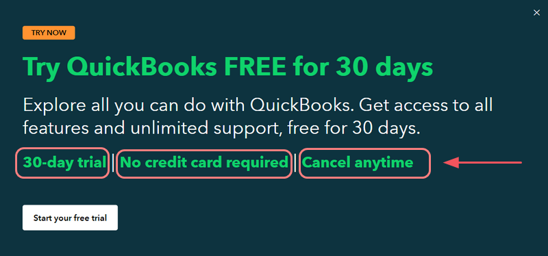
While requesting an upfront payment may increase your product’s perceived value, it can make users hesitant to sign up. In general, unless your product is exceptionally complex to learn, offer a no-credit card trial instead. This way, you’re building trust with users and allowing them to become familiar and comfortable with your product before requiring payment.
14. Avoid asking for private information (e.g., Phone number)
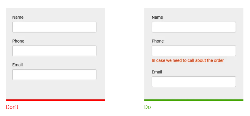
In today’s digital landscape, people are often reluctant to share private information. Hence, if your signup form requires sensitive information, you’ll need to share the reason why they should fill out these fields. Conversely, without proper clarification, users are likely to abandon the form due to concerns about their privacy.
15. Offer users multiple sign-up options
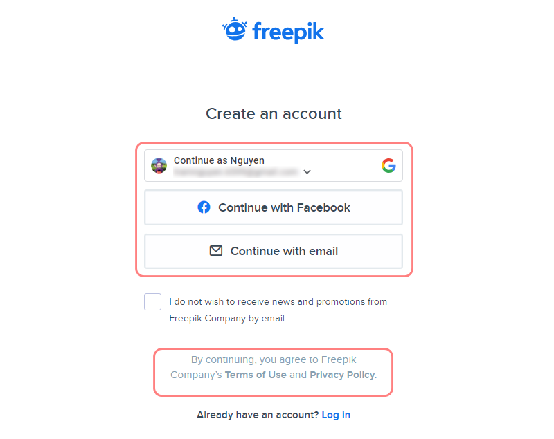
Besides filling out the form, you have an even quicker registration method with just a few clicks: using social sign-in options (assuming you have these accounts).
However, it’s essential to reassure users about the security of their social data and provide clear explanations for your required information. This clarity and reassurance will help users feel more confident and comfortable providing the necessary details.
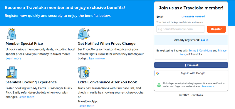
16. Offer an incentive to sign up
Providing an incentive is an excellent way to encourage people to sign up. Ecwid’s studies have shown that offering incentives can boost up to 15% of sign-up conversion rates. So, instead of simply asking users to sign up, you can present them with an appealing incentive that would make them eager to share their email.
| Read more: 20+ High-Converting Landing Page Forms Best Practices 25 eCommerce Design Trends to Stay Ahead of Your Competitors in 2023 |
II. Magento 2 Blue Form Builder: Create high-converting sign-up forms with ease
Once you have a solid understanding of how to create effective sign-up forms, it’s time to put that knowledge into action and start building yours. If you’re a Magento store owner looking to create high-converting forms for your eCommerce website, there’s one tool that stands out: Magento 2 Blue Form Builder by Magezon – a trusted Adobe exchange partner.
With this extension, you can effortlessly build forms that captivate your visitors and encourage them to take action.
Whether you want to collect contact information, sign up new users, or get newsletter subscribers, you can do it all with Magento 2 Blue Form Builder. The best part? It’s easy and fun to use, thanks to its drag-and-drop interface that lets you easily create forms in minutes, even if you’re not tech-savvy.
And that’s just the beginning. Magento 2 Blue Form Builder also gives you the ability to:
- Protect your forms from spam and bots with the built-in captcha
- Create multi-level forms where selecting an item reveals more options
- Ensure the form adapts perfectly to different devices
- Achieve powerful forms effortlessly with the built-in conditional logic
- Customize the look and feel of your forms to fit your website’s theme and style
- and more
Moreover, the extension integrates seamlessly with popular email marketing services like Mailchimp, so you can automatically add your form submissions to your mailing list and send them personalized newsletters and offers.
With its impressive range of features, Magento 2 Blue Form Builder is a must-have for your Magento store. So, don’t miss this chance to create high-converting forms and maximize your store’s potential. Discover the magic of Blue Form Builder and see how it can transform your eCommerce website today!
Be Prepared to Build
The user experience (UX) is very important when designing sign up forms. It means you ensure the form is easy to use so that more people will sign up. Remember the following points when creating a sign-up form:
- Simplify the sign-up form, make it concise, easy to understand, visually appealing, and only asking for essential information.
- Regularly analyze user interactions with the form to identify and address any issues or difficulties they may encounter.
And that wraps up our article. You’ve now have a lot of useful information and a powerful Magento form builder to create effective sign-up forms without relying on developers and designers. If you have any questions or need assistance, please leave comments right below.
Stay tuned for our upcoming article on inspiring sign-up form examples to improve your form designs further.
 Magezon Blog Help Merchants Build Comprehensive eCommerce Websites


