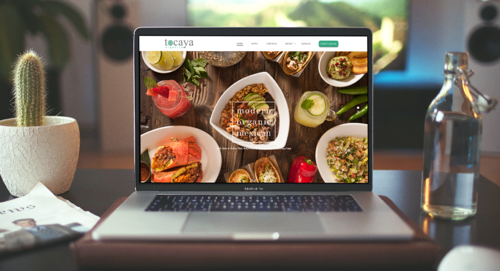
The top restaurant websites must be simple to use, packed with easily digestible information, and visually appealing enough to make visitors want to return for more. It doesn’t matter whether you’re just getting started with your restaurant’s website or if you want to take your current one to the next level; these 25+ successful restaurant website examples will help you do either. And don’t ignore some tips mentioned below to do it!
Table of contents
25+ Inspiring Restaurant Website Examples
1. Koox
Koox, a restaurant in the heart of London, uses a lot of white space and drawings of food in muted tones of green and orange to create a flawless and inviting look. Its website is an excellent example of using color to deliver a uniform appearance. Even the food photos on their menu make a good combination with the color scheme. Koox is the best restaurant website design if you want to learn.
Koox – restaurant website examples
2. The Fat Duck
The head chef of the Fat Duck, Heston Blumenthal, is renowned for his inventive cuisine. His meals frequently conceal wonderful surprises, such as a parfait of chicken liver and foie gras resembling a mandarin orange. The website for The Fat Duck has been created to live up to this expectation.
Right at first sight, you can tell how much effort they put into building this website. There’s a 4-minute clip pinned at the top of the page, luring you to click on and discover the restaurant’s story. Another interesting thing about The Fat Duck is how you can play with the magnifying glass in the books section. Watch the videos below to see what I mean.
The lesson here: Creating a website with which your visitors can interact is a fantastic approach to increasing its recall value.
3. Malai Ice Cream and Cake
They’ve done a terrific job of sprinkling in a bit of humor here and there to convey their cheeky, entertaining brand. The website immediately gives visitors the sense that it will be a laid-back location to dine, drink, and have fun.
Malai Ice Cream and Cake is a New York-based business that creates unique sweets inspired by South Asian flavors. Their website employs an intriguing and entertaining scrolling animation. As you scroll down the page, the two halves of the screen move separately, one up and one down.
This page animation is more lively than merely fading in and out, yet it does not interfere with the reader’s ability to read the page. Instead, it’s a creative method to make your website stand out.
4. Pastaria
The website for Pastaria is simple to use and just has one page. They made it even easier by adding a bubble nav bar that remains on the screen as you scroll. Having your navigation bar visible and accessible as a sidebar, topbar, or bubble is a good idea.
Since 65% of diners check out the menu online before going, they won’t even attempt to locate your restaurant if they can’t discover your cuisine. So make your navigation bar user-friendly to avoid it from happening.
5. Middle Child
When it comes to dynamic components, nothing beats moving elements. Including animations on your website makes browsing more appealing. Middle Child’s website is one of the best restaurant website examples if you want to view a variety of various genres of animation.
This Philadelphia restaurant’s website is more enjoyable with scrolling text, a sandwich train, and a flashing logo. It generates a whimsical, child-like atmosphere that complements the company name wonderfully.
6. Red Bamboo
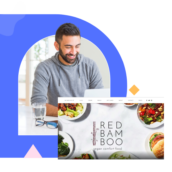
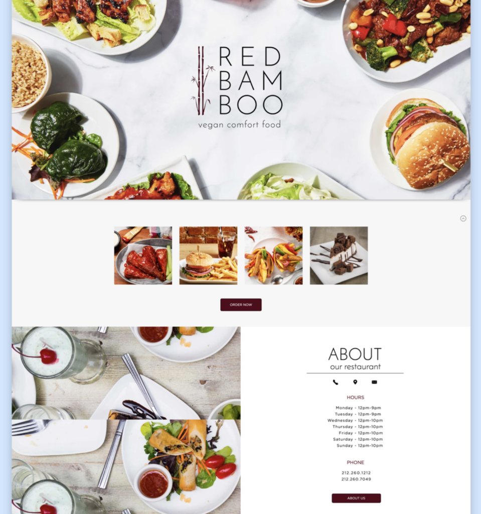
Red Bamboo’s homepage design is captivating and comprehensible; it begins with a full-width image of tantalizing foods around an attractive logo. It has multiple call-to-action buttons that encourage users to “Order Now” and “Order Pickup” throughout the page.
In addition, Red Bamboo uses restaurant social media marketing and embeds its Instagram feed. The vegan comfort food restaurant can develop its brand by sharing experiences in real time with website visitors and automatically posting new content to the restaurant website.
On the other hand, Red Bamboo has highlighted three out of many other positive feedback on their service directly on the site. This helps them build a good reputation for first-time visitors and increases the likelihood of getting more bookings.
7. Zero Fox
The beer label collage that acts as the website’s backdrop shows that Zero Fox is carefree and adventurous. When you pay closer attention, you’ll see that almost all labels are produced by Australian brewers, its specialty.
The Zero Fox crew is committed to using alcohol that is brewed nearby and incorporates current cocktail trends into its drink menu. They openly state in the About Us section, “We honestly feel that Australia produces some of the highest quality alcohol in the world.”
The Zero Fox team’s enthusiasm for spirits, wine, and Asian food is shown in the photographs gallery and the clickable symbols in the “Eat and Drink” section.
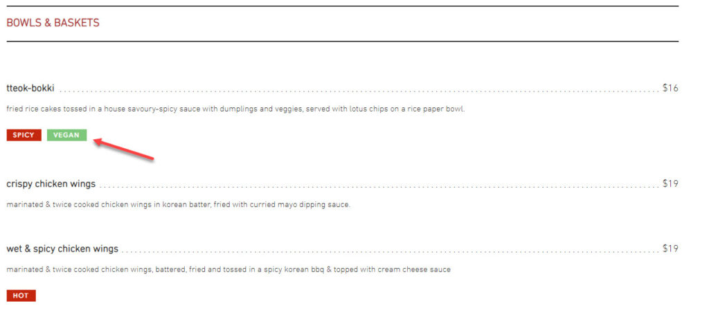
In addition, the Zero Fox menu is clearly written to show if the food is vegetarian, vegan, gluten-free, or hot. Overall, this restaurant website example gives visitors the impression that Zero Fox would bring them an exciting yet qualified experience.
8. Sliders
In Copenhagen, a burger joint called Sliders combines fantastic burgers with tapas. Their website is a simple restaurant with a lovely white-on-black look with gold accents.
The menu is composed of images and text. It’s not what you think. The explanation of each food disappears as you scroll over, and there’s when the photo appears. This is a fantastic method to include images and descriptions without overcrowding the page.
This website is the ideal example to follow if you want to include images and complete text on your website but don’t know how to optimize it. On the other hand, as you create an interaction between the visitors and the website, you have increased the time they would stay and the conversion rate.
9. Art District Craft and Kitchen
The Art District Craft and Kitchen in Las Vegas’s website has a basic scrolling layout with the navigation bar stuck to the top of the page, which helps visitors to keep track of wherever they go.
Customers can read the text easily thanks to the contrast created by the darker backdrop behind the white and gold writing. As you can notice, each section in the navigation bar will change its color from white to gold as you reach the corresponding area of the page.
10. JB Restavracija
Slovenia’s JB Restaurant belongs to Janez Bratov, a master chef and author, and his family. His website includes an uncluttered, straightforward layout that focuses all its visitors’ attention on the food. It creates a great contrast to highlight the food with white backdrops, pastel watercolor drawings, and straightforward black typography.
See the image below to get what I mean. Is the food the first thing you see when you look at it?
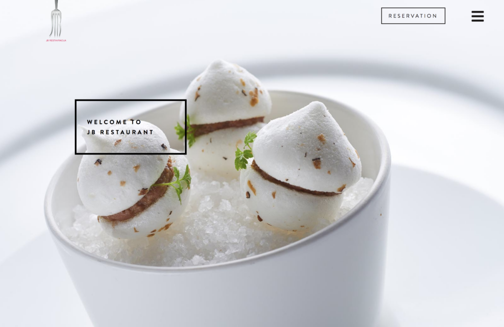
A lesson you can learn from this restaurant website example: Pay attention to the food is a terrific choice if yours is aesthetically appealing and you have (or are prepared to pay for) some excellent images.
Try FREE Magezon Page Builder!
Easily create your engaging Magento pages in any style whenever you want without relying on developers or designers, just by drag & drop.
11. Bresca
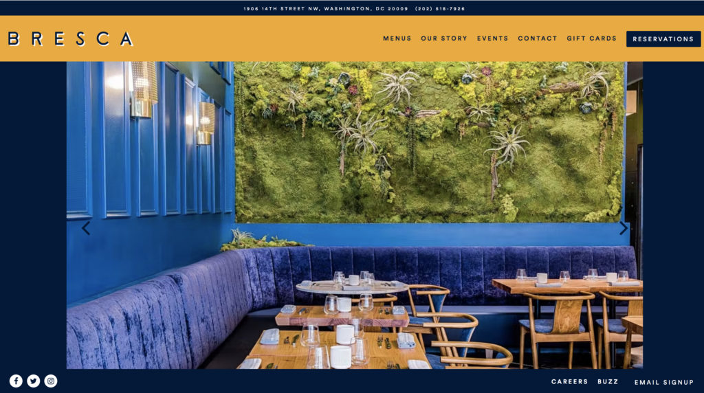
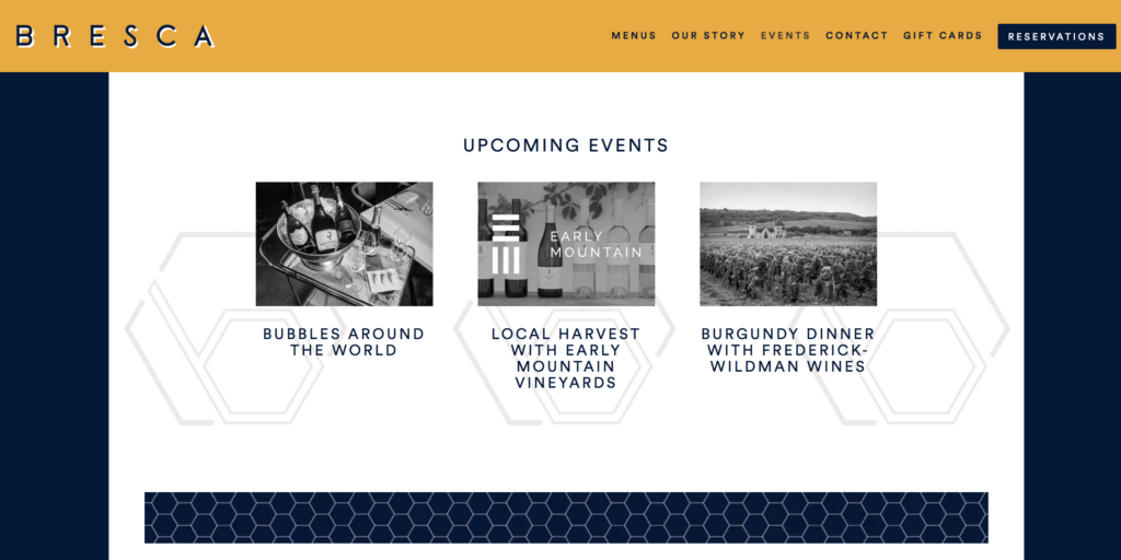
Bresca is a restaurant website example that does a fantastic job with subtle animation. This is a perfect example if you have heard of the lazy load. Its use is to capture the audience’s interest without overwhelming them.
12. Opa
Opa is a restaurant in Tel Aviv that serves high-end vegan food. A captivating widescreen film displaying Opa’s distinct farm-to-food philosophy and competence is played right after the visitors come. This is how you should use videos for your website. I like how they muted the video since I wasn’t distracted by the sounds.
13. MILK+T
When visiting this food website, visitors are asked to “join the boba squad” and provide their email addresses to get updates about MILK+T. This improves the boba bar’s email marketing and keeps loyal customers informed. You may also discover various boba-themed items on the webshop, including DIY kits, straws, pins, and t-shirts.
14. Schaller’s Stube
Schaller’s Stube Sausage Bar combines New York flair with street cuisine from Berlin. Its gorgeously designed homepage saves users time by providing all the information they want on a single page. It is easy to use and intuitive. The parallax scrolling effect produces an immersive browsing experience, which is included in many restaurant website layouts.
15. Quince Restaurant
The landing page for Quince Restaurant is simple but impressive. It has a giant, high-quality picture of a dish with a clear navigation bar right at the top of the page. Looking at its decor, you can clearly tell the restaurant’s sophistication. One of the restaurant website examples shows that simple is always the best.
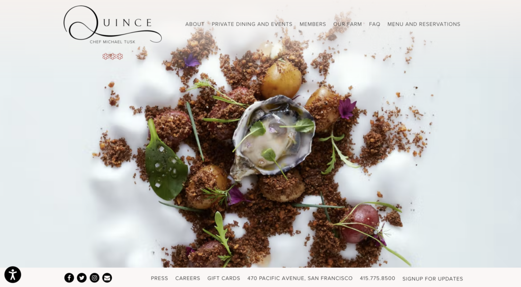
On the other hand, with some lovely rustic photographs, their “Our farm” page highlighted their “farm-to-table” philosophy.
16. Pelicano Coffee Pioneers
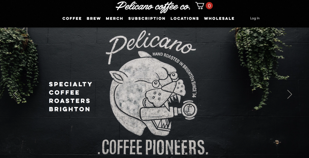
The Pelicano Coffee Pioneers’ website uses clear microcopy, such as “Best Seller,” “Just Dropped!” or “Baristas Pick,” to indicate specific updates, such as when an item may be out of stock or when a new coffee blend has just been produced.
The visual language is also decisive: Every coffee blend has a distinctive artwork that adds to the brand’s personality.
17. Simmons Bar
The above restaurant website examples remind you to remain committed to your brand’s theme, no matter how bizarre it may seem. And Simmons Pub’s website did a great job showcasing its uniqueness. As you can see, it contains engaging touches, from bright colors and colorful cartoons to a martini-drinking Kurt Russell cutout in the pulldown menu.
No matter how outlandish your restaurant or bar is, you may discover the ideal approach to promote your business online. So, let’s think outside the box.
18. FEZ
You need to look at the FEZ restaurant website to understand how effective complementary color schemes can be when used correctly. The site is covered in vibrant orange and turquoise boxes that border the header, footer, and highlight content. The sharp divisions between the various page areas created by the contrasting colors give off an energizing mood while maintaining the page’s balance.
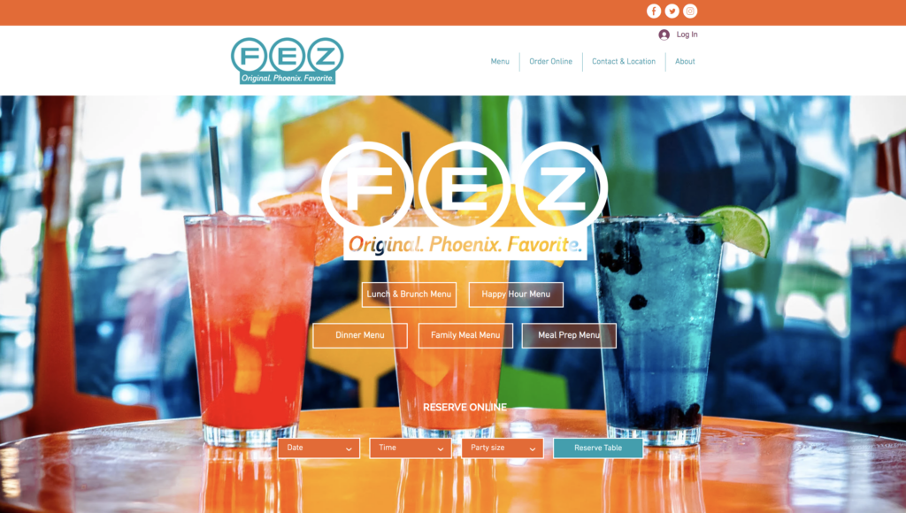
Besides its color scheme, the FEZ website is successful because it provides a wealth of information in a clear, exciting manner. The likelihood that people will remember what they read increases six times when a picture accompanies each paragraph of text. Moreover, the brand has a fun, laid-back tone.
The Our Team section has a picture of a staff member with burgundy hair holding a drink and poking her tongue out, with the caption, “Our team concentrates on offering the finest of service while creating a pleasant setting to dine and drink.” “Don’t hurry. There is no sales talk.” Despite the volume of content, nothing is lost. Every content—from the menu to the chef’s welcome—becomes a unified whole.
19. Añejo
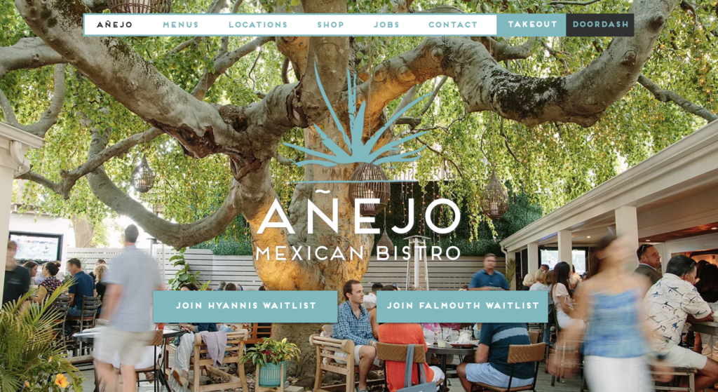
Añejo leaves an impression of a sleek, modern Mexican restaurant. This restaurant has great food and an outstanding design thanks to aqua, white, and dark gray. The website also uses animations, parallax scrolling, and dynamic forms, highlighting the feeling of location conveyed by the many photographs outside and inside.
>> Get inspiration creating parallax effect websites: 45+ Awe-Inspiring Parallax Effect Website Example
20. Park’s Restaurant
Park’s Restaurant is one of the strangest restaurant website examples, which makes it the most memorable. The webpage without pictures leaves a strong impression on prospective customers of a mystery sense. The website’s homepage writes white text on a black backdrop, the navigation links are located in the bottom-left corner of the page, and there are many more design principles that it breaks.
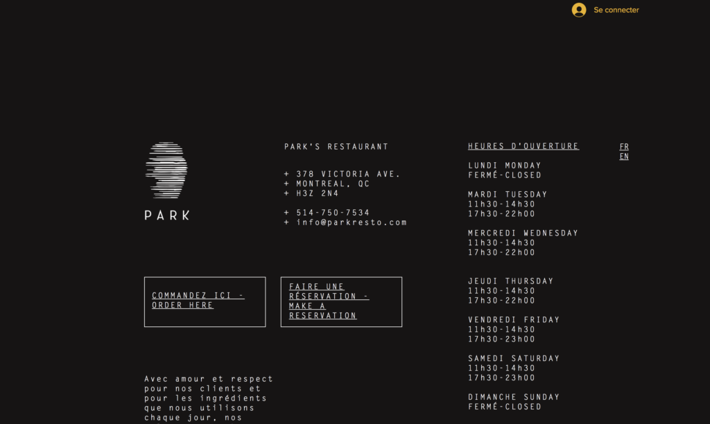
And it succeeds, particularly because Chef Antonio Park, who identifies as a “messed-up Latino with kimchi in his blood,” has a distinctive viewpoint and background in the field of cuisine.
Park’s Restaurant, located in Montreal, can serve French and English customers, and its visitors can translate the website by selecting their favorite language on the right.

Try FREE Magezon Page Builder!
Easily create your engaging Magento pages in any style whenever you want without relying on developers or designers, just by drag & drop.
21. Yang’s Place
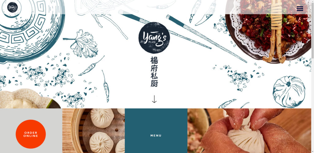
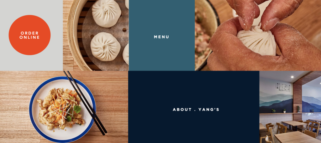
Yang’s Place, a family-run Chinese restaurant, is distinguished because of its geometric restaurant web page design, combining exquisite food images with clickable text boxes. When you choose the “Roughly Yang’s” option, a neat page including only two pictures and about 100 words gradually appears.
The crucial elements keep the reader’s attention since there is so much white space following so little information on the main page. This restaurant’s website proves, if nothing else, that it’s sometimes better to keep things brief and to the point.
22. Market on Front
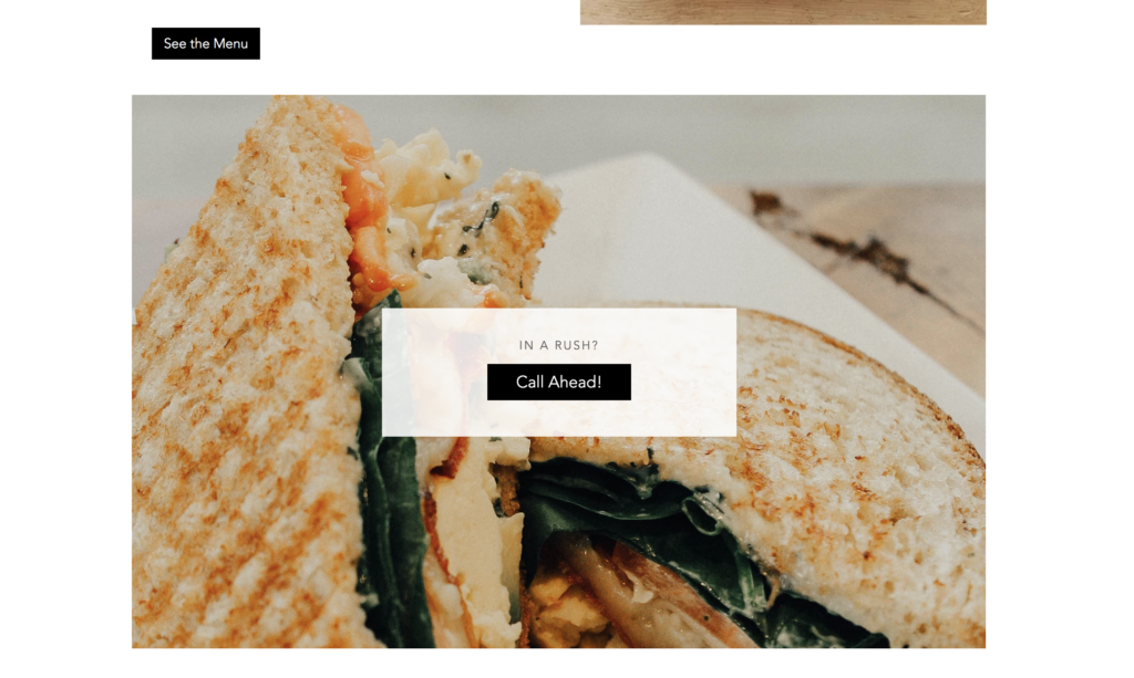
Market on Front has a website of restaurants, cafes, craft grocers, and eateries, so it has to be well organized. To uncover all Market on Front offers, go beyond the homepage’s central section. The organized header provides a link to every piece of information a consumer would require, including social network profiles, contact information, online buying system, and more.
23. Darwin & Wallace
Darwin&Wallace are pretty active on Instagram. They have stressed the originality of their bars and concentrated on adding their gorgeous Instagram feed rather than attempting to force their website to reflect the various styles of their several locations.
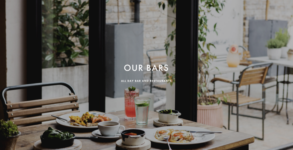
If your brand is similarly diversified, this is a terrific approach to maintaining a centralized website while enabling each location to flourish.
24. Restaurant Colibri — Cuisine Verte et Transparente
Restaurant Colibri, which also uses its website as an online marketplace, has a website that uses a lot of subtle animation. The website lets you explore the menu and order what you want for delivery or takeout while presenting food images and pricing.
A “Book now” option is also included for customers to make online bookings. Therefore, customers now find it quite simple to interact with their brand.
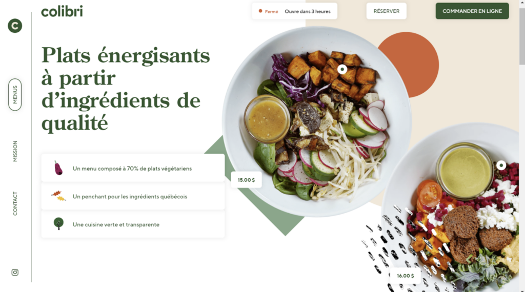
Thanks to all the technology, the brand has a contemporary, forward-thinking vibe, which is a terrific investment for a company hoping for rapid development in the future. However, this approach isn’t for everyone since it costs a lot to develop the website.
25. El Burro
If you want to find some restaurant website examples for your Mexican food, do not ignore El Burro. The website for this Mexican street food joint in Oslo is among the most vibrant and daring I’ve ever seen. Bright pinks, oranges, and greens are used instead of the specific formatting and scrolling navigation in Craft and Kitchen. The colors help them stand out from the crowd and go wonderfully with the images of their meals.
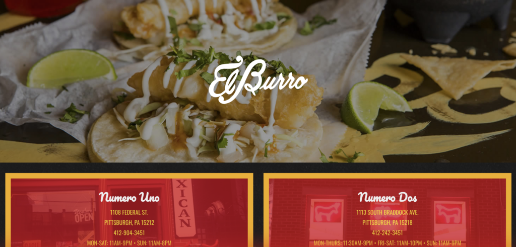
Lesson learned: Choosing the proper color scheme for your website is crucial, but if traditional beauty doesn’t fit your feel, don’t stick to it.
26. Hanai Poké
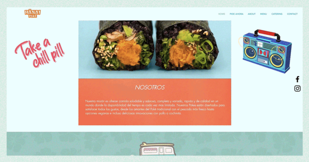
The Hanai Poké website ensures that all its visitors will have a good time by using a cheery, pastel color scheme and a variety of animated vector graphics. Along with the restaurant’s logo, “Hanai Poké,” written in a tiki-style script and cast in orange and white, these design decisions aid in building the restaurant’s identity. It is a link to the homepage and may be found at the top of every page, which is an essential part of website navigation.
27. Soufi’s
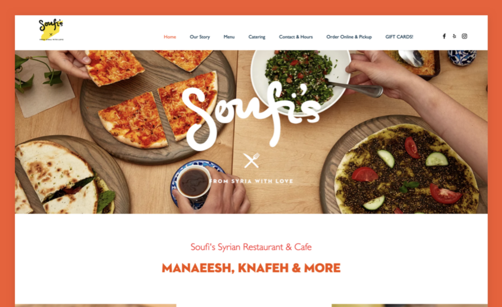
Soufi’s is of the best restaurant website examples for family restaurants. The Al-Soufi family knows how to connect with customers through a restaurant website by sharing an engaging personal narrative and outlining a compelling objective. To teach about manaeesh and knafeh, they founded their Syrian restaurant and café, Soufi’s.
The Al-Soufis utilize the “Our Story” page to further explore everything customers love about them and how they customize the recipes. The website provides further information about the family and the business via text, images, and a clear call-to-action link that leads to an advertisement video.
28. Top 2000 Online Café
Okay, so it’s not a real place, but I include it in this list because the location of this fictitious café is so distinctive. There isn’t a single spot in this entirely interactive 3-D setting that can’t be explored on this website, from the rear of the bar to the second story.
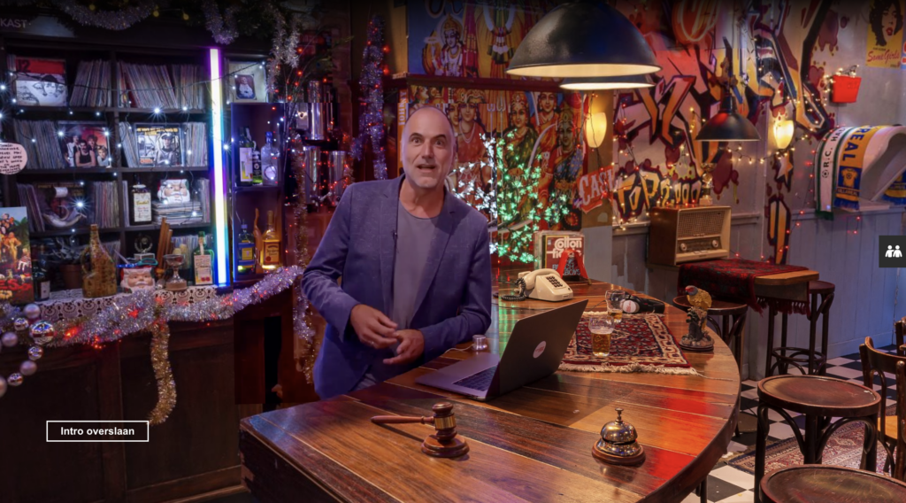
If you have a genuinely unique and intriguing place, the confidence shown by making the experience accessible online might elevate your company to the status of an iconic landmark. Again, this a daring plan, but I can think of a few rare spots that might pull it off.

Try FREE Magezon Page Builder!
Easily create your engaging Magento pages in any style whenever you want without relying on developers or designers, just by drag & drop.
25+ Tips for an Effective Restaurant Website
Before You Launch Your Website
1. Design inspiration – Plan it out before you start doing anything.
2. Mobile takes priority – Make sure your website is mobile-friendly because customers primarily use their phones to find your site.
3. Effective user headers – They should be suitably positioned and phrased for the optimum SEO effect.
4. Let the fold count – The fold is your initial impression; thus, it should be carefully constructed.
5. Create a visual hierarchy – Decide which part is vital and apply the typography rules to have a clear hierarchy on your website.
6. Keep content simple – Don’t bombard your consumers with irrelevant content or components.
7. Don’t skimp on images – Images are an excellent method to pique the attention of prospective buyers; make them high-quality and relevant.
8. Start a blog – This is a terrific method to interact with your customers and a powerful marketing tool.
9. Restaurant web design element tips – To make your website more corporate, the tips here are to write your menus in HTML to maximize searches, use a hamburger menu, add an “About Us” page, a FAQ, and a newsletter sign-up jobs page. Find some CSS frameworks to help you with this.
10. On-page optimization – These are the SEO actions you may do.
11. Implement retargeting marketing – Make more effort to attract bounced customers.
12. Identify your audience
Restaurant websites may meet the needs of a diverse clientele, ranging from retail to wholesale buyers and businesses looking for B2B food service. So, don’t forget to include stuff on your restaurant’s website that your customers will find beneficial.
13. Consistency – The theme and idea of your restaurant brand are reflected on your restaurant website. Make sure your restaurant’s branding is displayed on the website. The restaurant site design should match your restaurant’s color scheme and concept.
14. Pretend the user is visiting a physical place – When someone visits your website, they enter your virtual restaurant. Depending on how the site is presented, they will judge the quality of your foods, location, and service.
15. Speak out clearly in writing about your food
16. Use a variety of appeals
You may include further information about your business in the web page’s body (after the introduction) and follow the rule of numerous types of appeal in advertising:
- Appeal to Utility – For some people, the speed of service or the meal cost are the most important factors.
- Emotions – Does your food come from a local or ethical source?
To appeal to various personality types, it is ideal to incorporate a variety of appeals inside the website’s body.
17. Personalize
Tell visitors about your history and what makes your restaurant unique.
- When you were established.
- Where your food is sourced, how it is cooked, and where did you get the ideas.
- Who your chief chef is.
18. Make your menu more convenient
Any restaurant needs a tempting, tempting menu to read and use. Below are some guides you can follow to improve yours:
- Do not upload a picture or file of your actual menu.
- Never separate menu items into tabs or hind them behind a click.
19. Use photos in the menu
Adding photographs to your website is a good idea, even if you don’t include them in your physical menu. Do you notice that real-life diners will look at other guests’ plates to check whether the food “looks delicious” before ordering? That’s right.
20. Show hours and location
Your website’s main objective is to boost conversions, which means more calls or visits to your restaurant. Always show the restaurant’s name, location, and phone number. Link the location to Google Maps and the phone number to a tel link so customers may call or receive instructions with one click.

21. Monitor your visitor’s actions
With Google Analytics, you may get helpful success metrics such as bounce rate, time on site, and click-through rate. For instance, a low bounce rate (below 70%) and more than 20 seconds spent on your site mean you successfully captivate customers’ attention. If people click from your homepage to your menu, that would be perfect.
You can find out via Webmaster Tools what search terms people used to find your website on Google and how you are doing compared to your competitors. You may use this information to improve your performance and attract customers with high-value keywords.
22. Consider hiring a professional web design firm
A professional web design firm can handle all your tasks, from taking high-quality photographs to developing a stunning website.
After You Launch Your Website
23. Active in the blog
Your customers may communicate with you effectively via a blog; this is where you can demonstrate your qualifications. Top food blogs publish two to three times every week. Some topics for your blog post are articles about upcoming restaurant events, new recipes, and culinary trends. The chef can also provide culinary advice in the “From the Chef” posts.
24. Respond to customer questions
There are many questions about your restaurant, and a FAQ area is what you need to answer all of them. Answer them carefully and dedicatedly to show your customers that you care about them. Another great way is to create a specific blog with all the questions and answers that you have gotten so far.
>> Learn from inspiring FAQ page examples: 10+ Best FAQ Page Designs You’ll Definitely Get Inspired
25. Continue to optimize the images
Image optimization includes compressing photos while still ensuring their quality. This helps your website load quicker and implement simpler with WordPress or other content management systems. Keep in mind that this is one of the methods that SEOs use.
26. Continue to update WordPress and its plugins
Keeping your CMS (content management system) and all plugins updated is essential for maintaining the appearance of your restaurant website. To keep on top of it and ahead of your competitors, check often to see if there are changes and pay attention to alerts.
27. Install Google My Business – It’s a simple method to emphasize your restaurant’s offerings and assist consumers in finding you.
28. Activate Google Search Console – It has all the marketing tools you’ll need.
29. Social Media Profile Setup – Making sure your company presents on various social networks can result in more direct sales via those channels and help you naturally move up the Google search results page.
Conclusion
Creating the ideal website might be difficult. So, feel free to take some ideas from the beautiful restaurant website examples above if you don’t know how to represent your company online. Most importantly, each site should maintain brand integrity by highlighting and expressing the distinctiveness of the company’s principles, cuisine, and location.
If you are a Magento merchant and don’t know which extension to build your restaurant website, consider Page Builder from Magezon. As a trusted Adobe partner, we have satisfied thousands of customers with a vast collection of drag-and-drop extensions, helping you create a high-converting and unique store in minutes.
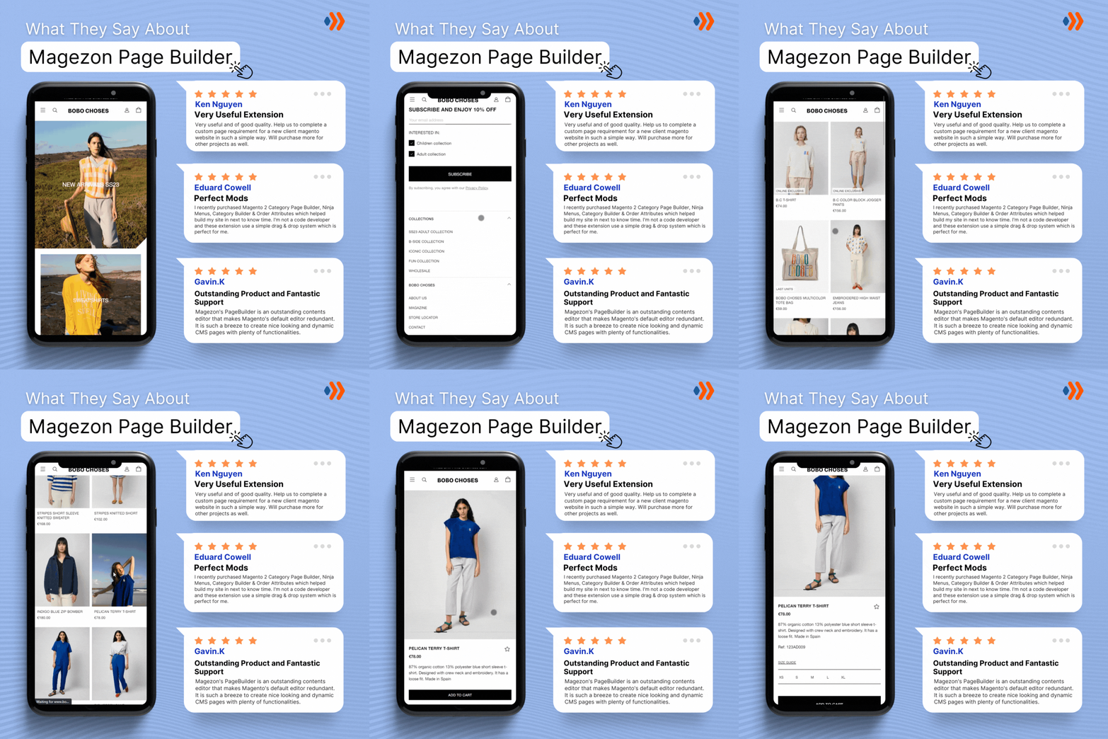
Don’t take my words for granted; see how your website can be with Magezon Page Builder and what others say about us:
 Magezon Blog Help Merchants Build Comprehensive eCommerce Websites

