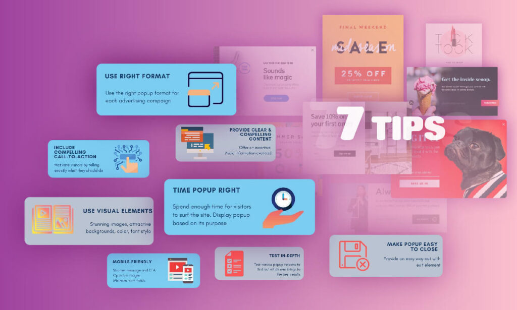
In the past, popups normally have a terrible reputation in marketing strategies due to their annoyance and distraction to visitors. However, over time, it is rapidly growing and is preferred by many businesses. If your popup provides a compelling value for users, it will deliver good results for the online store. This article will give you 7+ tips for creating a high-converting popup.
Table of contents
Which Benefits Does a Popup Bring to Your Website?
A popup is a window that suddenly appears on the screen when you visit a website and prevents you from continuing to read the article until you complete a specific action.
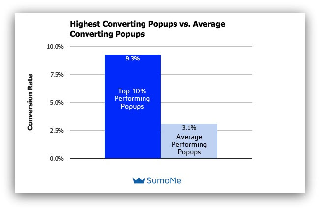
The popup is a powerful tool to increase conversion rates, grow the email list, and boost sales. To put that into perspective, let’s look at Sumo‘s research. After analyzing 2 billion popup examples, this study found some of the following results:
- The average conversion rate of the top 10% popups is 9.3%
- The average conversion rate of all popups is 3.1%.
Another study from Popupsmart also proved the great benefits of popups. Popupsmart team helps their custom build and use an exit-intent popup. After showing this popup to 20.300 people, their customers received 1,006 opt-in forms after a month. They gained 4.5% in sales conversions, with 382,28 sales in a month.
From these studies above, you can see how many benefits popups can bring to your online store.
7+ Efficient Tips to Create High-Converting Popup

1. Use the Right Popup Format
Each popup format comes with different pros and cons. So let’s use the right popup format for each advertising campaign to bring high efficiency.
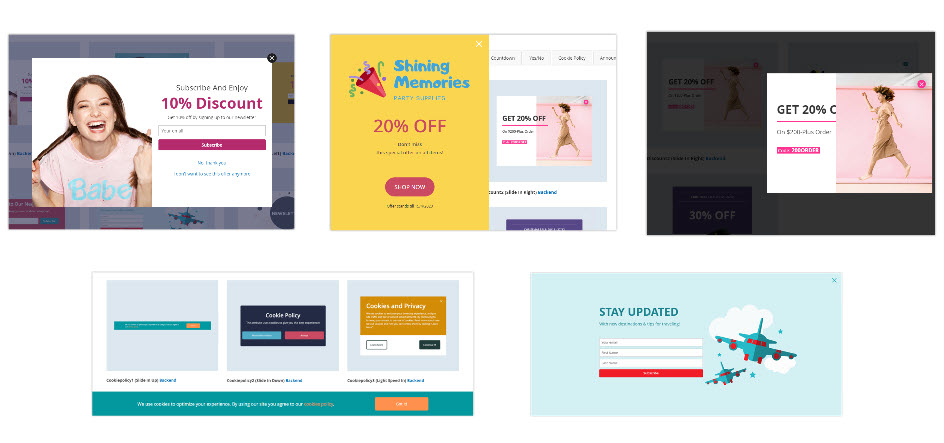
The format of popup can be divided into the following 4 types:
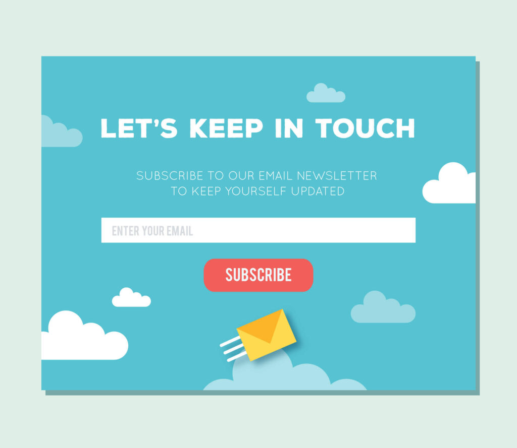
- A modal website popup usually appears as a small window within a short time, and its position is usually located in the center or a certain corner of the screen. This small popup is more appropriate for smaller screens than other ones, especially for mobile devices. This format is often applied for the Newsletter form popups or Exit-intent popups.
- Sidebar pop-up displays on the side of the screen. It is the least irritating popup because visitors can keep scrolling and read the article without being blocked.
- Full-screen popup covers the entire screen. You can use it for a big campaign to grab customers’ attention, such as offering discounts and noticing a new product.
- The top and bottom bars popup show on the top or bottom of the screen. You can use this format to create a Cookie Policy popup or Announcement popup.
2. Provide a Clear and Compelling Content
When building a popup, you have to decide what kind of offer you want to represent to visitors. If the popup doesn’t provide an attractive offer to motivate them, it’s just creating noise and driving them mad. Besides, the message of the popup should avoid information overload and don’t force them to answer unnecessary questions.
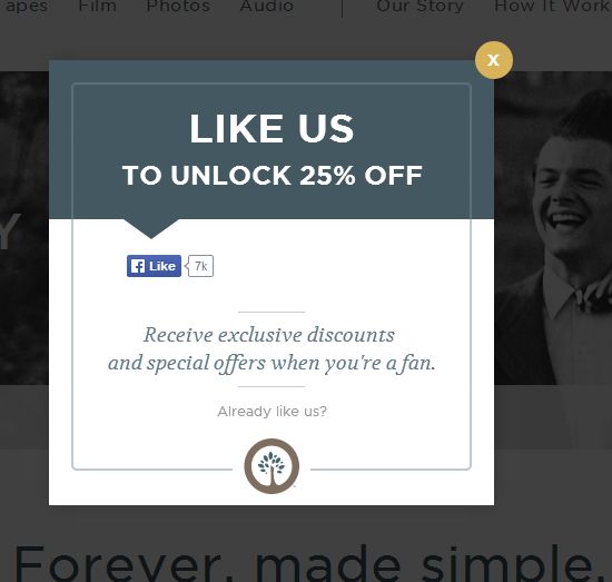
Visitors will find the value in your popup if an offer is good enough. That can motivate them to click on the call-to-action button to subscribe to email, try to use your product, or complete a purchase. For example, your offer should include a promise and a sense of urgency like a coupon, a special deal, or a limited-time deal to make a compelling offer.

Try FREE Popup Builder demo today
Create amazing and highly-targeted popups for your websites just by drag-and-drop. With this tool, you can deliver the right content to the right customers at the right time, thereby enhancing conversion rates.
3. Include Compelling Call-to-Action
Call-to-action (CTA) is a phrase used to tell the visitors exactly what they should do and motivate them to do so. This could be two simple words, “Shop Now” or a sentence “Subscribe now to get 20% off”, and it can be simple text with a hyperlink or a clickable button.
If a visitor is attracted to the message of a popup, the call-to-action button/hyperlink will be the last step to convert this visitor to become a customer of your business.
4. Use Visual Elements
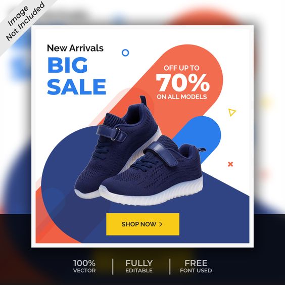
Visual elements such as image, background, color, and text styles are important in creating a high-converting popups. It will be the first thing that catches the visitor’s eyes when a popup appears. If your popup has a bad design, it could fail to attract their attention. So you need to put a lot of effort into designing eye-catching images or backgrounds.
5. Time Popup Right
Timing is an essential factor in creating a high-converting popup. If your popup appears at the right time, your website could reach the right customers and help to increase conversion rates.
Let your customers have enough time to explore your website and get information. If you set the popup to appear too early and don’t give visitors time to surf the site, this can really distract their browsing experience. Practices like this are what have given popups a bad reputation.
For instance, if you want to get a user’s email, you should set a popup showing on the screen after 5 seconds since a visitor comes to your website.

Besides, to display a popup at the right time, you always need to think about the purpose of the popup.
For example, if the goal of a popup is to prevent customers from leaving before purchasing, an exit-intent popup will be the best choice for this condition. In this case, you should only show the popup when they tend to leave your site. So that users will not be disturbed and help increase conversion rates.
6. Make Popup Easy to Close
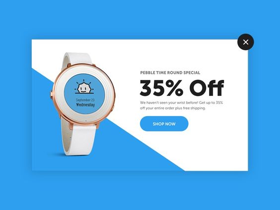
Let’s imagine that when users visit your website and are blocked by a popup that prevents them from reading information. Normally, they will close the popup to keep reading, but it’s hard to close in this case. This can drive them mad, and they tend to leave the website immediately because no one wants to read an article with a part of the screen blocked. So always ensure that your popup provides an easy way out with the exit element!
7. Mobile-Friendly
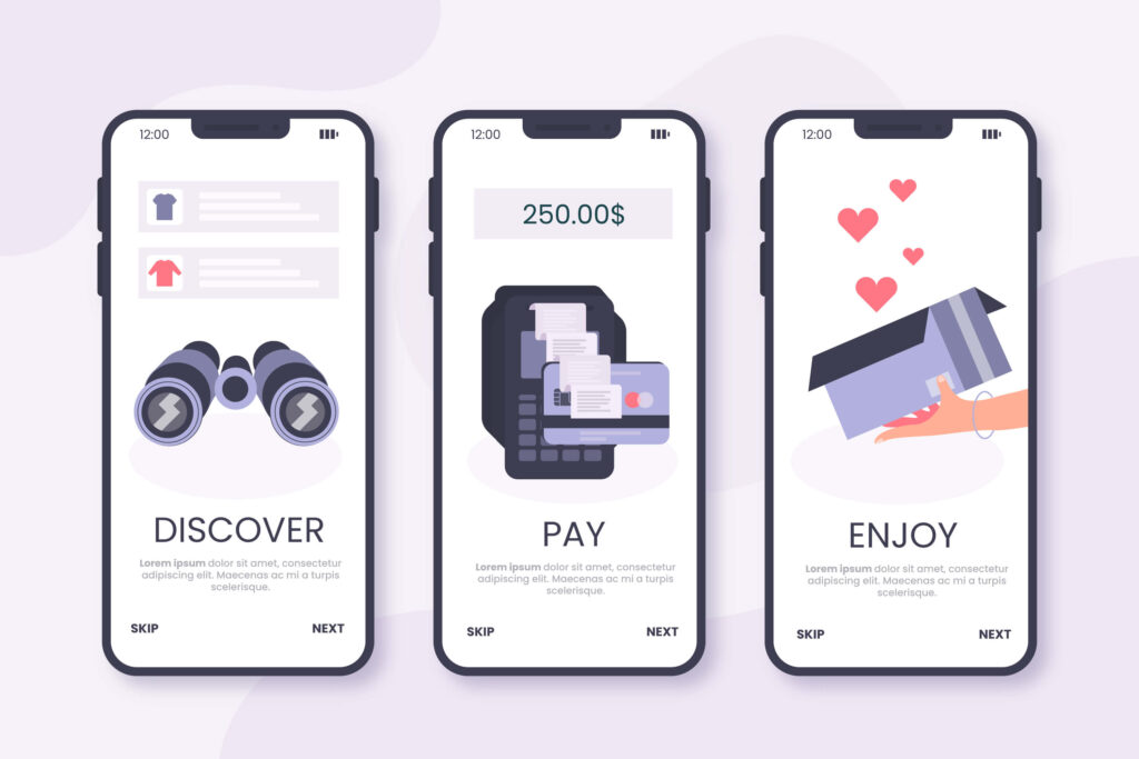
Currently, it can be said that the number of mobile device users is huge, so businesses can fully utilize and optimize popup ads on it. However, the mobile interface is minimal, so you should shorten the message and call-to-action of the pop-up but still convey the message to customers fully. Besides, you should minimize the form fields and optimize images.
8. Test in-Depth
Test a lot is one of the best practices in building high-converting popups. You should try to use lots of popup versions. Doing this makes it easy to determine which type, design, time, call-to-action, visual elements, etc., brings the best result. Serve to the visitors and see which ones perform the best.

Create a High-Converting Popup With Magento 2 Popup Builder
If you have not yet chosen an extension to build a popup, you could refer to our Magento 2 Popup Builder. It is possible to apply all these tips when you are using our extension. Magento 2 Popup Builder lets you build any popup type in minutes and give you full control to decide the conditions, triggers, and rules to display a popup at the right time.
Furthermore, you can freely customize the look and feel of the popup as you want. Design the close button, add any image or background, and have multiple effects.

Try FREE Popup Builder demo today
Create amazing and highly-targeted popups for your websites just by drag-and-drop. With this tool, you can deliver the right content to the right customers at the right time, thereby enhancing conversion rates.
 Magezon Blog Help Merchants Build Comprehensive eCommerce Websites

