When designing an eCommerce website, font is as important as the layout and color scheme. The best font combinations can establish a hierarchy, make your content more readable, and convey your brand’s personality. But with so many fonts available, choosing the perfect combination that fits your website can take time and effort. That’s why we’ve compiled a list of the 30 stunning font combinations for eCommerce websites in 2023.
Let’s get started.
Table of contents
- What Are Font Combinations?
- 9 Principles to Choose the Right Font Pairings
- Principle #1: Make Your Text Stand out With Contrast
- Principle #2: Keep Fonts in Harmony by Keeping Them Similar
- Principle #3: Use Sans Serif for Headings and Serif for Body Text
- Principle #4: Play Around With Different Font Styles to Find the Perfect Fit
- Principle #5: Learn From Successful Font Pairings
- Principle #6: Use Fewer Fonts for Better Results
- Principle #7: Get Feedback From Others
- Principle #8: Trust Your Instincts When Choosing Fonts
- Principle #9: Prioritize Readability and Legibility
- 35 Best Font Combinations for Websites
- 1. Abril Fatface & Lato
- 2. Alegreya Sans Black & Alegreya
- 3. Amatic SC & Josefin Slab
- 4. Aqua Grotesque & Roboto Slab Thin
- 5. Archivo Black & Roboto
- 6. Bebas Neue & Old Standard TT
- 7. Cinzel & Raleway
- 8. Cooper Hewitt Heavy & Cooper Hewitt Thin
- 9. Exo 2 & Alegreya Sans
- 10. Fira Sans Black & PT Serif
- 11. Josefin Sans Bold & Josefin Slab Semi-Bold
- 13. Karla Bold & Spectral Light
- 13. Lato & Merriweather
- 14. Lato & Roboto
- 15. League Gothic & PT Serif
- 16. League Spartan & Libre Baskerville
- 17. Libre Baskerville & Source Sans Pro
- 18. Libre Franklin & Libre Baskerville
- 19. Lobster & Roboto Condensed
- 20. Lora & Merriweather
- 21. Lora & Alegreya
- 22. Merriweather Sans Bold & Merriweather
- 23. Montserrat & Droid Serif
- 24. Neue Helvetica & EB Garamond Medium
- 25. Lexend Bold & Crimson Pro
- 26. Noir Pro & Playfair Display
- 27. Open Sans & Source Sans
- 28. Open Sans & Roboto
- 29. Oswald & Montserrat Light
- 30. Oswald & Old Standard TT
- 31. Playfair Display & Raleway Extra Light
- 32. Playfair Display & Montserrat
- 33. PT Sans & PT Serif
- 34. Raleway & Merriweather
- 35. Source Sans Pro & Times New Roman
- Final words
What Are Font Combinations?
Font combinations refer to pairing two or more different typefaces in design projects like websites, logos, or brochures to achieve the desired outcome. The objective is to enhance the overall look and feel of the design, improve readability, and effectively convey the intended message.
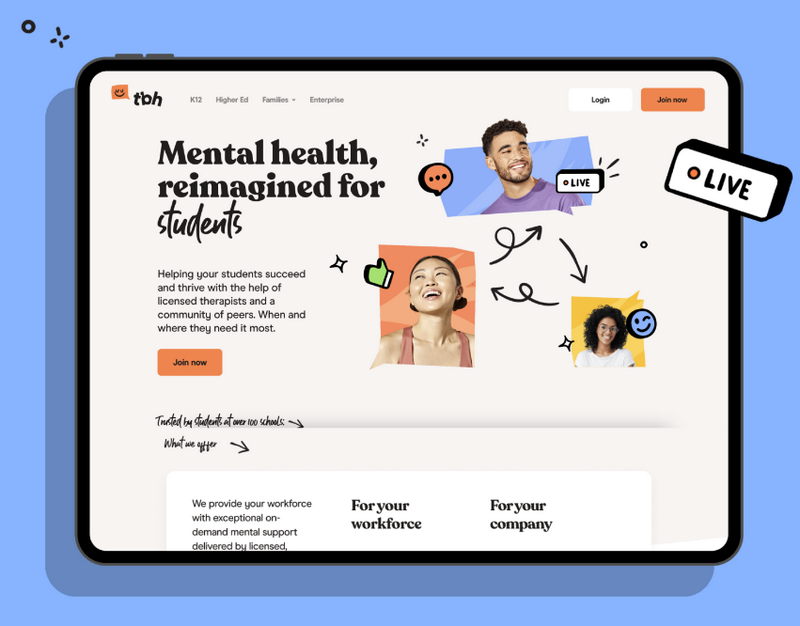
However, it’s about more than just selecting any two fonts randomly. A good font combination requires a careful balance between unity and contrast. To achieve this balance, the fonts should complement each other in style, weight, size, color, and spacing. At the same time, they must offer enough contrast to create visual interest and emphasize important information.
9 Principles to Choose the Right Font Pairings
Principle #1: Make Your Text Stand out With Contrast
One of the main notations we need to create font pairings is to add contrast to our text. Using contrasting fonts makes it easier for readers to distinguish between text sections, like headings and body. But the contrast isn’t just about practicality — it can make the text more visually appealing, capturing and holding the reader’s attention.
If you’re wondering what visual contrast looks like in real life, look at the example image of fonts below with sufficient contrast. Notice how the different font sizes, styles, and weights distinguish the heading and body text.

Conversely, when fonts lack sufficient contrast, the result can be hard to read like this:

Therefore, when selecting your fonts, it’s essential to consider factors such as:
1. Weight
Have you ever wondered what “weight” means regarding fonts? Well, it’s simply how bold or light a font looks. Take Roboto as our example. It comes in 6 different weights, ranging from the lightest to the darkest.
The weights of Roboto are:
- Thin
- Light
- Normal
- Medium
- Bold
- Black
However, remember that the font weights can differ depending on your selected font. The important thing is to make sure that the font pairings have enough contrast in weight.
2. Point Size
This refers to the text’s size. Looking at the first example image, you’ll notice that the heading text is considerably bigger than the body text.
3. Typographic Color
Typographic color is the darkness or lightness of a text block, which becomes more noticeable when you squint at it. The example below shows that the heading looks darker than the body text when you squint.

Factors contributing to the typographic color are the spacing between lines (leading), the spacing between letters (kerning), and the font size. The crucial thing is to ensure that the fonts you select have enough contrast in this aspect.
Principle #2: Keep Fonts in Harmony by Keeping Them Similar
We understand that balancing contrast is essential when choosing font combinations. Still, too much contrast can be distracting and uncomfortable for readers, causing them to click away from your content. To ensure that your fonts don’t contrast too strongly, keep the following font characteristics similar:
1. X-Height
This term mentions the height of the lowercase letter “x” in your selected font. Typically, two fonts with similar x-heights will complement each other nicely, although it’s only sometimes the case. To give you an idea, take a look at the graphic below. It compares the x-heights of Montserrat and Cardo fonts, highlighting their similarity. This similarity in x-height is the first step towards a successful font pairing.

2. Font Super Family
A superfamily is a group of fonts with specific characteristics. Consider its variations on a central typographic theme, usually a basic character shape. Fonts from the same family share the same base form, which makes them naturally compatible. For instance, the PT Sans Bold and PT Serif fonts create a visually pleasing pairing due to their similarity. However, there is still enough contrast to keep things visually engaging.

3. Mood
Did you know that the mood of a font is all about its emotional impact? It’s like the vibes you get from a font, whether playful, mysterious, serious, or even sad. And the cool thing is that it’s subjective. When pairing fonts, you want to ensure their moods complement each other. If you mix fonts with incompatible moods, it can throw off even the best content.
Consider the pairing of Lato and Lobster. Lato is a clean, modern sans-serif font with a severe mood, while Lobster is a playful, handwritten script with a more lighthearted mood. The contrast in mood can create a jarring visual experience for the reader and detract from the overall design.

In contrast, the combination of Lexend and Roboto balance aesthetics and functionality, making the text visually appealing.

Principle #3: Use Sans Serif for Headings and Serif for Body Text
Another practical approach is to choose a sans-serif font for your headings and a serif font for your body text. Why? Because sans-serif fonts have a simple look that can help your titles grab attention. On the other hand, serif fonts are typically easier to read, making them an excellent choice for body copy. Combining the two types can create a harmonious balance between style and functionality.
Principle #4: Play Around With Different Font Styles to Find the Perfect Fit
If you’re trying to pair fonts for your blog or website, you must do more than just look at how they appear in their standard form. Remember that writers will use bold, italic, and bold-italic text in their articles and create text blocks of various lengths. Hence, testing your fonts with these variations is essential to ensure they work well together. Otherwise, you may have some unappealing results.
Principle #5: Learn From Successful Font Pairings
If you want to create your pairings, it’s crucial to study those made by other designers and learn what makes them successful. Luckily, there are some great resources for font pairings in action out there to help you get started:
Principle #6: Use Fewer Fonts for Better Results
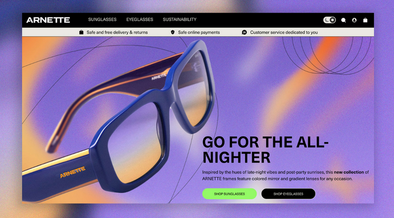
The “less is more” rule is a great guideline to follow. Ideally, you should aim for just two fonts in your project — 3 should be the maximum. This will help keep things streamlined, readable, and consistent throughout your website. The more fonts you use, the busier and more overwhelming your design can become for users.
Principle #7: Get Feedback From Others
Have you been working on a font pairing for so long that you can’t see its flaws anymore? It happens to most of us. To avoid overlooking potential issues, we suggest seeking feedback on your work.
The people you ask for feedback will depend on the nature of your project but try to get a diverse range of opinions from colleagues, mentors, readers, and potential customers. Look for common threads in their feedback. If they’re all pointing out the same problem, it’s time to make a change. And remember, the opinions of your readers and customers are crucial, as their experience and ease of reading should be your top priority.
Principle #8: Trust Your Instincts When Choosing Fonts
Sometimes, you have to trust your gut. It isn’t if something seems wrong about a particular pairing of fonts. Even if you’ve followed all the guidelines to a tee, some combinations might still feel off. But instead of ignoring that feeling, let it guide you. Experimenting and tweaking your pairing until it feels just right is okay. After all, you know what they say – sometimes, it’s all about the journey, not just the destination.

Try FREE Magezon Page Builder!
Easily create your engaging Magento pages in any style whenever you want without relying on developers or designers, just by drag & drop.
Principle #9: Prioritize Readability and Legibility
Regarding your brand’s font style, mood, or pairing, it’s vital to prioritize readability and legibility on your website. It is all about arranging fonts and words in a simple, easy-to-read manner, especially for large blocks of text. In this case, serif and sans-serif fonts are the way to go, as cursive or slab fonts may be too difficult to read.
For headings, you can prioritize the beauty element of your font a bit more, but readability should always come first for paragraphs with big chunks of text. Conversely, legibility refers to how easily distinguishable the letters are from one another, like the letters “I” and “i.” This is important for large and small text, such as headings and body text.
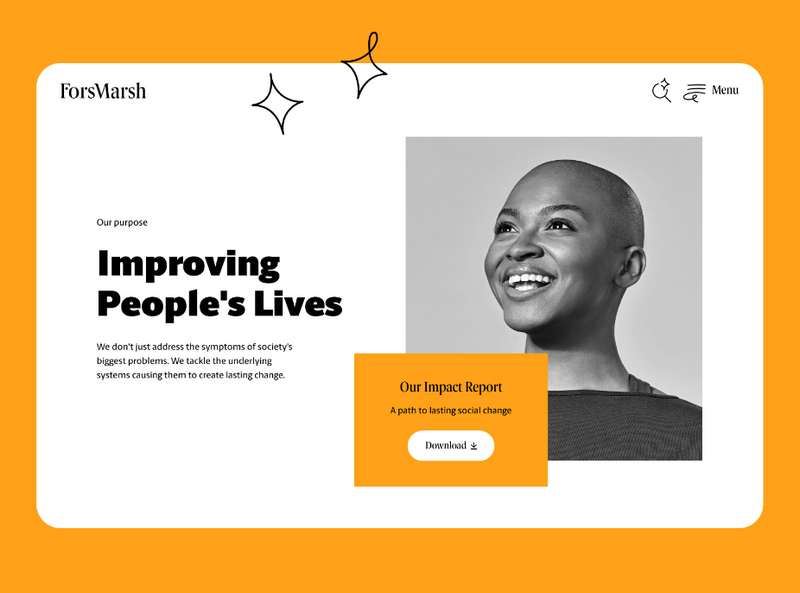
Now that you have a good understanding of the 9 principles of choosing the right font pairings, it’s time to put them into practice and explore the 35 best font combinations for websites. Let’s dive in!
35 Best Font Combinations for Websites
1. Abril Fatface & Lato
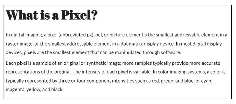
These fonts are the perfect match for your marketing or digital agency website. Abril Fatface is a font with a historical touch, designed to look like the headlines from 19th-century France and the UK. On the other hand, Lato is a more recent font created specifically for a corporation. Combined, these two fonts create a powerful blend of classical and modern typography to impress your visitors.
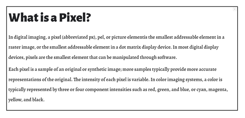
2. Alegreya Sans Black & Alegreya
Check out this excellent font superfamily example we found. You might not even realize it’s a superfamily at first glance.
The Alegreya Sans Black and Alegreya pairing was created initially for literature, but it’s also an excellent choice for blogs whether you’re using them for personal or commercial purposes. The bold Sans Black headline is eye-catching without being too overwhelming and complements the carefully crafted serif body perfectly.
3. Amatic SC & Josefin Slab
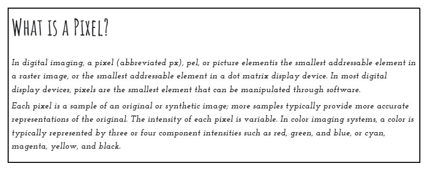
Looking for a unique and artistic font combination? Amatic SC bold and Josefin Slab italic is what you’re looking for. It may not be suitable for every website, but it’s perfect for artistic ones. If you’re a musician, painter, or photographer, these fonts can add a creative touch to your pages.
To ensure the fonts stand out, give them ample space to breathe. A white or very light background would be a great choice.
4. Aqua Grotesque & Roboto Slab Thin
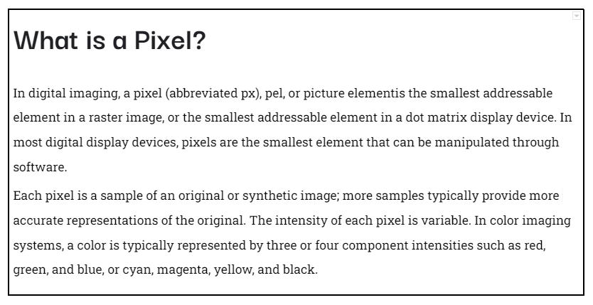
One of the best font combinations on this list is Aqua Grotesque and Roboto Slab Thin. They are especially suitable for software companies or organizations on energy and transportation initiatives. It’s worth noting that the body text is quite light, so it’s best to use this pairing on a homepage or pages with short text sections. This way, you can ensure the text is legible and easy to read.
5. Archivo Black & Roboto
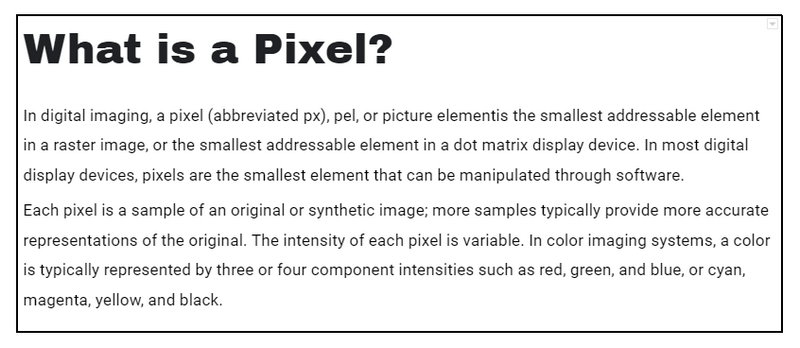
Let’s look at this sans-serif font pairing: Archivo Black and Roboto. Archivo Black’s unique and slightly imperfect style complements Roboto’s geometric and modern look. The pairing of these fonts creates a balance between perfect and imperfect, making it an excellent choice for websites that want to convey youthfulness and trustworthiness.
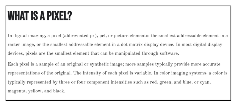
6. Bebas Neue & Old Standard TT
If you want a font pairing that exudes style and elegance, look no further than Bebas Neue and Old Standard TT. Bebas Neue is a stunning display font with a condensed, all-caps character set. Its narrow letters make it an excellent choice for headlines and titles, especially when paired with the old-world charm of Old Standard TT.
This combination would be perfect for websites specializing in all kinds of reviews – movies, books, Broadway plays, and more. The pairing would create a classic and timeless look that fits a site dedicated to reviewing works of art.
7. Cinzel & Raleway
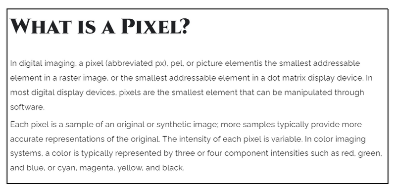
Cinzel is one bold and daring font. With its all-caps style, it’s best suited for brief text rather than lengthy blog posts or articles. When paired with a more classic font like Raleway, it shines even more. This dynamic duo is a perfect match for websites in the food and beverage industry.
Imagine using it to give your online menu a little bit of flair. Use Cinzel Black for the menu categories, Cinzel Bold for the dish titles, and Raleway Regular for the descriptions. Your customers won’t be able to resist.
8. Cooper Hewitt Heavy & Cooper Hewitt Thin
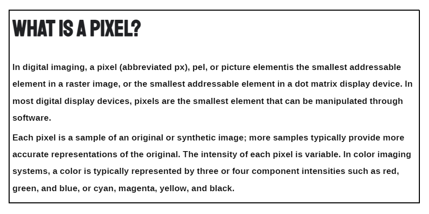
The Smithsonian Design Museum wanted a fresh look for the modern age, and the Cooper Hewitt font was an integral part of their rebranding. Though not a superfamily, the range of styles allows unique pairings of different weights to create a bold contrast.
This font would make a statement with its artistic flair for websites geared toward artists, photographers, and designers. Since visuals often take center stage, the lighter body text won’t be an issue, with minimal text needed.
9. Exo 2 & Alegreya Sans
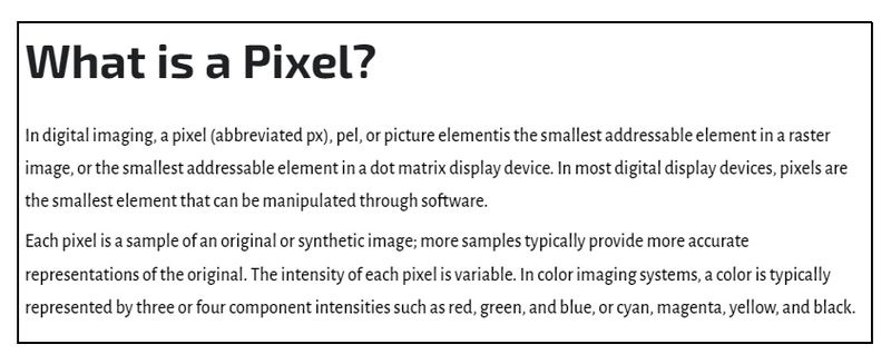
The Exo 2 header is sleek and futuristic, while the Alegreya Sans has a warmth and character that sets it apart from other neutral fonts.
This combination would be perfect for blogs focused on tech, defense, or aerospace, where it’s important to balance readability with a distinctive voice. Readers will appreciate the easy-to-read Alegreya body text, while the bold Exo 2 headers will draw their attention to important points.
→You might also want to read: An Ultimate Guide to Creating a Website Header That Converts
10. Fira Sans Black & PT Serif
Fira Sans and PT Serif are two fonts crafted with readability and legibility. They work well together to make content easy on the eyes.
This best font combination can fit right into any website or blog with many readerships, but they shine more urgently. Think of a newspaper’s front page with headlines that demand attention. If you want to create that same feeling, these fonts will serve you well on a news website, particularly for sports or entertainment coverage.
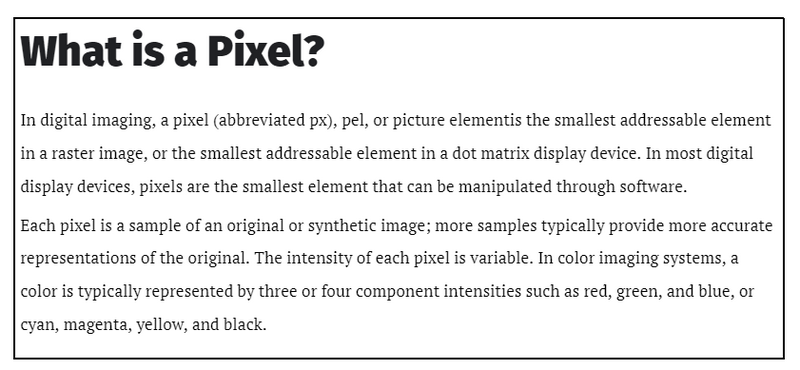
11. Josefin Sans Bold & Josefin Slab Semi-Bold
Meet Josefin Sans and Josefin Slab — two Google fonts that complement each other beautifully. They may not be part of the same superfamily, but they look like relatives.
These fonts are a nod to the past, inspired by geometric typefaces from the roaring 1920s (Sans) and elegant 1930s (Slab). To make the most of their vintage charm, consider using them on the homepage of your website. They’re a perfect fit for businesses with retro aesthetics, such as restaurants, bars, barbershops, and other cool hangouts.
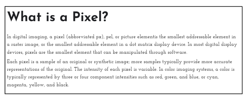
13. Karla Bold & Spectral Light
Karla and Spectral are another best font combination for attracting younger audiences. Even though they have little quirks, like Karla’s slightly off-kerning and Spectral’s less pronounced curves, these imperfections make them lovable.
With a youthful and friendly vibe, this pair is perfect for brands targeting millennials and Gen Z. If you’re creating a website or blog aimed at a younger audience, Karla and Spectral are the fonts to make an honest, relatable tone that resonates with your readers.
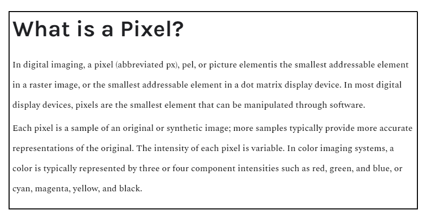
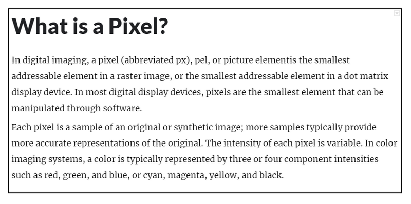
13. Lato & Merriweather
Lato and Merriweather are solid and sturdy fonts with excellent readability. Not only that, but they also have a welcoming feel to create an enjoyable and engaging reading experience.

Try FREE Magezon Page Builder!
Easily create your engaging Magento pages in any style whenever you want without relying on developers or designers, just by drag & drop.
14. Lato & Roboto
The differences here are more nuanced than the pairing of Lato with Merriweather. Roboto‘s more restrained and precise feel makes it an ideal choice for larger corporate websites in industries such as healthcare, biotech, or pharmaceuticals.
Given the significance of technology and science in building client trust, this duo can help establish a sense of reliability and confidence in your brand.
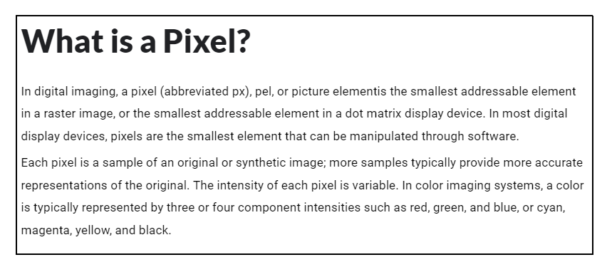
15. League Gothic & PT Serif
These fonts create an exciting contrast that balances the tall and bold League Gothic with the well-proportioned and rounded PT Serif. The resulting text looks serious yet approachable, striking a perfect balance. This combo could be a great choice if you’re looking for fonts for a fintech or financial services website. The design is sleek and efficient without feeling wasteful or unnecessary. Plus, the serious tone of the fonts is perfect for conveying trust and professionalism.
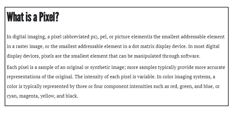
16. League Spartan & Libre Baskerville
Have you ever heard of Sparta? The name evokes images of strength, intelligence, and loyalty. Interestingly, a font conveys a similar impression – the League Spartan font. It’s a robust font with sharp edges that commands attention. And when paired with the softer, more rounded characters of Libre Baskerville, the tone is unmistakable.
If you’re designing a website for someone who needs to make an impact – whether they’re an entrepreneur, a speaker, or a consultant – this potent duo could be just what you need.
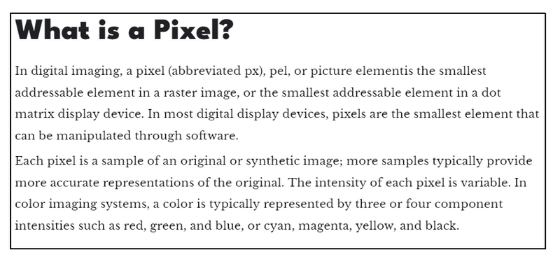
17. Libre Baskerville & Source Sans Pro
Imagine you’re driving, and suddenly someone else takes the wheel. That’s what happens when you put Baskerville font in the driver’s seat – it changes the vibe. Serifs are usually relegated to the background, but not with Baskerville. The classic yet modern look of Baskerville, paired with a complementary font like Source Sans Pro, really pops.

18. Libre Franklin & Libre Baskerville
Both Libre fonts draw inspiration from literary classics, but the header font steals the show. With Franklin in the lead, you can completely transform the vibe of your website. Plus, with 18 different styles, you can control how bold or subtle your header text appears. It’s a slight touch but can make a big difference in your site’s perception.
This font pair is perfect for content-heavy websites that want to maintain a fun, approachable feel. Think personal blogs, travel blogs, or food blogs – anything you want to read for hours without feeling overwhelmed. With this best font combination, your site will be accessible to the eyes and easy to read without sacrificing style.
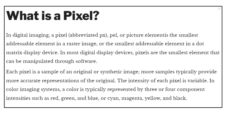
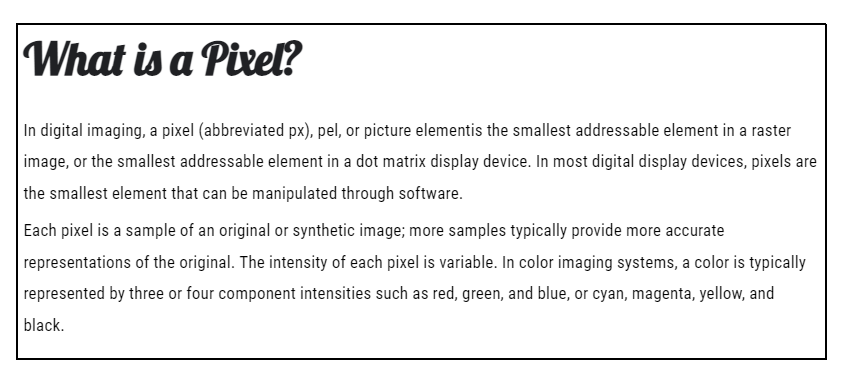
19. Lobster & Roboto Condensed
Are you a fan of cursive fonts? We have one on our font pairing list that will catch your eye. It’s called Lobster, and while it might not be the most accessible font to read in small doses, it adds a touch of fun and flair to any page.
The best part? You will get one of the best font combinations of style and substance when you pair Lobster with a more neutral font like Roboto Condensed. Lobster feels more like a font with extra flavor than a traditional handwriting font, making it an excellent choice for websites in the hospitality or travel industry.
20. Lora & Merriweather
Lora and Merriweather are two popular serif fonts that each bring their unique style to the table. Lora is all about warm, brush-like strokes that add a touch of creativity to any header. Conversely, Merriweather is more stable and predictable, providing a solid foundation for your content.
This duo is an excellent choice for websites about creativity and self-expression. Whether you’re a web designer, developer, copywriter, marketer, or any other creator type, this combination will make your website stand out.

21. Lora & Alegreya
Lora Bold is the perfect choice for title pages, with its robust and legible typography that is still inviting and welcoming. And when you pair it with Alegreya Regular, you get the perfect combination of strength and subtlety. Alegreya is an excellent choice for captioning images, with its legibility and understated style. Remember that Alegreya can be challenging to read for long stretches, so it’s best to stick to short text like captions or brief descriptions. And be sure to avoid experimenting with other variations of Alegreya – adding weight or italics can negatively impact its legibility.

22. Merriweather Sans Bold & Merriweather
One of the great things about Merriweather is that it comes in both a sans-serif and serif version that harmonizes perfectly. This makes it an excellent choice for any website, no matter what kind of content you’re showcasing.
But because Merriweather is so easy to read even at smaller sizes, it’s an especially great choice for ecommerce sites. Your mobile shoppers will appreciate the excellent readability of your product pages, which can lead to higher conversions.
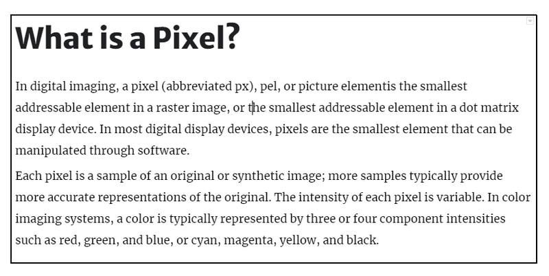
23. Montserrat & Droid Serif
Check out this font pairing that was just meant to be. Montserrat’s design inspiration comes straight from Brazilian signage, while Droid Serif was crafted for comfortable reading on Android devices. The result is the best match for news and entertainment sites with many mobile readers, especially younger ones. Montserrat’s bold and modern look draws readers to the headlines, while Droid Serif’s easy-to-read body text keeps them hooked even as they scroll down.
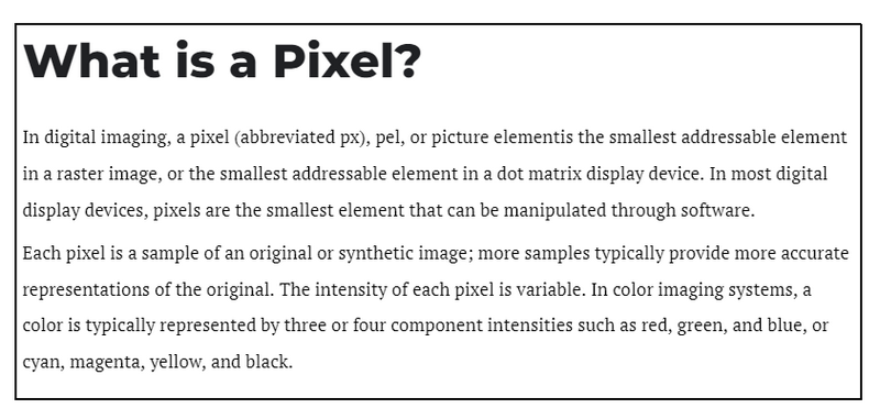
24. Neue Helvetica & EB Garamond Medium
Neue Helvetica offers a lot of versatility with its impressive 120 typeface styles. It’s a modernized version of the classic Helvetica font. It can be paired nicely with a more traditional font like EB Garamond.
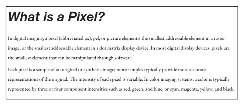
25. Lexend Bold & Crimson Pro
If you’re looking for the best font pairings for websites with a sophisticated vibe. Lexend and Crimson Pro are the perfect matches. Lexend’s sleek and minimalist design creates a modern look, while Crimson Pro’s elegant and refined style adds a touch of intellectualism.
These fonts work particularly well for content that requires a more scholarly tone, such as podcast episodes, research reports, or blogs with data visualizations. This combination makes your content look professional and easy to read and digest.
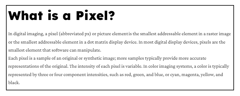
26. Noir Pro & Playfair Display
Playfair Display is a font that demands attention, and you can use it to create some real drama on your web page. It’s perfect for big, bold headlines that grab your visitors’ attention. The Noir/Playfair Display combination is an excellent choice for any website that needs a touch of elegance and sophistication.
Remember, when using Playfair Display, you must choose a third font for your body text. A classic serif font like Times New Roman or Georgia would work well and keep things balanced.
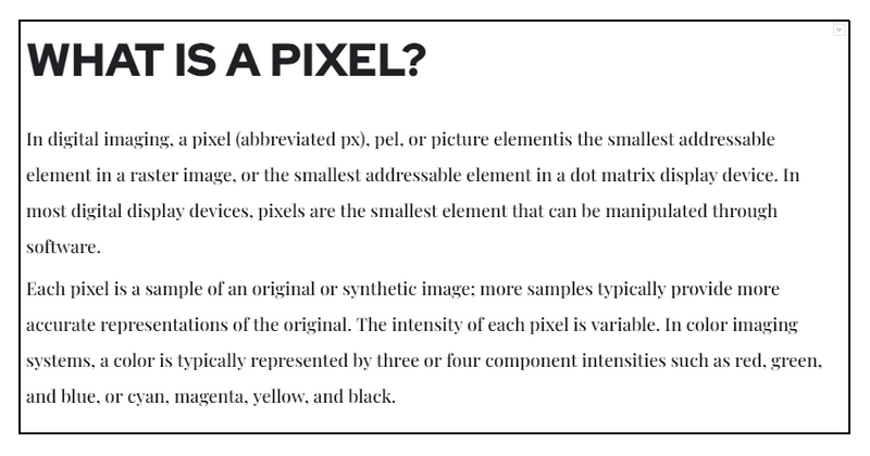
27. Open Sans & Source Sans
Open Sans and Source Sans Pro are a match made in font heaven. Not only are they neutral and friendly, but they also work wonders for websites with a global audience. You won’t have to fret about specific style choices that might not resonate with your visitors based on their location or time.
Another great thing about this duo is their extended character sets, which make them a perfect choice for multilingual websites. They can easily accommodate Latin, Cyrillic, and Greek alphabets.

Try FREE Magezon Page Builder!
Easily create your engaging Magento pages in any style whenever you want without relying on developers or designers, just by drag & drop.
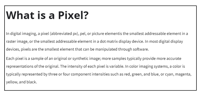
28. Open Sans & Roboto
These fonts work so well together because they’re both super crisp and effortless to read. Choosing legible fonts is key, especially if you use Open Sans and Roboto on a website or other digital platforms.
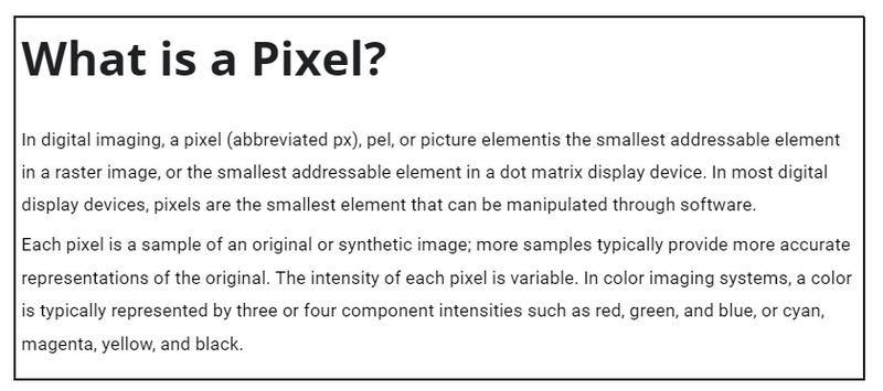
29. Oswald & Montserrat Light
The Oswald header is tall and imposing, while the Montserrat text below is lighter and more delicate. This font combination is perfect for websites promoting events, conferences, webinars, etc. It’s attention-grabbing and makes a statement. However, using Montserrat Light for smaller text segments, like subheadlines or short paragraphs, is essential. This will ensure that the text remains easy to read and doesn’t become a challenge for your readers.
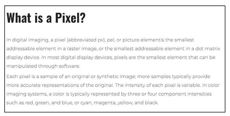
30. Oswald & Old Standard TT
The Oswald font takes on a dominant role, while the Old Standard TT font is smaller and more textbook-style. Together, they create a feeling of expertise and knowledge.
This font combination is perfect for websites for healthcare companies and educational institutions. It’s a great choice if you want to be seen as a well-respected authority in your industry. With this pairing, you can communicate your knowledge and expertise to your audience clearly and professionally.
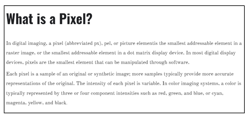
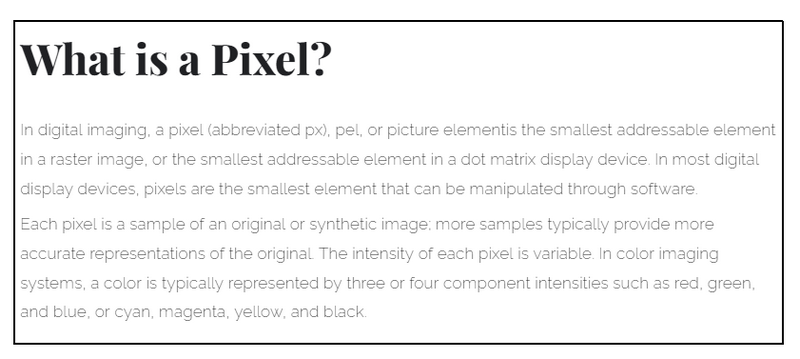
31. Playfair Display & Raleway Extra Light
Playfair Display and Raleway are perfect for creating eye-catching homepage hero images or introductory banners. The best font combination fonts create a delicate yet strong feeling that will capture your audience’s attention.
This font pairing would be great for designing websites for fashion brands or local retailers. With its stylish and modern look, it’s sure to make a statement and communicate the sophistication of your brand.
And the best part? Raleway Extra Light style adds an extra touch of delicacy and elegance to the pairing. It’s a perfect choice if you want to create a stylish and professional website.
→ Read more: 30+ Cool Promotion Banner Samples That Drive Clicks & Sale
32. Playfair Display & Montserrat
While this font combination may not be the best choice for longer texts like blog posts, it’s perfect for shorter text on your website.
If you’re running an eCommerce shop in the fashion industry, this font combination is ideal for product titles and descriptions. The lighter-weight font, such as Montserrat Light, adds a touch of elegance that perfectly fits with a luxury brand persona.
But here’s a fun twist – switching the two fonts and using Montserrat as the header can create a completely different persona for your brand. The combination takes on a futuristic or techy vibe, making it perfect for promoting a game or a landing page to download a mobile gaming app.

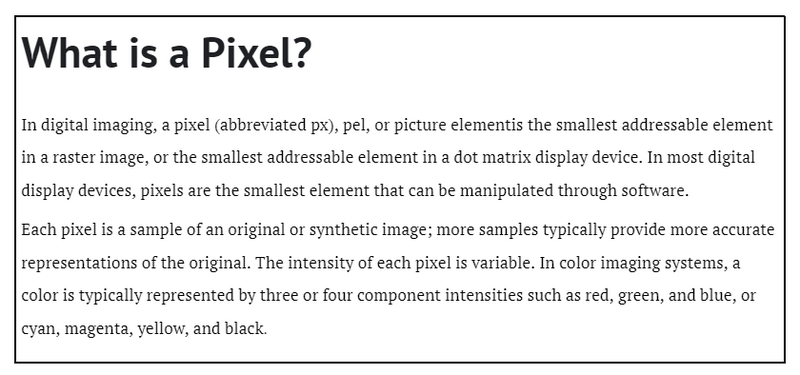
33. PT Sans & PT Serif
PT Sans and PT Serif may not be the flashiest fonts, but they do the job professionally and straightforwardly. Their clean and simple design makes them adaptable to various websites. However, they’re best suited for sites that rely heavily on striking visuals to sell their products, such as car manufacturers, robotics companies, and intelligent device retailers.
34. Raleway & Merriweather
You might recognize these fonts from your browsing history because they are popular online. And for a good reason. They’re both big, bold, and beautifully designed. Putting Raleway and Merriweather together creates a feeling of honesty and a focus on the user. This is one of the best font combinations for websites that belong to professional service providers like lawyers, agents, writers, and consultants.
35. Source Sans Pro & Times New Roman
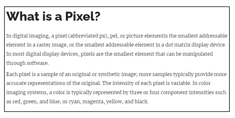
Times New Roman may be overused, but it creates an outstanding balance when paired with a Source Sans Pro header. The simple design of Source Sans Pro feels manageable and straightforward, while Times New Roman gives a sense of reliability and trustworthiness. This font combination would be perfect for websites that sell tech or digital products.

Final words
Choosing the right font combination for your eCommerce website can make a huge difference in how visitors perceive your brand. With the above 30+ best font combinations, you have many options to create a unique and memorable experience that stands out. Whether you’re going for a classic, modern, or playful look, a font combination here will help you achieve your design goals. So, go ahead and experiment with these best font pairings and see which ones work well for your eCommerce website. Your visitors will thank you for it.
If you are a Magento merchant and don’t know which extension to build your website, consider Page Builder from Magezon. As a trusted Adobe partner, we have satisfied thousands of customers with a vast collection of drag-and-drop extensions, helping you create a high-converting and unique store in minutes.
Don’t take my words for granted; see how your website can be with Magezon Page Builder and what others say about us:
 Magezon Blog Help Merchants Build Comprehensive eCommerce Websites

