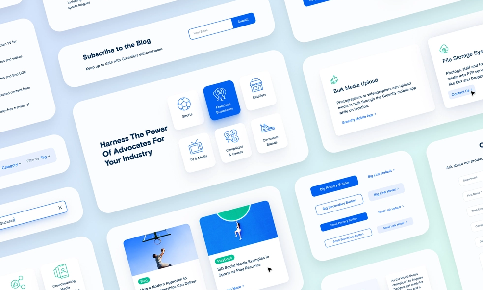
When visiting the site, what makes you prefer one website over another? Aside from the content, graphic design choices play a significant role. You should primarily focus on the color element. Color is essential in any visual design because it can set the tone, influence emotions, and establish trust.
There are thousands of different website colors, but some colors are better than others. According to Wired, the blue color website is the most popular. But it’s not just one shade. They come in various colors, from pale ice blue to deep, dark navy, and every tone in between.
So what makes websites with blue color schemes such a popular design choice? This article covers everything you need to know about the blue color website. From the meaning and benefits of a blue hue in web design to blue website color schemes and the best blue website designs with color schemes, you’ll discover everything inspiring you.
Table of contents
The Meaning of Blue Color
Many people’s favorite color is blue, so naturally, it would be a popular choice. More importantly, the psychology of color is considered in website design. While blue conjures images of sky and sea, it’s also the color of reliability and optimism.
- Reliability: When people see the color blue, it is supposed to induce thoughts of trustworthiness, and they feel more secure. That’s the reason why it is used by banks and governments. In web design, your users are more likely to purchase as they perceive your blue color website as trustworthy and professional.
- Optimism: The use of blue also carries the connotation of optimism. People are more likely to feel inspired and optimistic about the future when they see particular tones of blue. This is a warmer or brighter hue of blue than the darker blues associated with reliability. A blue color website can help customers feel optimistic about your products and services and be more inclined to buy or sign up.
Benefits of Blue Color in Web Designs
Blue signifies the sky and the sea and is associated with open spaces, freedom, intuition, imagination, inspiration, and sensitivity. The blue color also represents depth, trust, loyalty, sincerity, wisdom, confidence, stability, faith, and intelligence. It has equal appeal to men and women.
This color can be found on a wide range of websites. It’s also one of the most popular colors for corporate designs, so you’ll see it on many big company websites.
Communications and web businesses utilize medium shades of blue since they can appear smooth and high-tech, particularly when combined with shades of gray. Lighter shades of blue are often used to promote health and wellness, travel, and relaxation. In contrast, darker shades associated with intelligence and trust are great for companies that need to build trust, like financial institutions, healthcare, government organizations, and corporations.
| Discover how to use blue in medical websites: 25+ Inspiring Medical Website Design Examples (With Tips) |
Blue can cause the body to produce calming chemicals and release feelings of tranquility. Blue is also cooling in nature and helps with balance and self-expression. By choosing the correct blue color palette for a website, you can change how people think of your brand and generate lasting emotions that will drive purchasing decisions.
Blue Website Color Schemes
To make it easier for you to get started, we’ve gathered blue color schemes for websites through Canva’s Color Palette Generator to inspire you. The website color schemes and the hex color codes are listed below. You can get your blue website inspiration from these to begin developing or redesigning your website.
| Use color generators to decide your website’s scheme: 15+ Best Color Palette Generators for Website (+FAQs) |
1. Blue Ribbon, Shark, Ghost, and Malibu
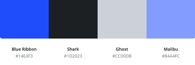
This color scheme would look great on a website for an agency or other creative sites. To grab your visitor’s attention right away, use light blue as the background color of your site, then use it as an accent color for parts with more text.
2. Moody Blue, Link Water, Persian Blue, and Spindle
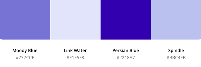
This pastel color palette provides a sense of harmony and balance. The darkest hue is bright enough to attract attention to different sections of the design or to utilize for typography against the lightest color.
3. Ebony, Iron, Torea Bay, and Royal Blue
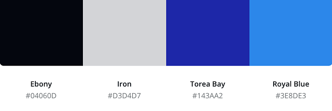
This color palette is perfect for innovative companies in tech and other businesses. Use the ebony and iron hues for the background and text; the blues for animations, navigation links, and other elements.
| Get tips to create an effective navbar: A Complete Guide to Creating Effective Website Navigation Bar |
4. Blue Ribbon, Ebony, Eagle, and Juniper
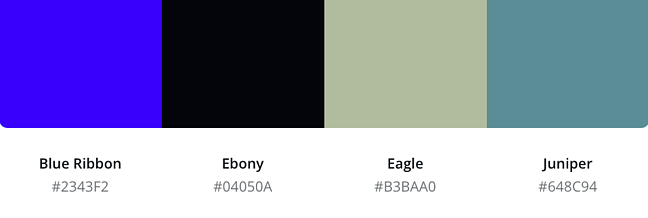
This color scheme is a modern take on the classic black-and-white palette. The blue and black color scheme will leave a lasting impact, while the pastels will add warmth and harmony.
5. Juniper, Mystic, Casper, and Jungle Mist
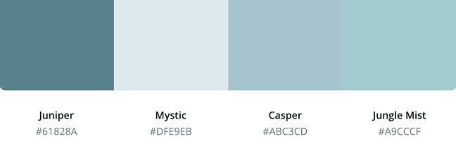
The turquoise pastel in this palette conjures sentiments of relaxation and tranquillity, as well as thoughts of water. As a result, it’s perfect for spa, resort, or wellness websites.
6. Blue Zodiac, Tiara, Fountain Blue, and Regent Gray
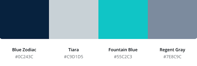
This color scheme is excellent for financial and other business websites. The vivid blue can assist capture the visitor’s eye, while the navy and grays create a professional and trustworthy impression.
7. Martinique, Loblolly, Nepal, and Wild Blue Yonder
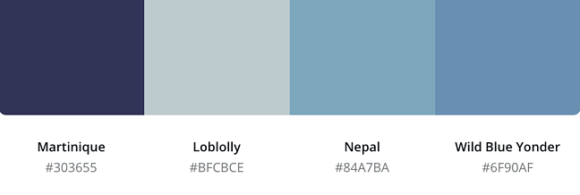
This monotone hue is calm but not dull. To make a blue color website minimalist, use these hues as a background or accent shade with stark white.
8. Sail, Mariner, Royal Blue, and Lynch
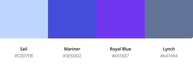
This palette is an excellent choice for your background without being boring as white. Go with a light blue background and darker hues for your text, buttons, and other components to give appropriate contrast.
9. Black, Blue Ribbon, Malibu, and Alto
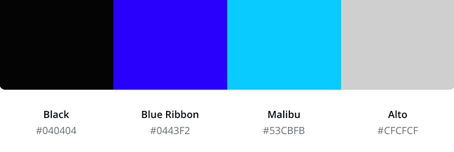
This color scheme is perfect for websites that demand a lot of contrast. Use black and alto for your background and typography and blues for essential parts like CTA buttons.
10. Rhino, Mischka, Fountain Blue, and Ship Cove
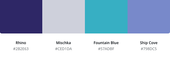
The mix of navy and gray in this palette creates a softer effect than the traditional black-and-white combination. Blues in pastel colors work well together.

Try FREE Magezon Page Builder!
Easily create your engaging Magento pages in any style whenever you want without relying on developers or designers, just by drag & drop.
40+ Best Blue Color Websites With Color Schemes
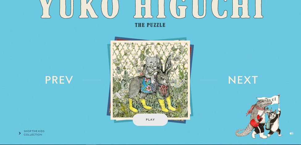
1. Yuko Higuchi x Gucci
This website’s retro design is quite appealing. The saturated blue blends beautifully with the text and the puzzle game in the middle. All of the other pages on the website have the same theme, which gives them a great sense of cohesion.
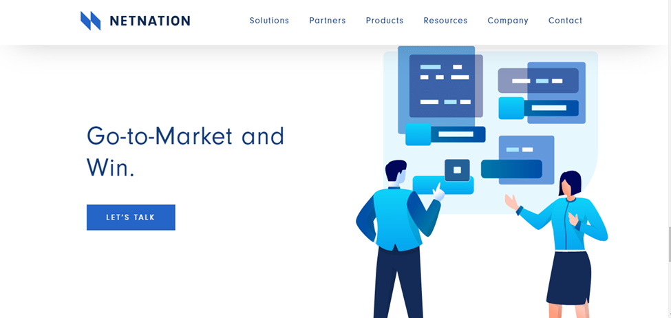
2. NetNation
Besides using blue as a background color, NetNation successfully illustrates blue as the dominant color in animations and images. On a white background, it looks elegant and modern.
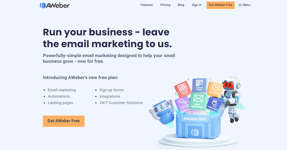
3. AWeber
The sky blue and black color palette used by AWeber represents conservatism, reliability, and trustworthiness. The call-to-action buttons were designed in a complementary orange color.
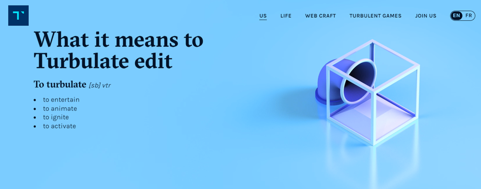
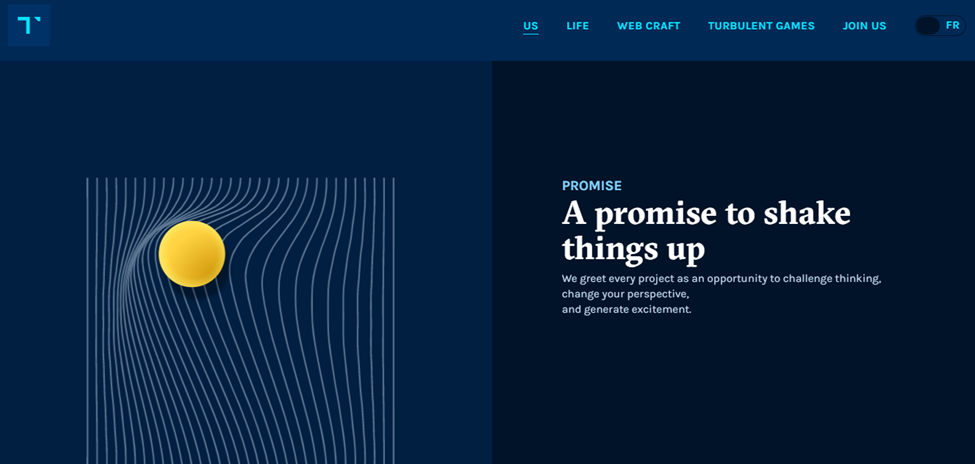
4. Turbulent.ca
Turbulent.ca is another example of the best blue website. This company unveiled its new brand image after a “turbulent” makeover, which used different tones of blue for the website’s background, from light to dark shades. Adding the brightness of the moving balls makes the website unique.
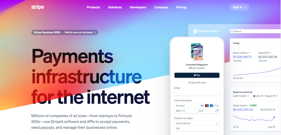
5. Stripe
Stripe is a well-known online payment processing platform. It is increasingly being chosen above the competition by online businesses. Stripe uses a blue gradient blended in flawlessly with the shades of purple and the color-moving effect of the landing page’s design to captivate new customers.
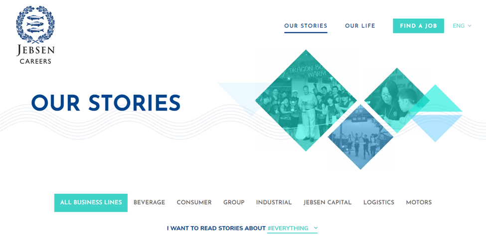
6. Jebsen Careers
This blue color website works very proficiently on a white background, and the layer of blue and green transparent boxes on top of the photo is exceptionally appealing. Variations of the same colors are utilized effectively throughout the entire website.
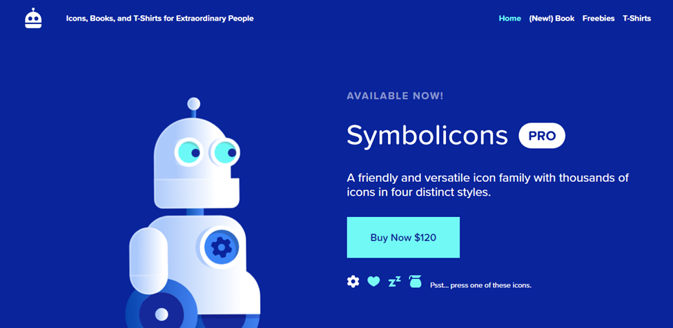
7. Symbolicons
Symbolics is a nice and friendly set of thousands of icons for designers. The unique website design is inspiring, with hues of blue and turquoise.
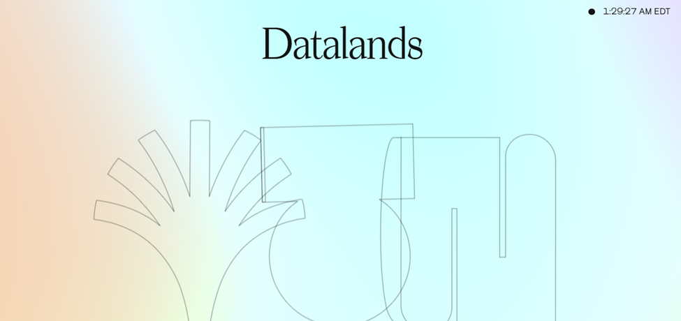
8. Datalands
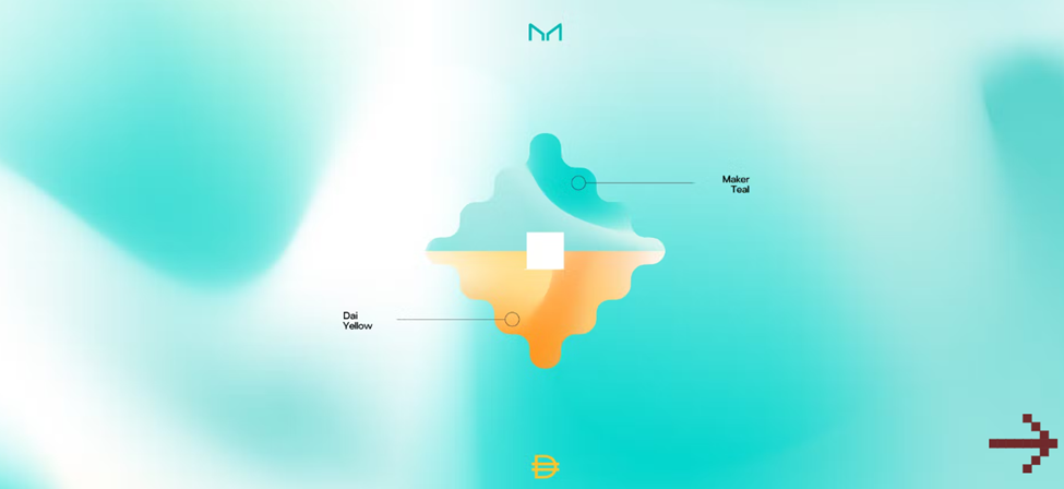
This can be found as the best blue website. Datalands offers a strong first impression as a business that “gives shape to data.” The design is emphasized by the variety of colors, with the blue balancing the overall contrast. In color psychology, this shade of blue brings out such individualistic feelings and delivers a sense of reliability. It represents clarity of the mind, your thoughts, and open communication, so you can freely express yourself without any internal confusion.
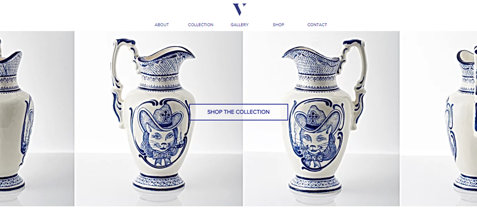
9. Valeria Monis
Valeria Monis is an Uzbek ceramic artist with a distinct vision of her work. She used her artistic eye to create a clean and appealing page for her website. The dark blue shade of the texts and art pieces contrasts with the flawless white of the background.
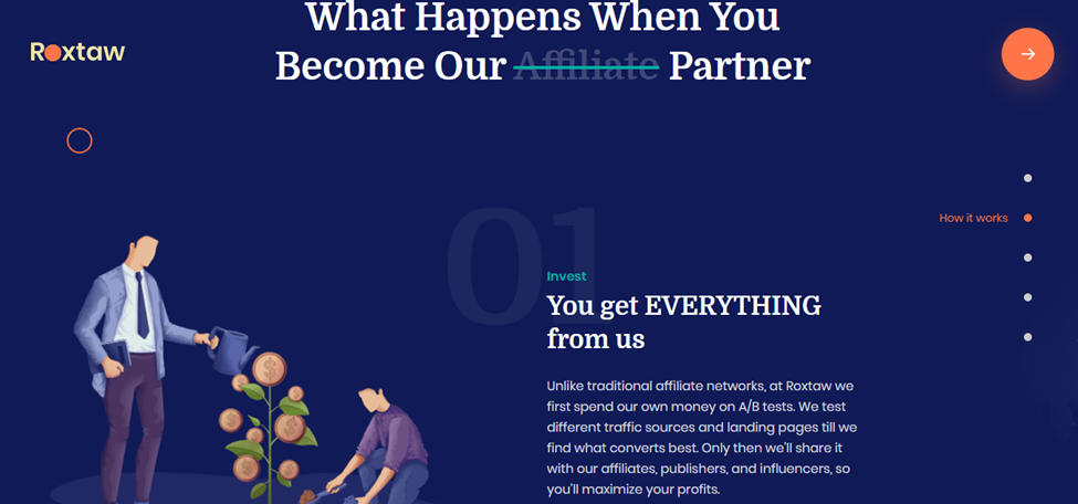
10. Roxtaw
Roxtaw contributes and scales “brands exponentially to that 10-figure milestone”. This purpose is symbolically represented by the website’s prominent illustration.
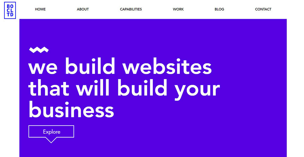
11. Brown Owl Creative
Despite the numerous color combinations, this website is well-organized. Because of the blue accents used across the website, the designers could regulate the contrasts and create an overall sense of harmony.
12. Dan Palmer
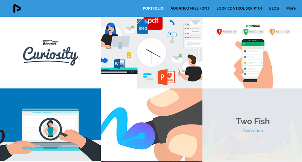
This is a great blue website inspiration. Dan Palmer uses a minimalist color palette to highlight his portfolio on the website’s main page. The page is organized and navigable, thanks to the box grids. The artist primarily uses blue to convey his professionalism and sincerity.
13. Zencargo
Zencargo is a company that specializes in logistics and shipping. The dark blue shade evokes productivity, order, authority, and reliability consistent with the company philosophy, “Powered by technology, delivered by experts.”

14. Studio&more
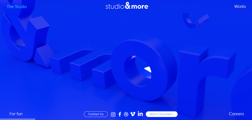
Studio&more is a blue-themed website. They created a visual style based on various shades of blue, all of which were vivid and saturated. The website’s white headings and icons provide contrast and balance to the design.
15. We (Heart) UX
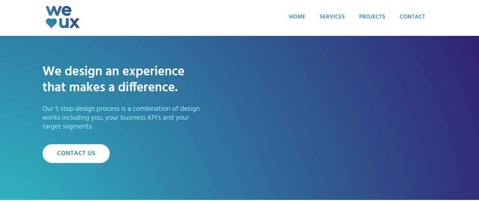
This design website is primarily dark blue and turquoise accents. The monotone color palette conveys wisdom and trust.

Try FREE Magezon Page Builder!
Easily create your engaging Magento pages in any style whenever you want without relying on developers or designers, just by drag & drop.
16. Puzzle Inn
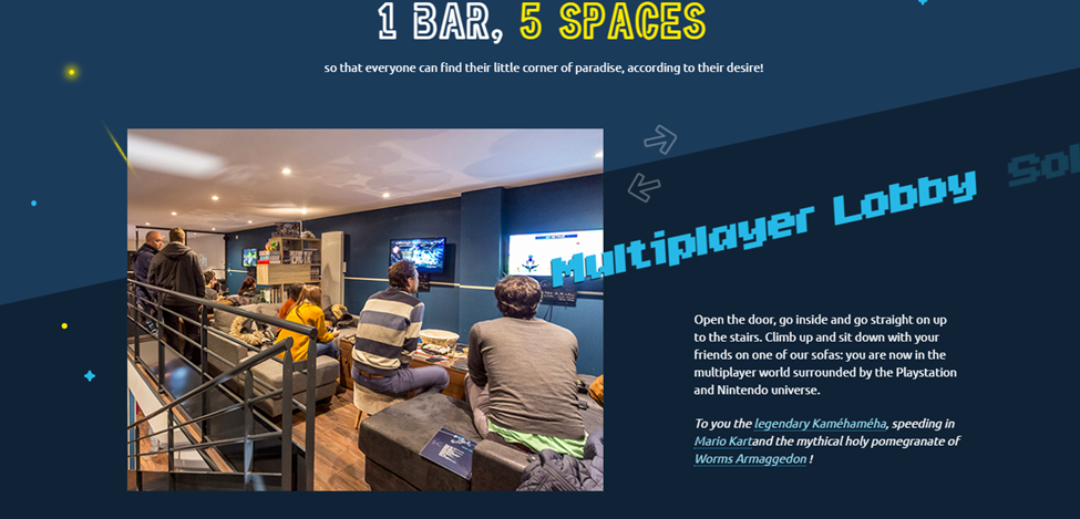
Combining the gaming experience with the bar atmosphere is a fantastic and unique concept. By scrolling through the website, you may sense the atmosphere. Moreover, the contrast between dark blue and bright yellow is striking.
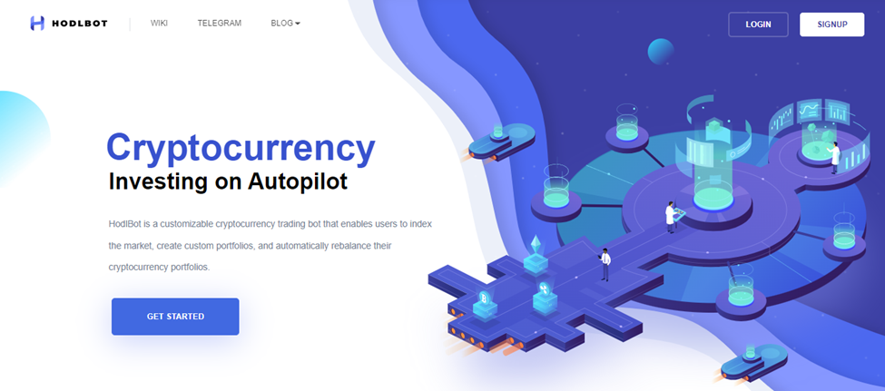
17. HodlBot
Next on our list of blue website design inspirations is HodlBot, a personal crypto trading bot. Using a predominant saturated blue color on their site is intentional since a blue palette illustrates professionalism.
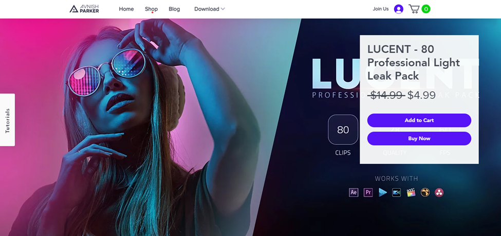
18. Avnish Parker
This website has a unique look to each slide. The designers modify the main tone and dominating colors while maintaining the aesthetic identity. As a result, they create a website that is both cohesive and attractive.
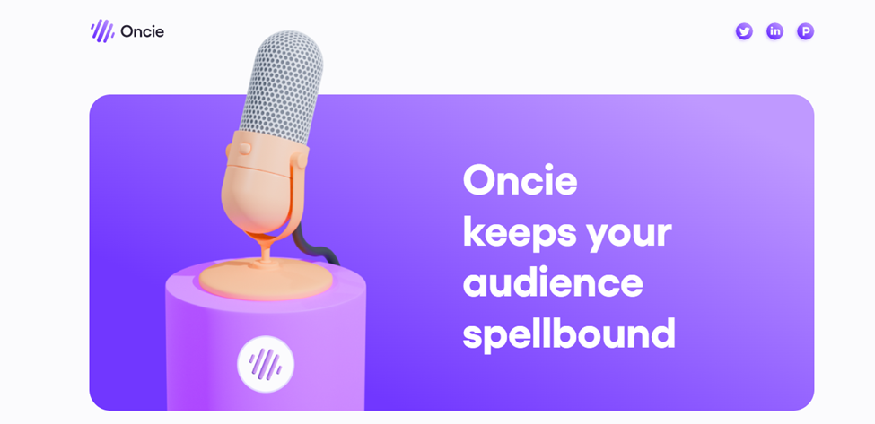
19. Oncie
This website features a blue and lavender-purple combination, producing a pleasant experience.
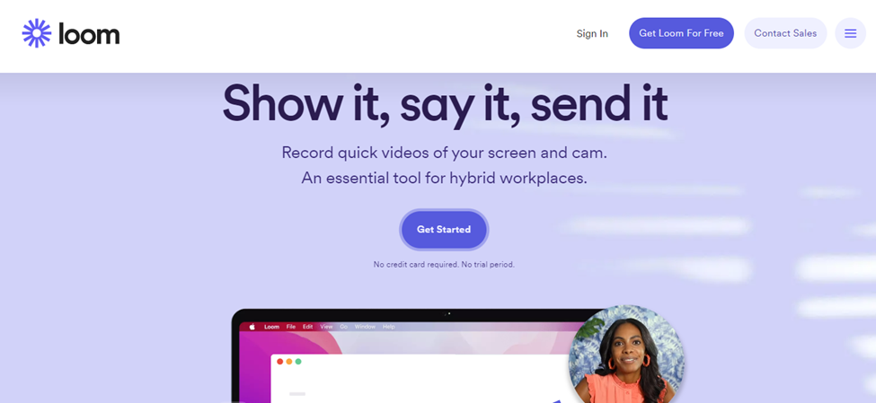
20. Loom
Loom is another best blue websites on our list. Loom’s landing page features a simple layout, but they make excellent use of colors and textures. Every part of the website displays the baby blue and white contrast, which is effectively balanced with the opaque white background. Motion is introduced to the text boxes and graphics to bring the design together.
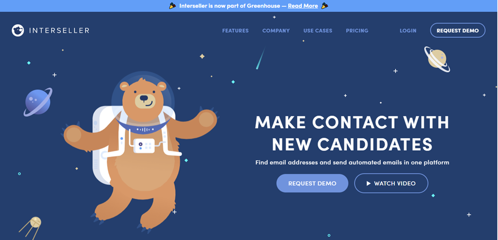
21. Interseller
Interseller unites people with similar interests as a facilitator between recruiters and candidates, and the image of the brown bear floating in the dark space is the symbol of their brand.
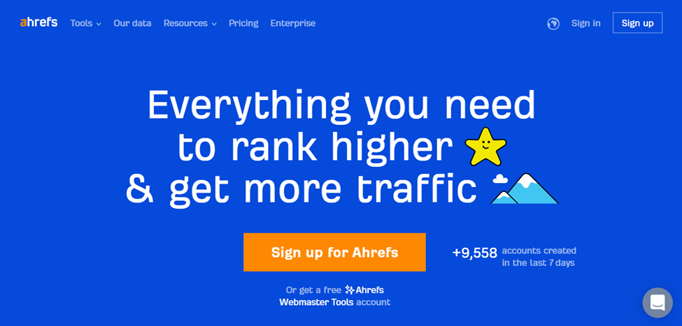
22. Ahrefs
Strong blue alternates with opaque black to generate order and variation on Ahrefs’ website. Also, the white-blue text completes the design by highlighting some of the page’s major elements.
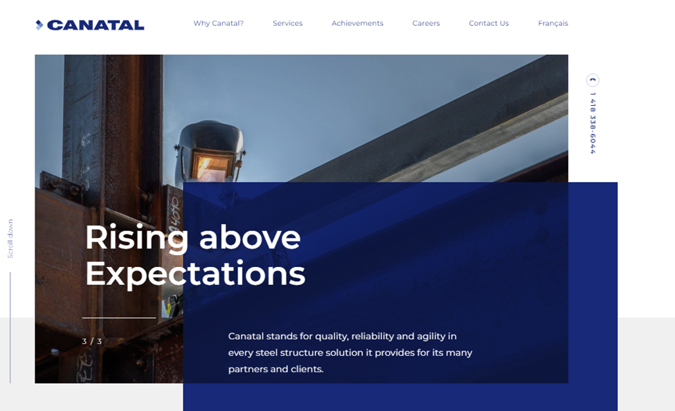
23. Canatal
On a light gray background, this stunning dark blue color pops. The layering of textures and hues is clever and conveys a strong sense of aesthetic taste.
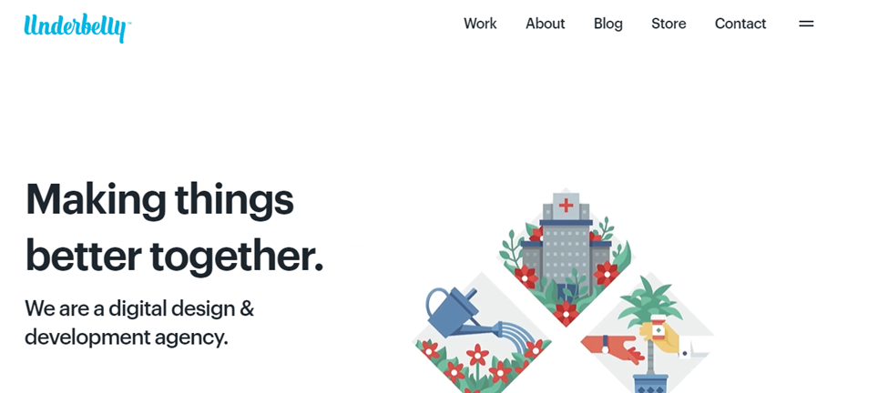
24. Underbelly Creative Co.
The abundance of bright illustrations, all of which transmit joy and cheerfulness, draws most visitors to this website. The main call-to-action button is highlighted in light blue at the bottom of the webpage.

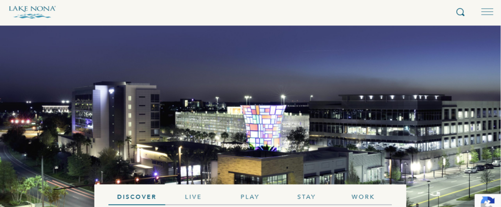
25. Lake Nona
Because this website is primarily dedicated to beautiful areas of nature, particularly those near water, blue is an ideal option, and the scenes are illuminated by a neutral background.
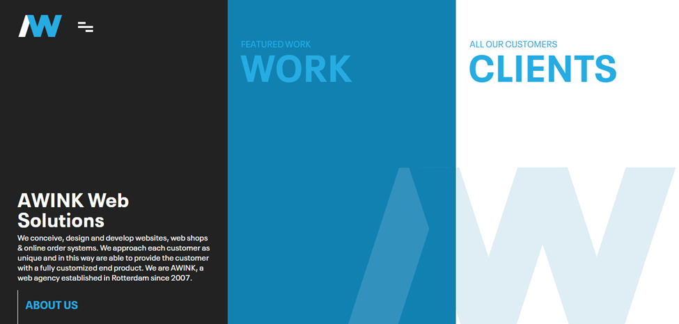
26. Awink
Awink puts a spin on the triadic color palette on their site: black, sky blue, and white. In this website color scheme, the sky blue takes center stage, with different shades and tones of base blue, black, and white in supporting roles, which create a simple design that is easy to follow and use.
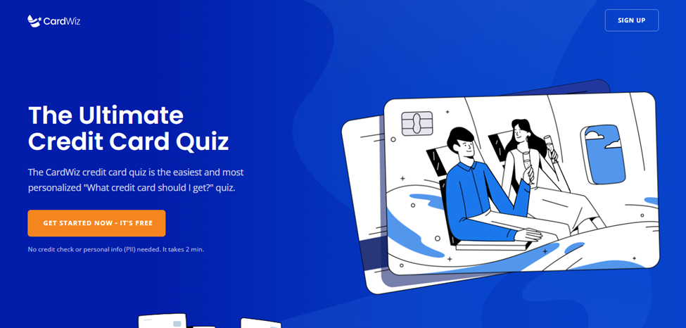
27. CardWiz
This wavy pattern appears to be modern and stylish. The creative blue-colored website design gives the consumer a feeling of security, safety, and trust. White and saturated blue is a basic combination that never goes out of style. It’s possibly one of the best blue website designs.
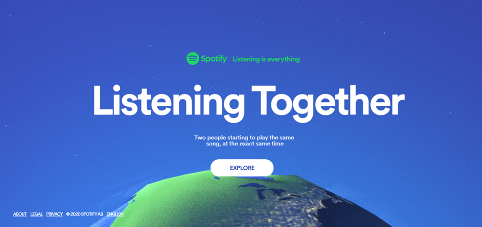
28. Spotify
Sharing is caring. The blue palette for the website makes you feel calm and relaxed; share your favorite songs with other Spotify users and let the world know about your taste.
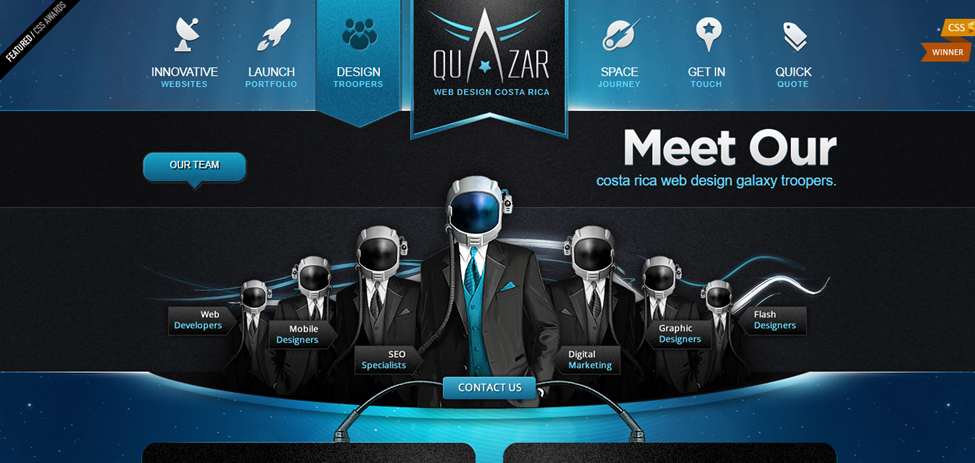
29. Quazar Web Design
Because of the electric vibe of the color highlights and the menu’s icon, this blue website background has a gaming appearance, which evokes creativity and competitiveness.

Try FREE Magezon Page Builder!
Easily create your engaging Magento pages in any style whenever you want without relying on developers or designers, just by drag & drop.
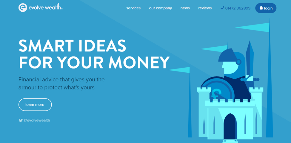
30. Evolve Wealth
This vivid blue website presents a professional appearance. The pure white of the text and the greenish-blue graphics are combined to create the color of a clear sky, which conveys trust, security, and finances.
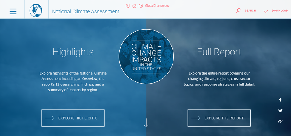
31. National Climate Assessment
When we think about climate, it comes to blue color. This blue website design with a grey shade reflects one of climate change’s most significant challenges.
32. Chronicled
Another blue website design to get you inspired is Chronicled. The light blue background is soothing and tranquil, making it ideal for health and pharmaceutical companies. Thanks to the purple and copper colors, it has an upscale and professional sense.

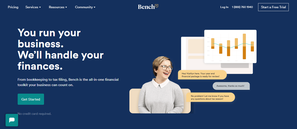
33. Bench
Bench is an accounting and tax preparation service available online. The navy blue background evokes trust in a company that helps keep your finances crystal clear, while the green call-to-action buttons correspond to the hue of money. Besides, the use of contrasting yellow is an excellent choice.
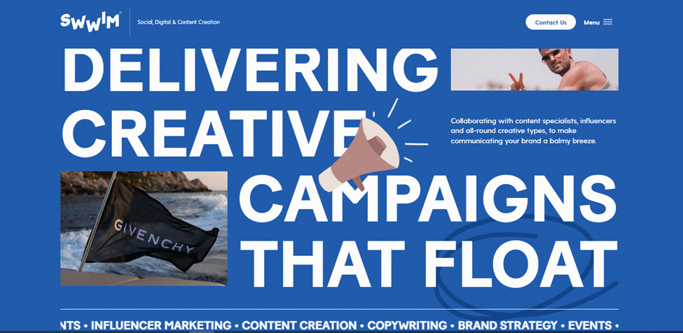
34. Swwim
This is a one-of-a-kind blue website design to help you get motivated! Swwim, a content creation company, employed a classic sapphire blue for their background but balanced their conservative color preferences with loud and big text and animated illustrations.
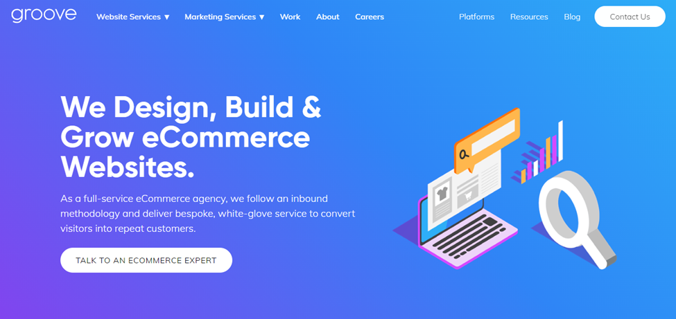
35. Groove Commerce
This eCommerce web design firm used a subtle gradient from purple to cyan blue. This was an excellent pick for a company that provides luxury and white-glove service.
36. Bunny.net
Bunny.net is a content delivery network that uses a blue color palette with complementing orange highlights. This design effectively conveys reliability, stability, performance, energy, and speed.

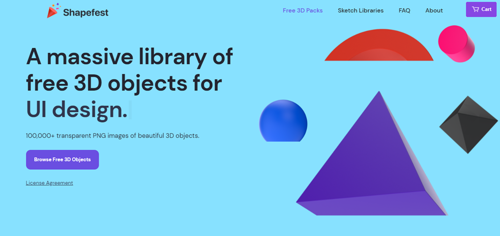
37. Shapefest
This gigantic library of free 3D shapes for designers uses a cool, pale blue background to deliver a sense of calm, relaxation, and inspiration.
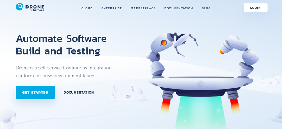
38. Drone
The background of Drone’s website, an integration platform for software developers, is a very light blue shade. Additionally, the calm color scheme conveys trustworthiness, reliability, and security.
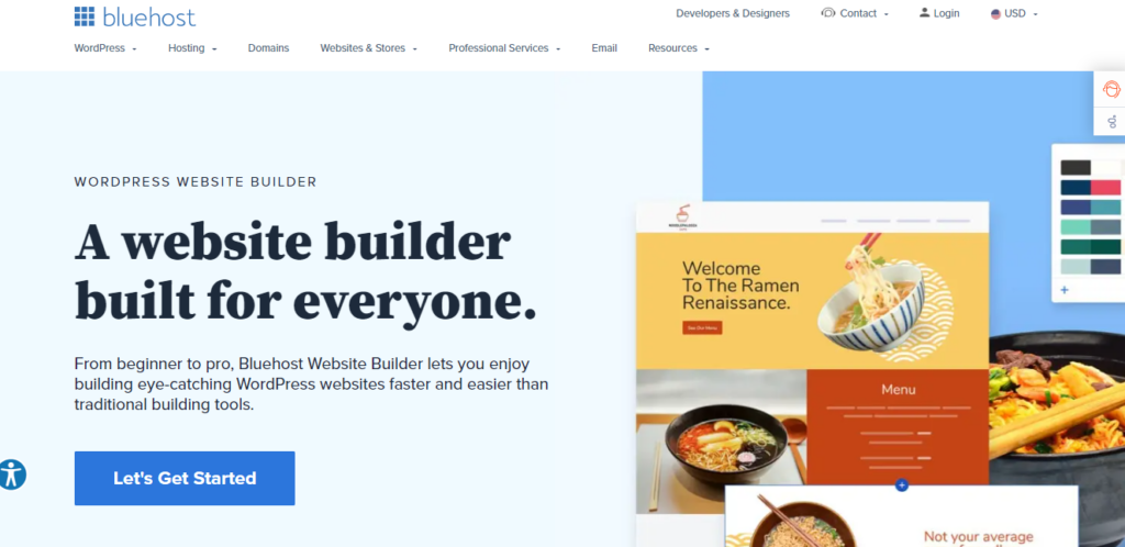
39. Bluehost
If the word “blue” appears in your company name, your website will likely be blue. This web hosting business uses brighter colors to signify reliability, which is crucial for website hosting.
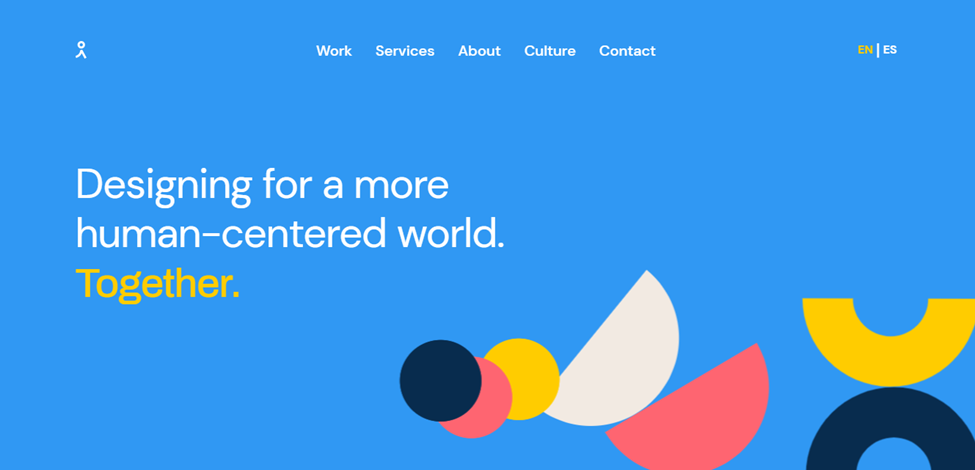
40. Indicius
On their home page, a Carolina blue background with multi-colored graphic accents was used to portray authority and wisdom in their field, as well as dynamism and enjoyment.
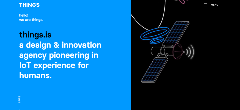
41. Things
Electronics and software companies frequently choose blue for their design. Things are not an exception. Especially, Things brings cutting-edge technology to market, and its website brings wisdom.
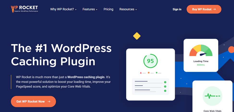
42. WP Rocket
WP Rocket is a performance plugin that will help your website load faster. On the company’s website, the deep navy blue signifies niche authority, while the orange and yellow lines represent speed and energy.
Conclusion
Your website is frequently the first (and sometimes the only) impression your customers will have of your business. As a result, you must get it properly. And it requires careful consideration of the colors you employ in your design.
If you want to depict your company as reliable, trustworthy, productive, and with authority and wisdom, use blue in your website design. You can choose blue website background or a whole blue color website design. The most crucial thing is to get the right color scheme or palette and stick to it across the website. We’re confident that this collection of more than 40 blue-themed websites will inspire your next work.
If you are a Magento merchant and don’t know which extension to build your website, consider Page Builder from Magezon. As a trusted Adobe partner, we have satisfied thousands of customers with a vast collection of drag-and-drop extensions, helping you create a high-converting and unique store in minutes.
Don’t take my words for granted; see how your website can be with Magezon Page Builder and what others say about us:
 Magezon Blog Help Merchants Build Comprehensive eCommerce Websites

