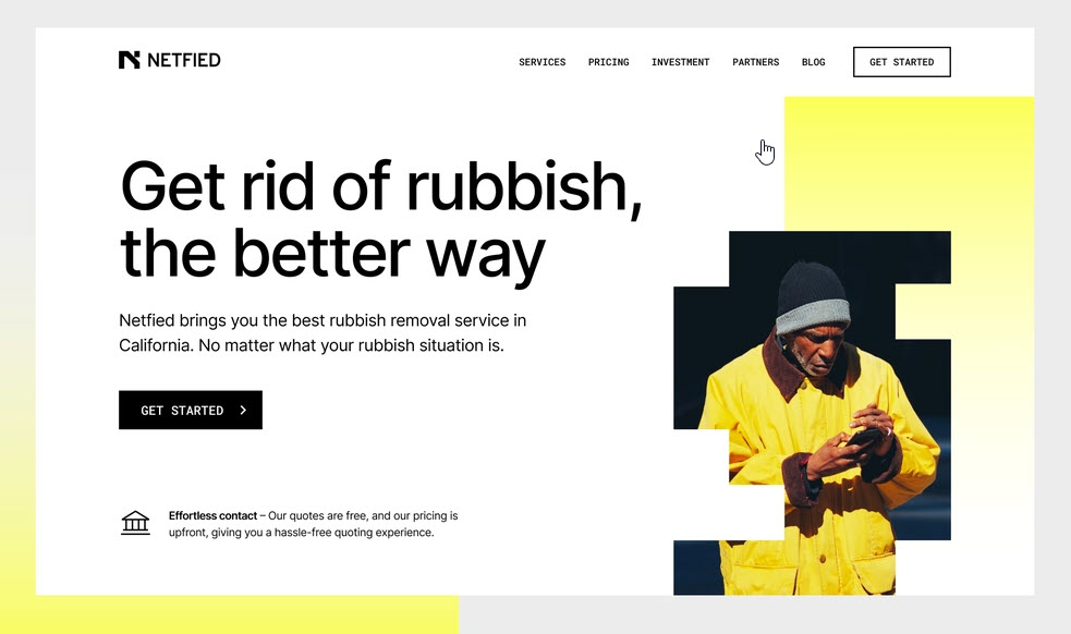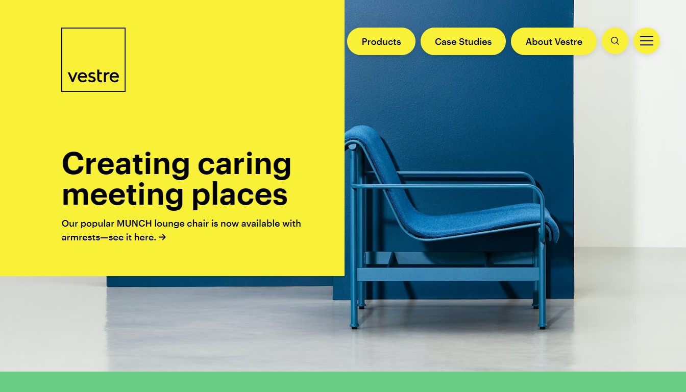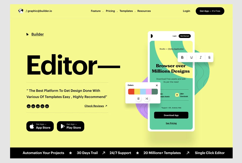
We all know that colors can affect emotions and user reactions. And some specific color palettes are more trendy than others. The vibrant yellow is a good example. Yellow websites always create a cheerful atmosphere, grabbing viewers’ attention at first sight. If you want to learn how to use yellow effectively for your website, our tips can help. We’ll also provide you with different stand-out examples to get some ideas and inspiration. Let’s get started!
Table of contents
Basics of the Yellow Color
1. What Yellow Means
The first yellow color appeared during the Stone Age when ancient people used the yellow ochre pigment to paint their caves. The word ‘yellow’ was first used in AD7000. In ancient Egypt, it presented the color of treasures since it was similar to gold. In China, the Emperors also highly prized it as the color of power.
Nowadays, yellow, especially bright yellow, appears quite often. It’s usually related to safety and visibility. People can see it from far distances, so it’s commonly used in traffic signs, neon signs, clothing for construction workers, etc.
Bright yellow is considered a commanding color. Since it’s the color of the sun, people usually associate it with warmth, energy, hope, happiness, and fun. According to psychologists, yellow brings a feeling of encouragement and optimism. However, it’s not a calming hue, so using too much yellow can lead to frustration and aggression. To build a yellow website, make it manageable and combine it smartly with other schemes for a better impression.
2. How to Use It Effectively
Yellow is vivid, and it is suitable to command attention. With this accent color, your website design can deliver energy and cheerfulness. Many famous brands such as Best Buy, McDonald’s, Subway, and IKEA use this color palette for their logos.
However, the color’s intensity makes it easy to overwhelm. Be careful when you use it in large amounts, as it can irritate people’s eyes. Improperly mixing it with other bright colors also can turn the yellow websites into a disaster with distracting colors and a chaotic look. Bright yellow text is also not a good idea since it’s hard to read.
Besides, there’s another critical association with yellow that you need to be aware of. Many people find yellow childish. Say you’re designing a website for a sophisticated luxury product; it’s best to avoid it. Unless, of course, you go for a golden yellow that implies wealth.
Yellow can be a problem for people who are colorblind as well. It means not everybody can see its stand out and benefit from it.
3. Why Choose Yellow in Web Design
Vibrant Color With a Positive Vibe
Color is an essential element in web design that can psychologically impact humans. A yellow website color scheme brings positive energy and raises the mood of your potential customers. They will likely order, book, or sign up for your services when happy.
Versatile Color
Yellow is versatile as it has many usable and visually appealing shades. The bold yellow is helpful for bright and eye-catching designs, while pastel yellow is suitable for muted and subtle themes. You can also combine it with other colors to make a great design. The growing popularity of a black and yellow website shows the effectiveness of the color combos.
Ranges of Applications
Normally, you will see various shades of color applied to different elements or sections in yellow websites, including yellow typography, picture frames, etc. You can set it as the primary color theme for the website or use it to direct user attention to the key features. Flexibility in its usage allows you to create a yellow website design that reflects your brand identity.
Common Combination With Color
You can match yellow with the shades of purple as Vicent Van Gogh did in his paintings; use the classic pair of blue and yellow in the color wheel, and make the color stand out while standing next to pure white and black, soften it by adding gray.
Below is the list of some complementary colors for your choice:
- Blue/ Navy blue
- Purple/ Lavender/ Indigo/ Violet
- Black
- White
- Gray
Besides the popular bright yellow, different hues also can help you have a tremendous yellow website color scheme, including:
- Yellow
- Yellow-green
- Gold
- Freesia
- Pastel yellow
- Amber

Try FREE Magezon Page Builder
Easily create your engaging Magento pages in any style whenever you want without relying on developers or designers, just by drag & drop.
15+ Best Yellow Websites to Get Inspired
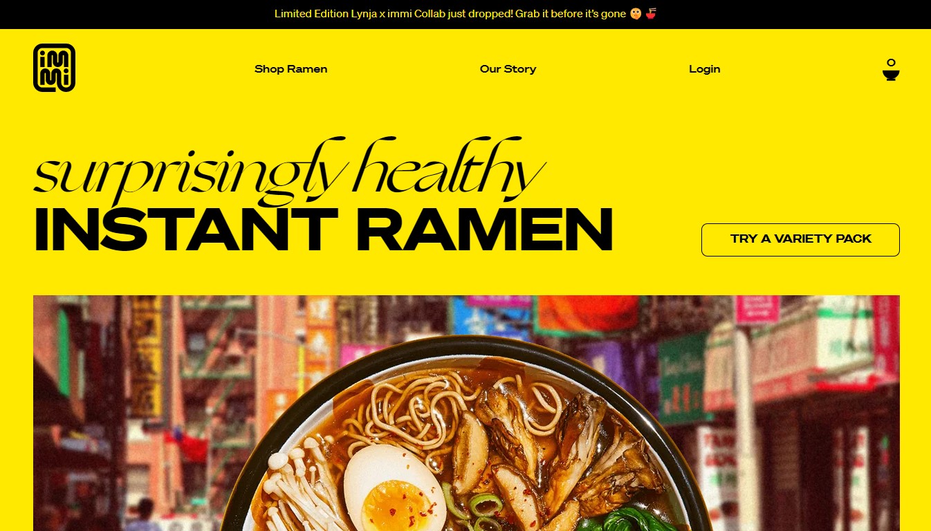
1. Immi
Immi is one of the best food websites successfully implementing yellow color. The color creates the feeling of carving, and their product Ramen is what customers need. They also use different typography (one actually looks like noodles) in black color to highlight information and navigate users.

2. Lipton
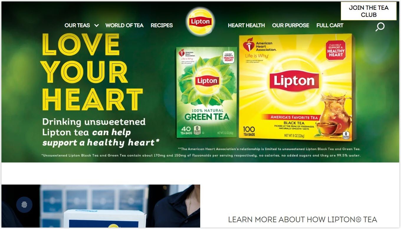
Lipton creates great harmony of green and yellow, the color of their green tea product, and the yellow logo. Entering the website, you’ll be attracted by the picture of the yellow tea package, yet feeling fresh and soothing to the eyes.

3. Hertz
Another excellent example of a yellow website where yellow is used just enough to direct customers to take the desired action is Hertz. Other natural shades of yellow are also applied, bringing the feeling of freshness, energy, and exploration, which is very suitable for a car hire website.


4. McDonald’s
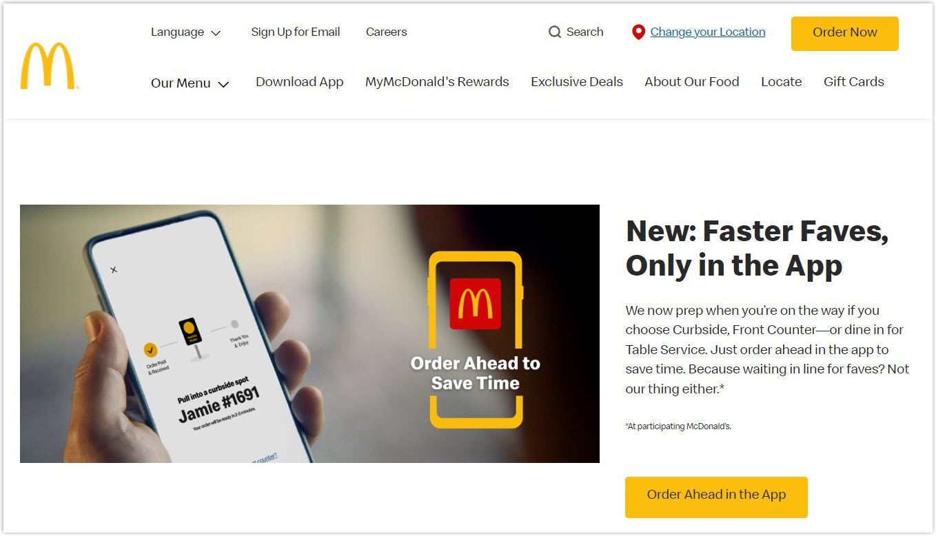
McDonald’s puts yellow patterns totally prominent on the website in the perfect combination with white and black colors. They’ve successfully offered a yellow call-to-action section, drawing users’ attention and motivating them to click.

5. Kenn & Kitt
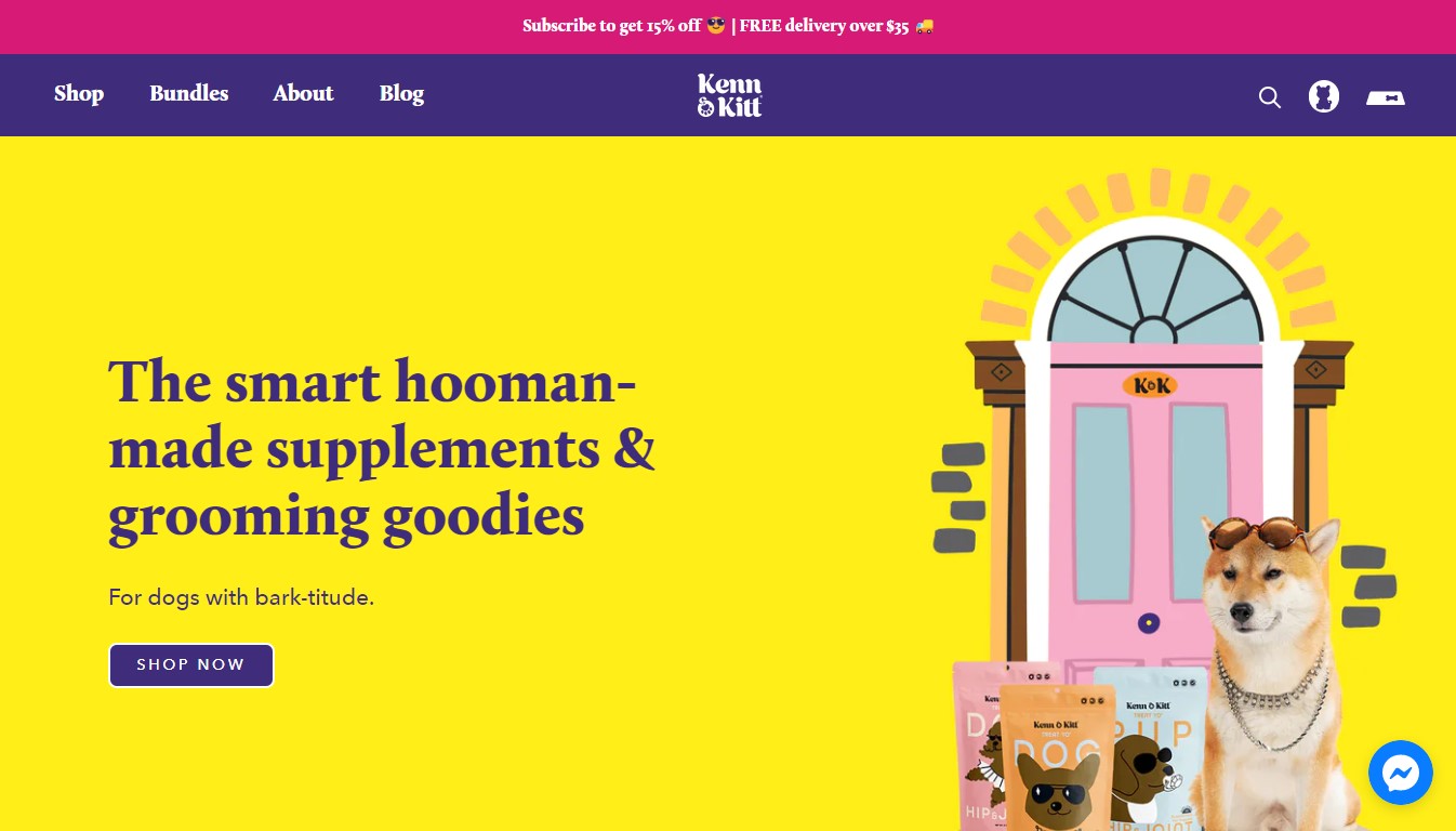
Bright yellow super fits pet websites, and Kenn & Kitt is a good example. The whole theme of the page generates a positive and happy feeling of having a pet. They also apply blue and purple, making the site more colorful and lively.

6. Ritual
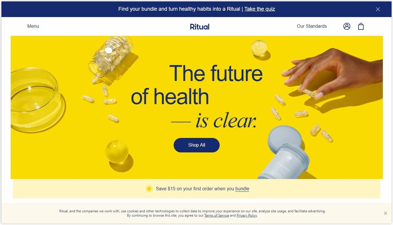
Ritual is a good showcase of blue and yellow websites. Yellow gives you a positive feeling of a healthy life, and blue engages you with trust.

7. Omsom
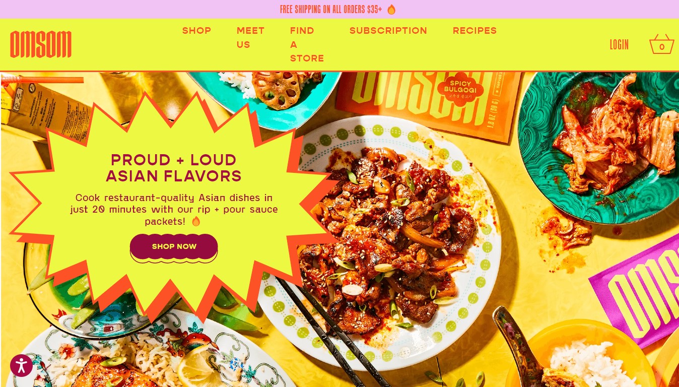
If you’re looking for a purple and yellow website for your reference, take a look at Omsom. It’s one of the restaurant websites designed with yellow themes and purple text, striking users’ attention and growing their appetite.

8. Kodak
Kodak matches yellow and black to indicate their tough products, serious business, and entrusted service. Their page shows a high level of professionalism.


9. Scoot
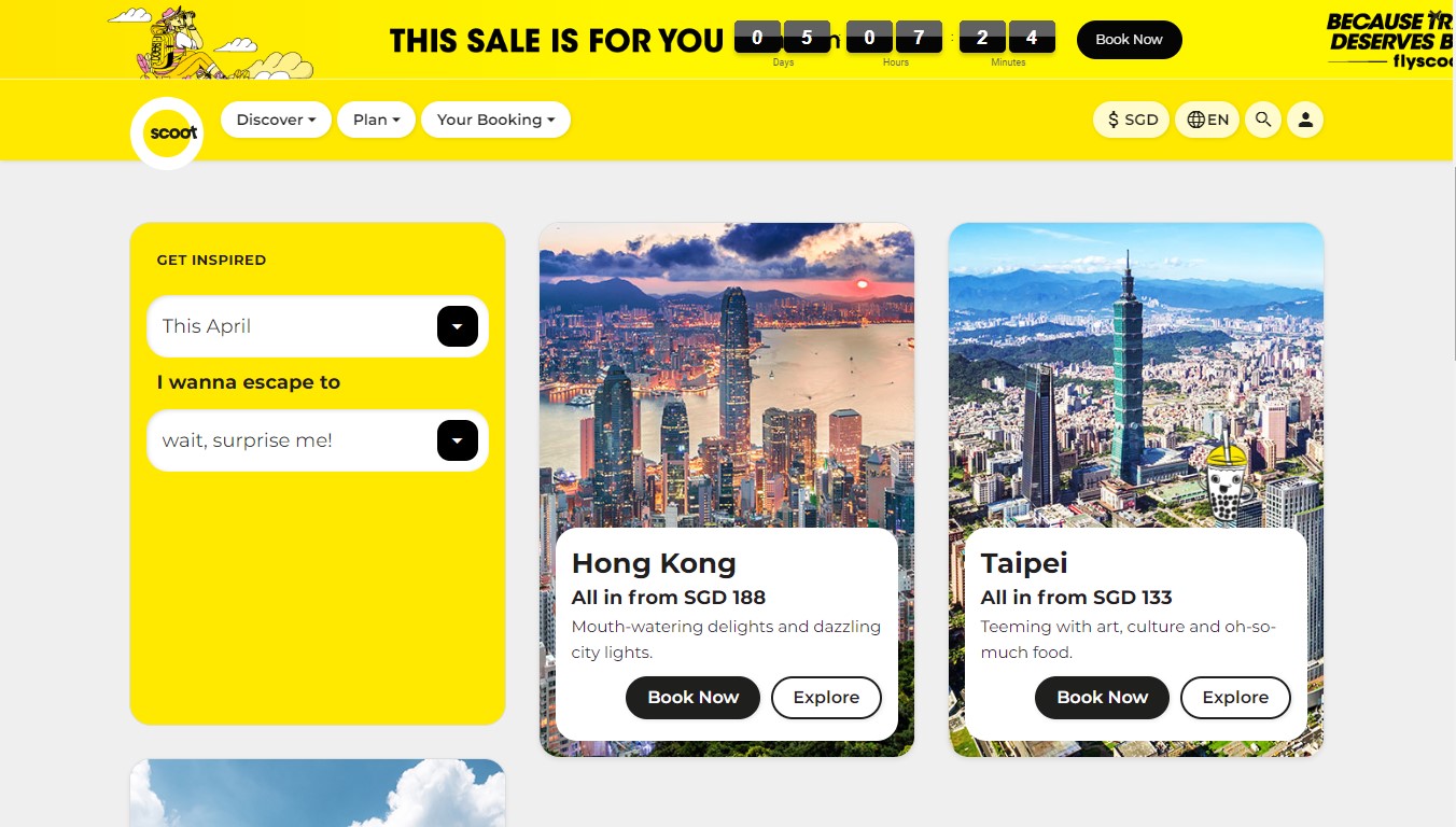
Scoot is one of the yellow websites that can inspire you. Its design brings youngness and energy and encourages people who hold the traveling spirit to travel to enjoy their lives.


Try FREE Magezon Page Builder
Easily create your engaging Magento pages in any style whenever you want without relying on developers or designers, just by drag & drop.
10. Dogs Trust
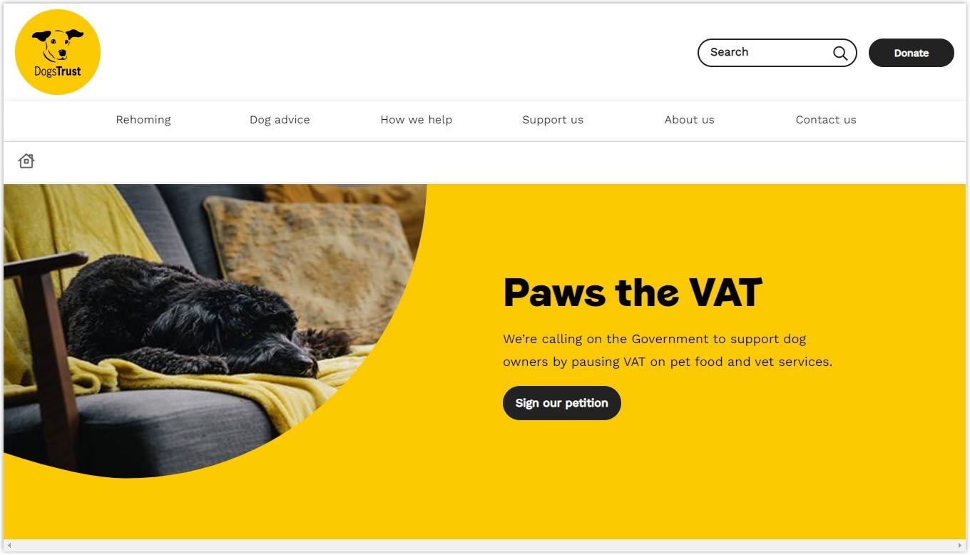
Unlike the fun and cute Kenn & Kitt creates, Dogs Trusts gives users a rare calmness and shows mature caring. It matches well with their purpose to save the lives of dogs.

11. The AA
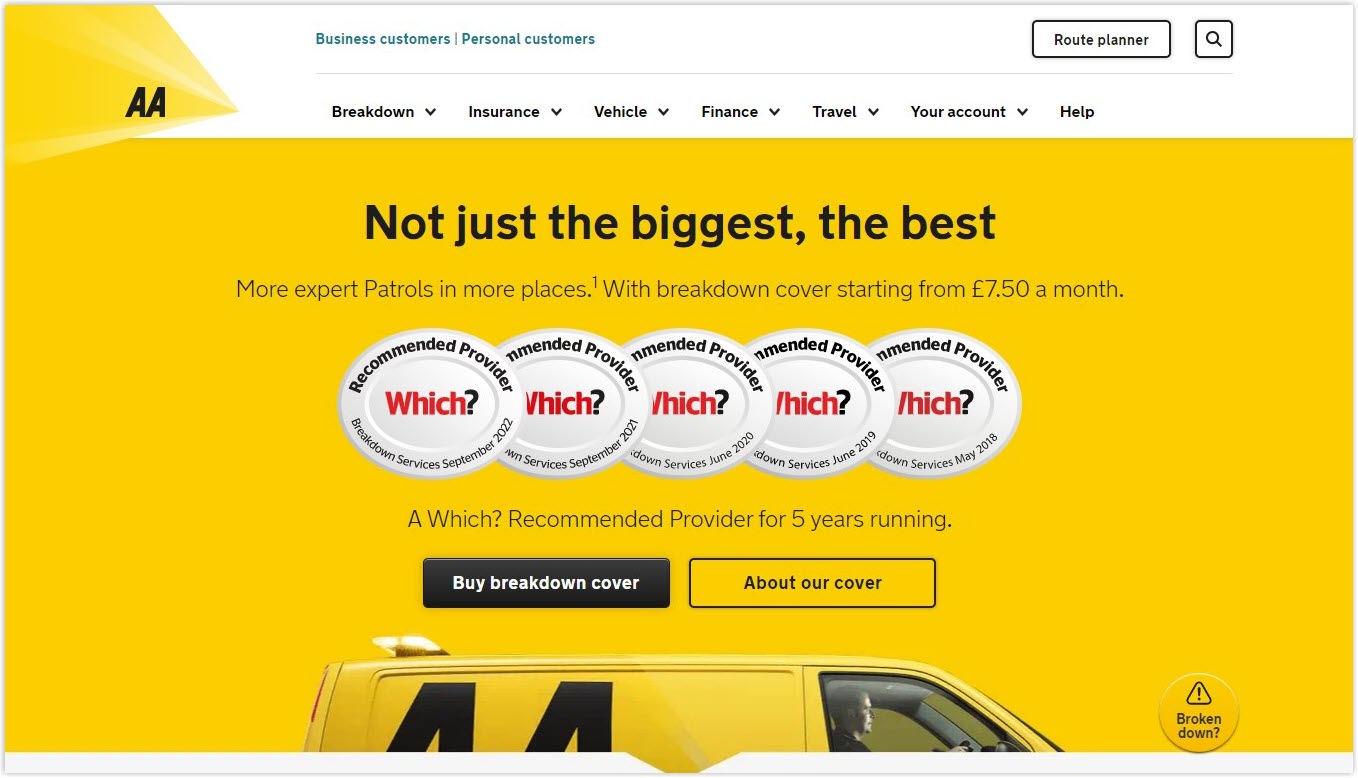
The energetic AA website plays around with yellow, black, white, and highlighted red, giving the users a little rush. When clicking on the site, they will likely feel they must act fast to get a good deal.

12. Old El Paso
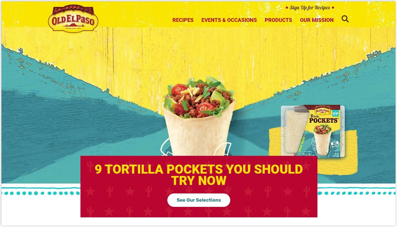
Old El Paso owns one of the best color palettes for websites when putting different yellows, blues, pinks, and reds together. It does not look messy, yet enhances your taste buds. You can’t help grabbing one of their tortillas.

13. Cheerios
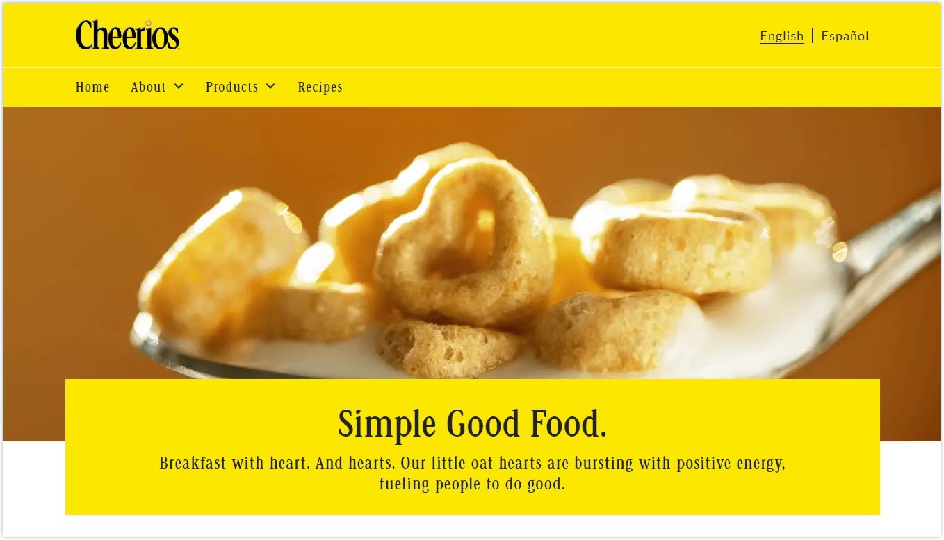
The site softens the vibrant yellow with a soft brown color. It’s such a pleasant and nourishing feeling when visiting the site. Cheerios make it one of the best yellow websites in its simple way.

14. Banky
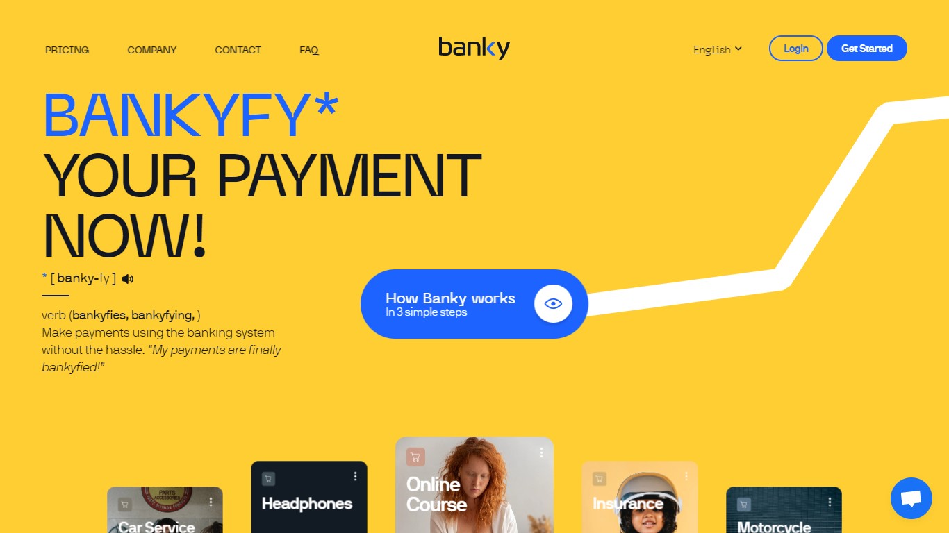
The classic combination of blue and yellow is implemented smartly on Banky. It creates trust among users and encourages them to take action to use the services.

15. Moscot
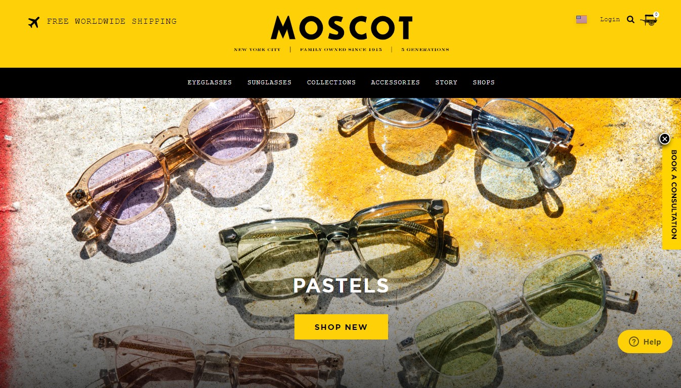
Combo of black and yellow offers Moscot a mature, serious, and trustable look. It matches their product: the glasses of fashion and intellectuals.

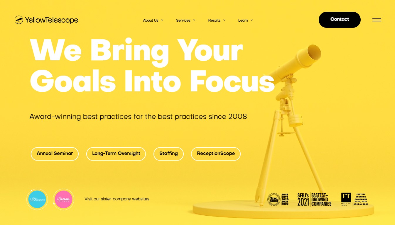
16. Yellow Telescope
Yellow Telescope stands out among yellow websites using pastel yellow with black and white colors. It brings a little dreamy feeling, like you’re watching the stars in the sky, yet with proper and serious equipment.

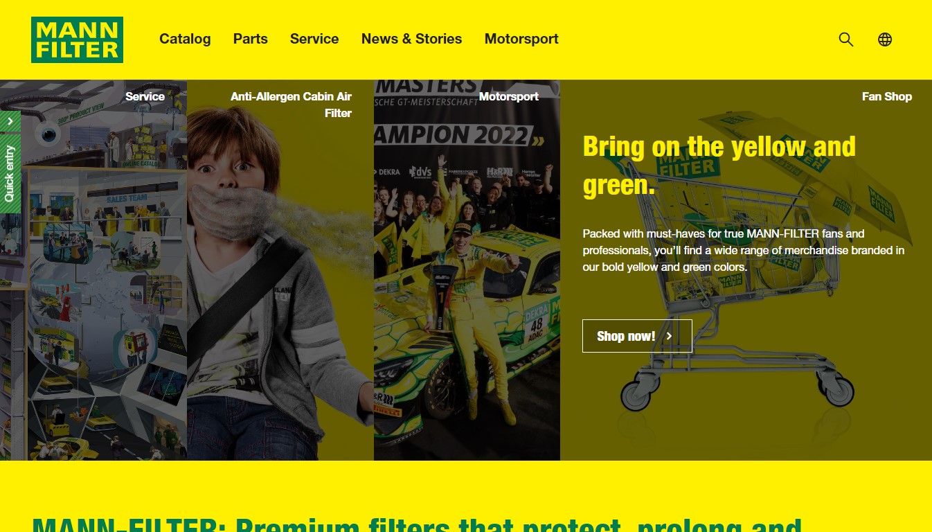
17. Mann Filter
Mann Filter shows their design level by combining yellow themes with green highlights, urging people to purchase quickly. It also gives shoppers the feeling that their products are green and clean.

Wrapping Up
Yellow websites are usually eye-catching, energetic, and positive. It brings users feelings of happiness, warmth, and encouragement. You can use the color to create an inviting atmosphere, draw attention, make your site stand out, and ultimately motivate potential customers to take action. However, be wise when applying shades of yellow for different factors or combining them with other colors. Otherwise, you’ll create a website that is hard to follow and bothers the eyes.
If you are a Magento merchant and don’t know which extension to build your yellow website, consider Page Builder from Magezon. As a trusted Adobe partner, we have satisfied thousands of customers with a vast collection of drag-and-drop extensions, helping you create a high-converting and unique store in minutes.
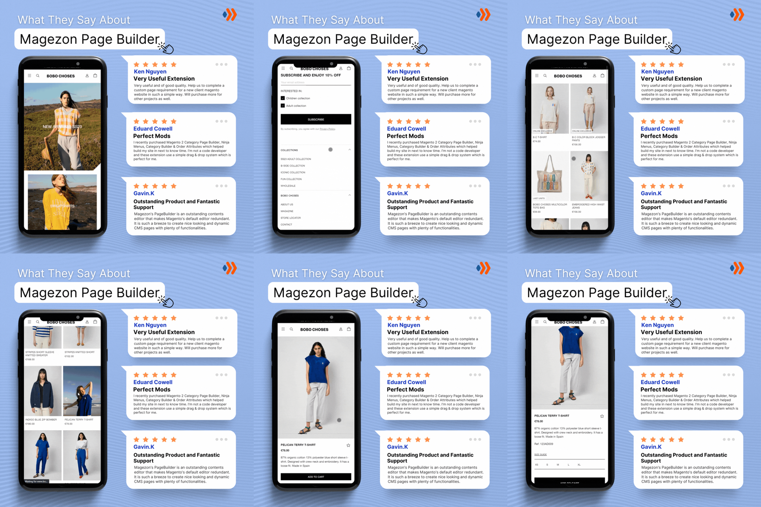
Don’t take my words for granted; see how your website can be with Magezon Page Builder and what others say about us:
 Magezon Blog Help Merchants Build Comprehensive eCommerce Websites

