A well-organized product category page design is essential in your online business as it benefits visitors in finding their desired items quickly, helps raise your ranking, and generates higher conversion rates. This article will provide helpful information such as when to use, what should be included, and some best practices to create or improve your PCP in e-commerce and boost your sales.
Let’s get started!
Table of contents
What Is a Product Category Page?
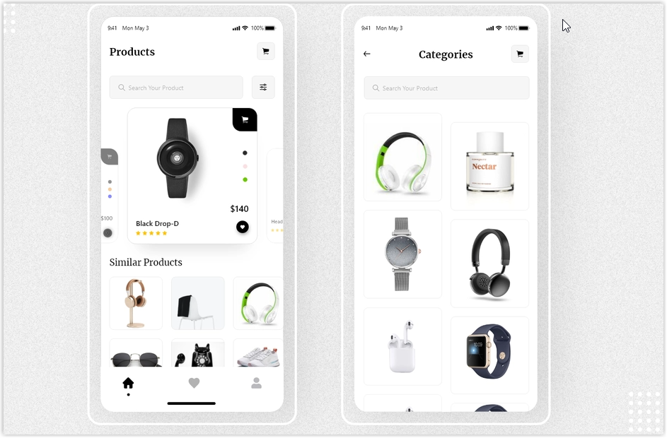
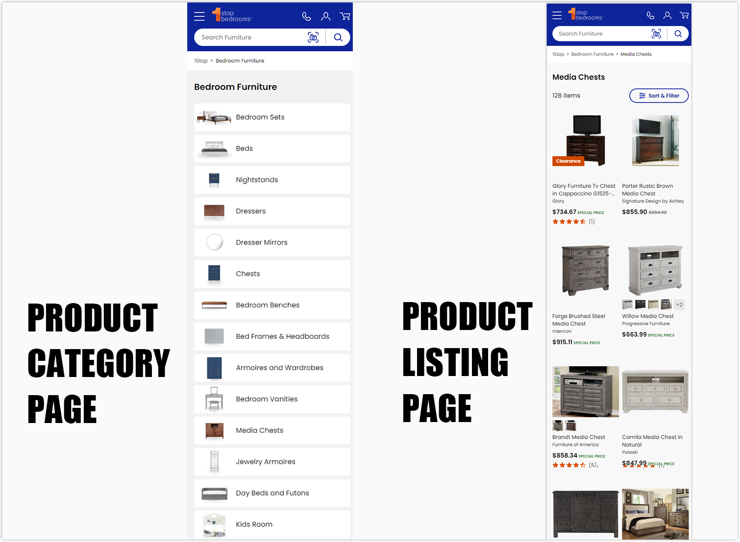
A product category page (PCP) is a part of a site hierarchy. It usually comes before the product listing pages and works as a homepage for groups of products. Some items (not the whole list) will be displayed and linked to subcategories so visitors can easily access their desired sections and products.
How Is It Different From the Product Listing Page?
While the PCP acts like a topic page for different product groups, the product listing page displays items based on a specific category or applied search filters. It will bring users to the product detail pages with more detailed information and an add-to-cart option.
PCP can be considered as an intermediary step before visitors reach PLP. However, product listing pages can also be referred to as eCommerce category pages when it’s not necessary for the brand to apply website category page design.
When to Use a Product Category Page
E-commerce category pages are suitable if you have complex product collections and want to educate them to potential customers. Once they understand more about your items, they can have a smooth-going filtering and comparing process. Your website may contain some category pages for specific products but not all since it depends on the types and complexity of the items.
Explaining Complex Products
E-commerce PCP gives browsers a general understanding of your items. It has an educational role in explaining different types of products and their relevant features. Thus, visitors know more about what they want to learn than random clicks.
Direction to Subcategories
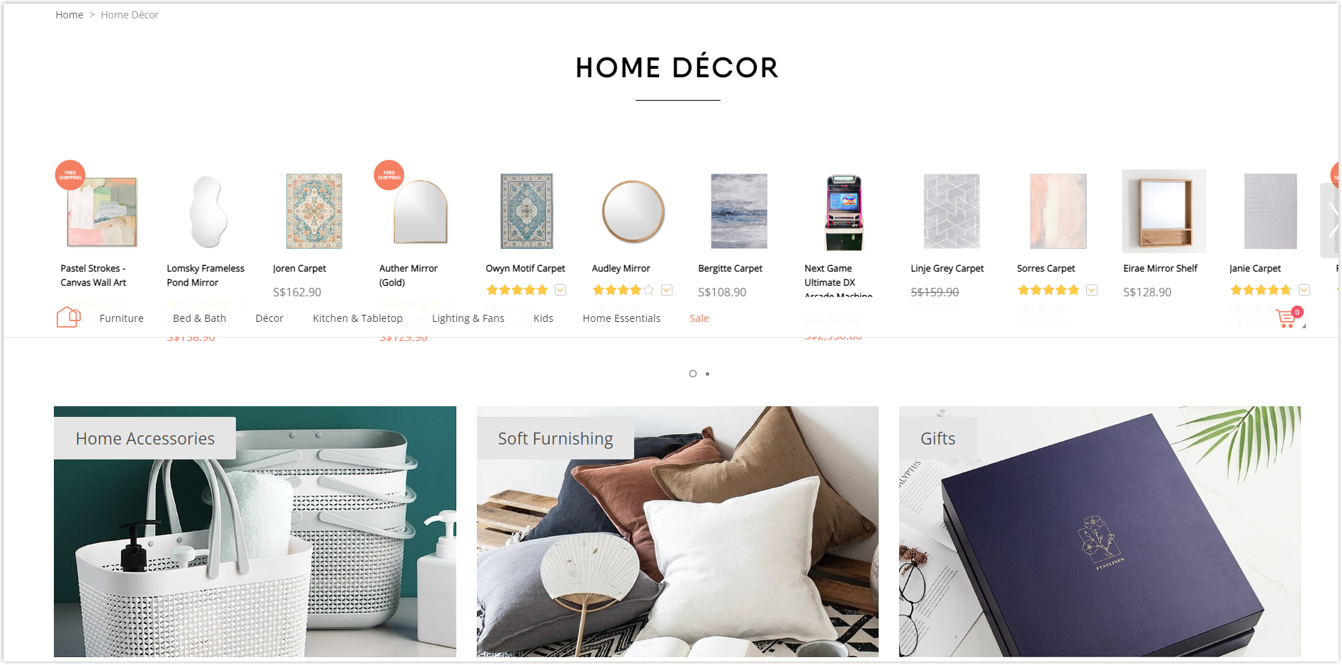
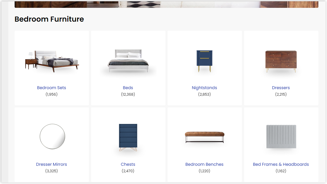
Users may not need education for commodities they’re familiar with, such as food and clothes. However, you still can benefit your vast-inventory site with a PCP. It’s even better if your subcategories are shown by images, as shoppers can quickly scan through them and know what you want to present. Image subcategories are also helpful for foreign visitors as they can’t read the text on the list of labels.

Try FREE Magezon Page Builder!
Easily create your engaging Magento pages in any style whenever you want without relying on developers or designers, just by drag & drop.
What Should Be Included in the Product Category Page Design?
Features Banners
Featured banners are beneficial if you are promoting a specific category. Or if you want to draw attention to meaningful news. They are typically placed above the fold, below the top navigation level, and above the category grid. However, you can customize the banner placement to match your category page.
The best thing about banners is adding a call-to-action button, like the below HP example. That way, you can drive more traffic to your deals. If you want to get high engagement from your banner, make sure it’s relevant to the category your users are browsing so that your ad really speaks to them.
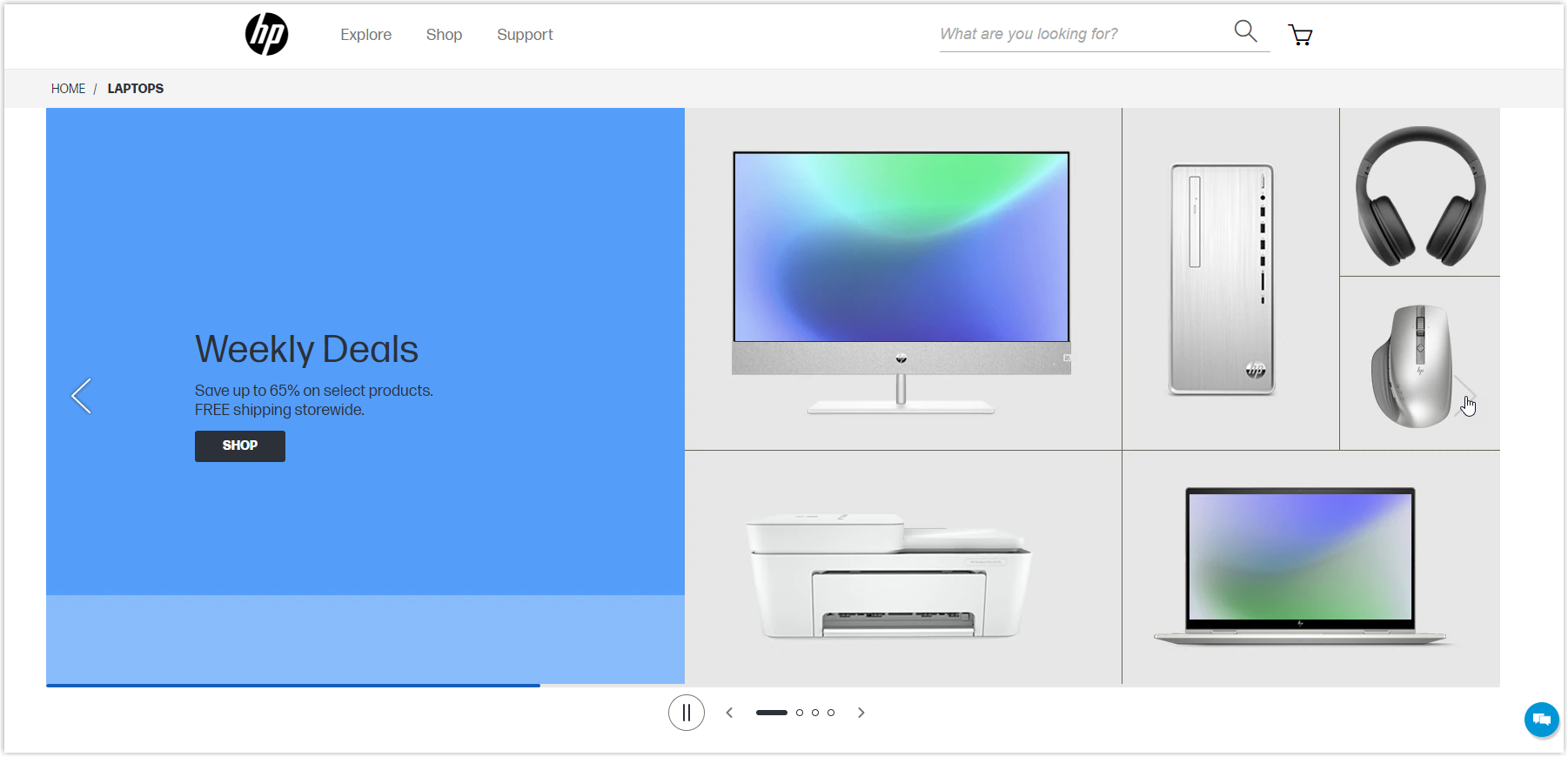
Besides highlighting your offers, banners add visual appeal to your category pages. Even if you’re not promoting it, you can use compelling product photography to appear in your subcategory and encourage visitors to continue browsing.
Product Category Name
Depending on your website’s niche, the name for each product category can vary. However, to help visitors quickly understand what you offer and your results appear on search engines, it’s preferred to call them by familiar names. Remember, esoteric or brand names are not recommended.
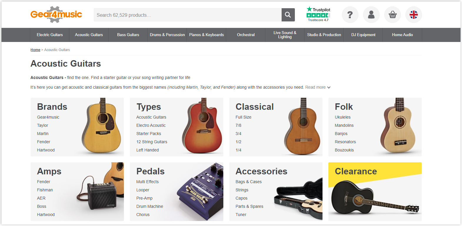
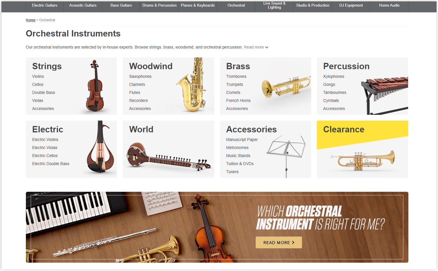
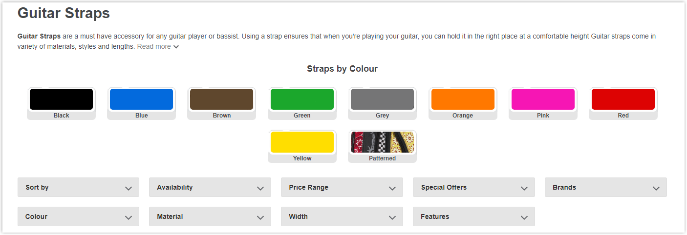
For example, to easily guide visitors through an online guitar shop and help them reach the desired items, category names for a guitar shop like Gear4music should be Classic, Folk, Acoustic, and Accessories, but not something like ‘Rock star guitars.’
Category Image
E-commerce category pages usually include generic, simple, and apparent images. They should have size consistency, yet at the same time, one should be different from another. It’s also better not to choose brand photos or not to present any particular brand features. Again, choose something general but stand out.
Feature Items or Top Categories
This is another way to differentiate your categories if you don’t want a consistent layout for your category pages.
For example, if you own a clothing store, you might still see categories such as gender, type, season, etc. But in addition to that, offer the best-selling items from one or two categories to drive even more sales. It can be stretched.
In the example of Kohls’, the main categories are displayed at the top, with “New arrival” items below. People who want to find new items can choose to click on them. Another exciting thing is that Kohl’s uses multiple banners throughout the page to highlight their prominent collections and unique points.

Category Description
We recommend using category names that your audience is familiar with rather than the vague creative, or internal terms used in your business. Familiar labels not only help your customers understand your category, but they also help you rank on Google.
Visitors may also need additional assistance to understand the category if the product is complex, relatively unfamiliar, or requires customer explanation. In such cases, it makes sense to have a more detailed product or category description.
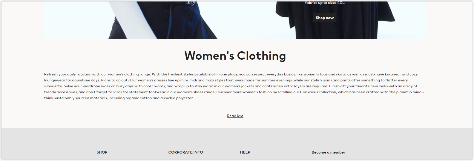
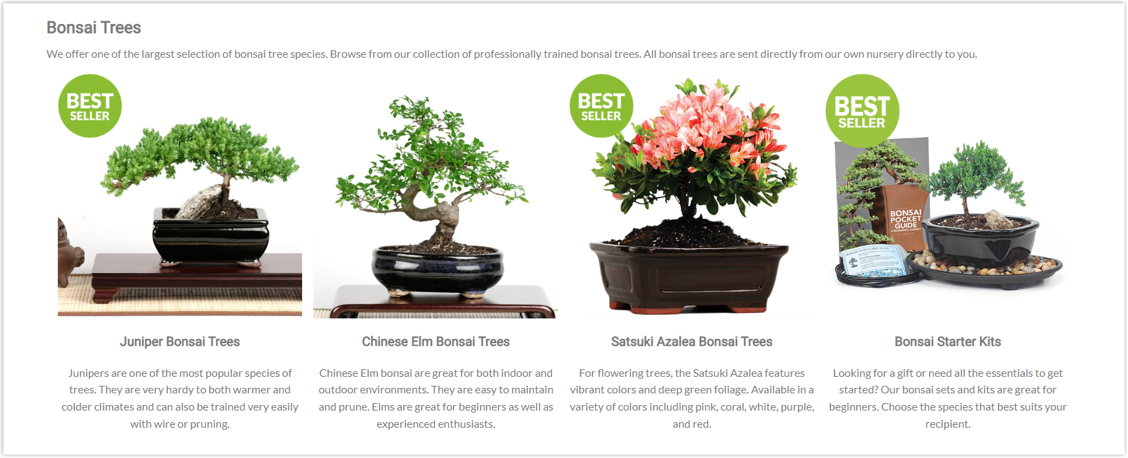
Easternleaf.com sells Southeast Asian herbs and plants that are hard to find in the West. Due to a lack of inventory, customers are often unsure of what they want to purchase. Hence, the site provides concise and helpful descriptions of all categories to help customers understand the type of product they are browsing. I’m here.
For example, Eastern Leaf not only explains what plants are but also the types of plants (easy and complex) and the types of climates they can survive in. With this information, customers can filter out their interests on category pages and end up on product pages that are relevant to them. This makes customer navigation easier and improves EasternLeaf’s click-through rate.
19 Best Practices for an Impressive Product Category Page Design
Content
1. Include valuable information in your eCommerce category pages
Smartly input informational assets when you work with the product category page design. It offers valuable content to your users and provides contextual information for Google. You can add a clickable banner on your site to direct visitors to the desired content and lead them to the purchase funnel.
2. Use the end-of-page content block to give additional context
You can leverage the end-page content blocks to make your PCP impressive and effective by providing further context that helps raise your website’s rank on the search engine while educating your users.
CRO
CRO or Conversion Rate Optimization includes website optimization, landing page optimization (LPO), marketing optimization, customer experience (CX), optimization and testing, growth hacking, usability (UX), or marketing experimentation. People focus on CRO as it is a valuable tool to direct customers to make desired shopping decisions. An effective CRO means a growth in the number of visitors and sale conversion.
Let’s see how to apply CRO best practices in your category page design!
3. Nail your filtering function
You should ensure a practical and complete searching functionality that brings correct results.
4. Simplify the language
It’s not a good idea when you have a product category page design written in academic language with lots of complicated words. It can become a barrier for users to continue shopping in your store. Make sure you simplify the terminologies, so even a 9 grader can read and understand your description.
5. Display one item per the main category
Simplifying navigation can bring a better user experience and, perhaps, more revenue.
6. Use browse abandonment automation
Browse abandonment means users stop visiting your site and add no item to the cart. It is as crucial as cart abandonment, yet not many online store owners focus on it. More than 90% of the lost visitors are due to browsing abandonment. A cutting-edge eCommerce marketing automation platform can be an excellent solution to improve the situation since it can help you bring back visitors and drive conversion.
UX
A seamless UX or user experience guarantees positive interactions between visitors and your brand through the webpage, mobile site, and apps. Below are some best practices you can apply for your category page design.
7. Use a maximum of seven parent categories
Having too many complicated parent categories can overwhelm your users and cause confusion. Thus, go for a clear and specific separation, and avoid using terminologies (or replace them with the more common ones instead).
8. Focus on website designs
A simple and straightforward web design can improve your user experience. You should know your target audience, then design your page logically by putting all elements in a visual hierarchy and highlighting the important ones.
9. Build a brief category landing page design
Statistics show that only 20% of people read every word of content, while almost 80% prefer to scan. Therefore, presenting a brief and to-the-point category landing page design plays an important role. Ensure your paragraphs are not longer than 3-4 lines and include a descriptive subhead between 2 sections.

Try FREE Magezon Page Builder!
Easily create your engaging Magento pages in any style whenever you want without relying on developers or designers, just by drag & drop.
SEO
The product category page design combined with SEO helps your brand grow conversion. There are several elements listed below that you should pay attention to.
10. Ensure a decent loading speed
Besides an appealing category page design, you must ensure that your visitors don’t need to wait long when loading your page and your website has a higher rank on Google. So, don’t let the waiting time be more than 5 seconds.
11. Build an effective site hierarchy
There’s a rule called the 3-clicks away, meaning shoppers should be able to find any information they need within 3 clicks. You can apply this rule to your website category page design by creating an effective site hierarchy. To do so, you can add one to two levels of subcategories below the main categories. Remember, make sure the lower levels deliver more specific information.
12. Optimize keywords
There are two things related to keywords you should do for your category page design. Firstly, add the relevant keywords to the categories. Secondly, long-tail keywords are ideal options to offer a chance for your page to be found by the search engine since some short ones are hot with high competition.
13. Write category descriptions using related keywords
Include related keywords when you write descriptions for categories. Using any known SEO tool can quickly help you with this job. However, you can also create your eCommerce category page design with excellent and free tools such as Google’s autocomplete functionality.
14. Include internal links
Placing the internal links to your subcategories right in the parent categories’ description is helpful for your brand and shoppers. This tip assists visitors in visiting the page they want without moving the mouse too far, and it’s proven to boost your seasonal campaigns for some time.
Mobile Responsive
Mobile UX optimization is necessary when building your UX and boosting your conversion. Below are some best practices you’ll definitely need.
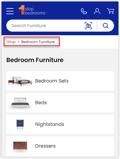
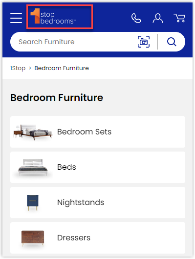
15. Make the breadcrumbs visible
Breadcrumbs are a series of connected pieces of information. Since you want to make sure they link and deliver the correct messages, present them clearly to your users.
16. Ensure brand visibility
Despite the small screen, your product category page design on mobiles should include your company’s logo to identify your brand.
17. Pay attention to your loading speed
It doesn’t matter what devices visitors use to browse your PCP; the loading speed can not be too slow. The ideal speed on a mobile connection is 1-2 seconds. Site-visit abandonment is likely to happen if it takes longer than 3 seconds.
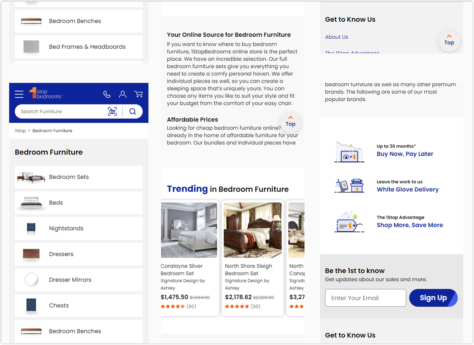
18. Optimize mobile category page design
To have a proper category page, adjusting the layout is necessary. Each component needs to fit the mobile screen; so that users have no difficulty viewing and navigating.
19. Apply an appropriate scrolling option (when you combine the category page with the product listing page)
The infinite scroll can sometimes be helpful for your product category page design. However, to compare its influence with the paginated version, you may need to use a screen-capturing tool. Make sure you know which one is more beneficial for your brand.

Try FREE Magezon Page Builder!
Easily create your engaging Magento pages in any style whenever you want without relying on developers or designers, just by drag & drop.
Lowes’ Product Category Page Example and Why It Works
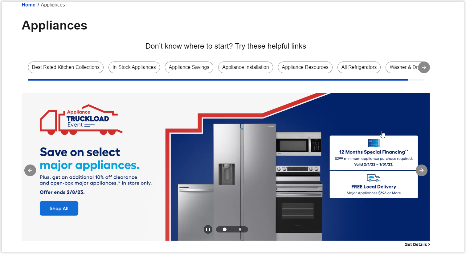
If you are looking for design inspiration, I’ll help you analyze the Appliances category page from Lowes. This is a worth learning case study to optimize yours.
The page starts with eye-catching and appealing banners of the most recent discount campaigns. An innovative strategy to impress visitors and encourage them to scroll down more to discover.
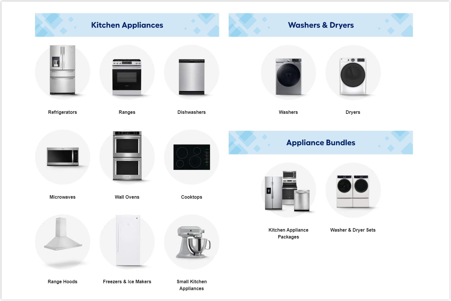
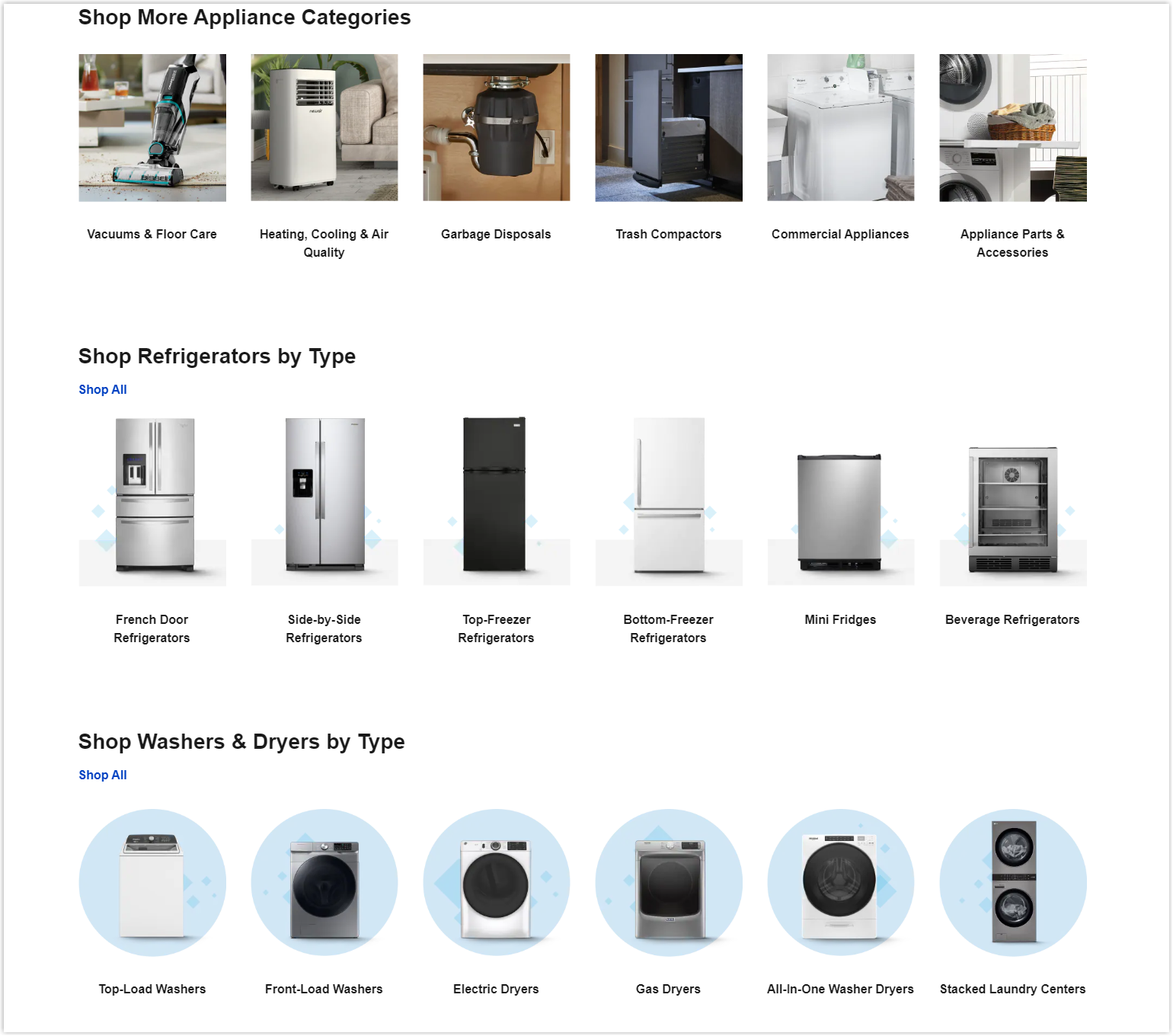
More sub-categories are displayed in the following sections and in different arrangements. The neat and clean appearance makes it easier for users to navigate and find what they need.
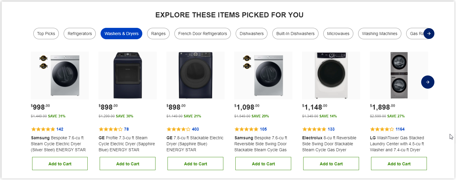
Lowes also includes top-picked products for each sub-category and related items to save shoppers time and increase cross-sales.
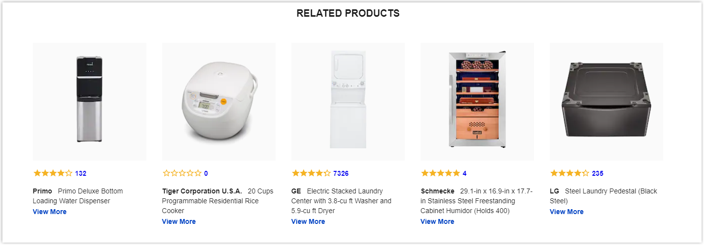
Remember to add some of the unique benefits you can offer your shoppers, such as Free delivery or Insurance like Lowes does. This intelligent method creates trust and the first significant impression for users while motivating them to buy your products.

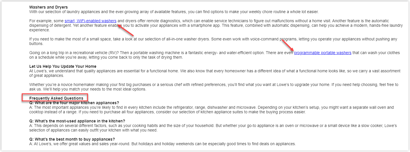
The last thing that strikes me is how they put their effort into writing content at the end of the page. The description is clear and adequate, thanks to all the internal links and necessary keywords so that visitors can immediately catch their message. Lowes also adds frequently asked questions in case their shoppers want to know more.
It’s Time to Build Your Stunning Product Category Page
I believe you already have what you need to create an impressive and effective product category page from all the information I’ve provided above. Having a polished website is the shortest and easiest way to get your brand carved in customers’ minds, so every effort will be worthwhile.
If you’re a Magento store owner planning to build an impressive and high-converting category page on your own, consider Magento 2 Category Page Builder from Magezon, an Adobe trusted partner. With a user-friendly drag-and-drop interface and diverse powerful features, you can easily design or redesign any style whenever you want without relying on developers or designers.
More Magento extensions are also available to create all necessary pages and elements for your website. Don’t worry if you’re not that good with coding because these extensions are the solution.
 Magezon Blog Help Merchants Build Comprehensive eCommerce Websites

