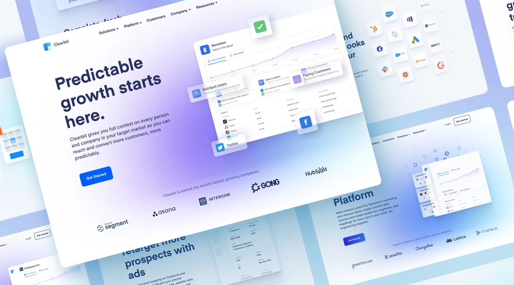
The effectiveness of your PPC campaign greatly depends on the quality of your landing page. But how can you make a paid search landing page that is perfectly optimized? In this post, we’ll share 25+ PPC landing page best practices to increase conversions.
First, we’ll talk about why you need a PPC landing page, and then we’ll look at some of its best practices. So, let’s go!
Table of contents
What Is a PPC Landing Page?
When visitors click on a paid landing page, they are sent to a specially designed web page called a PPC landing page.
A landing page for PPC, like other landing pages, has the same objective: to encourage visitors to convert, whether that be by subscribing to a newsletter, signing up for an event, or making a purchase.
Why Do You Need a PPC Landing Page?
Creating a unique landing page for PPC requires more work than just sending your paid traffic to an existing webpage. But in almost every case, creating a special landing page is worth your time. Let me explain why:
Increase Conversion Rates
Dedicated landing pages often have substantially greater conversion rates than generic sites. For example, according to Leadpages’s research, a lead magnet placed on a specific landing page will usually result in a conversion rate of between 8% and 20%, as opposed to between 1% and 3% when placed on a homepage.
It is clear why this is the case. A dedicated landing page’s only function is elaborating on the message that compelled the visitor to click on the PPC ad. It serves as an advertisement’s extension. Additionally, unlike a “normal” web page, a PPC landing page is focused on encouraging the visitor to convert rather than include any irrelevant distractions (such as a navigation bar or links to other material on the site).
Your campaign will be jeopardized by losing key leads if you direct your sponsored visitors to a generic page (or a PPC landing page with a bad design). First impressions count for a lot, so if a prospective lead arrives on a page that’s awkward, unclear, or loosely linked to the advertisement they clicked on, they’ll probably click away without thinking twice.
Improve Google Ads Quality Score
Making excellent landing pages for your PPC ads also significantly improves your Google Ads Quality Score.
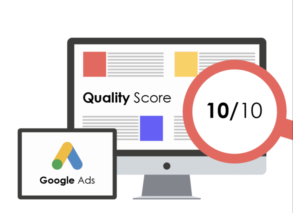
The Quality Score is a measure that shows how well your ad performs compared to your rivals for a specific term. Notably, the lower your cost-per-click (CPC), the higher your Quality Score will be.
One of the three elements Google considers when calculating your Quality Score is the landing page experience. Therefore, the greater your score, the more relevant your landing page is to your advertisement.
Simply said, a PPC landing page optimization may lower the cost per click that you spend.
Try FREE Magezon Page Builder!
Easily create your engaging Magento pages in any style whenever you want without relying on developers or designers, just by drag & drop.
25+ PPC Landing Page Best Practices
1. Fast
Your site’s speed is important. When was the last time you enjoyed waiting online for something?
The moment a loading screen displays, most of us experience irritation. One of the best PPC landing page practices is to make it quick since slow loading speeds result in high bounce rates and little time spent on your sites.
According to Google’s research, sites that take three seconds to load have a bounce rate 32% greater than those that load in only one second. What about those who bounce? They’re not purchasing.
How to begin:
To evaluate your PPC landing pages’ loading speed and see recommendations for improvement, go to Google’s PageSpeed Insights.
2. Use the Advertisement as a Guide
The transition between seeing your advertisement and clicking on it should be effortless. Your landing page should be as relevant to the ad as possible to make sense in context. One of the factors Google takes into account when determining the Quality Score of your campaign is relevance.
Additionally, you want your audience to understand the meaning of the “pre-” and “post-” click experiences. For example, they will get puzzled if they click on an advertisement for a purpose that disappears or isn’t immediately apparent on the landing page.
The easiest approach to do this is to maintain consistency in your message that is guided by the advertisement.
How to begin:
- Think about utilizing comparable titles on the landing page and advertisement.
- Put your attention on a selling point (USP).
- Consistency is key when using any images (similar feel and colors).
- Make sure the landing page displays all of the arguments made in the advertisement.
3. Use a Single PPC Landing Page for Each Ad
Gathering specific campaign data and plan optimization without guesswork are two ways to raise landing page conversion rates. Collecting and analyzing data is easier with just one PPC landing page per advertisement.
If you have many advertisements leading to a single landing page, it will be difficult for you to discern. Are the positive or negative results from the ad or the landing page? Which elements of each have contributed?
Assessing what needs to be fixed is simpler when there is just one PPC landing page per advertisement.
By following this PPC landing page best practice, you can maintain the relevance of your landing page and ad combinations. Even though the three advertisements are comparable, if there is just one landing page, it cannot be appropriately designed to maximize conversions from each.
How to begin: Although you may customize each landing page to improve the ad performance it’s partnered with, it’s OK to start modest. If your advertising presently goes to the same landing page, replicate it so that each ad directs to a unique page. Then, make modest adjustments to the headline, benefits language, and call-to-action to match each page’s ad.
4. Match the Intent of Your Target
Success in a PPC campaign primarily hinges on how well you can match the intent of your target. If you’ve ever developed a sponsored search campaign, you know that keywords represent intent.

You must choose keywords for your ad when filling out the campaign details in Google Ads. These are the phrases you anticipate people searching for while considering your offer will do so.
Four categories of intent—navigational, informative, commercial, and transactional—underlie audience search queries. Don’t forget to ensure your landing page corresponds to the purpose you have created using best practices for PPC landing pages.
Your advertisement and landing page should have a commercial aim if you want the customer to think about your product while they do research. They should both be transaction-focused if you want them to purchase straight now.
You should avoid sending customers with a commercial purpose to transactional landing pages since they aren’t ready to make a purchase and will bounce. Although eCommerce landing pages are often transactional since they aim to sell things, PPC landing page best practices sometimes target customers early in the funnel.
In addition, you should make sure that the advantages listed on your landing page are relevant to the search terms you are ranking for.
How to begin:
Examine and classify the keywords your ad ranks for according to the four intent categories. If your targeting doesn’t already match one kind of intent, narrow it down and make sure your landing page and advertisement are written in the same language.
You may use keyword research tools like SEMRush or Ahrefs, or you can speak with a PPC management agency if you’re unclear about locating the best keywords for your campaign.
5. Create a Natural Navigation Process
Making a PPC landing page simple and natural for users is the key component of the design. You want to direct users’ attention to the most important text and call to action.
Utilizing white space between design components is one way to simplify your website, enhance its appearance, and prevent your viewers from becoming overstimulated. White or empty space may be used to subtly separate page components.
A complex design will be impressive, but the message should always come first. Because it may enhance your credibility and highlight your message, an effective landing page design can increase sales. However, too many distractions may send the reader away from the content.
6. Focus on the Headline
You must already know how crucial it is to make a good first impression. The headline, after all, serves as the initial impression.
The average web user leaves a web page within 10 to 20 seconds; therefore, a compelling value proposition is essential to securing a lengthier visit. That’s why a strong headline either offers the value proposition or is clear enough to draw readers to the following line, which contains the proposal. No further down the page than that, it ought to be.
Sell the primary value of your product to create a strong proposition that the reader will care about. Later on, specific characteristics ought to be used. Before caring, they must understand why.
Benefits inform prospective purchasers of who they can become with your goods. Offer an advantage relevant to the search term that leads the visitor to your landing page.
How to begin:
Promote the same key benefit in your landing page and ad headlines. Use a separate landing page and ad combination for each benefit in the headline if you advertise many benefits equally.
If you cannot utilize the precise keywords you’re targeting in your headlines (as keywords rarely make the best headlines), generate headlines based on the concept of the keywords.
→ Get inspired by the best landing page examples: 30+ Most Inspiring Landing Pages Examples in 2022
7. Answer all Questions and Objections
To convince buyers to buy your product, you must make them feel safe. Then, let them know they have made the correct choice.
We suggest one of our preferred PPC landing page best practices: begin by compiling a list of all the things the buyer is unsure of and needs to know. The site copy should be concise but still able to answer the questions completely.
On e-commerce landing pages, some of the common questions are:
- Do I find what I’m looking for on this website?
- Is this website reliable?
- What if I don’t enjoy the item? Is a simple return policy available?
- What is the price?
- What shipping options do I have? Is it pricey? Timely?

Some questions may be specified based on your products:
- Fashion: How can I be sure I’m ordering the correct size?
- Comestic: Will it look well on me?
- Food: Will it taste well?
- Decor: Will it look lovely in my house?
We also want to stress the value of honesty about delivery and price because it helps build customers’ confidence and reduces the likelihood of abandoning their shopping cart.
How to begin:
Make a list of everything you would want to know or be cautious about if you were in your client’s place. If possible, do a survey and ask your clients directly. Then, prioritize these concerns and address them briefly on your landing page.
8. Maintain a Single, Prominent CTA
One of the most important elements to get right when optimizing landing pages for conversions is the call to action. The CTA button is the last step, and it won’t convert if it even slightly misleads visitors or is challenging to find.
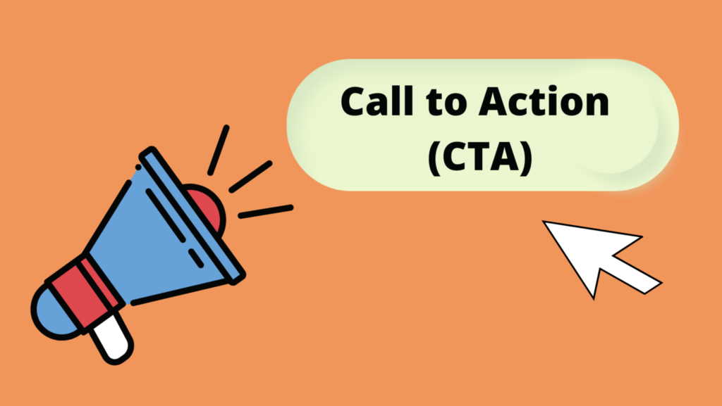
Observe these CTA guidelines at all times:
- Maintain a single, clear CTA: Landing pages should have one aim and one CTA, so pick one and stick with it. Too many CTA distracts customers.
- Make it simple to see: Use design features like color, size contrasts, and well-known CTA shapes to make your CTA button stand out.
- Use it as frequently as required: While shorter landing pages might need one CTA, longer ones might benefit from having your CTA (always the same one) scattered throughout. Again, this raises awareness in case a potential customer converts before the end.
- Evocative CTA text: The CTA copy should precisely match your offer and explain to visitors what they will get by clicking. Use “Buy Now” or “Get My Free Sample” instead of “Submit.”
Before creating or developing your PPC landing page, decide on its purpose to ensure it stays focused and grows toward the CTA.

Try FREE Magezon Page Builder!
Easily create your engaging Magento pages in any style whenever you want without relying on developers or designers, just by drag & drop.
9. Select Only the Best Photos and Videos
Using high-quality photographs and videos is the PPC landing page best practice, especially for eCommerce landing page SEO.

As said in tip 7, great product images and videos encourage interaction and assist in addressing queries and concerns from customers. So it’s no surprise that 96% of customers find product videos useful when deciding what to buy.
On the other hand, low-quality images or videos will raise questions about the caliber of your goods, so it’s better to be picky. Take a look at our guide to product videos, but if you don’t have the time or knowledge to make one yourself, hire a professional.
You may also consider user-generated photographs to make your landing pages more natural and credible. Still, keep in mind to be picky.
How to begin:
Prioritize taking pictures of your product from all angles and showing it in use. This enables people to envision using it for themselves and to get a true sense of how it seems. Take crisp, expert shots with a tidy backdrop.
→ Get tips for your products’ image: Best Tips to Improve Your Product Image for Ecommerce
10. Create Content Before Design
Designing a landing page typically comes first. For example, a wireframe outlining the page might be created by a designer, and the writer would then fill it in. Unfortunately, this is not the greatest strategy to optimize the landing pages and can waste time.
Beginning with the design restricts the writer in terms of what they can include, how much they can include, and where they can have it.
You may also encounter situations where the writer must suggest a new design to accommodate the required content. The designer must perform more effort than if they had access to the content from the start.
How to begin:
Have the copywriter start with the content. The designer can begin once they have a strong draft and know what they are dealing with. In addition, maintain an open discussion between your writers and designers throughout the process to avoid conflicts.
11. Prioritize Credibility
In e-commerce, trust is everything. People may make purchases online, but the majority won’t do so until they are sure they can trust you and your product.
Most of the PPC landing page best practices we’ve discussed so far will assist in establishing your trust. Still, you may utilize the following advice to persuade even the most cautious customers:
- Use only the greatest endorsements and reviews.
- If you have any awards or badges, include them.
- Showcase evidence in the form of performance metrics, statistics, and case studies.
- If possible, mention the number of users or downloads.
- Be clear with your use of form data.
- Give your contact details.

Professionalism benefits much from clean design as well. According to research on the factors influencing website users’ initial trust, 94% of visitors’ first impressions are influenced by design elements.
How to begin:
Add any bullets above that pertain to your product, and have the landing page’s design reviewed by an eCommerce-focused web designer.
12. Decide Whether to Use a Short or Long Landing Page
If you’ve used landing pages before, you might have observed that some of them are considerably longer than others. Again, we can confirm this was a wise choice if the landing pages were effective.
You should think about the product, the audience’s familiarity with it, and the level of commitment you’re asking them to make when choosing the correct length for your PPC landing page.
The best practices for brief PPC landing pages are:
- Small commitments, like signing up for newsletters or using free resources.
- High familiarity is when customers have used or are acquainted with a product.
- Low-quality leads with a high conversion rate.
The ideal long landing pages are for the following:
- Big commitments, such as expensive purchases.
- Low familiarities, such as a new product or service.
An extended landing page could convert at a lower rate than a brief one, but only because the objectives are different. It’s more difficult to persuade customers to purchase a laptop than to accept an email.
A long landing page will be more effective than a short one when persuading a prospect to make an expensive purchase or try a new service since they will have more queries and worries.
How to begin:
How much persuasion is required for a lead to convert? Consider their level of product familiarity, the novelty of the offering, the cost you ask them to pay, and other factors. You’re on the correct road if you respond to all their inquiries.
13. Optimize Above the Fold
No matter how long your landing page is, the area above the fold is essential.
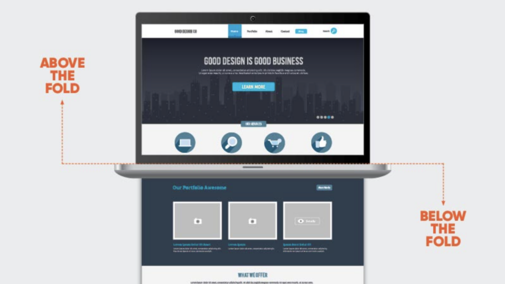
A landing page’s fold is the point at which the screen terminates, preventing visitors from seeing additional content without scrolling. In other words, it is the area of your landing page your audience initially sees when they arrive at your website.
In fact, visitors spend most of their time above the fold, despite design and text strategies intended to encourage them. According to Nielsen Norman Group data, page visitors spend 57% of their time above the fold and 74% inside the first two screenfuls.
All of this emphasizes how important it is to carefully consider what goes above the fold.
How to begin:
See what part of your landing page appears above the fold by seeing it on all devices. Put the most crucial information above the fold and motivate readers to scroll down with clear language and thoughtful design.
14. Minimize at All Costs
We have become used to skimming and being picky in a society with too many distractions and information. Therefore, the ideal approach is to minimize, minimize, and minimize to get people to read and remember what you write on your landing page.
Two guidelines may be used to cut material on a PPC landing page: First, remove it if it doesn’t significantly improve the situation. But don’t sacrifice value by removing the content. For example, adding a live chat option for prospective customers may be helpful if you are super concerned about omitting information.
Keep in mind that a clean and simple design is more appealing to the eye and is more likely to be digested.
How to begin:
Go line by line through your landing page and consider if each statement offers value and whether it may be cut or simplified without losing meaning. Then repeat the process for each design piece.
15. Get Rid of Pop-Ups
A well-designed pop-up that isn’t too invasive may achieve wonders, but if it appears too often, they are just annoying. Why? Because it is distractive and violates the principle of having just one aim for a landing page.
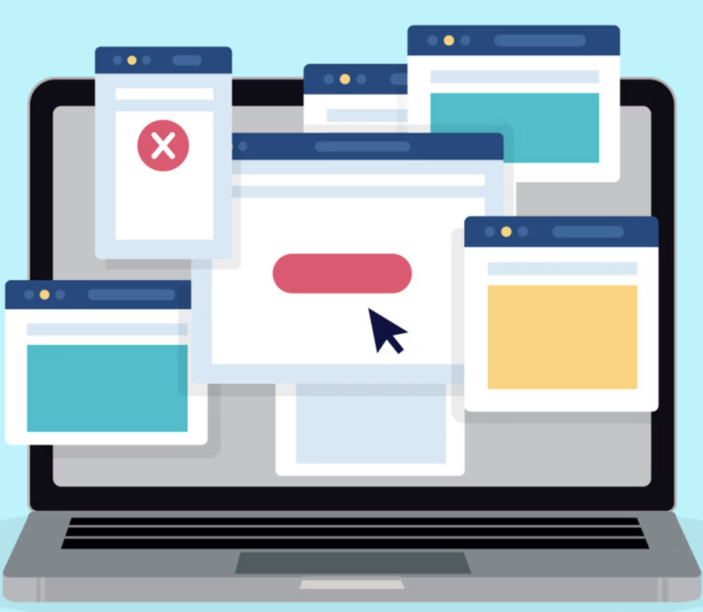
If many visitors leave your landing page without converting, you may consider including an “exit-intent pop-up.” These function as a “Wait! Before you go..” message and show up right before a visitor is about to leave your landing page.
However, before thinking about using pop-ups, it is better to optimize and redesign your landing page to make it converse as much as possible.
How to begin: Simply turn off all pop-ups on your landing pages.
16. Make Your Audience Eligible
If you’ve been operating a company or marketing campaign for a long time, you must already realize how crucial it is to identify your target market.
What’s easy to forget is that your audience also has to work for you. And sometimes, the incorrect people find your landing page just to squander your money and distort your statistics. For this reason, you should qualify the leads from your landing page.
A qualified lead increases the likelihood of converting besides solely visiting your website. So, if you want the conversion rate to go up, you should focus on this group of customers.
Qualifying your leads will allow you to:
- Reserve your marketing budget for qualified prospects and enhance your return.
- Ensure you are optimizing your strategy using the relevant data.
- Define and prioritize customers who are likely to return.
How to begin:
Start gathering information about visitors who come to your landing page, both those who convert and those who do not. A CRM may assist you in storing large amounts of data and forecasting the customer lifetime value of your leads.
Use the information you get to evaluate the success of your targeting and decide which users to retarget first. Your targeting approach or landing page has to be changed if most leads are underqualified or a landing page has significant bounce rates.
17. Make the Checkout Process Easier
Although we previously said that the CTA was the last conversion stage, it isn’t entirely accurate. Even the most enthusiastic customers might get discouraged by a disorganized checkout procedure.
Perhaps the design is unclear, it requests a huge quantity of data without justification, or the error message text is terrible. Unfortunately, these are just some reasons why we give up on forms.
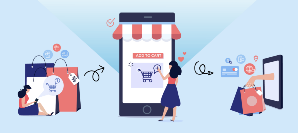
You should design your checkout process effectively, keep instructions simple, and make it as user-friendly as possible if you want to encourage customers to finish it.
Utilizing social log-ins like Google and Facebook or pre-filling form data are two standard methods for streamlining the procedure. Additionally, you may connect form fields to users’ keyboards to enable automated switching between letters and numbers as required. (For instance, when moving from credit card entry to email.)
User testing is the best approach to identify possible consumer turnoffs in your checkout process.
18. Mobile-Friendly Design
Making a responsive website automatically scales information to fit every screen size is a prominent investment. However, optimizing for mobile is a distinct process.
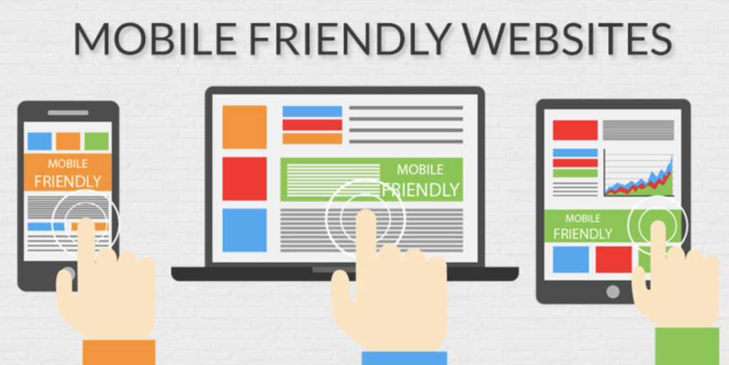
Making additional efforts to improve a mobile user’s experience is meant “mobile optimization.” The same design may not always be the best-optimized conversion for mobile device PPC landing pages just because the content suits the user’s screen.
A little redesign might sometimes assist in utilizing the new fold, encouraging scrolling, or capitalizing on specific mobile patterns. Sometimes it makes sense to build an app.
Working with your eCommerce web developer to determine if your pages can compatibly survive with responsive design. Or whether a different version of your site is required, as Google Ads advises.
We advise being cautious while eliminating content if you decide to construct a mobile site. If you’ve followed suggestion 14 (minimize where you can), you should have already pared down your page content to the bare necessities. Therefore, deleting one more thing would mean deleting important information.
If you can remove anything, consider if it belongs on the standard edition of your website in the first place.
How to begin:
Use Google’s mobile-friendliness tester to check your PPC landing pages and evaluate them on various mobile devices. You might also look at your Google Analytics analytics to determine whether mobile users convert or bounce from pages differently than desktop users.
19. Carefully Personalize
More conversions will occur if your landing page is tailored to each visitor’s individual needs and history. However, not every customization approach will provide results, and it’s easy to over-personalize, particularly with someone who has never visited your website.
A red flag would be using someone’s first name when they had never provided it to you. Instead, use discretion and integrity.
You may use local references if you are a local. If not, you may still market various items to consumers in multiple locations without stating it. Another way to improve landing pages is to optimize them based on demographics. For example, sell high-end dresses to women and suits to men.
How to begin:
Before personalizing ads for different audience groups, you’ll need to confirm that you’re gathering accurate data and being able to target precisely. Use demographic filters to target based on age or gender and geo customizers for location-based targeting.
Making a targeted campaign to retarget site visitors who left without converting or those who did but may be interested in a related product is another excellent place to start.
20. Add a Little SEO
There’s a possibility that some fortunate person may find your page naturally if you add a little SEO. No regulation prohibits you from attempting to get clicks without paying, either.
How to begin:
Start by including the search intent keywords you chose above in your headers, body content, and meta description to improve search engines of your PPC landing page optimization. However, be careful not to fill them so much that it seems out of place. Then, utilize informative picture titles and alt text.
21. Test Variations
Few things are more thrilling than launching your PPC landing page and anxiously anticipating its success.
To guarantee you’re utilizing the most conversion-optimized version of your page, PPC landing page best practices include testing different iterations of page components over time. Occasionally, an additional header or layout converts better.
Avoid getting bogged down in testing as well. Set priorities and work quickly. Remember that the context may have changed between the testing and final forms if you test a headline and CTA before combining the best two.
How to begin:
Run multivariate or A/B tests. For example, you may compare two specific pages using A/B testing. Multivariate testing examines numerous aspects on a page to determine the ideal combination.
22. Take a Look at Your Google Analytics
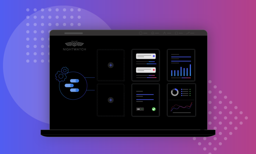
Your best buddy is analytics. Even if you aren’t testing several landing page versions against one other, keep an eye on your statistics to see how well your campaign is doing.
Use your landing page’s aim as a significant success statistic, but don’t be afraid to look at bounce rates and other key performance indicators.
How to begin:
Google Analytics (GA) is the industry standard for tracking page analytics. Aside from impressions and clicks, you can utilize GA’s behavior and flow reports to get more information about where visitors originate from and where they travel on your website.
Use the information you discover in Google Analytics to enhance your user experience.
23. Retarget a Missed Opportunity
Not all visitors to your website are disinterested in what you have to say. However, sometimes people require a bit more persuasion because they are busy, preoccupied, or planning to return at a later time.
The strength of retargeting is the ability to target people who have previously visited your website or landing page.
How to begin:
Decide which platforms you want to use for visitor retargeting first. Retargeting possibilities are provided by Google and social media sites like Facebook.
After that, you’ll add a “tag” to your page that the platform(s) you choose will supply. The tag will track visitors and notify the platform to deliver your adverts. Unless you’re retargeting users for another product, ensure you don’t advertise to customers who have previously converted.
24. Create a Feeling of Urgency
Many online shops find that creating a feeling of urgency increases conversions. If you’ve ever done any shopping online, you are aware of how simple it is to put off making a purchase or put off making a choice. You’re more likely to convert if you feel pressure to do so before it’s “too late.”

Sales or discounts that are only accessible for a “limited time” or items that are only available “while supplies last” are examples of building urgency.
How to begin:
Examine your future deals to see whether you can use the strategies above. If not, think about the kinds of urgency that are compatible with the product you’re advertising.
By including a part that indicates how many units of a product are still available (for example, “x remaining in stock”), fashion shops may give indications of low availability. You could use phrases like “x other people have this saved” or “x individuals have their eyes on this” when referring to unique products like original artwork or an Airbnb rental.

Try FREE Magezon Page Builder!
Easily create your engaging Magento pages in any style whenever you want without relying on developers or designers, just by drag & drop.
25. Only Use Single-Column Layouts
Avoid confusing things with intricate layouts to convey your idea as fast as possible. Your landing pages should only have one column, so avoid cramming too much information into any one area of the page.
See below where Asana chooses a straightforward design, emphasizing only one advantage in each page element. The final result is a clear, concise message that shows visitors what the SaaS company offers and how to get it.

26. Get Rid of the Fear-Inducing Factors
Removing people’s worries and hesitations about making an online purchase is the PPC landing page’s best practice for building trust. Depending on your brand, what you offer, and the visitors’ prior experiences, these worries may take different forms (this last point should be part of your audience research).
How to begin:
The easiest way to ease consumers’ concerns is to be clear that they do not need to provide their credit card information if your objective is to provide a free trial rather than sell a product. Similarly, if you’re asking for an email sign-up, assuring them that you won’t share their information may allay their fears about providing you with their email address (be careful not to lie about it).
27. Use Multi-step Forms
You may know that forms for collecting leads improve conversions. However, for landing pages, creating effective forms may be incredibly challenging. Most experts say to use short forms with no more than three or four fields, but it turns out that this isn’t always the best option.
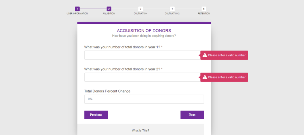
Contrary to common assumption, multi-step forms perform up to 300% better than their shorter relatives. I wanted to think differently, but Instapage released its research on multi-step conditions working better on landing pages, and I have discovered comparable results.
28. Finish With a Sincere Thank You Page
Thank you is human and courteous, but an intelligent thank you page for your consumers is a terrific spot to give extra value. For example, you can seize the chance to market things linked to their purchase or provide information on what to anticipate or how to use the product once it comes. Another option is to include some of the links you wanted on your landing page but was forced to leave off to adhere to the one CTA guideline.

How to begin:
No matter what you include on your thank you page, always begin by expressing gratitude. Inform your client that you value them.
After that, consider how you may benefit them. For example, tell clients what they will get if they subscribe to your newsletter or follow you on social media. Make sure you have a good reason to think they desire the product before you attempt to offer it to them.
Conclusion
Pay-per-click (PPC) advertising is, without question, one of the most efficient ways to obtain highly-qualified leads for your organization. But if you want your campaigns to have the best possible chance of success, you must make the most of PPC landing pages. By reading this post, we hope you’ve gained enough knowledge of the best practices for landing pages and felt encouraged to start using PPC campaigns of your own.
If you are a Magento merchant and don’t know which extension to build your landing page, consider Page Builder from Magezon. As a trusted Adobe partner, we have satisfied thousands of customers with a vast collection of drag-and-drop extensions, helping you create a high-converting and unique store in minutes.
Don’t take my words for granted; see how your website can be with Magezon Page Builder and what others say about us:
 Magezon Blog Help Merchants Build Comprehensive eCommerce Websites

