When building your online store, there are many elements you should take care of, and the shopping cart page is one of them. The average abandonment rate is around 70%, but you can still encourage customers to checkout and generate revenue with the correct tactics.
Below is basic knowledge about an online shopping basket and some best practices for reference. Keep on reading!
Table of contents
What’s a Shopping Cart Page on an eCommerce Store?
A shopping cart page is necessary for your online store as it’s the last page before customers checkout. It is where people add all they want to buy and then pay. Think of it as regular shopping carts in stores, just instead of checking out at the counter, you’ll do it online.
Why Is a Shopping Cart Page Important?
A website shopping cart is a must-have for all e-commerce businesses. It creates a better shopping and paying experience since users can pile up all items they need and check out once instead of paying for each item. Thus, if your customers buy multiple products, an e-commerce cart will help them save a lot of time.
How Does It Work?
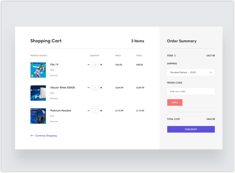
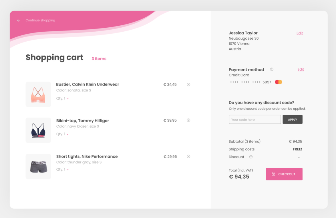
How an e-commerce website’s shopping cart page works are pretty simple. A “Add to cart” button on every product page (or product listing page) allows customers to put their favorite products inside and add as many items as they want. After choosing, they can go to the e-commerce cart page to see all added products with price and quantity, and they will also see the total amount of selected items. Here, customers will complete purchasing via multiple payment options and get their receipts.

17 Pro Tips for Your Shopping Cart Page
UX Tips
1. Offer the Right Payment Options
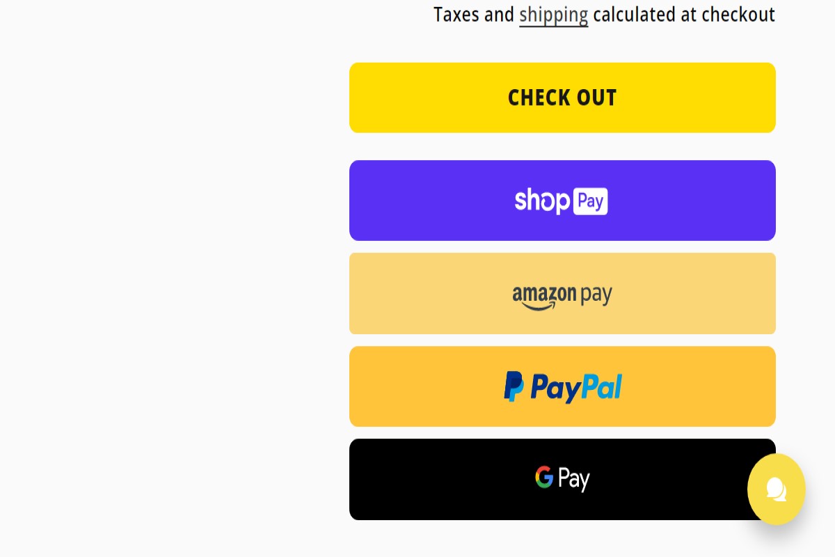
A shopping cart should include various payment options for users to create a fast and easy payment process and reduce the abandonment rate. SaleCycle points out some preferable paying methods, including debit cards, credit cards, bank transfers, and digital wallets (digital payments not attached to a card).
However, when adding the options, consider the most suitable for your customers and business size. For example, if you’re a start-up with a limited budget, you should start with PayPal or Venmo. Then, apply more options such as VisaCard, MasterCard, Discover, American Express, Apple Pay, or even Afterpay or Klarna (buy now, pay later).
The express checkout option is also worth considering to help customers skip some steps while paying. For example, on Shopify, people can pay through Amazon, so they don’t need to fill up information about contact, payment, and billing.
2. Display the Estimated Total Cost
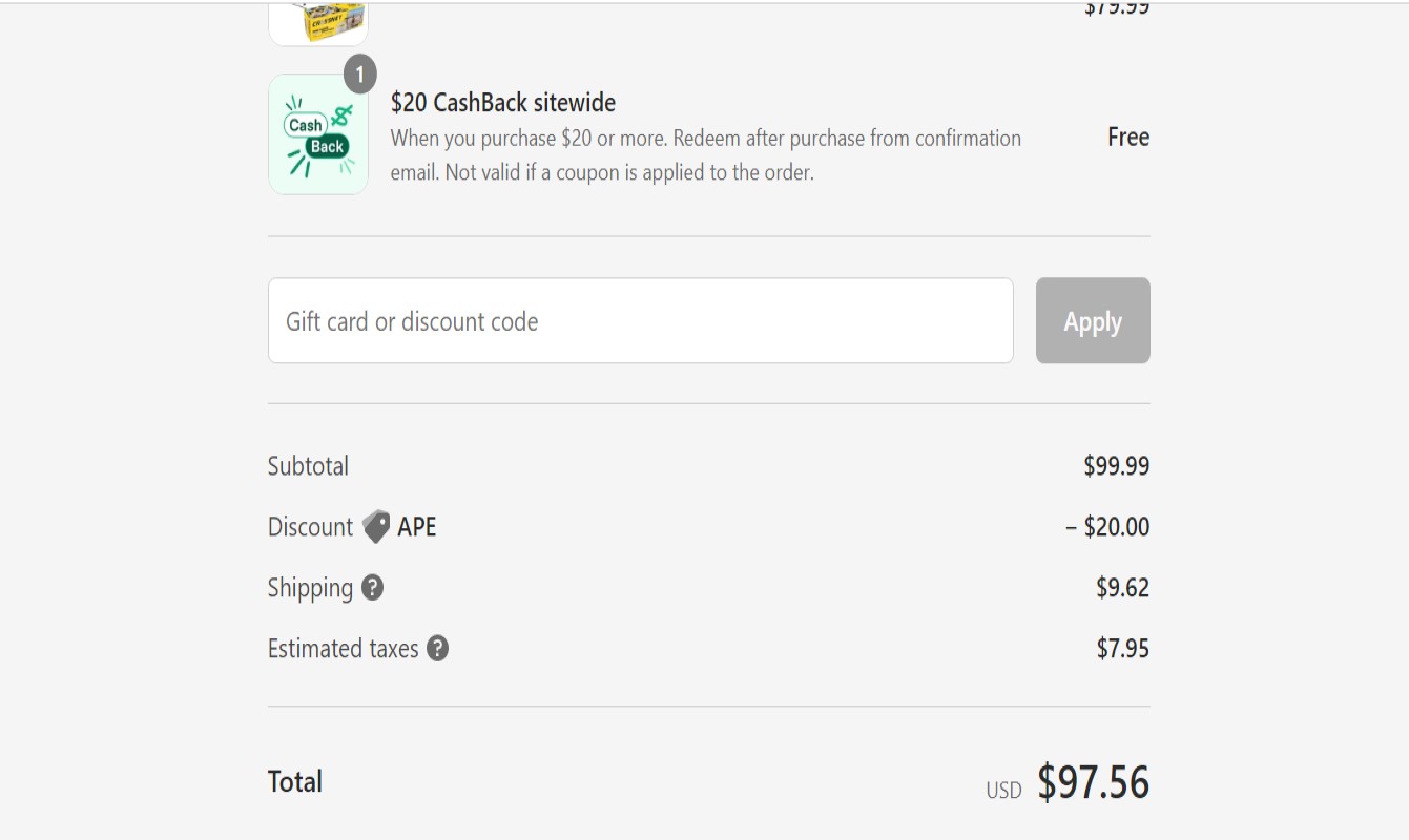
Unexpected fees cause shoppers to leave without purchasing. Therefore, your shopping cart page should include the estimated total cost to avoid shocking your customers. Especially when you sell oversized items such as sofas, their shipping fee, and tax are likely to be (much) higher than a package of clothes. A tip here is to add the option to input the zip code to check estimated tax and fee (with different shipping options) on the product page, so the shoppers will know how much more they need to pay before adding to the cart.
4. Make It Easy to Switching Between the Cart and Other Pages
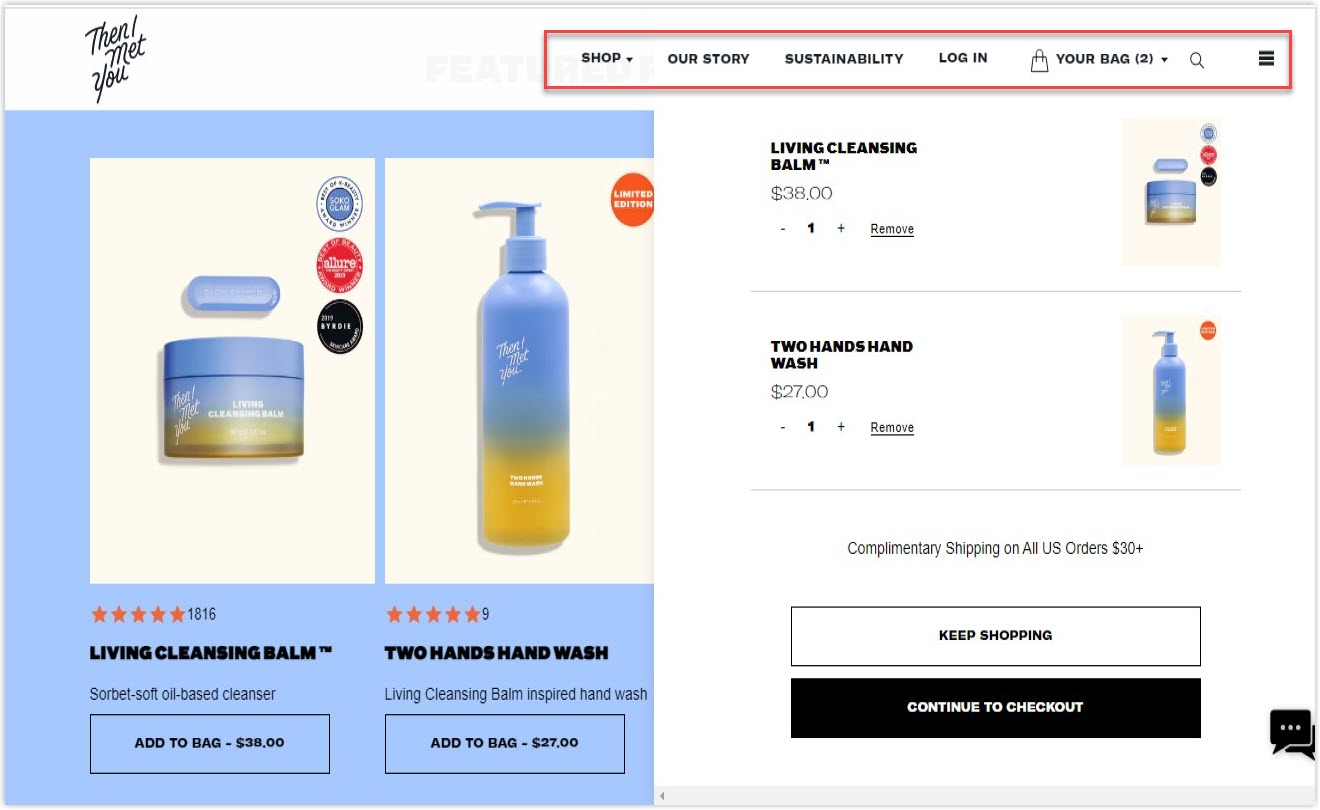
When your customers are on the shopping cart page, make sure they can move quickly between the cart, product page, and other pages on your website. It will create a smooth shopping journey and lower the abandonment rate.

Try FREE Magezon Page Builder!
Easily create your engaging Magento pages in any style whenever you want without relying on developers or designers, just by drag & drop.
5. Use Your Shopping Cart for Upselling and Cross-Selling
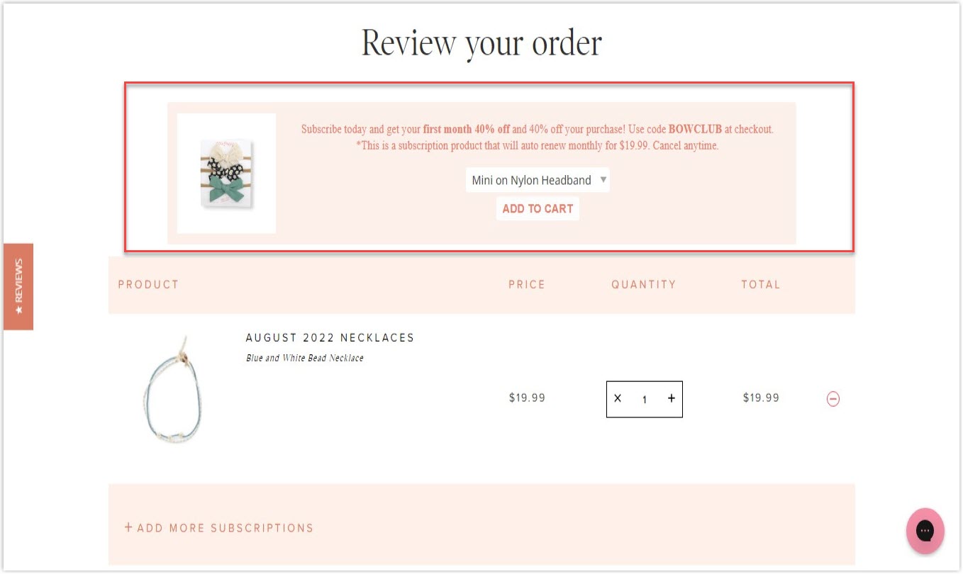
An online store shopping cart can be an excellent place to deploy some strategies for upselling and cross-upselling. It’s beneficial when your customers need additional products to complete the functionality of the one they want to buy. However, too many items can have side effects. So, remember to do it smartly with limits; otherwise, your shoppers may feel it is annoying and even abandon the prior purchase.
6. Create an Abandoned Cart Workflow Automation
Many online stores utilize the Save for later and Wish list buttons to decrease the number of times users put items in the e-commerce cart without immediate buying decisions. Whether you have those features or not, abandoned cart workflow automation is necessary, including sending email reminders, follow-up coupon codes, retargeting ads, on-screen pop-ups, or live chat. Choose the tactics smartly to benefit your brand, as some may work for some specific models but not yours.
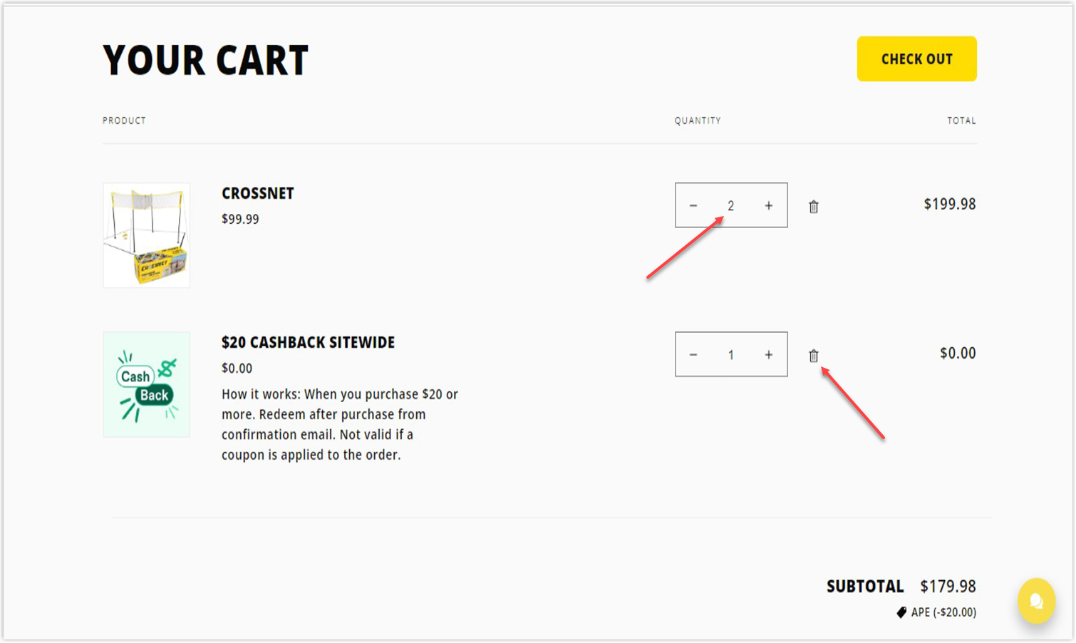
7. Allow Customers to Change the Quantity or Remove a Product
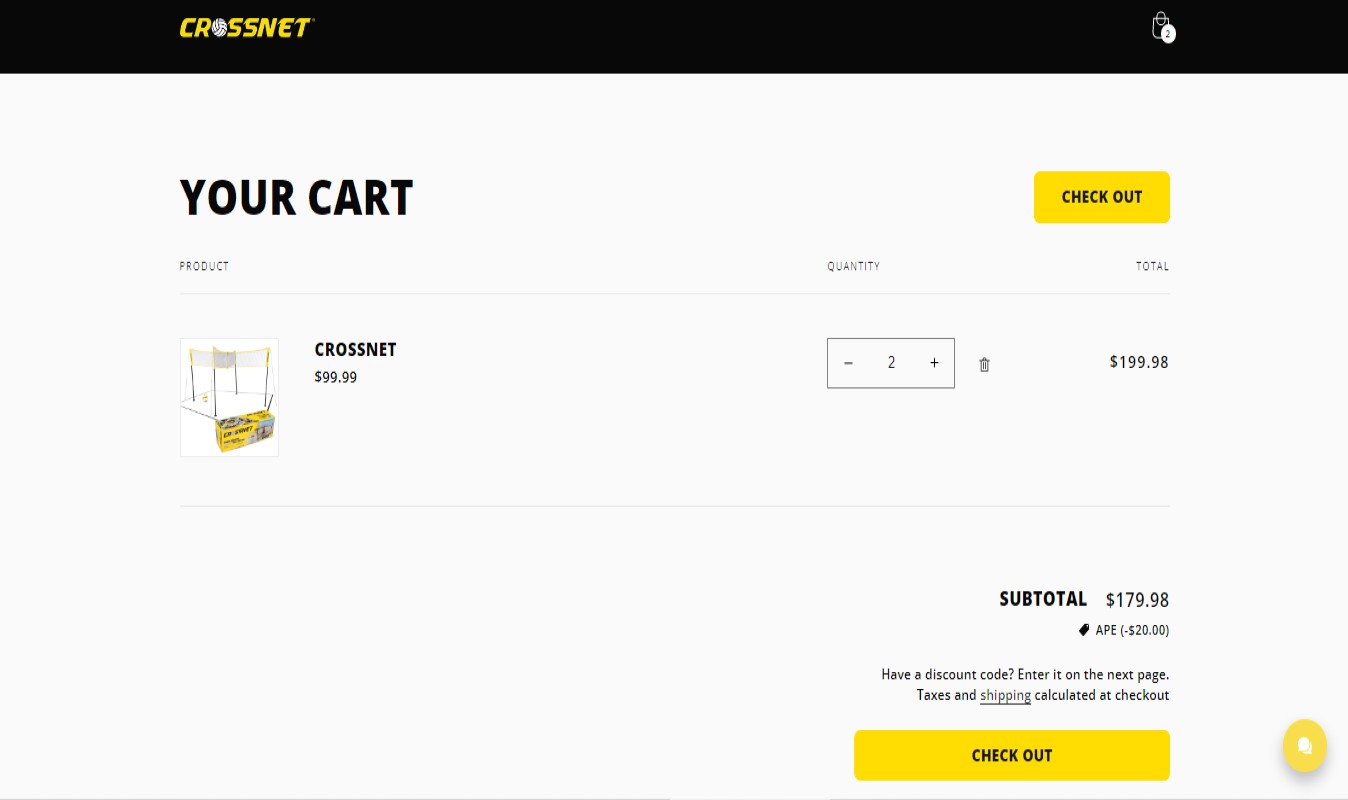
One of the best practices for shopping carts you can apply is to offer customers the right to modify their cart, specifically, changing the quantity and removing a product. If your shoppers want to purchase more than one product item, allow them to do so right on your shopping cart page. So they don’t need to return to the product page, thus reducing friction and driving sales.
Similarly, you should allow users to delete an item if they change their minds. Therefore, they can pay for all the rest of the products at once without being bothered by the eliminated one.
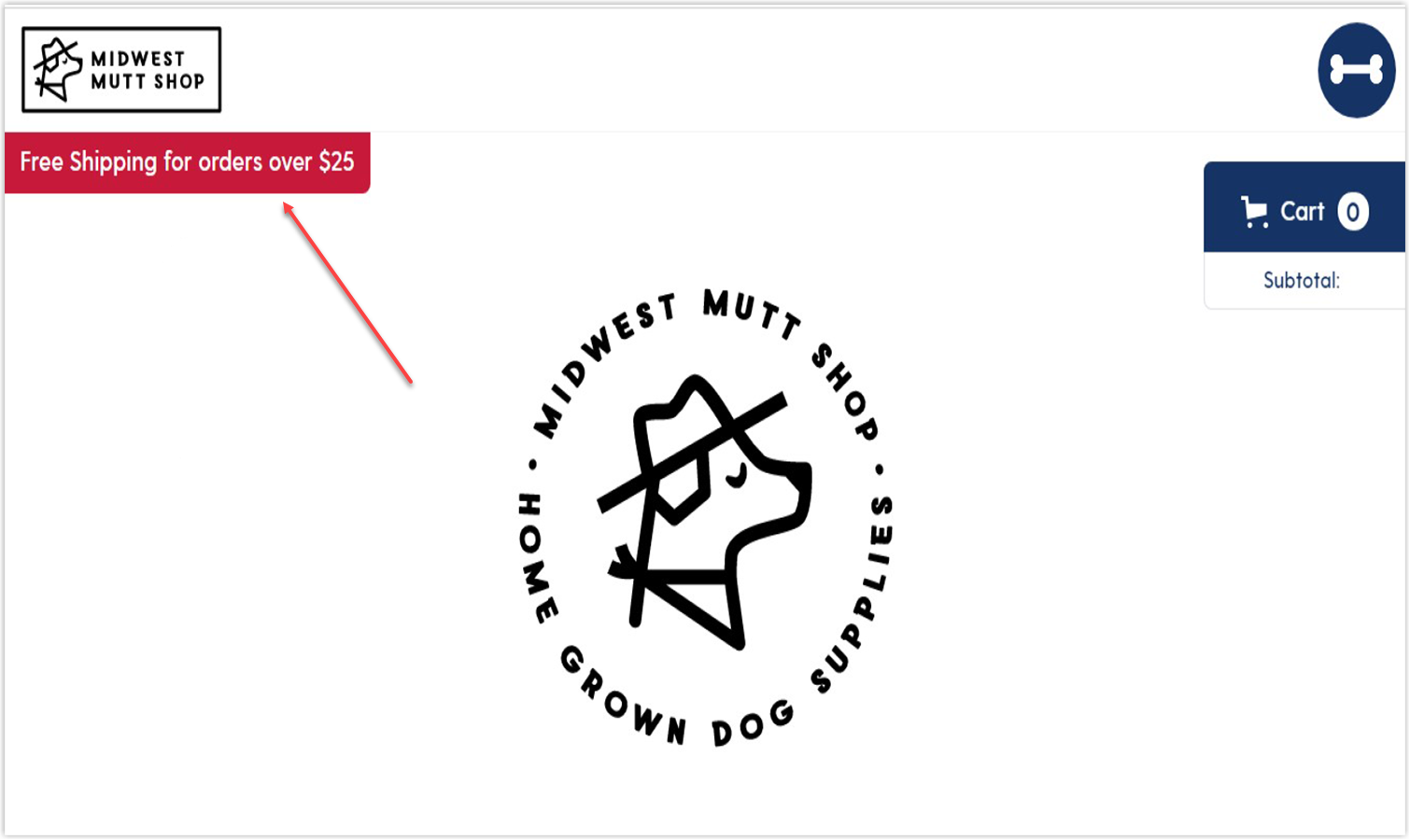
8. Provide Information About Free Shipping
When customers are asked to spend more money on extra fees, it can result in the cart being left over. Giving free shipping for orders over a certain amount of money is a great solution. It encourages users to buy more and finish their purchases.
You can highlight the reminder on your shopping cart page (and other pages) and combine it with CTAs (Call To Action) to actively persuade customers. Plus, telling them how much more they should buy for free shipping, such as “Only $3 more to go!” will make them willing to spend a little more.
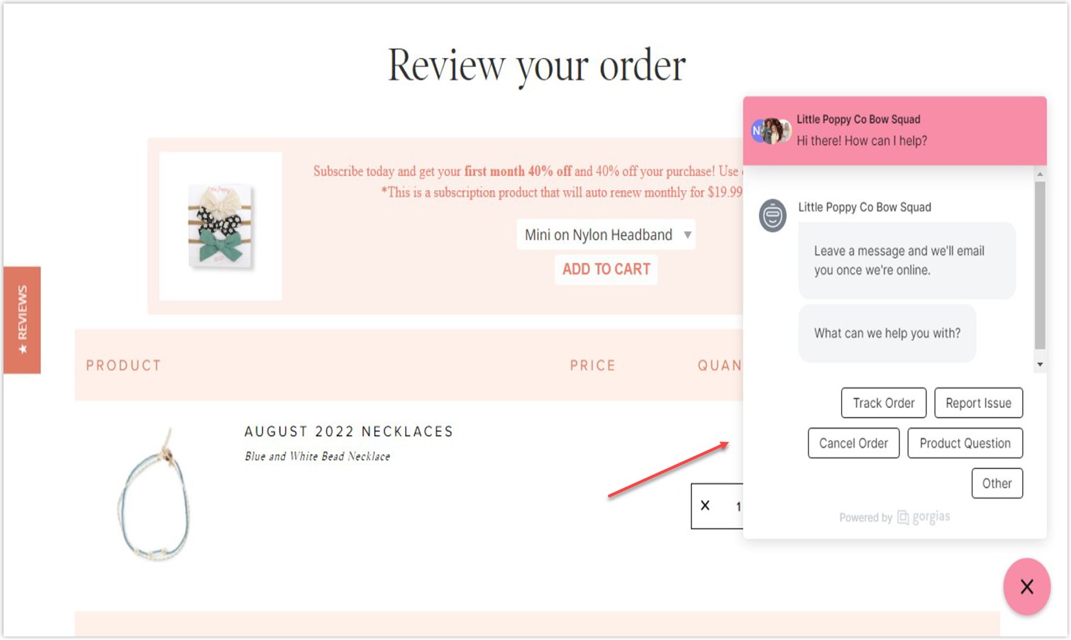
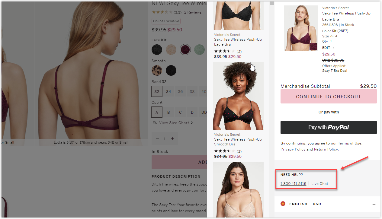
9. Include Phone, Chat, or Email Assistance
Your brand’s contact number and address should be displayed clearly to help customers easily keep in touch and gain their trust. On the other hand, you should be there when your customers are about to make a purchase. Therefore, offering customer service on the shopping cart page will make shoppers feel comfortable and well-cared for, as they can ask the actual humans for advice.
Both phone assistance and live chat drastically increase sales because it’s real support for buyers, and you can offer them a discount immediately to help them decide. However, people tend to prefer live chat to phone calls.

Try FREE Magezon Page Builder!
Easily create your engaging Magento pages in any style whenever you want without relying on developers or designers, just by drag & drop.
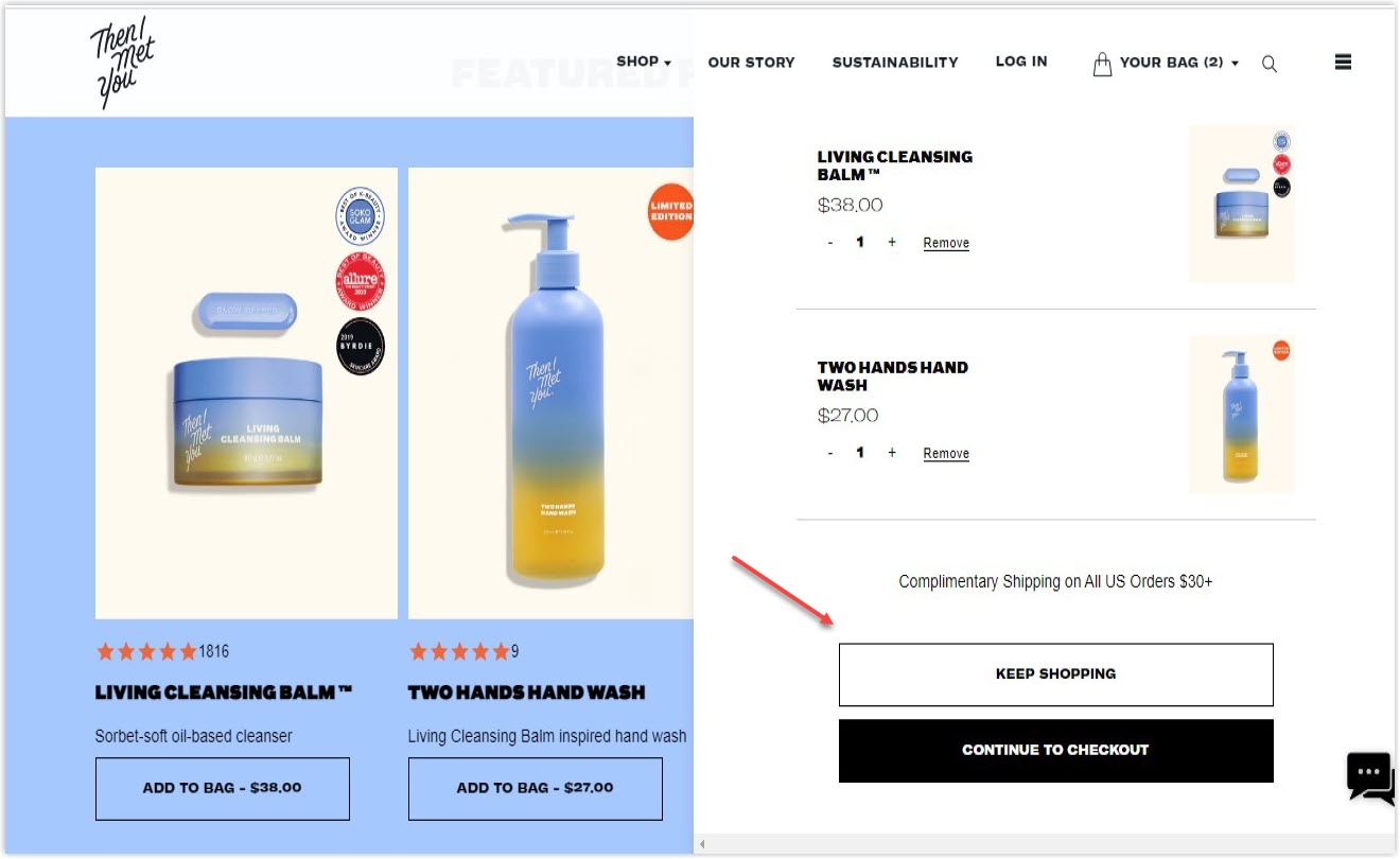
10. Continue Shopping Option
The continue shopping option is a smart strategy as it allows users to “abandon” their cart yet stay on your site to buy more. Even if they don’t place the order at that moment, they can still store items in the cart to purchase in the future.
11. Reassurance and More
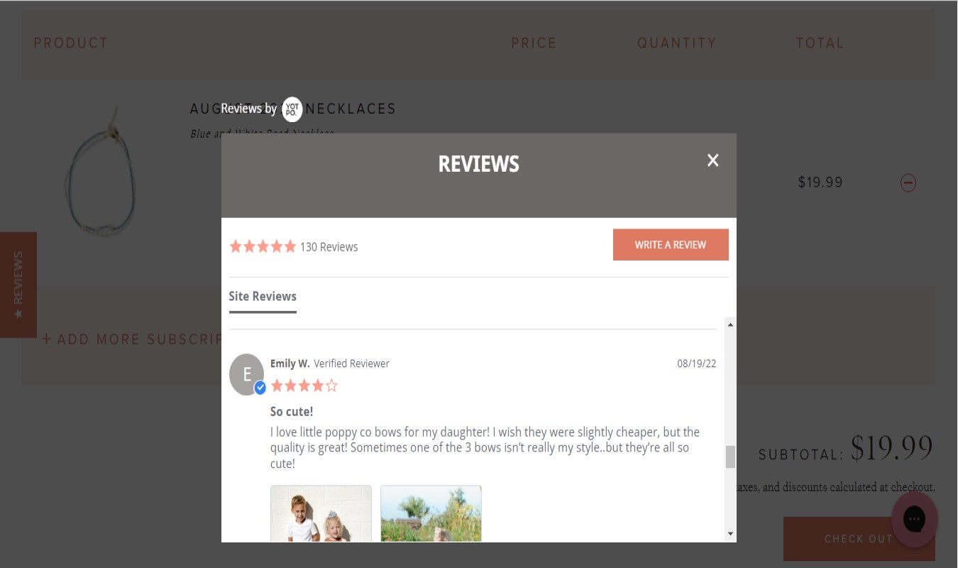
When working with shopping cart website design, don’t forget to add some features to reassure your prestige. A security logo or CTA button “Proceed to secure checkout” will work out, especially for a first-time customer. You can also display testimonials to clarify doubts and encourage shoppers to complete their orders. Sometimes, showing the product review scores on the shopping cart page also reassures customers about the popularity of the selected items.
Another critical point affecting the buying decisions is return and delivery policies. Let your customers access this information on their e-commerce cart page (a lightbox window, for example), so they don’t need to leave and finish the checkout process faster.
UI Tips
12. Use Clear, User-Friendly Color Code
Though there are many studies about the connections between colors and psychology, it’s almost impossible to tell what color is the most suitable and generates the most sales. However, a harmonious and clear shopping cart UI design will definitely help.
13. Make Product Descriptions and Thumbnails Visible
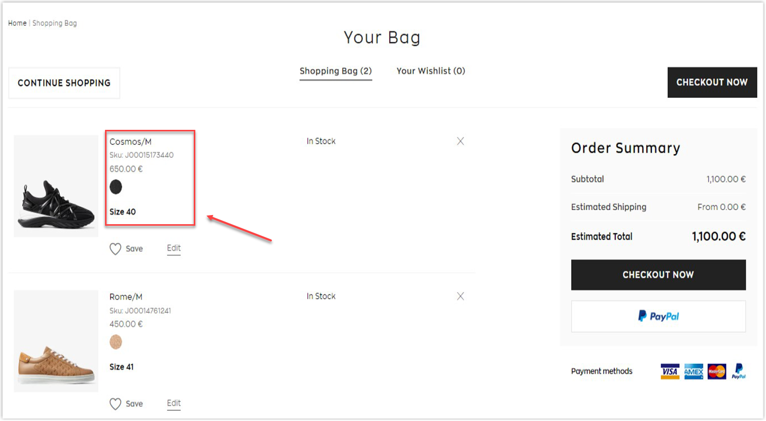
Including a short product description on your website shopping cart page (where it makes sense) can be helpful for your customers as they can double check what option they chose without going back to the product page, eliminating the potential slow loading page and frustrating customers.
One or two sentences are enough for the product description. For example, you can display the size and color below the product name if you sell T-shirts. Or, use a thumbnail (if possible) as a picture worth a thousand words.
14. Display Big Thumbnails and Make Them Clickable
As mentioned above, a thumbnail is extremely helpful. However, it should be big enough to display necessary details such as color, size, and model, so shoppers can confirm their orders quickly. It should also be clickable because sometimes customers want to return to the product page to reread the details and instructions.
15. Remove Any Distracting Elements
The shopping cart page aims to push your customers to the checkout process. You should not include distracting elements like email pop-ups, Google AdSense or banner ads, etc. You can use the heatmap tool to see whether those elements distract your customers from the page.
16. Don’t Display Prominently the Coupon Code Field
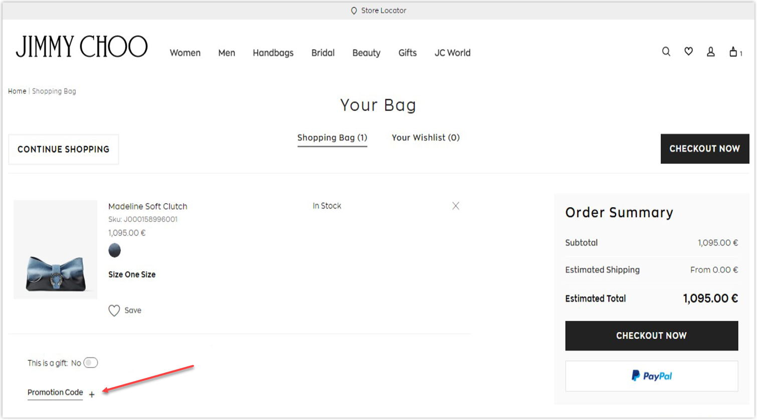
The coupon code encourages customers to buy more, but if you display it prominently on the shopping cart page, it will lead them to give off the website to find the discount code. Once they abandon, it’s hard to say if they will return. You still can leave the field to enter the code, but make it smaller. So you can minimize its magnitude on the checkout process.
17. Pay Attention to the Checkout Button
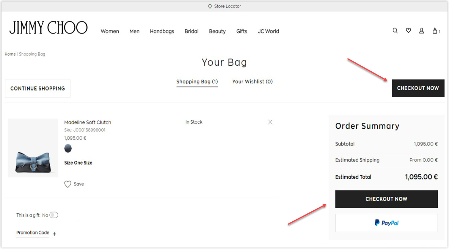
The shopping cart page is meaningless if there’s no checkout button or it’s difficult to see. Therefore, the part should be highlighted (with larger font and contrasting color) yet fit the background theme, leading customers to immediately click on it to pay.
Next, place the checkout button above the fold on the upper half of the page to make it visible for shoppers so they don’t need to scroll down to find it.
Another trick for your shopping cart UI design is to utilize two checkout buttons (one above and one below the cart) on the website shopping cart. It’s beneficial for customers with a long list of products that they don’t need to scroll all the way up to checkout.
The Bottom Lines
A shopping cart page is a necessary step before the checkout that you should not underestimate since your customers can still change their minds at the last moment. I believe all the above e-commerce shopping cart best practices will significantly help diminish the abandonment rate and increase conversions and revenue.
If you’re a Magento store owner planning to build a unique and high-converting website, consider Magento 2 Page Builder from Magezon, an Adobe trusted partner. With a user-friendly drag-and-drop interface and powerful diverse features, you can easily design or redesign any style whenever you want without relying on developers or designers.
More Magento extensions are also available to create all necessary pages and elements for your website. Don’t worry if you’re not good with coding because these extensions are the solution.
 Magezon Blog Help Merchants Build Comprehensive eCommerce Websites

