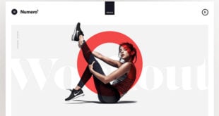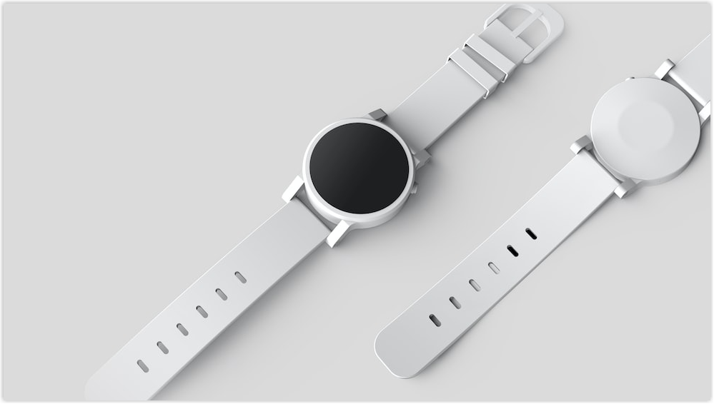
Your website may include the appropriate keywords and enticing writing, but customers may hesitate to purchase if it lacks decent photographs. High-quality visual elements, such as product images for eCommerce, can improve the visibility of an eCommerce brand and its user experience.
High-quality online product images have regularly been shown to increase engagement, establish trust, and enhance conversion rates. No matter how seamless and frictionless your website design is, if your products have low-quality pictures, it will negatively influence your bottom line. In this post, let’s look at the 19 best tips to improve your product image for eCommerce.
Table of contents
How Important Are Product Images for E-commerce?
Without a physical store, customers will base on your website’s images and descriptions to make a purchasing choice. As a result, having high-quality photographs of your products is critical to your company’s success.
1. Make the First Impression
It takes only 13 milliseconds to process images and give customers the first impression of your brand and products. These great product photos for eCommerce leave a lasting impact because of their high quality and utility.

2. Customers Want to View Photographs of the Products They Are Interested in
When customers buy anything online, high-quality pictures show them precisely what they’re getting. They demonstrate form, texture, color, and other characteristics. They also assist customers in determining the size of the goods and the many ways they may be used. Customers want to see visuals, and they want a variety of images.
According to Shopify research, just 0.52 percent of buyers prefer to see a single product picture, 33.16 percent prefer several shots, and almost 60 percent prefer images that provide a 360° view of the product. Meet the customers’ demands and present lots of good product images to make an informed purchasing choice.
3. More Sales and Fewer Returns Result From High-Quality Product Photographs
According to a Weebly poll, 75% of respondents thought great product photos for eCommerce were “extremely significant” in their purchase decision. In the same survey, 22% of respondents stated they returned things because they appeared different in reality from how they did in the picture.

Humans are visual creatures by nature. So while product descriptions and technical specifications are crucial, images are what pique a consumer’s attention and demand for a product.
Furthermore, if a customer gets a product that does not match the image, they will probably return it. A return equals an unhappy customer, lost sales money, and increased restocking expenses.
4. They Help SEO Efforts
An alt tag and description can assist search engines in better comprehending what a product picture is about. Search engines like Google look at the alt tag and description to decide whether your product picture will appear when someone searches for a specific product, such as “black running shoes.” The more your photo matches the search, the more likely it will appear in the results.
You can boost the quantity of organic traffic to your product pages by using high-quality product images for your eCommerce websites.
5. Poor Product Visuals Hamper Conversions
You might think that any picture on your website is better than none, but a bad picture will take away the goal that both you and the buyer share, to learn about your products and eventually make a conversion.
Your photos must convey information while also clearly distinguishing each product. Otherwise, they will be ignored or send the customers to your opponents’ websites.

Try FREE Magezon Page Builder!
Easily create your engaging Magento pages in any style whenever you want without relying on developers or designers, just by drag & drop.
6 Product Images Types
Is there a way to guarantee a high-converting user experience with your product images? Of course. It is to use different types of product images!
Each type serves a distinct function, and the most efficient product pages use a variety of image styles to boost conversion rates.
Here are 6 types of product images for eCommerce websites:
1. Inspiring Photos
You can use these photos to illustrate how your items can be used in various ways. For example, if you are selling a cleaning product, show it being used on a kitchen counter, a vehicle dashboard, or the glass of an automobile window. Visitors are more likely to be your customers if you show how you use the product in practice.

2. Lifestyle Images
Lifestyle images, like inspiration images, let potential customers envision themselves using your products. This image type can send essential lifestyle values to your visitors. A supplement company, for example, may portray a person enjoying a healthy lifestyle while holding their vitamins.

3. Images of Customers
When a customer takes a photo of them using the product, it’s called customer image, as the name implies. These photos are often shared on social media, and you can use them as social proof. It reassures prospects as they can see your products are in use by actual buyers. Actual images might seem more authentic than studio photographs.
Get permission first to use customer photographs on a product page.

4. Compatibility Images
Using compatibility images, you help customers assess whether your product is suitable for their needs. For example, a charging cord for your smartphone must be checked out before buying it. The cable tip and the charging port it is compatible with are clearly shown to ensure that you are getting what you need.
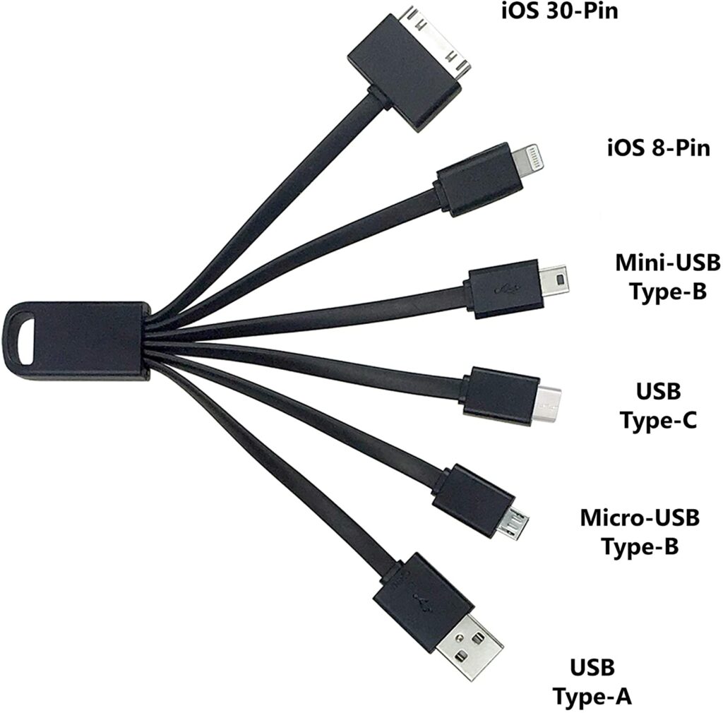
If your items will be used in combination with another item, it is critical to provide compatibility photographs so that users know they are getting the suitable item.
5. Textural Photos
When buying something, customers will definitely want to touch the product, but this is not possible for eCommerce. Customers can’t experience the softness and durability of a T-shirt or a sturdy leather boot.
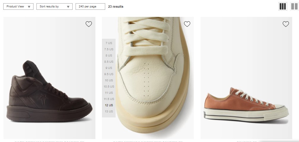
Textural images are close-up photos that give consumers a sense of the product’s quality. They can zoom in on high-solution photos or see different images you provide. If shoppers want to know how a product feels (or appears), you must provide texture images on the product page.
Dr.Martens has eCommerce image best practices when they use texture photos. Let’s see how good they are with images and descriptions of “black smooth leather boots.”
6. Size Proportion Photos
A size proportion image shows how great the product is about another object.
For instance, in the case of flashlights, you can depict a hand holding a flashlight so that customers can get an idea of its size. If you’re selling an item that may potentially be mistaken for being much bigger or smaller than it is, you need to offer proportion photographs on your product pages.
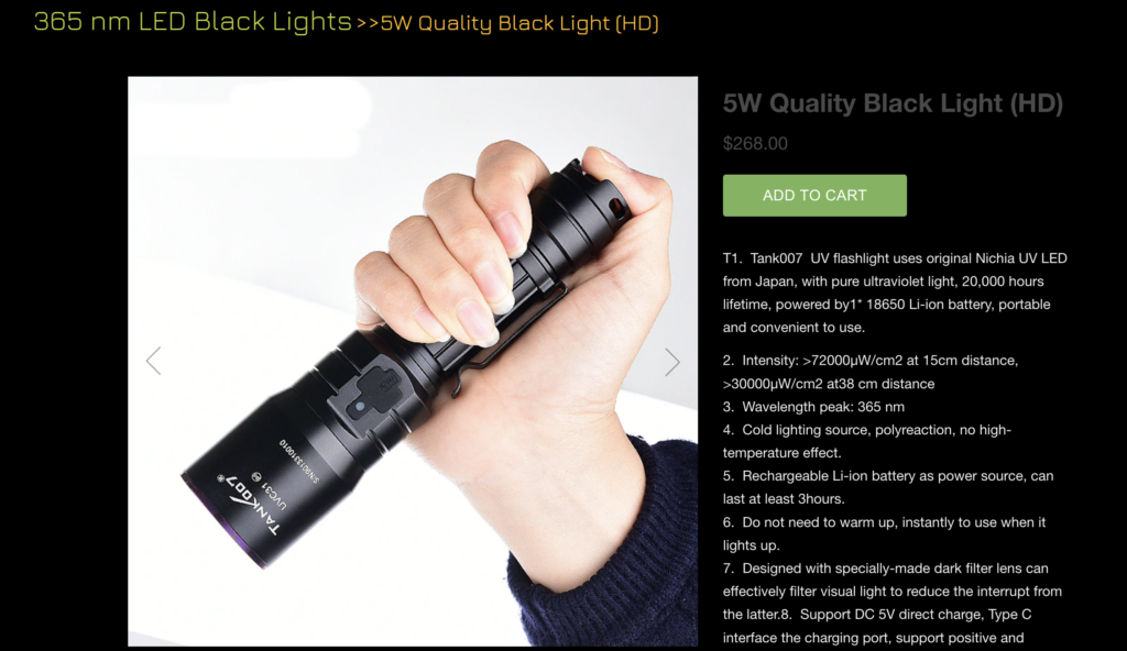
Image Standards of Major E-tailers
Here are some guidelines that the majority of online retailers follow nowadays:
- Size of the images: Most retailers want their product images for eCommerce to be at least 500 × 500 pixels in size. Amazon demands at least 1000 x 1000 pixels for optical zoom capability with various devices, and Walmart recommends 2000 x 2000 pixels. We recommend making your photographs at least 2000 × 2000 pixels in size, so you can quickly scale down if necessary.
- Format of the images: you can use JPEG, TIFF, JPG, PNG, and BMP formats, but JPG is the most popular.
- Quality: Product images should be sharp, with excellent lighting and realistic colors. Tips for you are: edit images to reflect real-life hues but don’t use filters to make the image seem beyond what it is.
- Aspect ratio: Although square (1:1) is the most common aspect ratio, particular sites or departments, such as fashion, may need portrait orientations.
- Background of the images: The majority of e-tailers use white backgrounds.
- Negative space: The primary product should take up at least half of the photo.
- Recommended images: The number of images may vary for different e-tailers. Using four or more photographs without duplicating or needless images is common.
- Resolution: The resolution for websites should be between 72 and 300 dpi.
- File size: Generally, you should prepare the smallest file size and provide an optimal image size and resolution. Files that are too big may slow downloading or be rejected. The maximum file size allowed by Walmart is 5MB.
The e-tailer needs to meet the above guidelines for product images before launching new products.

Try FREE Magezon Page Builder!
Easily create your engaging Magento pages in any style whenever you want without relying on developers or designers, just by drag & drop.
19 Tips for Improving Product Image for Ecommerce
1. Show all Necessary Angles
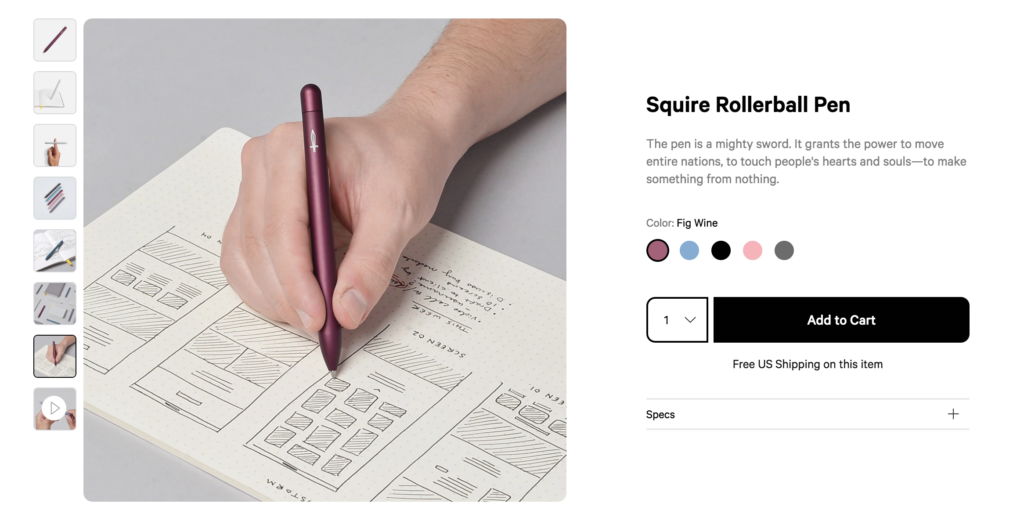
While almost everyone knows the importance of providing all angles of a product, sometimes high-traffic sites can forget this. So, always remember to upload many photos from many angles.
In addition, you should add a product image that specifies how big or tiny the object is to eliminate confusion about a product’s scale.
Baron Fig is one of the brands with eCommerce product image best practices. For the higher-priced things they offer, they must show several angles of the product for users to envision themselves using it. So, as you can see, Baron Fig’s product photos show pens from various perspectives.
2. Show a Product Image for Each Color or Style You Offer
Give them a snapshot of the item in each hue instead of simply saying, “Also available in blue, red, and green.” Customers cannot imagine that if there is no exact color picture, they will hesitate, which may lead to them not wanting to buy. Nothing is worse than having a product with 3-4 color choices but only one color presented.
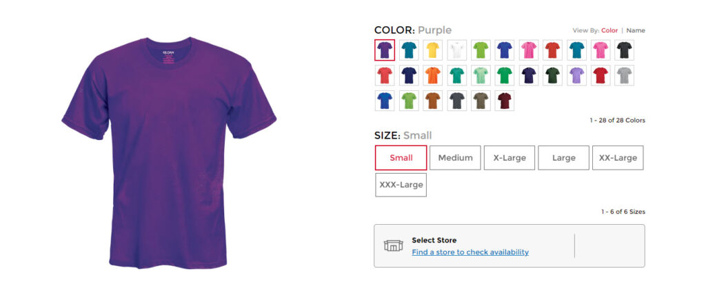
Below is an example of different colors and sizes for a t-shirt you can learn from.
3. Allow Customers to Zoom in on Any Part of the Product
A feature that allows your customers to zoom in on images is essential for any eCommerce website. Users will nearly always hover their mouse over a product picture to check whether they can get a more thorough look at it, and if you don’t provide that capability, they will be disappointed.
This is when having high-resolution product photos comes in handy. You want your consumers to be able to zoom close on a product without sacrificing picture quality. Check the plugin specs or the platform your eCommerce business is hosted for particulars.
4. Keep in Mind the Basics of Branding and Consistency
Although each product picture on your website is unique, you must keep a uniform look and style. Your eCommerce website should use the same background, modeling, lighting, and picture placement approach.

Give your customers a sense of familiarity, security, and professionality by maintaining consistency throughout your website. Inconsistency distracts customers from your primary purpose.
5. Work With a Professional Photographer or Agency
Ensure that the person or organization you choose has skills in product photography and understands your company’s vision. Don’t settle for low-quality photos that you took in the kitchen.

Any eCommerce firm can benefit from hiring a professional product photography company or individual. You will not regret the money spent because it is a reasonable investment to grow your business, and it’s sure to be a success.
6. Use Social Media Content for Product eCommerce Photography
The social media presence of many e-commerce firms is essential to build enthusiasm about new items and establishing trust with their target audience. You can repost KOLs’ images when using your product on your social media platform. For instance, brands like Glossier rely on user-generated content to demonstrate their product’s look and feel to potential buyers (see screenshot below).

7. Notice the Image File Size and How It Displays
Ensure that your architecture and techniques align with your eCommerce strategy’s product image. The consistent relationship between page load time and picture load must be identified, monitored, and maintained.
You may not want to rely entirely on photographers for optimal website performance. Instead, it is better to have them collaborate with the web developers and SEO manager so that the resolution and size requirements are qualified.
JPG is the most used digital picture file format on the web. It is supported by all eCommerce systems (Shopify, Woo Commerce, Big Commerce, etc.) and provides a compact file size and wide color gamut.
8. Keep in Mind the Basics of Image SEO
The more well-written meta description you write for search engines like Google, the more value you get. On the contrary, you may lose sales if you overlook this seemingly little detail.
The information is also essential for colorblind shoppers. They may be unable to view your photographs properly, so they rely on your metadata to describe their content and appearance. In addition to alt and title text, you should consider using captions with images.
9. Consider 360-Degree Viewing or a High-resolution Product Video
Product image for eCommerce can be enhanced by using 360° photography, which gives visitors a comprehensive visual view of the product. If you don’t think you can handle the technology of 360 product photography, you can consider the companies that specialize in it.
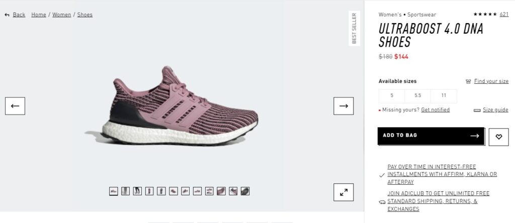
You can also consider videos and GIFs to enhance your conversion rate for your product pages. Video boosts organic traffic by 157% and will raise your site’s conversions. In the long term, you will see the results from it.
10. Make Sure You Have the Right to Use the Images
Make sure you have permission to use any images or drawings you find. Taking a screenshot doesn’t make you the owner of the image. If you don’t want your company to get involved in troublesome legal proceedings over the ownership of the images, you should ensure that your company has the right to use those photos.
11. Show the Product in Use
Including a picture of your product being used create a connection with the customers. This is an excellent technique to overcome the drawback of shopping at an online store: customers can’t feel the products they’re buying.

12. Use The Right Dimensions
A picture’s aspect ratio, or the ratio of width to height, might be distorted when you upload it to your online store. Remember that the image’s proportions on your computer should match those of the image on your storefront. This will guarantee that your photo has the correct aspect ratio and shorten the time for the browser to render the image.
13. Use Clean Product Cutouts
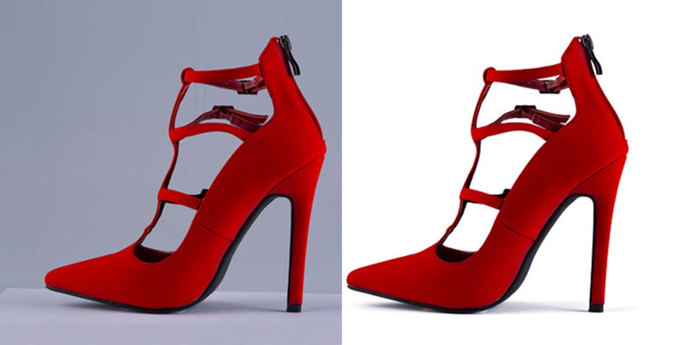
When you remove the background of your image product, it is necessary to have a clean cutout. This implies that your picture won’t have a pixelated border but a clean cutout with no background traces. However, it may need more advanced picture separation techniques for some specific products.
14. Use Realistic Reflections
If you use a reflection, make sure it’s genuine. The easiest way is to take the object against a reflecting surface rather than adding the reflection during post-production. If you are going to edit your images, be aware of your image perspective and light source. Too detailed or unnatural reflections will take the viewer’s attention away from the product.

15. Make Sure the Brightness and Contrast Are Correct
Your product picture should have the correct brightness and contrast to highlight product features and make your image stand out. Using “Curves” or “Levels” in Photoshop will enable you to evaluate and adjust brightness and contrast. You can also wish to try “Auto Contrast” in Photoshop as a starting point for modifying your picture.
16. Show Hidden Features
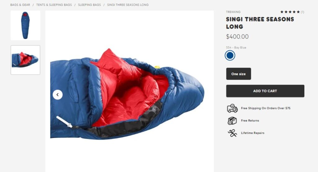
It’s essential to provide a picture of the item’s features in eCommerce, including some that can’t be seen in a photo. In the example below, Kanken’s photo shows the convenience of their sleeping bag. It has a comfortable head section, thermal collar, and a large foot box. In addition, the picture can show the texture of this sleeping bag which helps warm down with good insulation and compressibility.
17. Use White Background in Images
Improving the visuals of your e-commerce site is not a suggestion but a need. Since marketplaces only allow photographs with a white background, they should all have this background, as seen in the following example.

18. Do Not Use Filters
It may sound counterproductive, but not using filters can avoid future issues. Although it is essential to enhance the product images for eCommerce websites, do not apply filters. Using filters can make your image far different from the actual product, which causes customers to lose trust in you and increase product return rates.
19. Compress Images
Large, under-optimized photos impede site performance and drive customers away. According to research, if an eCommerce site takes longer than anticipated to load, more than 45 percent of visitors say they are less likely to purchase. As a result, you should compress photos to provide a better user experience for your customers.
Wrapping Up
As you know, each page on your e-commerce website serves a specific function, and every element on that page should contribute somehow. However, if you optimize your website design, if your products are a mess, then everything is useless. They come to your website with a purpose: to see your product. Remember that you are assisting the consumer in moving down the sale route. Every look and click represents one more step down that route.
If you are a Magento merchant and don’t know which extension to build your website, consider Page Builder from Magezon. As a trusted Adobe partner, we have satisfied thousands of customers with a vast collection of drag-and-drop extensions, helping you create a high-converting and unique store in minutes.
Don’t take my words for granted; see how your website can be with Magezon Page Builder and what others say about us:
 Magezon Blog Help Merchants Build Comprehensive eCommerce Websites

