It’s undeniable that contact forms play a vital role in building bridges between your company and customers. Customers can still use contact forms to keep in touch with you even when you’re unavailable. Therefore, the increasing conversion rate of your contact form can make a big difference to your business.
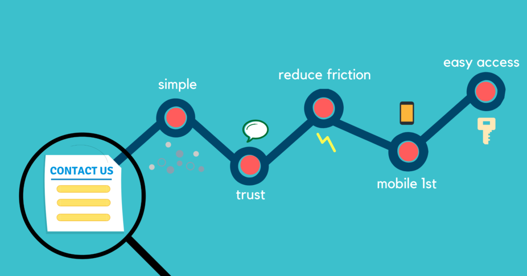
However, improving the contact form conversion rate is not easy, not to say art. But of course, it’s not impossible. And based on my experience as well as online research, I’d like to share 5 tips to encourage customers to fill in your contact form.
Table of contents
Simple Is the Best
‘Simple is the best is certainly true regarding contact forms. A too complicated form makes your clients feel tired or even annoyed. In contrast, a simple one will make it much easier for customers to complete. In that spirit, keeping your contact form simple will increase visitors’ chances of filling it out.
Now you may wonder what a ‘simple’ contact form is?
First, being simple means, all form fields are necessary. So let’s look back at your contact form. Do I really need this form field? Will, that form field help me collect what I want? Think carefully and wisely to decide what to keep and eliminate so that you can drive high-quality conversions.
Secondly, be simple in form, layout, and format. It shouldn’t include too many texts or too many images. Don’t use too many font types (personally, I prefer san serif font for contact form), font sizes, or colors that can make clients confused.

Make your contact form simple, then just wait and see the contact form conversion rate increase. You can try Magento 2 Form Builder, a great tool to help you create a simple contact form without coding.
Create Trust for Your Contact Form
Have you ever wondered why customers buy products from your online website? They come to you even when you exist online. They come to you even when they’ve never seen you in reality. If you think about that, it’s a matter of trust.
The same to your contact form. If you want customers to provide their personal information via an online form, then your contact form has to gain their trust.
First, don’t make your contact form a blank one asking for personal information. Instead, let customers know why you need their information and what will be done with it.
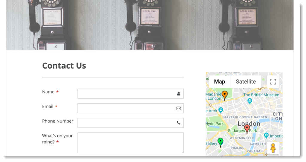
If your store has a location, including Google Maps in your contact form will be an effective way to gain trust.
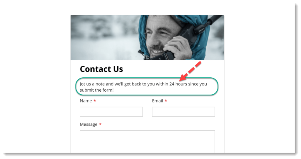
Another great idea is that let them know when they should expect a response. In other words, be clear when you will reply to them once you receive their submissions. This could help build their trust, as long as you reply on time.

Try FREE Blue Form Builder demo today
Create whatever type of Magento form in any style you want just in minutes. Just by drag & drop.
Reduce Friction
By reducing friction, customers will be encouraged to complete your contact form instead of giving up halfway.
So how can you reduce friction? Here are some simple ways:
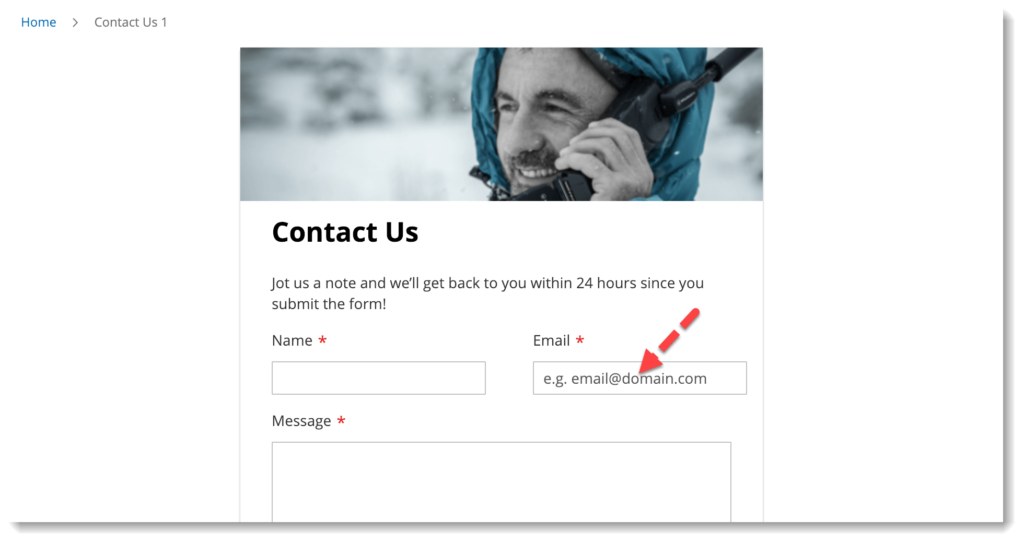
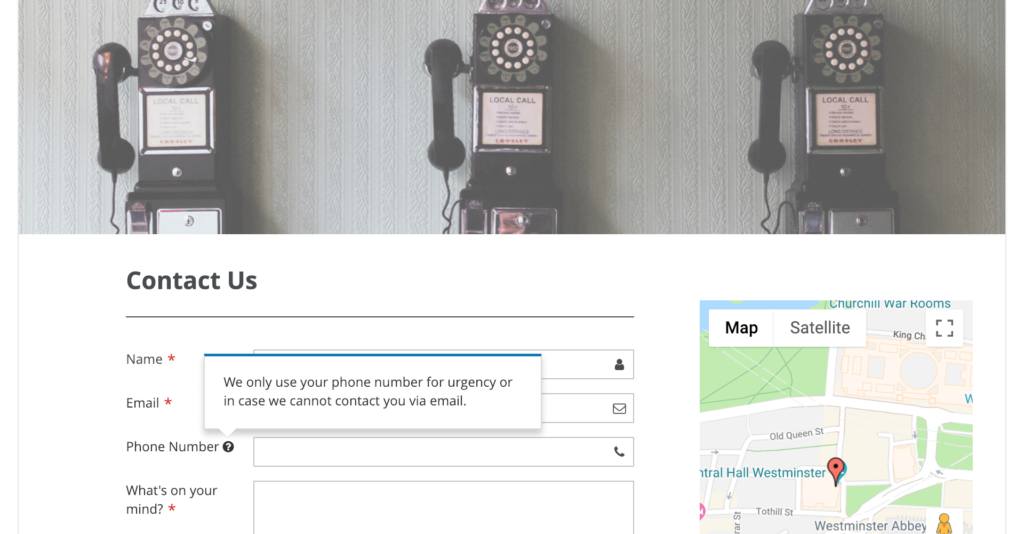
- Show customers what and how they should fill. You can do this with the help of placeholder text (or ghost text). If you need to give detailed instructions, let’s consider using tooltips next to each form field.
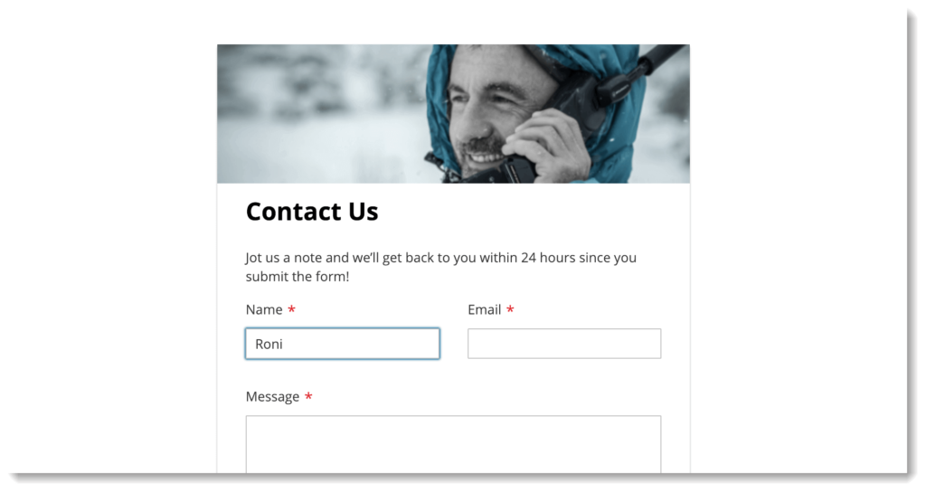
- Show where users are in the contact form. Highlight the form field they are filling, so they know where to continue in case they get distracted.
- Use validation to let users know they miss filling a field or enter the wrong submission format. This way, they don’t have to waste time finding errors after having tried to submit the form. At the same time, you can collect high-quality information.
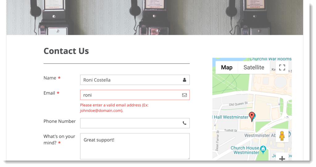
- Limit mandatory form fields. If there are too many fields of this kind, customers may feel reluctant to fill them out. Also, be careful in deciding which form fields are mandatory and which are optional. For example, people are more reluctant to leave their phone number than an email address. So if you include this field in your form, let’s make it optional and maybe let customers know why.
- Use multi-page form. By applying this kind of form, first, you can solve the problem of long contact forms. Besides, it can help customers easily navigate. They will know how many parts the form has, where they are and how much is left to complete.
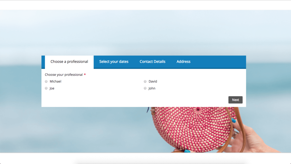
The more friction you can reduce, the more likely customers will complete the form, and the higher your contact form conversion rate will be.
Design for Mobile
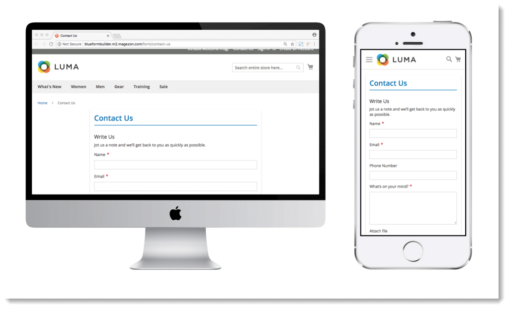
Due to the rapid increase in mobile audiences, the demand for responsive design is growing too. And mobile-friendly contact forms are not an exception. As viewing a contact form on mobile is totally different, let’s think carefully about how to build and customize it.
For example, the form field with a drop-down list of countries is advised to have major countries right at the top by default. On mobile, you cannot filter by the first character like on a laptop; this will help mobile users quickly find their wanted countries without digging through a massive list.
So as more and more users access your contact form by mobile phone, the form must be designed to work perfectly on this device. However, you should not ignore other devices that many customers use. So, to sum up, design your contact form for everyone and every device.
Make It Easy to Access Contact Form
The more easily users can access your contact form, the more likely they will fill it out.
And an effective way is to add a contact form on different website pages. In this way, customers don’t have to waste time finding it. Instead, they can access it where they already are.
If you’re afraid that there’s not enough space on a page to add the form, let’s display it in popup, slide, or link form format.
Conclusion
A high contact form conversion rate certainly means a lot. It helps you connect with more customers and create a closer relationship with them, and it can push up your sales.
My final advice is to combine different ways to encourage customers to complete your contact form. Also, keep track of contact form statistics and make appropriate adjustments. And more importantly, put yourself in customers’ shoes to see with this contact form. Would you fill it out if you were a customer?
What about your ideas to boost the contact form conversion rate? Please feel free to share with us by leaving your comment below!

Try FREE Blue Form Builder demo today
Create whatever type of Magento form in any style you want just in minutes. Just by drag & drop.
 Magezon Blog Help Merchants Build Comprehensive eCommerce Websites


