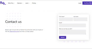
An often overlooked aspect of building a website is the homepage. This is your front door to your online project and the first thing people will see when they land on it.
Great homepages are visually arresting and convey what sets you apart from your competitors, attract visitors while announcing your strengths, and capture the essence of what makes you a unique business.
Today, a website’s home page is heavily used to promote businesses. Therefore, a homepage for your new site or blog is essential for finding success.
This article will share the best homepage design examples and offer some advice on what it takes to succeed with such a website in today’s internet marketing and digital content creation.
Table of contents
- What Is a Website’s Homepage?
- Benefits of a Good Home Page
- Anatomy of a Homepage
- Tips for Making an Excellent Website Homepage
- Best Homepage Design Examples
- 1. Creative Digital
- 2. Built By Buffalo
- 3. Eldorado Stone
- 3. Moooi
- 4. Rotech
- 5. Aperture
- 6. Rh
- 7. Edward Jones
- 8. Eastern Bank
- 9. Achieve Lausd
- 10. Stanford Federal Credit Union
- 11. Pearl Izumi
- 12. Designzillas
- 13. DC Fonts
- 14. British Antarctic Survey
- 15. Planet
- 16. DocuSign
- 17. National Trust
- 18. Ten Thousand Villages
- 19. The Telecommunications Industry Ombudsman
- 20. Fusion Hotel Group
- Conclusion
What Is a Website’s Homepage?
A website’s homepage is the starting point for a website. It includes text (content, fonts, typography, etc), images, and videos that introduce visitors to what the site offers. It may also provide links to other pages on the site, as well as other sites.
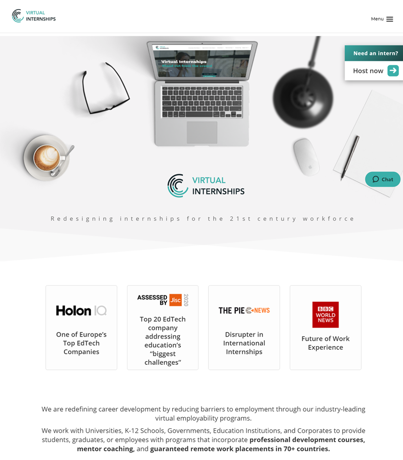
The website’s front page is designed to capture potential clients’ attention and convince them to visit the rest of the website. Sometimes, it can also be a marketing tool where companies advertise their products and services. The homepage is meant to help users quickly navigate through a website and find what they need efficiently.
In addition, it is one of the most critical parts of the site and can be likened to a private page in a public library. This page can also be compared to the front door of a house. Above all, a good homepage design has a consistent and straightforward layout design that is clutter-free and free of flashiness.
| People also read: 25+ Ecommerce Homepage Best Practices With Examples What Are the Key Differences Between Landing Page and Website? 15+ Best CSS Frameworks (Extremely Detail) |
Benefits of a Good Home Page
Best website homepages offer many benefits, and many small details can make a big difference. Here are seven advantages of having a beautiful homepage:
1. Introduce Your Business
A homepage is the first thing everyone sees when they visit your website, and it provides a general overview of what content or product you’re trying to sell. Top homepages also have pictures, links, and clear text explaining your website’s benefits.
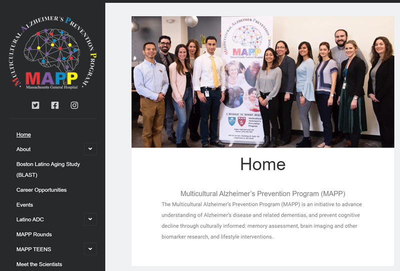
Without a homepage, people will have trouble finding what they’re looking for on your site because there will be no central hub with vital information about who you are or what you do.
The homepage is the face of your site and should give visitors insight into who you are, what makes your company unique, and why they should choose you over the competition.
2. Better Google Rankings Score
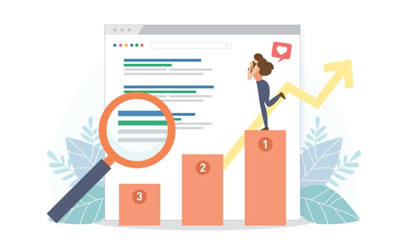
When your website has a solid homepage, it’s more likely to rank well in search results. The search engine algorithm considers how relevant your website is to the query and the quality of its content and user experience. So if you have an attractive home page, it could increase your chances of discovering your site.
3. Attract Visitors and Keep Them Stay on Your Site Longer
A well-designed homepage will attract users seeking information on a topic.

Visitors with a good user experience are less likely to leave your site. This is especially true for websites with customer service or other benefits only customers can access. By building a good website, more consumers will stay on your page.
4. Build Trust

A good homepage will help you build relationships with your visitors, which sets you apart from the competition. It’s easy for people to click away from your site if they don’t think you are trustworthy, and without them, why would anyone want to visit again?
5. Returning Visitors
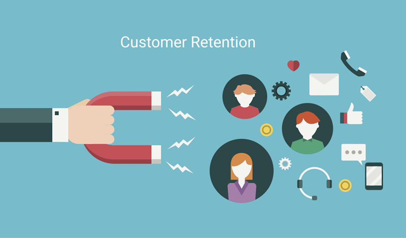
Great website homepages will create returning visitors who continue to come back daily. With the right web design, you can build a visually appealing site that is functional and does not bore your visitors. If people like what they see on your best homepage, they are more likely to keep using and reinforcing their brand loyalty with you.
6. More Social Shares

The benefit of top homepages is creating more social shares, which means more content is being seen by more people.
Best website home pages can help you bring in new visitors and keep your site current with what is going on in the industry, while a poorly done one can result in social shares going down, which means fewer potential customers seeing your content.
7. More Sales

You can generate more sales for the company if you have a good homepage. It is your first point of contact with a potential customer, and it has to grab them instantly. Awesome homepage layout will create a sense of urgency, represent your brand, and answer any questions the visitor might have about your product or service before they’ve even asked.

Try FREE Magezon Page Builder demo today
Easily create your engaging, interactive Magento homepages in any style whenever you want without relying on developers or designers. Just by drag & drop.
Anatomy of a Homepage
Ever wonder what goes on behind the scenes of the website you visit every day? The best web home page looks, at its images, videos and links; it takes a lot of effort and thought to construct a proper homepage. So we decided to compile the anatomy of what makes up the spec sheet of your favorite site.
1. Logo
The logo is the most crucial aspect of any website, and a little graphic can say a lot about the company behind it. Moreover, an effective logo is the first impression visitors get from your site. If it’s too complex, they’ll leave. Too simple, and they won’t notice what’s going on on your website.

The logo needs to reflect the character of your company, product, or service. This is done by researching and understanding what it’s like to use your product or service.
For example, if you want a logo that says “serious,” you must graphically represent serious actions, words, and graphics. In addition, you need to be aware of the industry you’re in and the people who use your product or service.
2. Navigation
Navigation is a system that allows people to find their way around the website by providing different routes. These routes can be text links, buttons or tabs, or menus (drop-down or fly-out) on the side of the page.
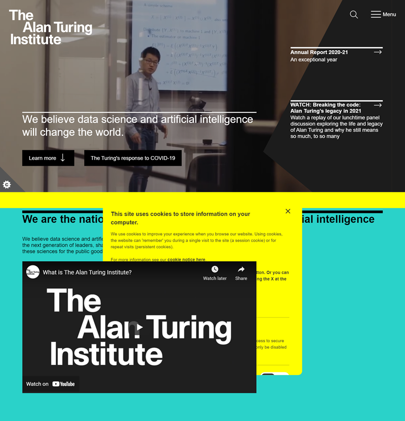
It should be easy for the user to navigate because you want your website’s visitors to find everything they need in a few clicks or less. They don’t want a tangled mess of links that take them forever to get to the point. Your goal is for visitors to find their way around your site by quickly scanning the content, not by checking out every link and page on the site.
3. Headline
Headlines are a crucial part of any web page. A good headline will provide enough information for the user to know what they need to know about what you are offering them. Therefore, the title of your page must be eye-catching, memorable, and easy to understand.
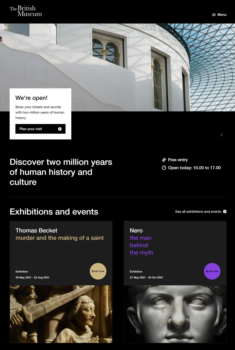
People have a limited attention span when scanning through websites’ home pages, so a good way to grab their attention is with an appealing headline that is relevant and concise. Additionally, many visitors decide to click on a headline and skim through the text summary before they commit to reading your piece.
4. Call to Action
A call to action is a message that encourages people to take a specific action. To be more precise, if you want to build a successful homepage, it’s essential to have a call to action that answers the question asking for something and confirms they are ready for it. This will encourage people to sign up or purchase, increasing product demand and profits.
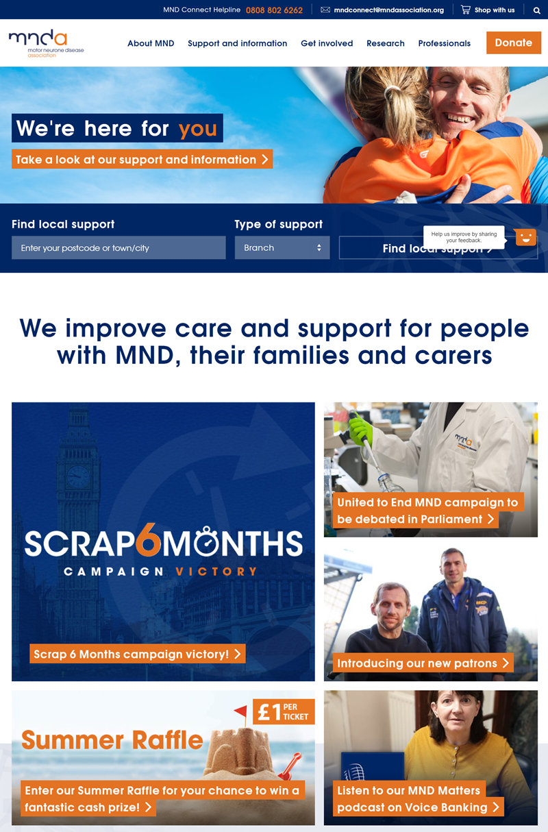
Some examples of calls-to-action would be: “Let us show you how we can help with your roof repairs!” or “Find out more about our commercial carpet cleaning service today.”
5. Social Proof
Social proof is the information you get from third-party sources about how other people respond to your website. It can be in survey results, comments from best home page websites with similar content, or first-hand reviews and testimonials.
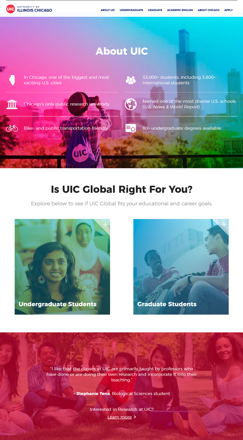
You can build trust and establish your expertise by giving testimonials or customer/client reviews. Social proof helps new visitors realize you understand what you’re doing and enhances their experience with your website. In addition, a positive first impression can be created through success stories.
6. Photos
For any website to succeed, it needs a website home page that engages visitors. Photos can be a great addition to this page, both for purposes of aesthetics and for a more interactive and engaging user experience.

Quite simply, people see things visually. Because of the viewer’s ability to connect with the image, a stationary photo of your product should have a picture of someone using it or engaging in the service.
As humans, we are hardwired to bear witness to emotional expressiveness, and we empathize with the emotion expressed in faces. Therefore, a website is more credible and authentic when it includes photos.
7. Text Content
Text content is the written word that appears on your homepage or web page. It can be anything from a description of your company to a promotion for an upcoming event.
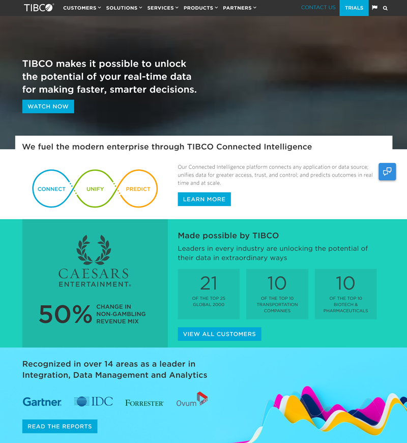
Designers want their text content to tell visitors more about what they will find on your website and why they should visit you. As with many home page designs, text content is important because it is most likely what the visitor will read when visiting your site and then viewing other pages afterward.
8. Footer
Footer is a section at the bottom of a web page that will appear at the very end of your website. It contains copyright notes, links to footer pages, site maps, contact information, and so on.
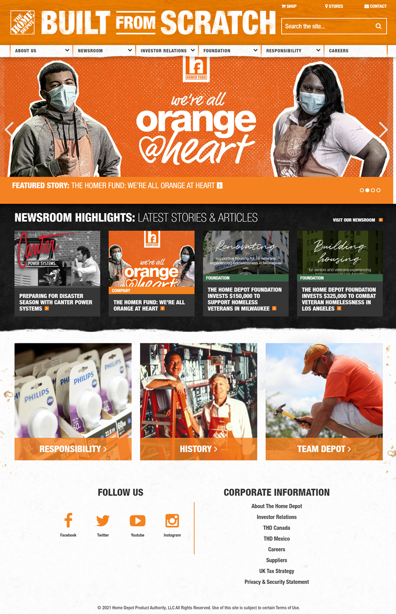
The page width usually determines the size of a footer, and it should fit in the bottom part of the browser window. You usually put it at the bottom of your site because it’s easy to read, doesn’t affect page display, and allows users to scroll down more quickly.
Read more: 33 Unique Website Footer Examples and Why They Work
9. Benefit Buying From You
This section is perfect for businesses that want to create a great first impression on potential customers with their home page!
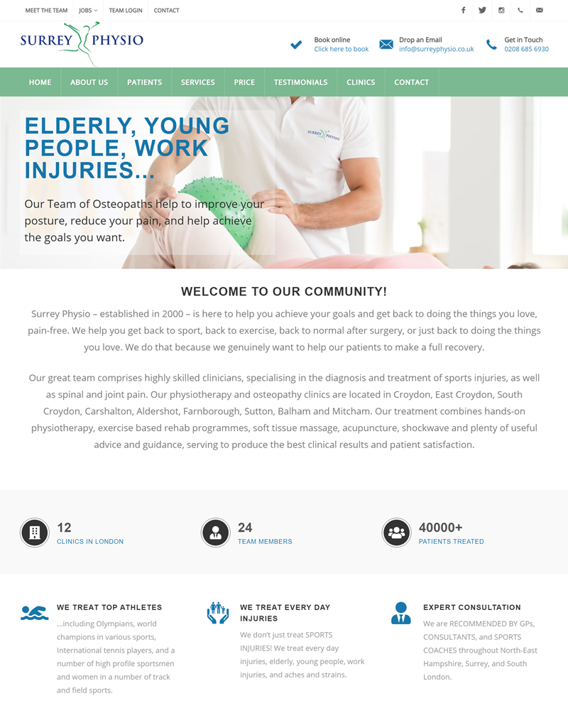
Putting the benefits of buying is a wise homepage idea because it will show the customer what they are getting into their purchase. You might also mention the guarantee you give them when they order or how your products are better than your competitors.
10. Add Social Link
A social link is a forward or backward link from your website to another. The website owner usually sets up such links to send traffic to their site.
When you visit any page, social media icons provide instant access to a person on the internet.
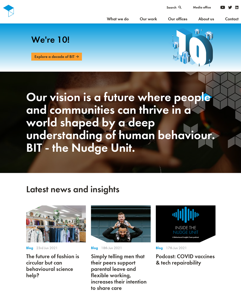
Putting your profile next to your company name can help people feel more confident purchasing from your business. You also have the opportunity to directly reach out and connect with future customers through Twitter or Facebook messages.

Create beautiful Magento home pages with Magezon Page Builder
Easily create your engaging Magento homepages in any style whenever you want without relying on developers or designers. Just by drag & drop.
Tips for Making an Excellent Website Homepage
If you are just starting with a website or your business needs a facelift, your home page is one of the most important parts to consider. It needs to be attention-grabbing, and it needs to grab people’s interest and make it easy for them to find what they are looking for. And while there is no perfect formula for the ideal layout, plenty of tips and tricks will help you create a good home page.
1. Clean up Your Layout and Make It Easy to Navigate
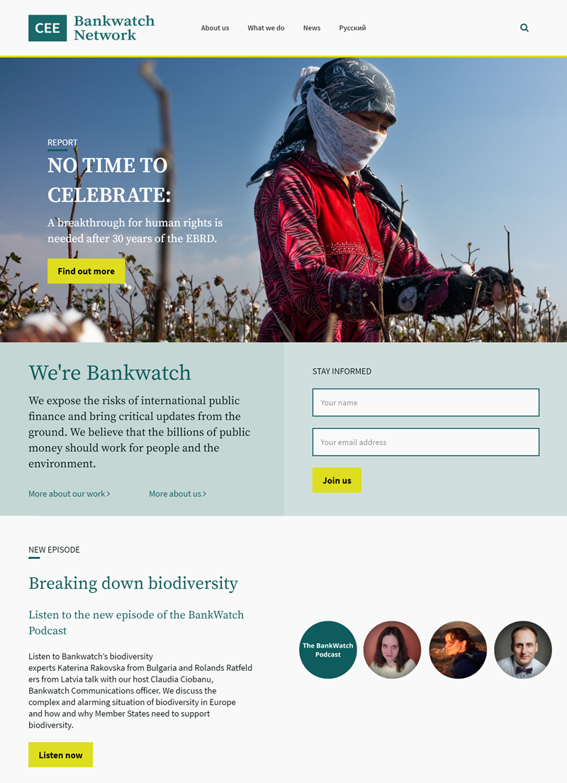
To make a good first impression for great home pages, it is necessary to have a clean design. A cluttered and confusing home page can turn people away from your website before they even read your content.
Here are some tips to help you perfect your website homepage designs and help make an impact:
- Start by picking the perfect color scheme (or at least choosing a primary color that contrasts with your background).
- Give all of your links a big, brightly colored border around them. This will make them stand out from the page. Another technique is to give each link a unique background so they are easy to tell apart from each other.
- Avoid using too much text and clutter, and make sure you don’t put critical information in the bottom corners of your page where it is harder to see.
- Try to avoid clip art and other graphics that might seem outdated or tacky, as this could detract from the professionalism of an otherwise great website.
If you want them to convert into customers, they must immediately see that an easy navigation system is available. You may put your main messages upfront and center and establish a clear call to action.
2. Content Should Be Useful
Aside from the appearance of your website, it is also important to ensure you have interesting and valuable content. Furthermore, you must present all of this content in an organized manner.
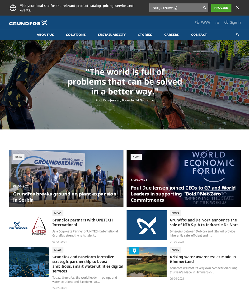
People should be able to find what they are looking for without too much trouble. You can do this by ensuring that your headings are clear and easily identifiable and that there are plenty of links to other pages where people can find more information on the topic if they want it.
You may keep content short on the home page, allowing customers to read any relevant information you have provided. However, if the content is too long, it will create a cluttered look on your page, with visitors feeling overwhelmed and unable to find what they are looking for.
3. Update Frequently
Also, your content should always be high quality and up-to-date. If your blog is no longer relevant, get rid of it. If you change your website’s homepage design, update everything else. Just because you don’t want to do it doesn’t mean your readers don’t need it.
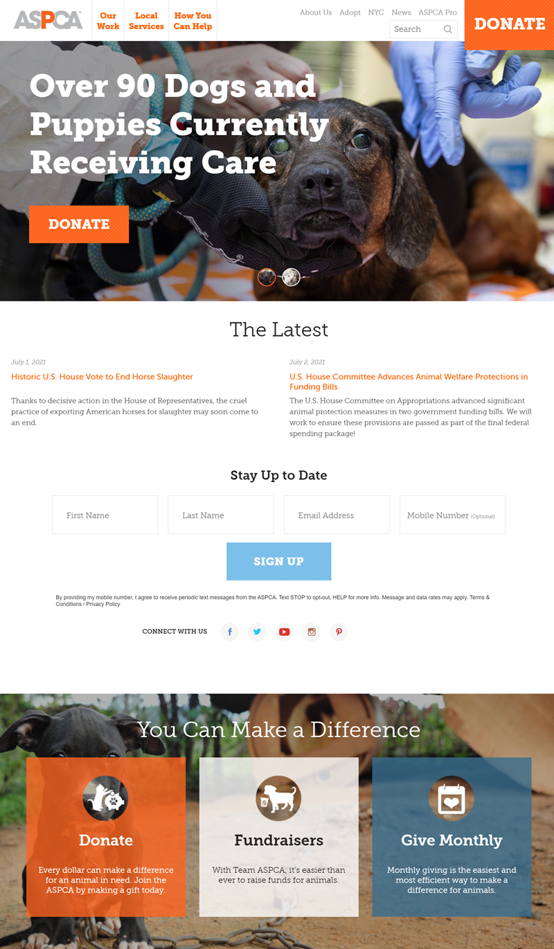
Readers need to have the most up-to-date and detailed information about a topic they are researching, which is why bloggers create blog posts.
4. Create a Blog or News Feed
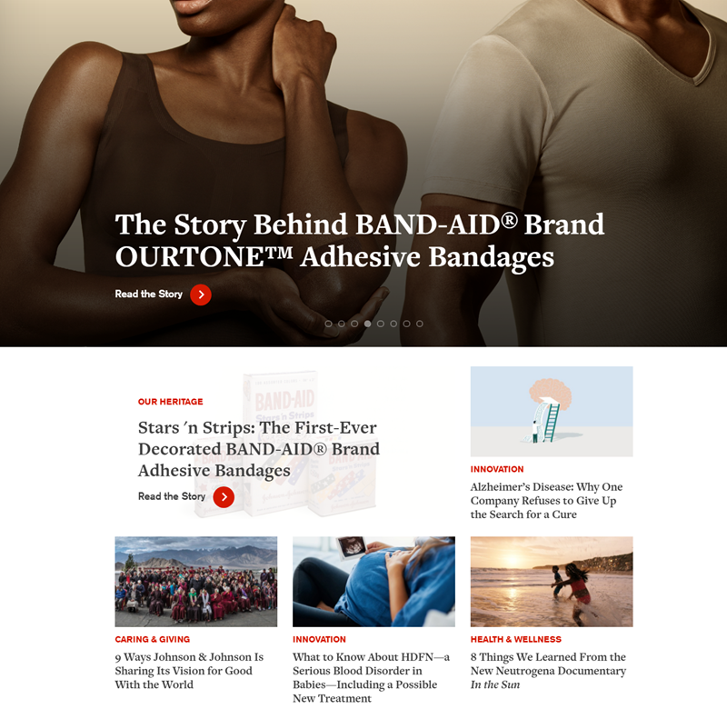
Another thing you can do to help keep people on your site is to create a blog or news feed. This way, customers will access new information as it comes out and will be more likely to visit your website frequently. You can also use social media sites like Facebook or Twitter to immediately get the word out about new content and attract more people to your website.
5. Create Optimized Buttons
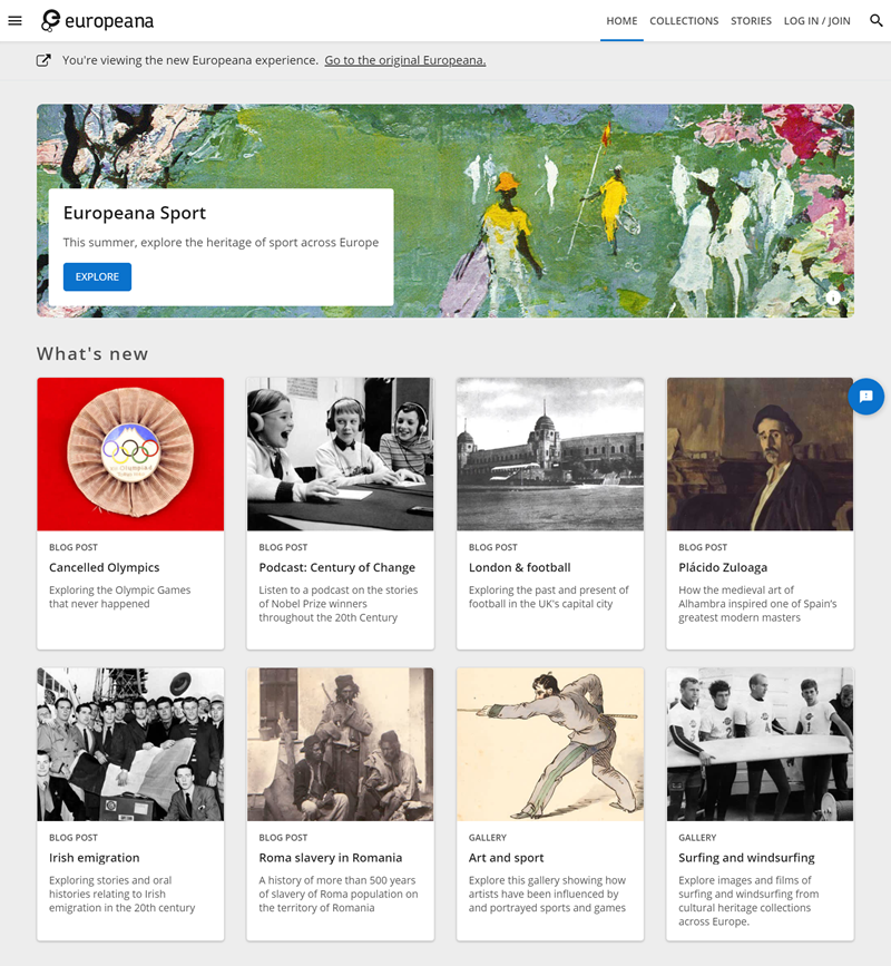
The home page is a critical part of any website, so it’s worth considering whether you want to optimize your home page buttons. If you decide you do, here are a few tips and tricks:
- Check to see that your main button is easy to see. The most common mistake people make on their homepage is putting the other buttons near the bottom of the screen; if they’re too small, nobody will see them. Remember, put the CTA above the fold! Don’t just assume that everyone who visits your site will scroll straight down to the bottom of the page. Most people don’t.
- If you design your buttons, make sure they are big enough and have enough contrast with their backgrounds. If they’re too small, they’ll be hard to see, and if their color blends in too much with the background, your visitors won’t be able to click them.
6. Be Sure Your Background and Color Scheme Are Compatible

As a rule of thumb, keep your background simple and avoid using anything very busy or distracting. Also, I recommend using a solid color (or gradient if you’d like) with little texture for the best results. Some websites have used textures and patterns in the past, and most of them didn’t look good– it’s much wiser to go with a solid color.
7. Photos Should Be High Resolution
To provide a welcoming environment for your visitors, the focus of your site must be on them. To ensure this happens, you should create a website with high-resolution and beautiful photos to capture their attention. This makes the site more aesthetically pleasing and encourages more extended interactions or better referrals from visitors.
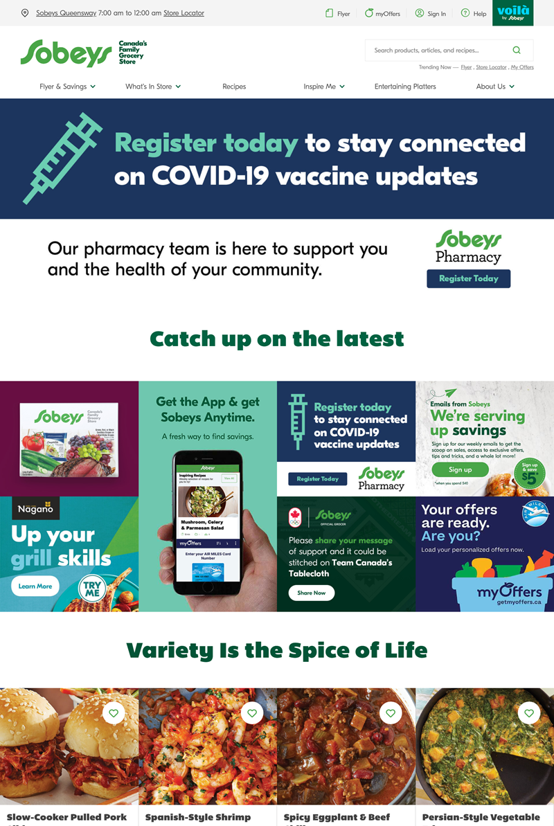
Having said that, photos on your homepage can be a double-edged sword; if done wrong, they can lead to lost conversions and a poor user experience, so ensure that you only add high-quality images.
8. Get Humour
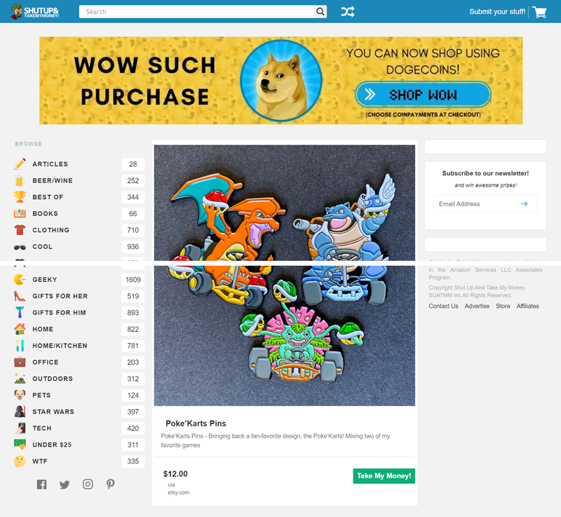
A good way to get attention is through humor in the headline, which can grab visitors’ attention. This is because so many people come to their site for the funny headlines and then go to other pages when they are shown that the content is relevant and has depth and provides them with what they came for.

Create beautiful Magento home pages with Magezon Page Builder
Easily create your engaging Magento homepages in any style whenever you want without relying on developers or designers. Just by drag & drop.
Best Homepage Design Examples
1. Creative Digital
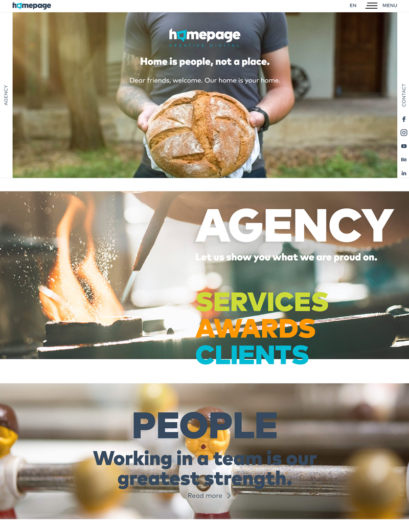
Their website is appealing because it has a soothing color scheme that feels enjoyable with a simple layout. Besides, it has well-designed graphics that make it easy to read without distraction.
There are plenty of visuals to go with the text that help understand and bring some life into articles that might be dull if written only using text.
Overall, the website design homepage is fantastic, and you can tell they put in a lot of work to ensure their visitors have an uncluttered but aesthetically pleasing homepage experience.
2. Built By Buffalo
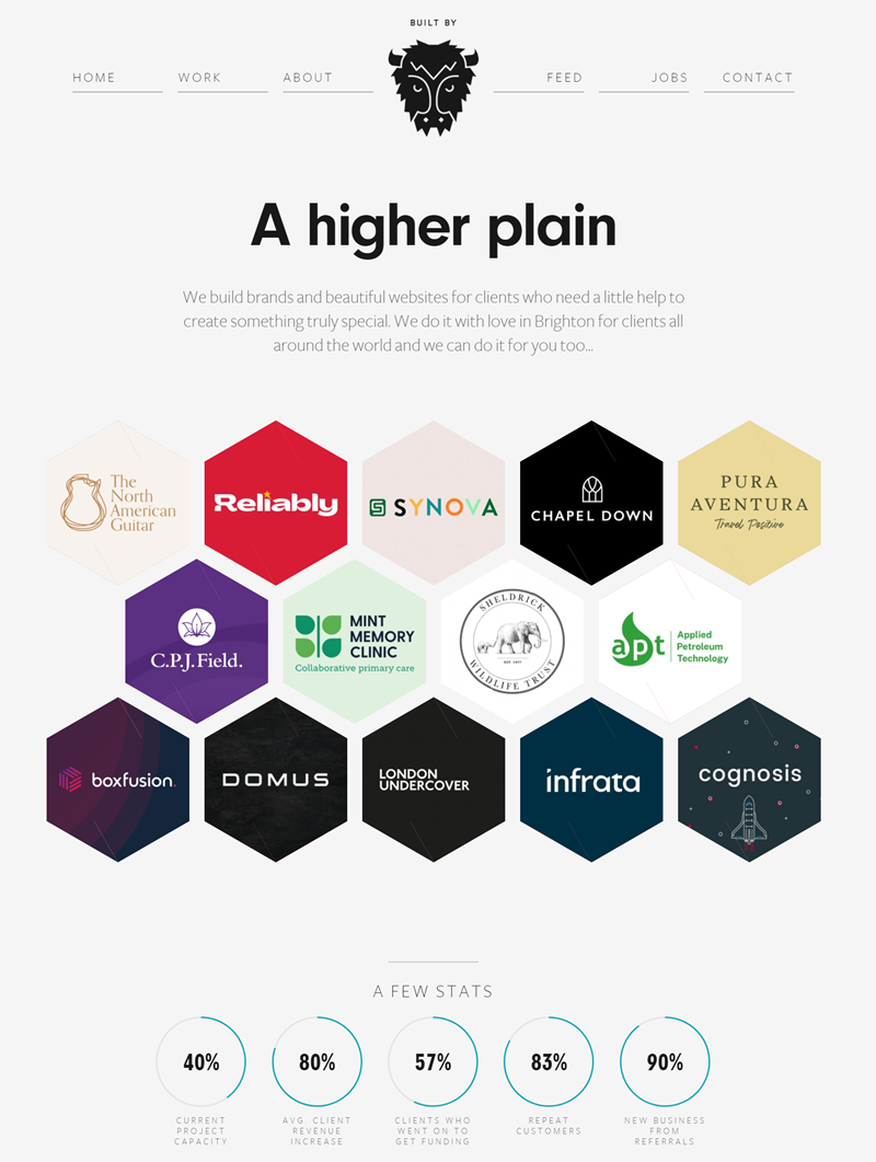
Built By Buffalo is one of the cool homepage designs and is well laid out and easy to flow through. There is a good balance between the content and images, which aren’t too heavy or too light in number.
The art design is very well done and pleasing to the eye, creating an atmosphere of relaxation while reading through the article. The homepage is packed with creativity, beauty, and diversity, some of the website’s trademarks.
BuiltByBuffalo.com is proud of what they do because they don’t just restrict itself to one type of advertising or style of content—they are all over the place while maintaining a cohesive web presence.
3. Eldorado Stone
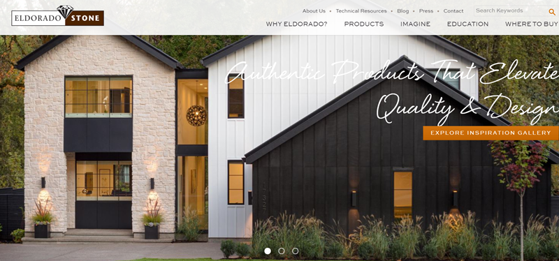
The homepage of Eldorado Stone may not be the first website you come across, but it’s the kind of home page that will catch people’s attention and deliver a clear message about the company.
The homepage is nicely laid out with subtle colors, and its simplicity makes it easy to navigate and learn what they do. The permalink at the top of the page makes sure any visitor knows where they are about the information on their website and other pages, making navigation easy.
What builds the homepage creative, though, is the headlines at the top that draw attention and present an attractive message about Eldorado Stone.
3. Moooi
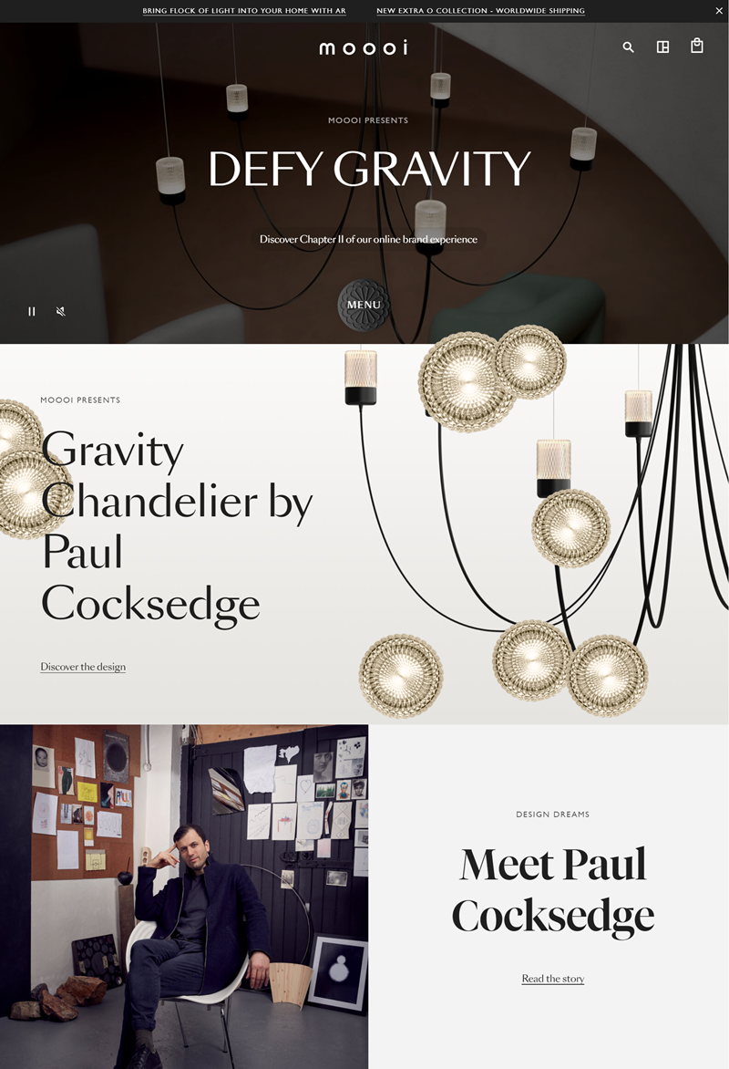
Moooi is one of the homepage examples reflecting the company and its product. This best homepage design shows a lot of creativity and thought.
The way they did their site is creative because they incorporated Moooi’s logo into it. It gives the homepage a more modern feel while providing a creative vibe. They also have a large photo of one of their lights, which shows how much light those things can emit.
Moooi’s brand identity is created by the site’s overall aesthetic, which is meant to capture the wonder of creativity. Due to this website’s engaging design, visitors can learn about what this company does and enjoy it simultaneously.
4. Rotech
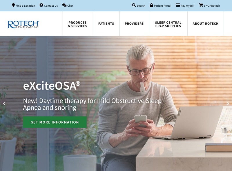
The website is one of the most creative on the internet because it offers a professional vibe by having many large and colorful pictures and emphasizing visitors with a friendly, welcoming font.
They have a clear vision of what they want their homepage to look like and how they want people to feel about it, making all the difference in the world. Visitors automatically feel welcomed by this page because it feels familiar and comfortable.
This website homepage also provides users with information that keeps them focused on what they want to know- making them less likely to leave without finding what they’re looking for.
5. Aperture
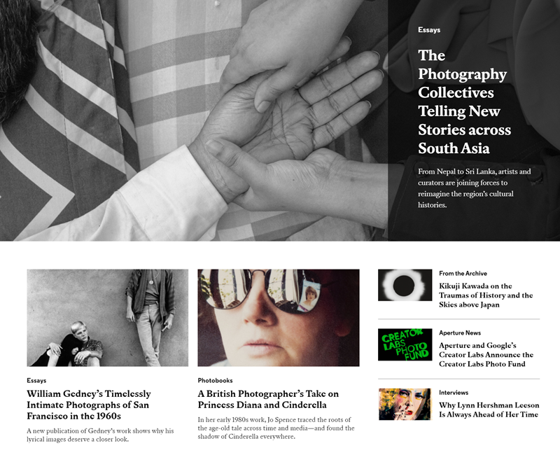
Aperture’s front page is unique because it has a minimalistic website design approach. They use whitespace to make the design simple yet elegant, where users can easily navigate through one page.
Otherwise, they have white space and simple colors, making it easy to find what you are looking for by searching and exploring. In addition, you can discover different categories such as videos, iPhones, photos, and more. Overall, it is an understandable and creative homepage that is uniquely their own.
6. Rh
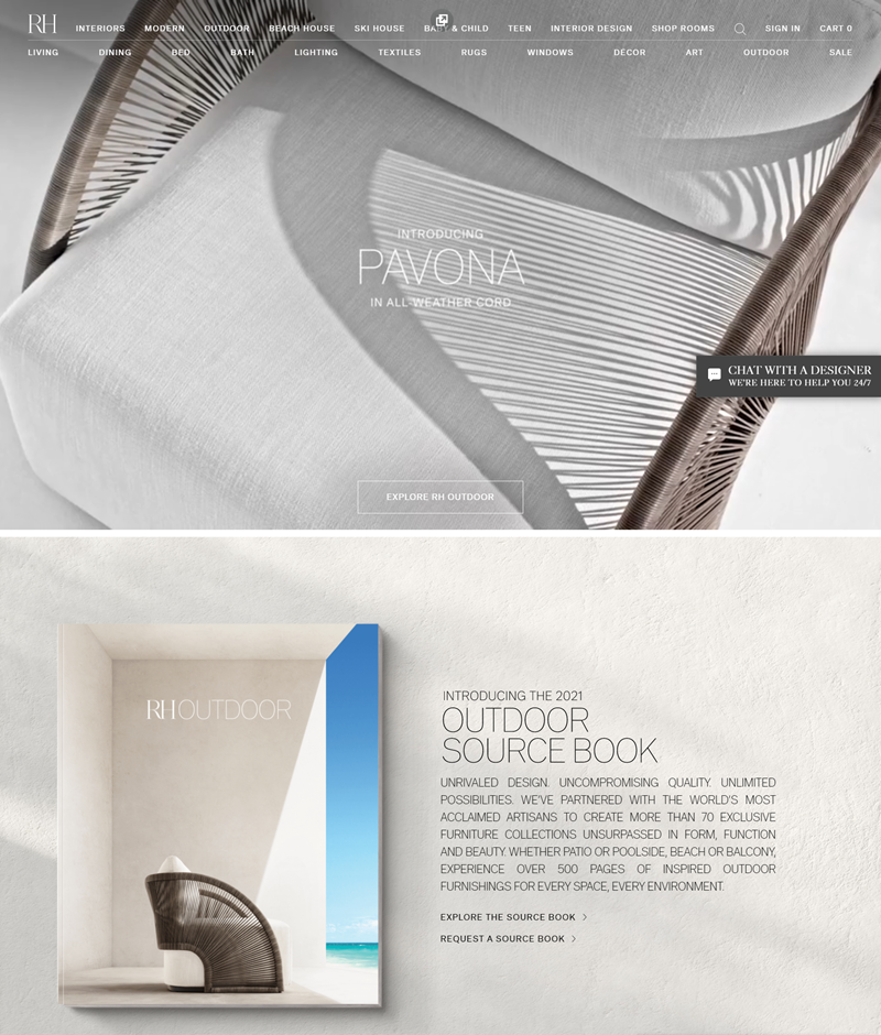
Rh’s homepage is creative because it has many elements that make it creative and appealing to the eye. It considers aesthetics, usability, good typography, colors, and even information architecture.
If you visit their site, you can tell that creativity comes naturally because they have presented their website this way, showing through perfectly well.
It makes you want to click and explore further, which is one of the most important aspects of a website. If a website can’t get you in that quickly and inspire creativity, then it’s probably not going to be very successful. Rh has done a fantastic job with its homepage for these reasons.
7. Edward Jones

Edward Jones’s homepage is not overloaded with flashy graphics. The best part about their site is that it has information and images without cluttering.
It is well organized, and the content is easy to find. When users first come to the homepage, they are immediately given an overview of what Edward Jones does, which is good for someone who might not know anything about Edward Jones or how it works.
EJ is not only creative, but it’s also unique. It’s a website unlike any other in its category and offers visitors a fantastic experience. Their homepage calls to mind a more human-interactive world than ever before.
8. Eastern Bank
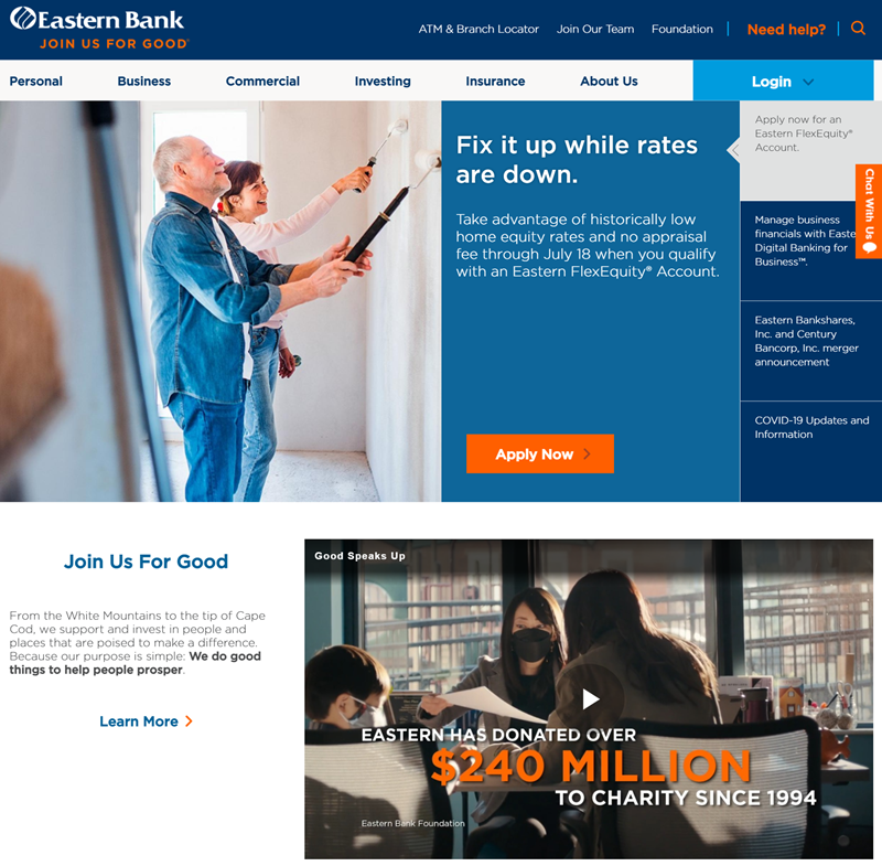
The colors of Eastern Bank are eye-catching with a clean and interesting design, everything is easy to read, and you can see what they are about.
Eastern Bank has many different sections that branch off of the homepage: “commercial”, “personal”, “investment services”, etc. The links at the top of the page will take you back to each one. They also have a link on their homepage, so if you have any questions or need help, there’s always a way to contact them directly when needed.
9. Achieve Lausd
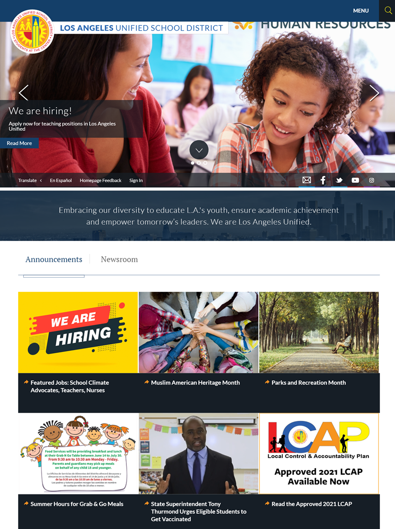
The homepage is centered around a large, unique photo, and the background is done in bright colors to match the central image. It is a showpiece of what Lausd can offer its students. The homepage has a modern feel and vibrant colors and shapes to encourage visitors to explore the rest of the website.
Creative design helps draw people in and keeps them there long enough to digest all its visitors can discover through exploration. If you’re an educator or student looking for homepages for education-related websites, Lausd would be a good place for you because it is inspiring.
10. Stanford Federal Credit Union
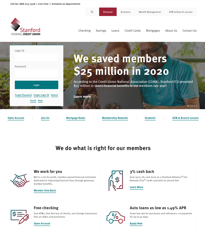
Stanford Federal Credit Union is one of the good website examples because it’s as simple as creative. These are the most important tenants of a good homepage. They focus on the company’s mission and values and are easy to understand.
The layout is easy to read, especially with a strong, bold font for their titles and sub-titles, which communicate what they stand for. The credit union emphasizes this same tactic across its website, with each section conveying its purpose through its name.
They also provide their customers with a very easy-to-use search tool, and by giving a small amount of information on each page, their homepage is not so crowded, but all the essential details are included.
11. Pearl Izumi
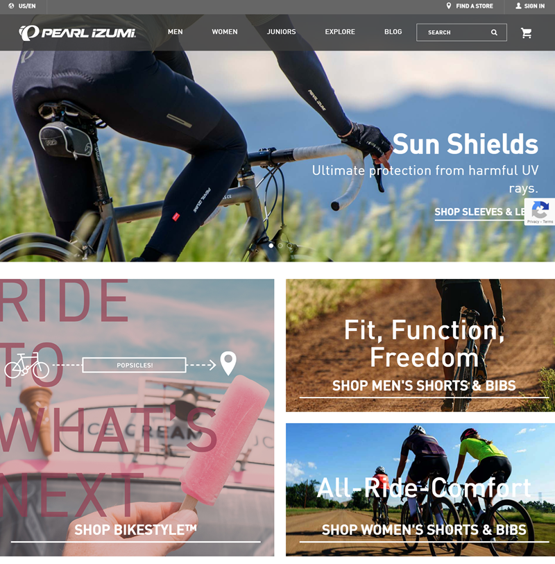
Pearl Izumi’s beautiful homepage captures the essence of what they offer, well-crafted writing. The site is bold and daring in its use of color. It’s easy on the eyes, easy to navigate, and looks as professional as creative.
It is an excellent example of how creativity can be used effectively to draw the attention of potential customers. The site is attractive to the eye and bold and daring, but when you dig deeper into the content, something polished and professional makes this home page stand out from all others.
12. Designzillas
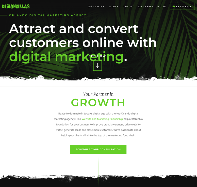
Designzillas is one of the great homepage designs that looks simple and elegant. It is innovative because the color scheme mixes black, white, and green which looks spectacular. The text font is white, and the contrasting boxes with arrows are creatively designed.
The tight, concise lines of the website make it look like a magazine cover. It’s creative because there is not too much information but not too little.
The homepage appeals to my aesthetic sense and conveys creativity well. I can imagine what a blog or another website might look like because of this design’s simplicity and attention to detail.

Create beautiful Magento home pages with Magezon Page Builder
Easily create your engaging Magento homepages in any style whenever you want without relying on developers or designers. Just by drag & drop.
13. DC Fonts
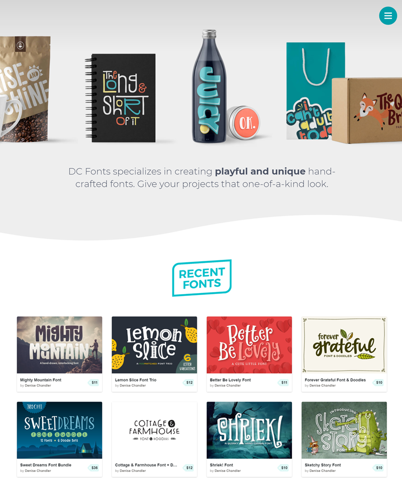
Here is one of the top website homepage ideas, which is artistic and original. It has a crafty vibe that you would not find anywhere else. Every painting and font selection adds to the website’s personality and makes many aspects of its design stand out.
When you dive into the site to explore all the beautiful typography, it becomes apparent that everything on Dc Fonts’ homepage is unique, from images to fonts, which means you always have something new to see when visiting this page over and over again.
14. British Antarctic Survey
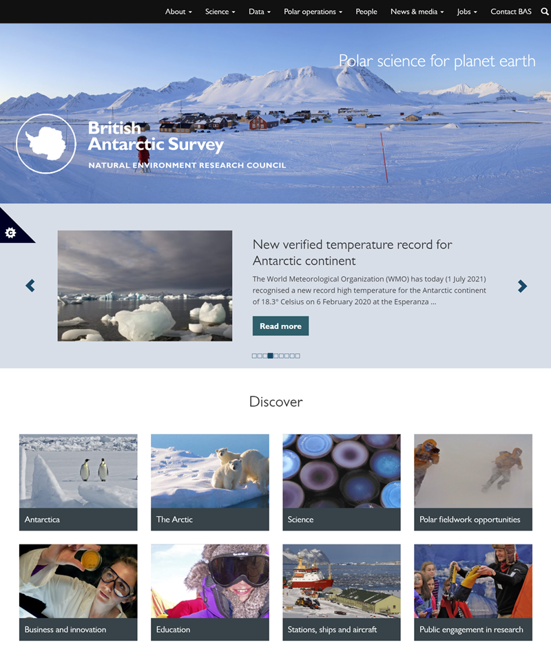
Their website home page design is stunning because of its simplicity and obsessively clean and minimal. Nothing on the page distracts from the information. Its only purpose is to deliver a clear message: things about Antarctica and this website are contained.
This website has realized the importance of clarity, conciseness, and efficiency in conveying its message to readers. It has become so incredibly successful in attracting an audience that will find value from what they read every day.
15. Planet

The layout of Planet’s homepage is just right- it’s not so busy that you can’t see what the page offers, but it also has lots to explore.
The layout of Planet’s homepage is pleasing to the eye and attractive. For starters, there is a wormhole-like transition when you navigate the site that grabs your attention and helps you discover new content. On top of that, Planet incorporates plenty of vivid colors to add even more life to its design while providing an intuitive navigation menu.
16. DocuSign
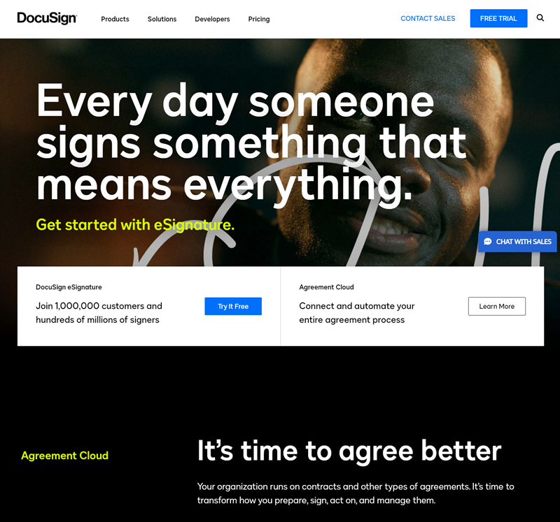
DocuSign’s homepage is beautiful because it is, in its own way, creative. The design for the homepage is colorful and one-of-a-kind. It emphasizes its visual web app, which shows what is happening on a project with creative visuals to serve as reminders for people doing the work.
The homepage has found a way to do something that many other home pages fail to do: it has been inventive enough to make people notice, but at the same time, it does not go over the top so much that it looks unintelligent.
17. National Trust
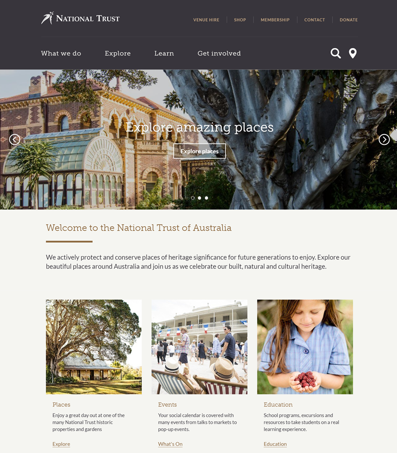
National Trust is what a good home page looks like. It is creatively designed to reflect the values people at the organization believe in. The homepage is made up of four sections that are neat and easy to navigate: “What we do,” “Explore,” “Learn,” and “Get Involved.”
The design offers a way to connect with people and be surrounded by a million different homepage ideas you can love. The National Trust’s values are clearly displayed on the homepage. The “What we do” section highlights what the charity has done to protect and campaign for places of historical importance, nationally and internationally.
18. Ten Thousand Villages
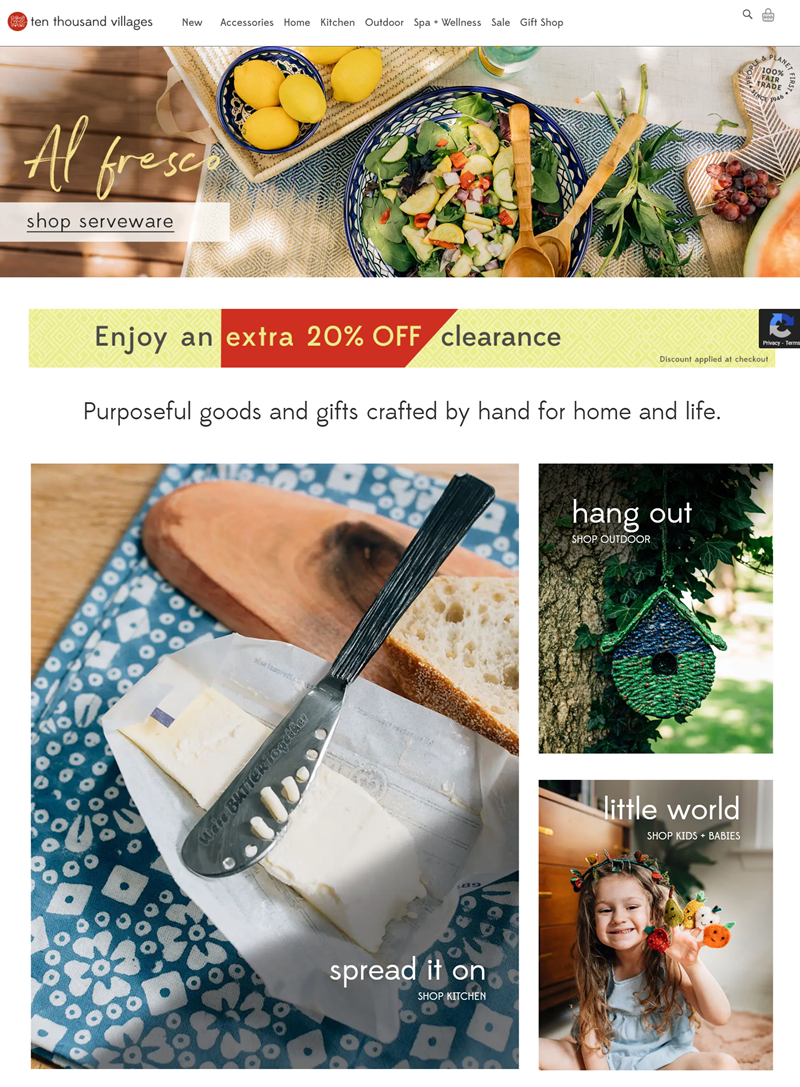
It is one of the best homepages, made with a beautiful layout. Looking at the website, you know this isn’t going to be a typical article about an e-commerce company—it’s a nonprofit that helps improve lives in developing communities.
The homepage gives visitors an overview of how they help people (they don’t just sell goods) and what precisely they do. But unfortunately, most companies forget that your website is not just a commercial tool for you to promote your product or services; it’s also a creative vehicle for ideas and inspiration.
19. The Telecommunications Industry Ombudsman
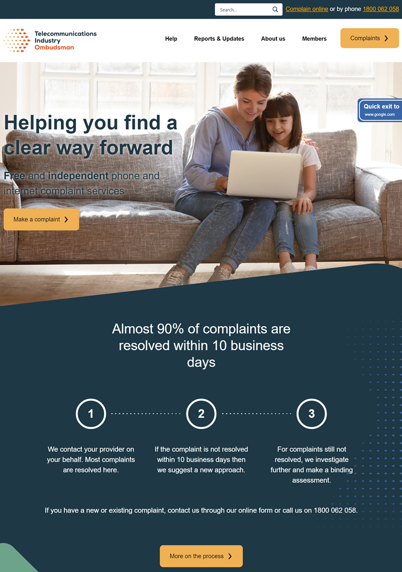
What is a good home page? The Telecommunications Industry Ombudsman will show you that. The page design is clear and concise and uses interactive features to make the user experience as engaging as possible.
The homepage is a great example of how creativity can make websites and other design forms more visually appealing to users. Many different design elements make the homepage creative. However, the two most impressive pictures and their use of blue have been proven to calm people down.
20. Fusion Hotel Group
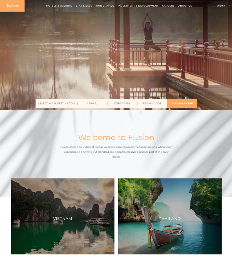
Fusion Hotel Group – Best Home Page.
It has a fully-branded color scheme of white; plenty of pictures showcase different destinations; the navigation bar is organized and straightforward. Fusion Hotel Group’s website homepage inspiration clarifies what they offer and makes their brand stand out through color coordination.
The background picture of the mountain peaks sets a mood for this website. I like these things because they make the website seem more original and modern. It also makes it easier for the user to read what is on the screen because it is striking more than plain text with no font or color variations.
Conclusion
In conclusion, homepage websites are becoming increasingly critical for companies to create an online presence. In addition, the website’s design can speak volumes about the company or organization’s brand identity, values, and identity.
As a result, it’s essential to invest time and energy into designing this page well. The design should be attractive, informative, and up-to-date with current trends. Keep in mind that the homepages are typically the first thing you see when visiting a company website or blog post.
As with any other industry, we should adopt new trends to improve things. Organizations must take advantage of each opportunity to improve their best home pages for increased visibility in today’s competitive market with a fast-changing internet environment.

Try FREE Magezon Page Builder demo today
Easily create your engaging, interactive Magento homepages in any style whenever you want without relying on developers or designers. Just by drag & drop.
 Magezon Blog Help Merchants Build Comprehensive eCommerce Websites


