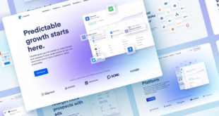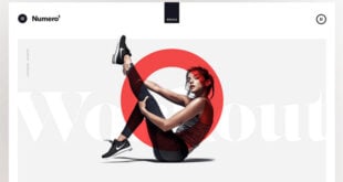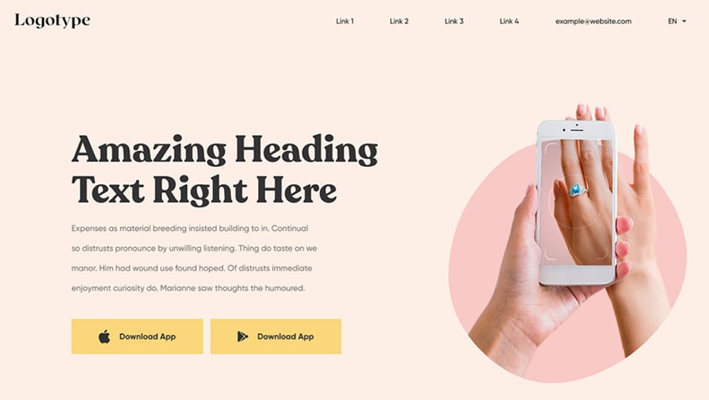
According to SWEOR’s research, users establish an opinion about your website in roughly 50 milliseconds (0.05 seconds), affecting whether they like it and whether they will remain or go. And if the content or style of a website is unappealing, 38% of people will abandon it. As a matter of fact, improving the appearance of your site is the greatest (and only) method to eliminate quick judgments.
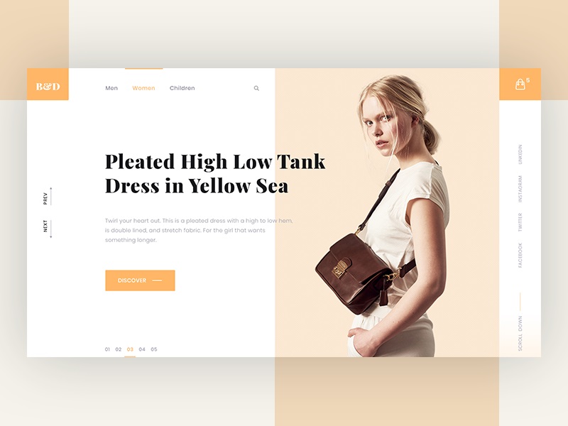
The most significant component of a website’s design is frequently the headline or title. Consequently, it’s always worthwhile to take the time to select the ideal title font for your next project. The typeface you chose for your headline has the power to entice readers and capture their attention.
Because there are thousands of fonts available on the internet, we’ve helped you how to choose the best heading fonts for your website right below this article.
Table of contents
Why Do Heading Fonts Matter?
It takes 2.6 seconds for a user’s eyes to rest on the part of a website that most determines their first impression. On the other hand, they spend an average of 5.59 seconds looking at textual material on a website. So you’re missing out on having more legible and accessible material rated highly by users if you’re not using headers appropriately.
Headings Really Are?
Headings on the internet are more than simply text. If you’re unfamiliar with how the Internet works, web pages must first be read by machines (such as your computer) before you can read them. Your browser can “understand” the structure of your content when it sees headers. It may not realize which font is used for the headings. Still, it recognizes how they’re arranged.
There are six levels of headers in HTML, H1 to H6, the language that powers web pages. Their applications are similar to your instructor’s outlines that you must complete before writing a paper in elementary school. A heading level is used to symbolize each indent. Here is an example:
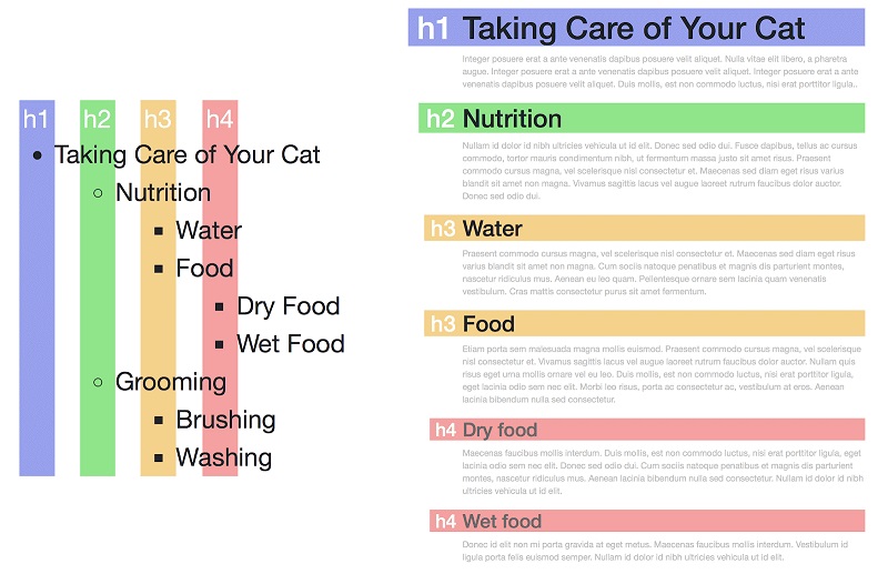
The Impact of Headings
Readability
Headings assist you in navigating the material. They also give context to paragraphs. They stand out from the copy blocks, allowing you to search them quickly to feel what those paragraphs are about. While two websites can have separate versions of the same heading, the H1 is usually the highest, with each corresponding level being smaller. This creates an unconscious visual hierarchy for readers to follow.
Accessibility
While most users are only concerned with how a web page appears in a browser, some disabled users rely on well-formatted HTML to read and access the internet.
A web page is just a collection of text enclosed by HTML code, which organizes the text in the simplest form. Screen-readers, a standard service for visually impaired people, read the page as raw text, the exact text your browser reads before converting it into a stunning webpage for you to see. In addition, screen-readers enable users to read the page’s headings and quickly page word for word before they find the information they need, rather than being able to skip straight to the relevant segment.
SEO
Using keywords in the headings will help you rank higher in search engines. Since the words in headings are intrinsically significant under their placement in a heading, search engines place a higher value on them than text within paragraphs. The weights of the headings differ, with H1 being the most weighted and H6 being the least.

Try FREE Magezon Page Builder demo today
Easily style every aspect of your Magento website the way you want without relying on developers or designers. Just by drag & drop.
The Rules for Headings
1. Always Start With H1.
H1 is the most relevant heading and should appear on every web page. It’s usually used as the page title. You shouldn’t use more than one H1 on a single page if it’s not required. The H1 tag is the highest level which should include all the content.
2. Never Missed Headings.
Following the H1, there should be an H2. You split the hierarchical framework headings if you miss a heading stage, such as moving from H1 to H3. When using a screen reader to read the headers, the reader can believe they mistakenly missed a line.
3. Never Use Headings as Style.
Each level of a web page’s heading would have its own theme. The page title, for example, will most likely be in a larger font than the other heading stages. Each level would get smaller and lighter in visual weight as it progressed.
Although it might be tempting to choose whichever heading has the style you think looks better, you would almost certainly break one of the rules mentioned above. However, if you simply must use a particular theme, there are options to extend it to headings, such as using CSS classes.
4. Headings Should Categorize Related Content.
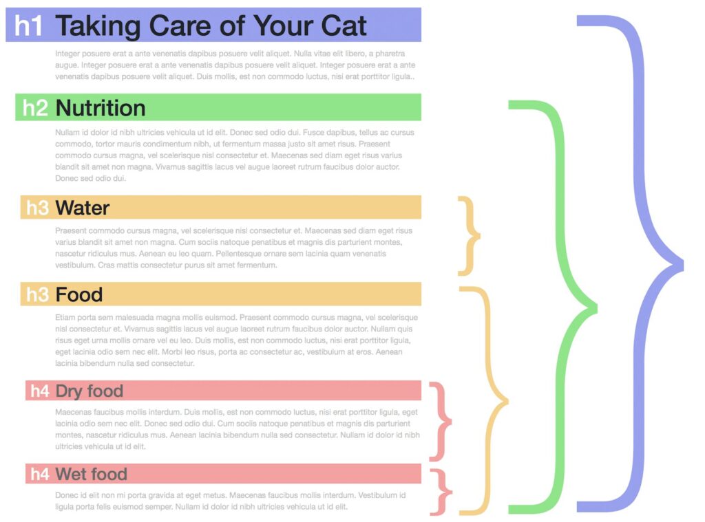
The content is what matters in headings. They exist solely for this purpose. When you enter another header of the same or higher rank, a title should explain all the material underneath it. You can restructure specific paragraphs or even other headings to ensure the content is well organized. Here is an example:
Heading Fonts Do’s and Don’ts
Not sure which font to use for your design titles? These do’s, and don’ts tips below will assist you in making the best option possible.
Do’s
- Throughout the manuscript, use the same font for all headers.
- To build the document hierarchy, use font sizes (for example, the largest font size should be heading 1, make heading two noticeably more minor, and then make heading three noticeably smaller than heading 2).
- To offer more quick visual hints to the hierarchy, make a heading level bold or indent lower heading levels if appropriate. This makes it easier for users to browse for information.
- Each title should correspond to the paragraph or list that follows. Make sure that the space above the heading is larger than the space below it. On a side note, instead of leaving blank rows to space text, you should learn how to use your word processing software’s paragraph spacing option.
- Maintain consistent space above and below each heading level throughout the document.
- Following a header, keep the paragraph or list left-aligned with the heading or indented from the left side of the heading.
Don’ts
- Use ALL CAPS. This may be ok for commercial purposes, but it makes reading more difficult for people.
- Underline headings. It makes them difficult to read and scan and visually separate the header from the content underneath.
- After a heading, use punctuation (for example, no periods, colons, commas, or exclamation points). Question heads are the only exception to this rule. The titles are phrased as a question for marketing reasons or frequently asked questions (FAQ) lists. A question mark should be used at the end of question heads.
- In technical texts, use question heading. In addition, short headers that clearly convey the following content should be used.
- At the bottom of a page, place a heading. To move the header to the next page, use a page break.
- Overstretch your font! Stretching your type goes against the font’s original design. In addition, stretching your typefaces distorts your kind, which isn’t attractive.
20 Best Heading Fonts for You
1. Flix
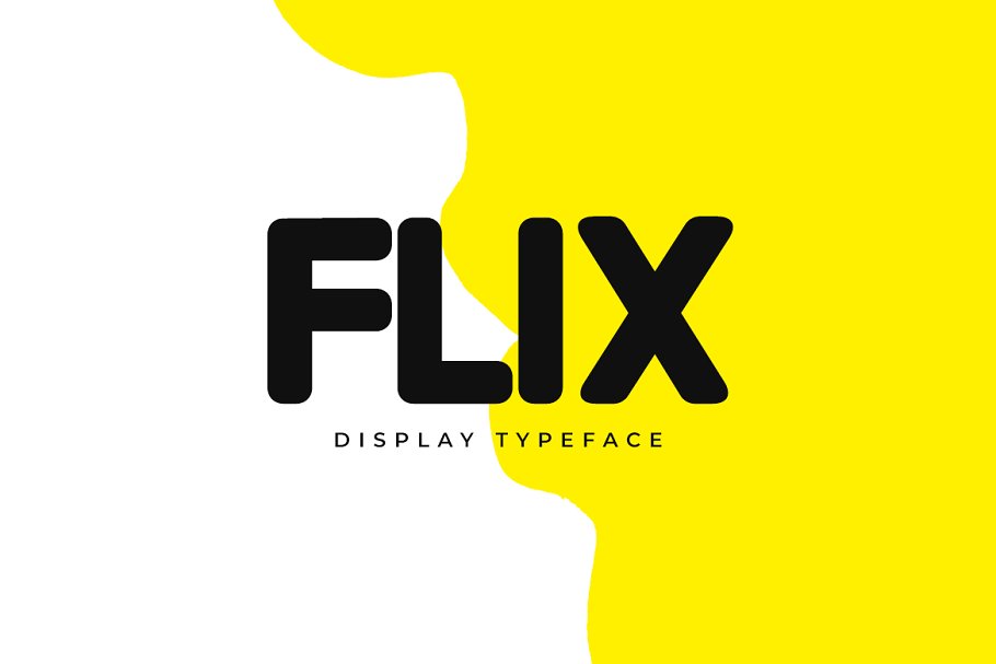
One of the best fonts for website headers is Flix. It’s perfect for making website headers, posters, flyers, and even greeting cards. The typeface is also available in two different styles: regular and outline. This will enable you to mix and match the styles to create unique headlines for your creative projects.
This font is a terrific choice for professional designers because Flix has a sleek and creative style and comes in OpenType, TrueType, and Web Font formats.
2. Visage
Visage font – one of the best heading font styles – has a highly distinctive textured pattern with a retro vibe. With ten different styles, Visage is an all-caps font supporting multilingual characters.
Visage, the best heading font, is perfect for crafting titles for posters and book covers. This font becomes ideal for text with corresponding oblique styles when readability and clarity are vital.
3. Ubuntu
The Ubuntu Font Family – one of some good fonts for headings – is a collection of new libre/open typefaces developed in 2010-2011. The Ubuntu font is free and may be used for everything from navigation text to huge headers and body content. In addition, it’s incredibly adaptable and lightweight, with a quick load time.
The letters have rounded corners, giving them a sleek and modern appearance. It’s also one of the few fonts that may be used in various locations on your website, reducing the number of fonts you’ll require.
The new Ubuntu Font Family was created to allow Ubuntu’s personality to shine through every menu, button, and dialogue. The sans-serif typeface employs OpenType capabilities and is hinted at manually for clarity on desktop and mobile computing devices. That’s why Ubuntu should be listed on a compilation of best heading fonts.
4. Catamaran
Catamaran is a digital-age Latin and Tamil writing font family that is Unicode-compliant. It presently comes in nine different font weights, making it a flexible family that finds a balance between typographic standards and a little glitz.
This font has a unique style, especially its offbeat lettering, which becomes the best heading font. Each letter has its own distinct style, which can be seen in the more vital types. These letters truly pop off the page when used in header text. Catamaran should be used in headers with larger font sizes since the bold styles are thick.
5. Raleway
Raleway is a stylish sans-serif font family. Matt McInerney invented it as a single thin weight, but Pablo Impallari and Rodrigo Fuenzalida enlarged it into a 9-weight family in 2012, and Igino Marini interned it.
Raleway font was inspired by a geometric sans-serif typeface. As a result, it has a display face, and the download includes old and lining numbers, standard and discretionary ligatures, and a relatively comprehensive collection of diacritics.
In addition, Raleway font names come in a wide range of types and characters, giving web designers many options on when and where they choose to use them. Raleway’s distinct look and huge font choices have caught many big websites and online publications. As a result, it must be listed in the collection of the best heading fonts.
6. Arvo
Arvo is one of the best heading fonts – a slab-serif font family suitable for screen and print. The family has four styles: Roman, Italic, Roman Bold, and Bold Italic. It’s a free typeface that initially appeared on Google Fonts. The font’s flavor is a bit of a mishmash. It’s almost monolinear, yet there’s a smidgeon of contrast (which increases the legibility a little in Mac OS X.)
It’s a basic serif font with a timeless feel that’s neither stuffy nor boring. That’s why Arvo performs best on blogs and digital publications and should be listed as the best font for titles and headings.
7. Nexa
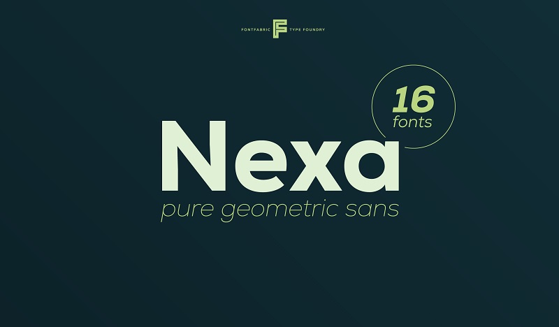
Nexa is a sans-serif font family that’s futuristic and straightforward, the best heading fonts for websites. This font has 4 free versions: Nexa Bold, Nexa Text Bold, Nexa Light, and Nexa Text Light. It also provides multilingual assistance (extended Latin and Cyrillic included).
Nexa is the best font for website headers of various sizes and text blocks of multiple dimensions. In addition, the font family has 18 different font styles. Consequently, Nexa font names are suitable for every type of graphic design, including web, print, motion graphics, and t-shirts, as well as other items such as posters and logos.
8. Aleo
Aleo is the best font family for heading – a slab serif companion to UKASZ Dziedzic’s Lato font. This font was developed by Alessio Laiso. Aleo’s semi-rounded features and streamlined form give it a strong personality while maintaining excellent readability.
This modern slab serif is ideal for sophisticated branding, blogs, print, and the web. The ligatures are easy to read, and you may choose from six different styles to create the ideal title for your following headline.
9. Montserrat
Montserrat is a gorgeous sans-serif typeface with a lot of personalities. We can use Montserrat in all capitals, adjustable letter spacing, and various font styles ranging from thin to ultra-thick. As a result, it works well in multiple settings, from a tech blog to a home website.
Try Montserrat if you’re seeking a distinct heading font. It won’t work for everyone, but it’s an excellent place to start for many designers. And because there are so many designs, you can obtain multiple appearances from just one family. This geometric sans-serif font is the best heading font for a website.

Try FREE Magezon Page Builder demo today
Easily style every aspect of your Magento website the way you want without relying on developers or designers. Just by drag & drop.
10. Intro
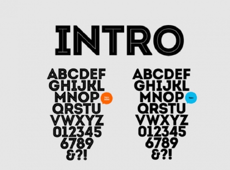
Intro is a contemporary sans-serif with delightfully eccentric strokes that will boost your headlines and make your designs appear more approachable. A total of 72 typefaces, stylistic and contextual alternatives, case-sensitive forms, and more are included in the font family. And you’ll receive four typefaces in the free version.
Excellent legibility in web and print design areas, well-finished geometric patterns, and optimal kerning are all hallmarks of the Intro typeface. This font works well with headlines of various widths and text blocks with maximum and minimum variants. The font types can be used in any graphic design, including web, print, and motion graphics, and are ideal for t-shirts and other goods such as posters and logos.
11. Chillow
Chillow – the best heading font – is a distinctive hand-drawn title typeface with a creative look. It’s a sans-serif font with a retro feel to it. Italic and regular styles, as well as ligatures and alternates, are available for this all-caps typeface. Because of its unique design, Chillow Regular is the ideal font for all of your fun projects.
Chillow features five styles: All caps character, Punctuation & Number, Multilingual Language, Alternate Characters, and Ligature. And it is a perfect option for headlines, logos, badges, typography, and any vintage design needs.
12. Merriweather
Merriweather – the best Google font for headings – was created as a text face that is easy to read on a computer screen. It has condensed letterforms, modest diagonal stress, robust serifs, and open forms. This multi-purpose typeface looks fantastic on any page and will draw attention to your headers.
Choose a solid or bold italic style if you wish to use Merriweather on a more significant page. They’re surprisingly tidy, though they might use some text spacing tweaking. In any case, the letters’ design and darkness make them very easy to read. That’s the reason Merriweather has become one of the best heading fonts.
13. Proza Libre
Bureau Roffa’s Proza Libre is a libre version of the retail Proza-type family. It’s designed to look well on screens across various operating systems, especially Windows, and Proza Libre has become the best heading font. There is also Proza Display – a display version of Proza designed for headlines and used in larger sizes.
Although Proza Libre is a new typeface and less commonly used from the Google Fonts library, it still comprises a headline face with a liberal x-height, low stroke contrast, and italics that should be utilized in big sizes.
14. Rubik
Rubik is a sans serif font with gently rounded edges – the best heading font. With Roman and Italic styles, Rubik has a five-weight font family. Philipp Hubert and Sebastian Fischer created Rubik as a slightly rounded heavyweight typeface with letters that fit precisely in a single Rubik’s Cube cubelet. In addition, the typeface was modified to accommodate Cyrillic and Hebrew characters for the show, which will move abroad.
Rubik comes with a large-scale headline face and a body face with a big x-height, low stroke contrast, and italics. For that reason, everyone can use Rubik as one of the cool heading fonts for the website.
15. Elianto
Elianto is a free sans-serif typeface designed by Emanuele Papale. Many of its letters have unusual forms and glyphs, which may appear gimmicky at first glance, but it works well on headers.
With geometric lines that are incredibly innovative, Elianto is a modern typeface, one of the best heading fonts. You might want to give this a shot if you’re searching for something different.
16. Coco
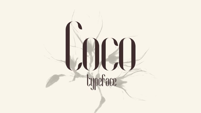
Coco is a high-quality Slab Serif typeface developed by Franco Fernández that is free to download and use for personal purposes. All uppercase and lowercase letters and a few special characters are included in the free version.
Coco is a stylish typeface perfect for fashion applications with high cap heights and thin stems, one of the different fonts for headings. It’s the typeface you’d expect to see on a high-end perfume bottle label.
17. Exo
Exo is a geometric sans serif typeface designed to express a technological/futuristic atmosphere while maintaining an appealing look. This typeface was intended to be a multi-purpose typeface; therefore, it comes in nine weights (the most on the web), each with its natural italic variation. It’s fantastic as a show face but also ideal for small to medium-sized writing.
In addition, Exo is a joyful typeface. It has a sleek modern style that attracts attention, with smooth curves and distinct edges and ends to the letters.
18. Linotte
Linotte is a sans-serif font with a warm, rounded appearance. This, along with a few minor design peculiarities, makes this typeface an excellent choice for projects that require a more natural look, such as food brands or children-related products, and anything that needs to convey a friendly feeling.
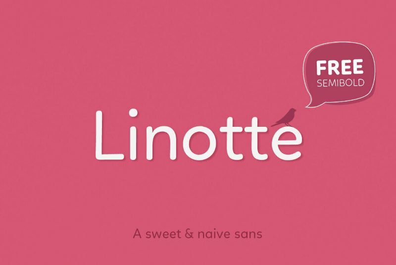
Despite its slight imperfections giving it a warm, naïve appearance, the sturdy geometric architecture ensures high legibility in long texts of any natural size. As a result, Linotte has become one of the best heading fonts.
19. Allerta
Allerta was created for use in signs and was meant to be read quickly and swiftly from a distance. Each glyph takes advantage of the distinct characteristics of each letter to make it easy to recognize it from the others. That’s why Allerta can catch anyone’s attention very quickly.
In addition, the spacing between letters is appropriately maintained, making them legible. Consequently, this font is one of the best heading fonts for websites.
20. Quantico
Quantico is a geometric typeface inspired by vintage beer packaging and military writing. It creates distinct character forms by combining 30-degree angles and absolutely straight lines.
This typeface is also highly distinctive and catches the eye right away. Quantico is one of the best heading fonts, a good option if you want to attempt something different for your website or if your brand is masculine.
21. Capriola
Capriola – the best WordPress heading font – is a sans-serif typeface with a distinctive look inspired by handwriting and italics. The skeletons of the most recognizable symbols are built on a single-hand movement and inspired by fast writing (G, a, g, k, e). Capriola aspires to push the genre’s bounds of uniqueness while maintaining legibility.
The odd glyphs stand out in enormous proportions, allowing for eye-catching headlines. However, these movements are less evident in calligraphy at smaller sizes, allowing for lengthier messages to be placed. Capriola’s uniqueness, paired with its versatility, makes it excellent for various applications.
Conclusion
Although a snappy typeface will not make your headlines more captivating, it can positively influence how your viewers view your designs.
Sans serif typefaces are often much more potent than serif fonts, making them ideal for headers. If you don’t find what you’re searching for in this list, check out some of your favorite font resources, such as Google Fonts, Behance, and Font Squirrel.

Try FREE Magezon Page Builder demo today
Easily style every aspect of your Magento website the way you want without relying on developers or designers. Just by drag & drop.
 Magezon Blog Help Merchants Build Comprehensive eCommerce Websites

