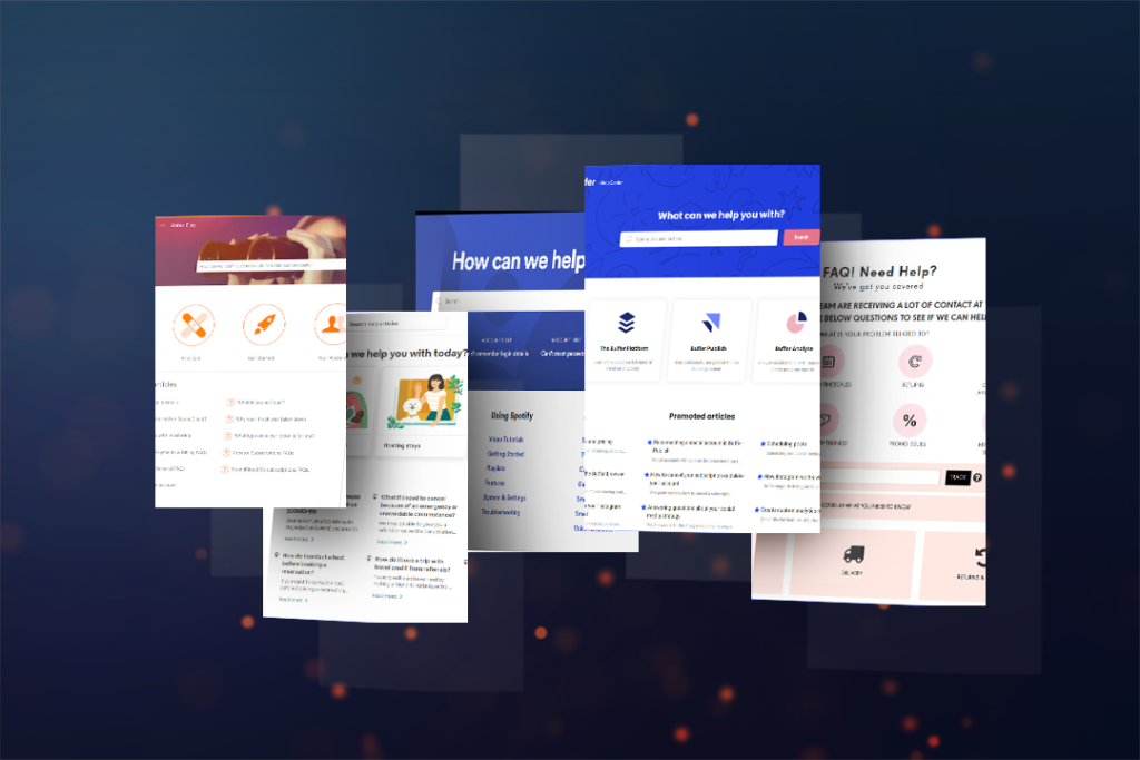
The FAQ page is one of the most cost-effective and streamlined customer services. It is essential to save time for both customers and store owners. Customers can quickly find simple questions and their answers without getting support from the customer support team. Also, the support team can reduce their workloads by answering multiple frequently asked questions and enhancing response time. This post will share tips for the best FAQ page design and develop 10+ best faq page designs. You’ll definitely get inspired.
Table of contents
| Must read: The Golden Rules for an Effective Typography in Web Design 8 Must-Have Characteristics of the High-Converting CTA Buttons and Examples 10 Useful Tips to Choose a Color Palette for Website |
The Best FAQ Page Design
The best FAQ page design will help your website drive more traffic and enhance customers’ trust. Here are some tips we want to share with you to build an effective FAQ page design. Let’s explore!
1. Reflect on Visitor’s Needs
FAQs are created for customers, so all your FAQs need to be related to their questions. Before building a FAQ page, you should take an insight into what your visitors are considering and confusing. Your FAQ page will easily build trust and a good reputation through it.
2. Provide Clear and Concise Information
It’s better to provide clear and concise answers instead of long paragraphs, which can cause confusion and annoy visitors.
3. Remain Up-to-Date FAQs
Your FAQs are clear and concise and need to be accurate. As mentioned in the first tip, you always have to reflect your audience’s needs. Hence, your team needs to update the information when a new feature or product is released. Also, you should regularly update your audience’s frequently asked questions.
4. Group FAQs by Categories
It’s difficult to manage a ton of FAQs in a random list, so organizing them by suitable categories will help you easily follow them according to topics and update them regularly. Further, it’s beneficial in guiding your visitors on their search answers.
5. Offer a Search Bar
A search bar also plays an important role in building an effective FAQ page design. It’s beneficial for audiences who want to find their desired question instantly because visitors often visit your FAQs page with a question in mind. All they need to do is enter their question or keywords on the search bar and get answers immediately. So fast and convenient, right?
6. Build a Page Based on Basic Criteria
You may want to make your FAQ page colorful, beautiful, and humorous, but customers who come to your FAQ page are not entertained. So it’s typically best to build your FAQ page in a simple design that can be quickly and easily accessed and read.

Try FREE Magento 2 FAQ Builder demo today
Easily create informative and SEO-friendly FAQ pages for your Magento store just by using drag and drop. Explore now!
10+ Best FAQ Page Designs You’ll Definitely Want to Copy
You’ve already had some tips for building an effective FAQ page. Now, it’s time to explore 10+ best FAQ page designs that we’re sure you will get inspired by their layout and content!
1. Twitter
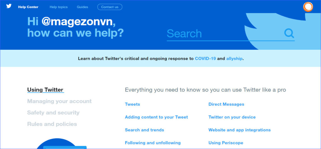
Twitter’s FAQ page is created based on the blue color – its color brand. Especially each topic comes up with different colors so customers can easily distinguish which topic they are following. Visitors can also use the search bar to quickly search for their questions and get answers instantly.
2. WhatsApp
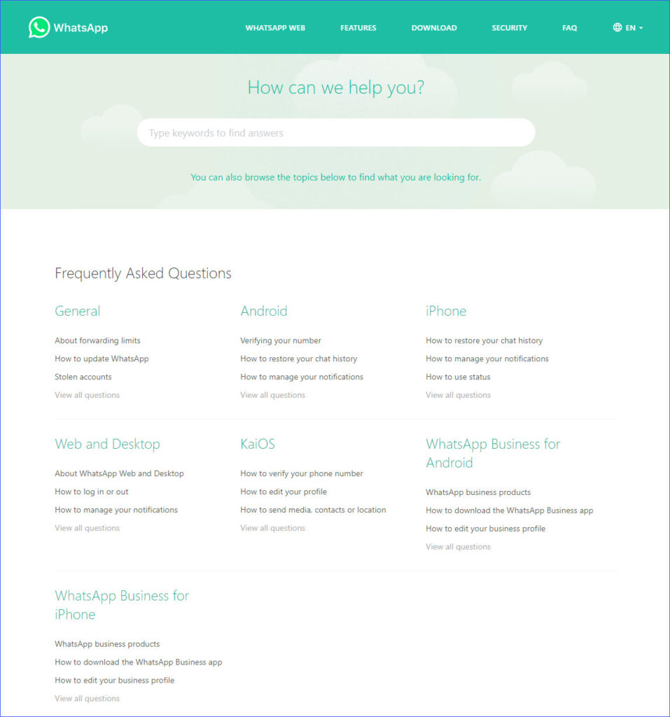
WhatsApp’s FAQ page uses green color to match well with its branding. Its FAQ page is well-organized and simple, with a search bar and a list of categories. You can view all questions about your desired topic with a click on the link below each category. If you come up with a single question, you can type a keyword on the search to find it quickly.
3. WorldFirst
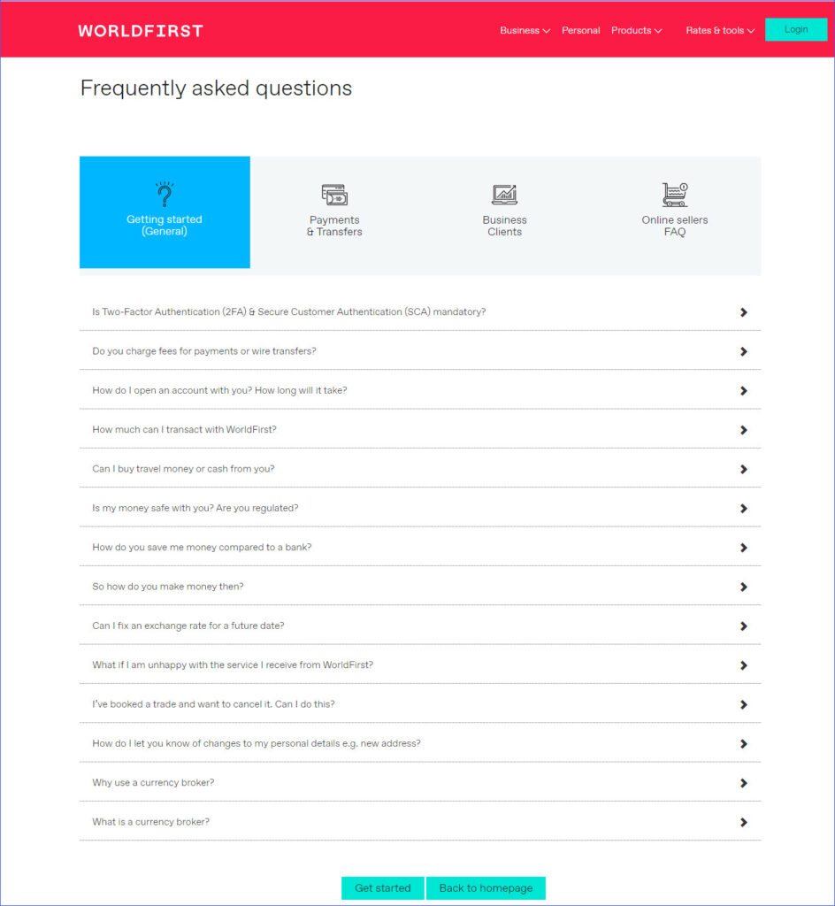
WorldFirst’s FAQ page also groups questions & answers by suitable categories. Each category comes up with a beautiful icon. Besides, questions in each category are organized by dropdown-list; customers can hit the down arrow to view the full answer to their desired question.
4. Buffer
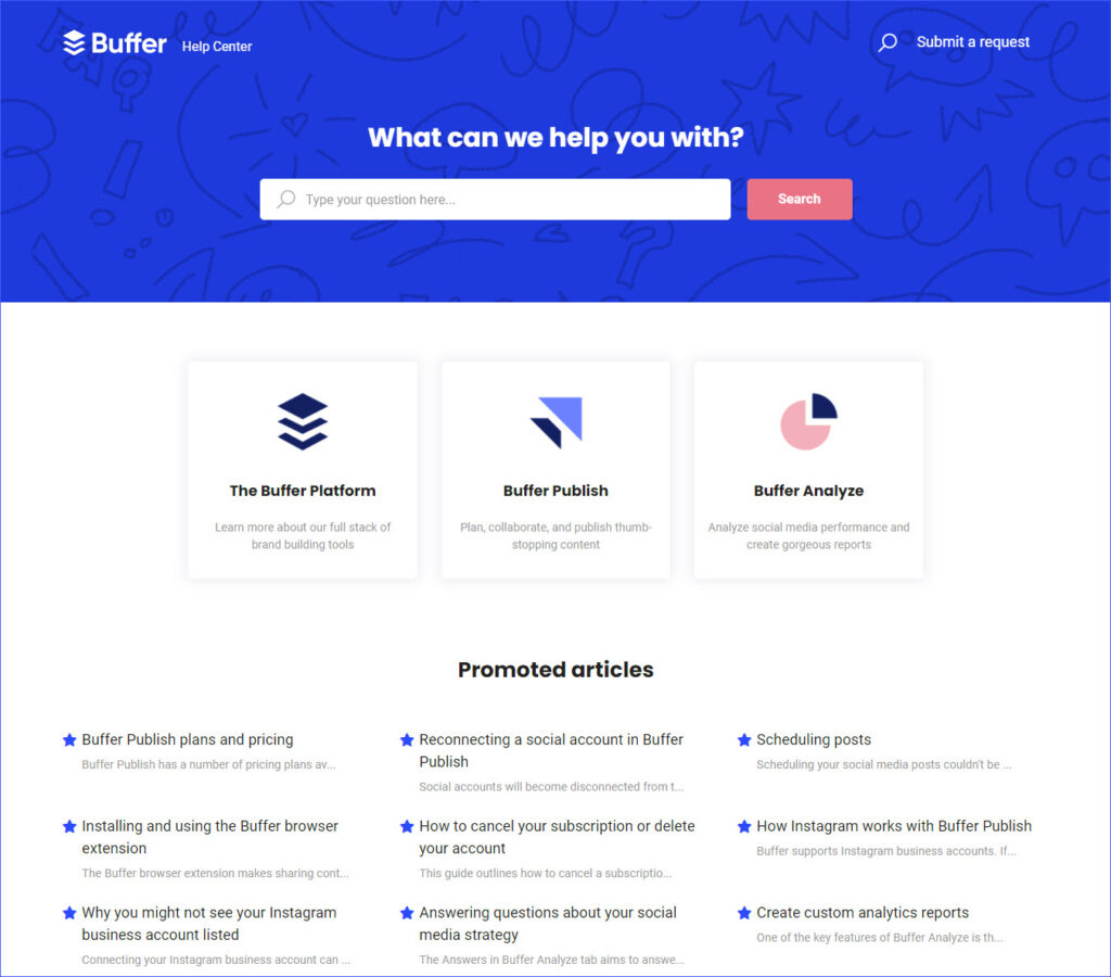
Like WorldFirst, Buffer’s FAQ page also adds an image for each category, making it visually appealing. With a provided search bar, customers can search questions with a keyword. Furthermore, it creates a list of the most popular questions to help save customers time and enhance customer experience.
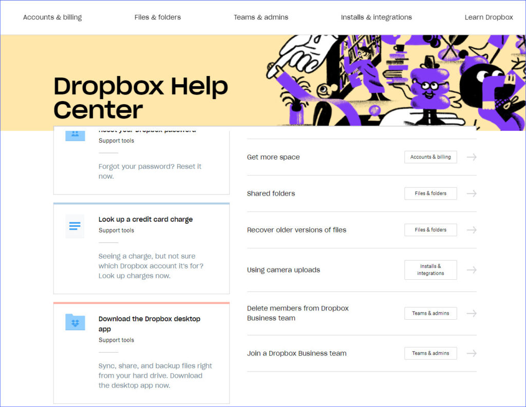
5. Dropbox
Dropbox’s FAQ page provides categories right on the top bar; you can view the topics of each category by hovering over the category. Below the category is a search bar and a list of top questions. It provides the most popular information in the right bar and some basic guide documents for customers in the left bar.

Try FREE Magento 2 FAQ Builder demo today
Easily create informative and SEO-friendly FAQ pages for your Magento store just by using drag and drop. Explore now!
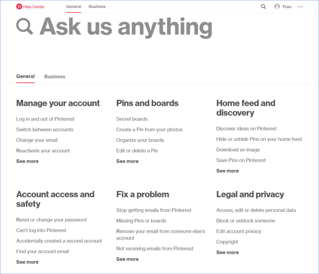
6. Pinterest
Almost all social platforms allow users to create personal and business accounts. The using purposes of these two accounts are totally different. So that it’s beneficial when Pinterest provides two different tabs to handle these differences. It does well in reflecting customers’ needs.
7. Pretty Little Thing
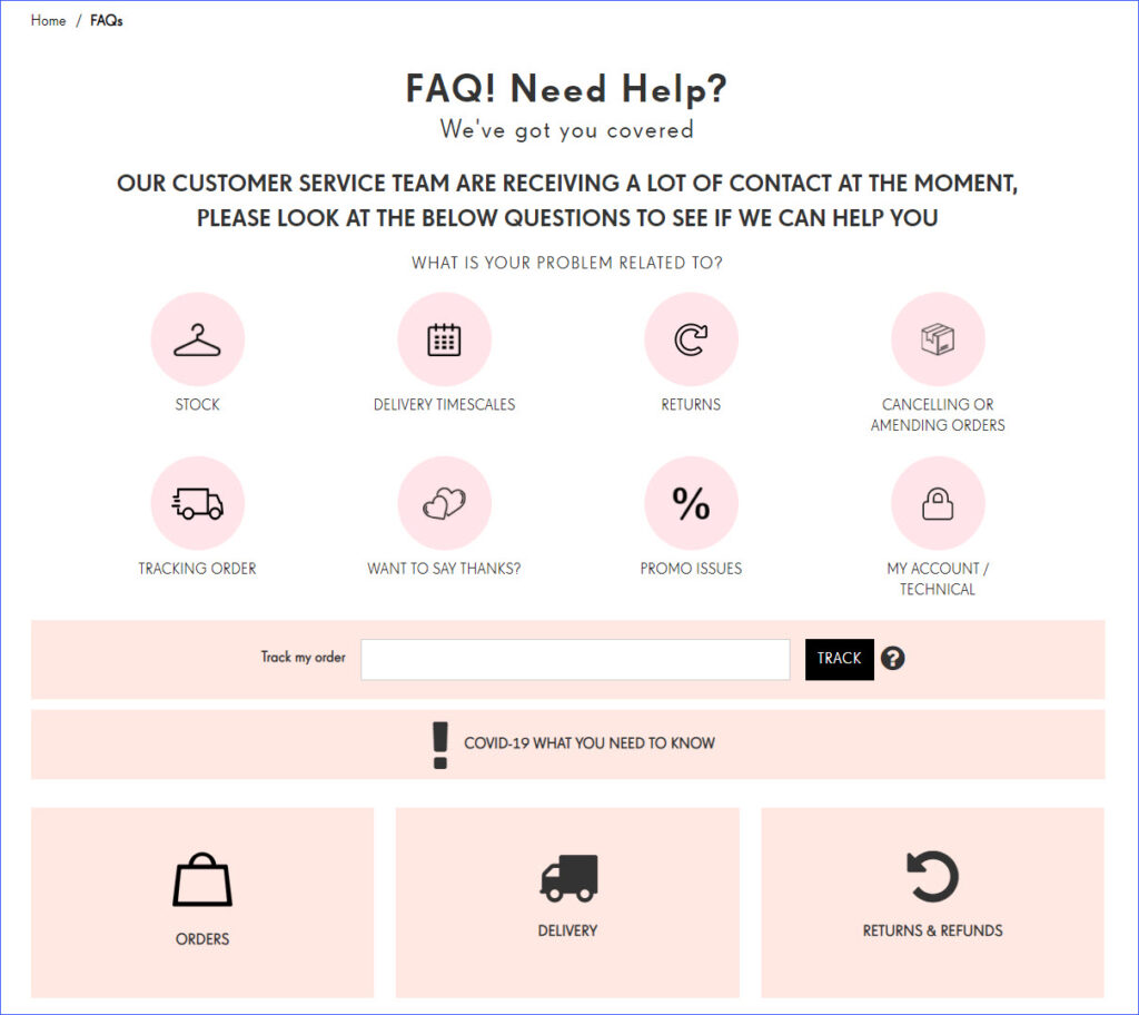
Once you’ve accessed PrettyLittleThing’s FAQ page, you can see a list of categories with attractive images and colors. Just select your desired one to view the related questions or scroll down to quickly search questions on the search bar. PrettyLittleThing also writes a sentence before categories; it’s a great way to make customers feel sympathy for their situation.
8. Airbnb
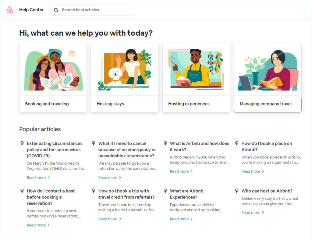
For anything related to UX, Airbnb is always a go-to example. Their FAQ page is a perfect design to follow.
Their FAQ page comes up with a search bar first right on the top bar. Below the search are customized questions based on your profile, which lead to different popular questions answering the common questions. Airbnb is a good example that you can learn from.
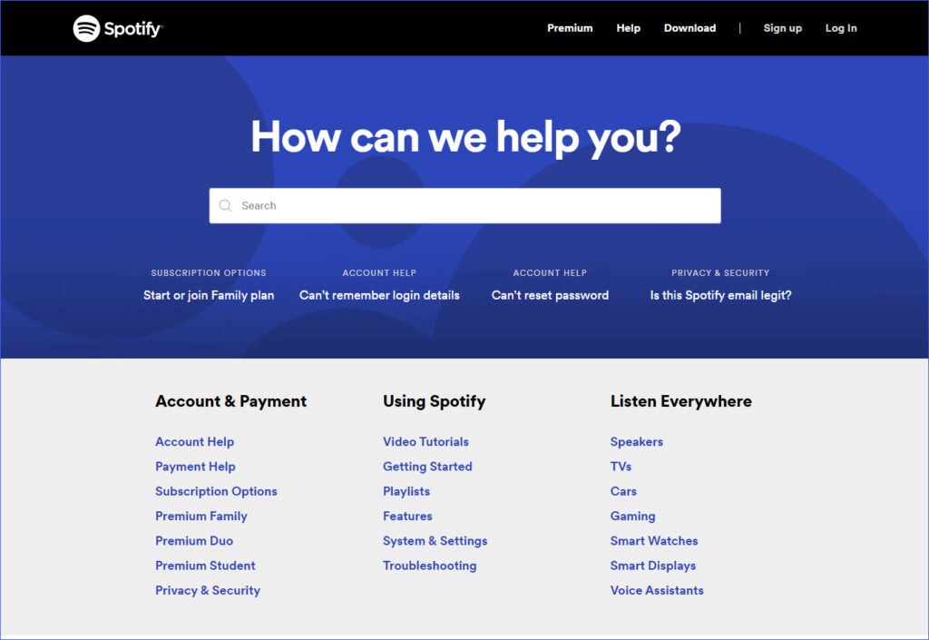
9. Spotify
Like others, you can also get a search bar on Spotify’s FAQ page. The search base section shows the four most popular questions that are very nice when they are emphasized and categorized.
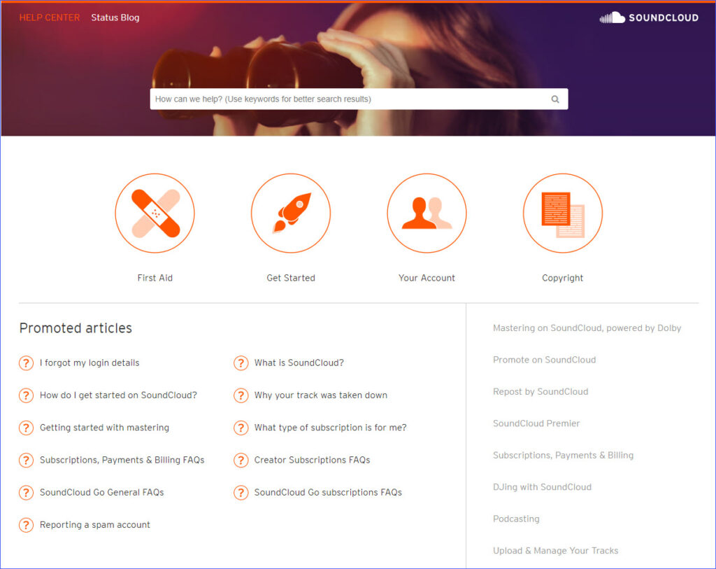
10. Soundcloud
It’s different when comparing SoundCloud’s FAQ page to others; it only gives users tips to use the search bar effectively by entering keywords. That makes the page more accessible for those who don’t use search engines as frequently.
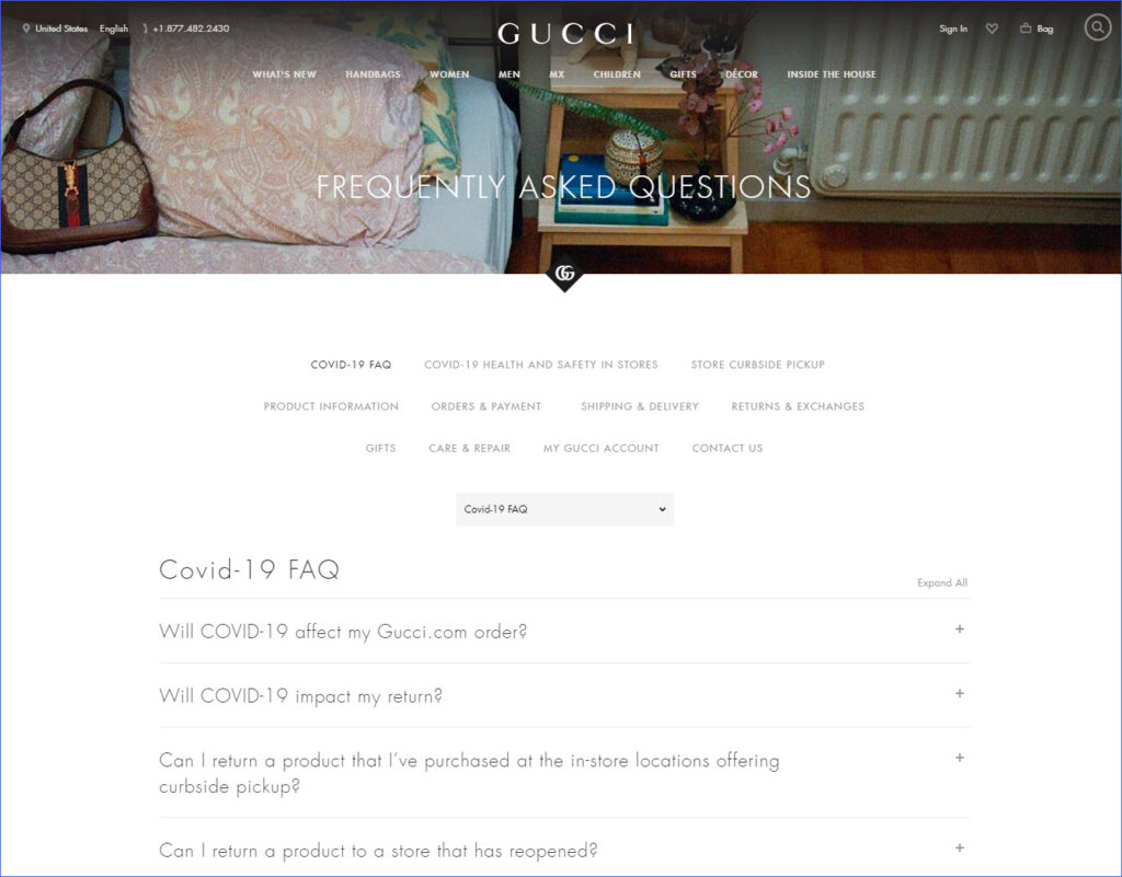
11. Gucci
Gucci provides visitors plenty of topics to find answers to. Visitors can select their consideration topic and view all the related questions in the drop-down menu.
Conclusion
Don’t ignore your FAQ page. You can drive more sales and get a good reputation when you provide useful information for users. With these best FAQ page designs above, be sure to spend enough time to create your own FAQ page effectively, and you’ll get many benefits. If you are a Magento store owner and finding a powerful tool to build a FAQ page, you can refer to our Magento 2 FAQ Extension. Don’t hesitate to leave comments below if you have any questions.

Try FREE Magento 2 FAQ Builder demo today
Easily create informative and SEO-friendly FAQ pages for your Magento store just by using drag and drop. Explore now!
 Magezon Blog Help Merchants Build Comprehensive eCommerce Websites

