When creating an online store, there are many elements you should focus on, and the hero section design is unskippable. The part is considered a key factor in a successful and quality site that determines whether your visitors will converse. Without this important section, your website can’t impress and hook up customers.
Before starting with your website hero section, let’s learn basic knowledge and look at some examples.
Table of contents
What Is a Hero Section of a Website?
The hero section is the first thing that appears on the screen below the logo and menu. There are four key pieces of information you should provide to your users in the hero area:
- Your products or services
- Reasons to trust in you
- Benefits your brand can bring
- The action you desire visitors to take
On the other hand, to stand out among others, you should choose the design suitable for your website style and preference. And keep in mind that a website hero section is not necessary for every page.
Why Is the Website Hero Section Important?
As mentioned above, it is the part where you can draw people’s attention and make the first impression. The section presents throughout your website and encompasses your main navigation to tell users where they are, what steps to take, and how you can help them.
An appealing, clear, and informative hero section design will guide potential customers to get to know your brand, gain their trust and convince them to go through all the processes to make buying decisions.
What Makes a Great Hero Section?
1. The Headline
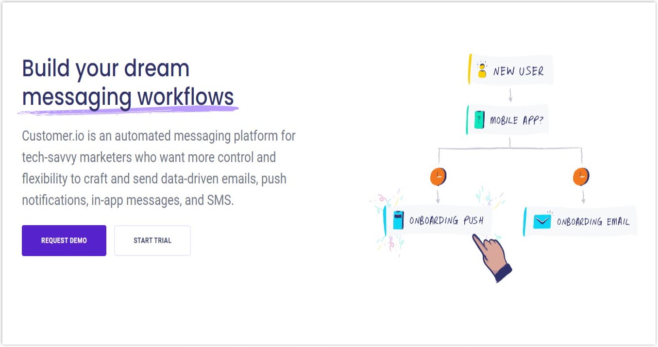
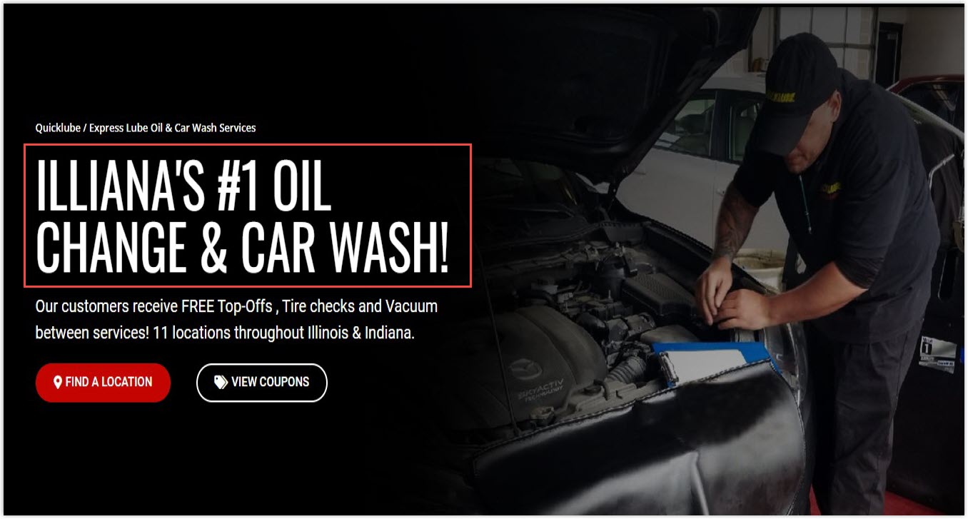
A headline is where you tell your customers about your products and services and how they can help. Below are some Dos and Don’ts when creating a headline in your hero section design.
Dos:
- Make it direct and concise. Clearly state what your products/ services can serve your users.
- Narrow the message to the intended audience. Use simple words without jargon for mass-market products and more specialized language for niche users.
- Use a statement, not a question. There’s no need to make it inspiring.
- The content is always about benefits for your ideal visitors, never about your brand; you can describe your products or services later.
Don’ts:
- Vague headlines are not accepted, no matter how good-sounding or clever you think they are.
- Never use the company tagline as a headline.
2. The Subhead
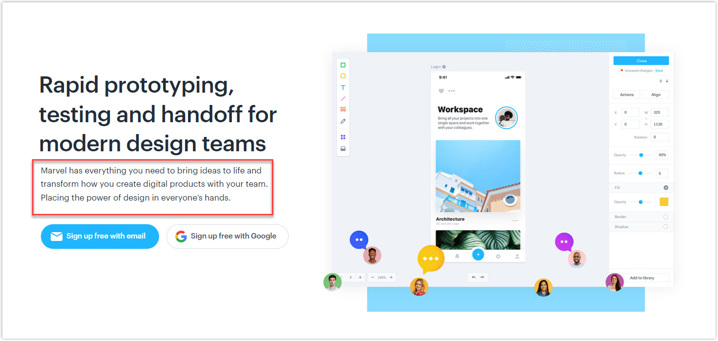
Sometimes, the headline still sounds vague and can’t provide enough information; that’s why you need a subhead in your hero section design to do some of the heavy liftings for you.
The trick to creating a subhead is to read your headline out loud, then ask yourself, ‘So what?’. The answer will be perfect for the subhead. The information provided here will decide their interest in your products or services. Below are some useful tips to write an effective subhead:
- A subhead typically contains words that are 2 or 3 times more than in the headline, helping customers understand what they have to gain from your products and services.
- To attract your target customers, the subhead should highlight your products: how they differ from others, your innovation, or how they can solve customers’ major problems.
3. Hero Image or Video
Human eyes process images 60,000 times faster than text. That’s why including a photo or video in your hero section design is an excellent idea to grab users’ attention, convince them to stay longer to explore and serve the ultimate goal of generating sales.
What Is a Hero Image?
The hero image is a critical element of a successful landing page. A good-designed picture will linger in your customers’ minds, leave them with a pleasant experience and encourage them to spread the word.
Thus, you should ensure your hero image design obtains three goals: be authentic, grab attention, and support your headline and subhead. The reason for an authentic image is that the stock photo may cause users to wonder about your trustworthiness level. I mean, you can’t even design a good picture, how can visitors trust that your service or product will be of good quality?
Here are some ideas for a perfect hero image web design:
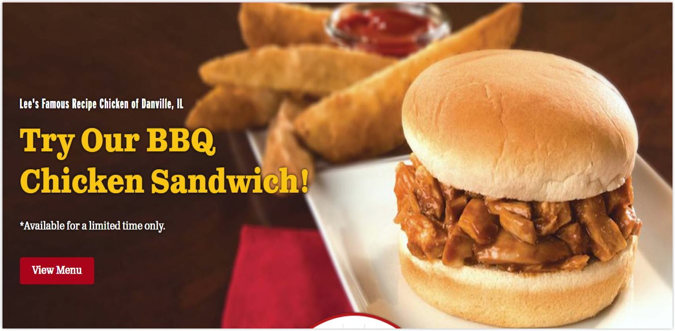
- It should be a product shot, a shot of a person happily using your product, an illustration of how the item works, or the outcome of the products, for example, an elegant sofa in a luxurious room.
- If you’re not confident about taking photos, hire a professional photographer.
- Don’t shoot a hero image with a smartphone.
- Don’t choose a stock photo unless it meets the following requirements:
- It’s a super good photo.
- It’s 100% relevant and supports your message perfectly.
- No one would recognize nor believe it’s a stock photo.
A video is also an excellent choice to capture users’ attention and provide them with the necessary information. It’s one of the best ways to boost the ROI of your marketing efforts and contributes to your conversion rate growth.
Let’s look at the website of Mamashelter – a chain of boutique hotels providing different relaxing services. The video (auto-played, muted, 9-second-length) on their hero section smartly and successfully spreads the idea of modern design and their relaxed atmosphere.
4. Social Proof
Many brands display social proof at the bottom of their page, which is not a smart move. Rather than that, try to move it above the fold, where visitors can trust and be eager to join you from the start.
The social proof should include the following:
- Number of customers who bought and are using your product (only when you have a large user base or your selling pace is increasing impressively)
- Display 4.5/5 star ratings.
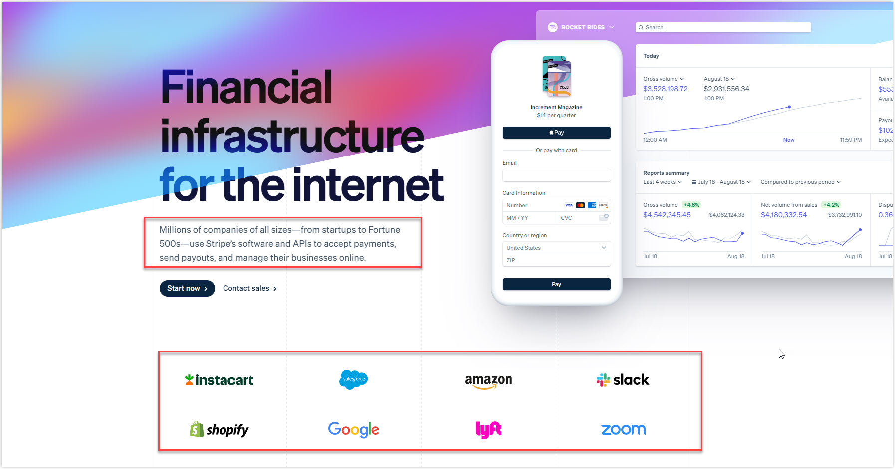
- Mention major brands that you support with your products or services.
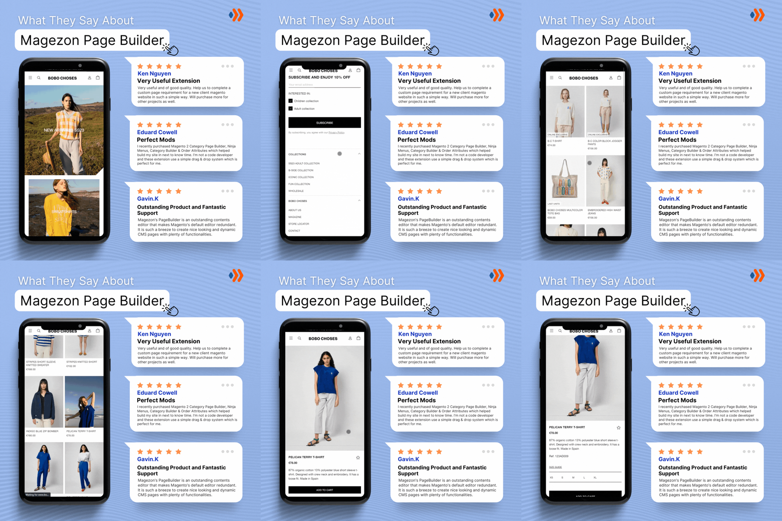
- Apply a testimonial slider to save space and organize better.
5. CTA
After the headline and image, your customers need a guide; that’s the time for a CTA. You should:
- Make it incredibly easy to find and approach. Use big and bold characters in contrasting colors.
- Include multiple choices such as Buy Now, Free Trial, Shop More, etc. Make your preferred and targeted option prominent.
- Make it as short and specific as possible. For example, Sign up for a free version.
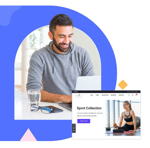
Try FREE Magezon Page Builder!
Easily create your engaging Magento pages in any style whenever you want without relying on developers or designers. Just by drag & drop.
20 Hero Section Examples for Your Inspiration
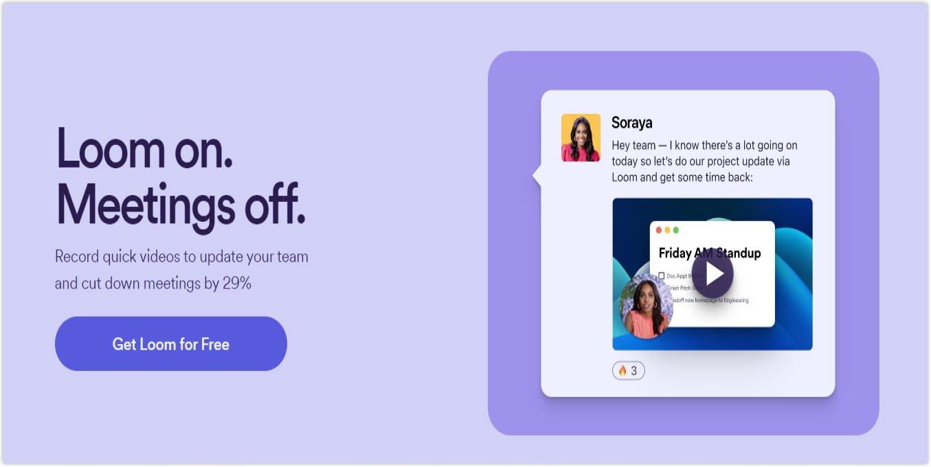
1. Loom
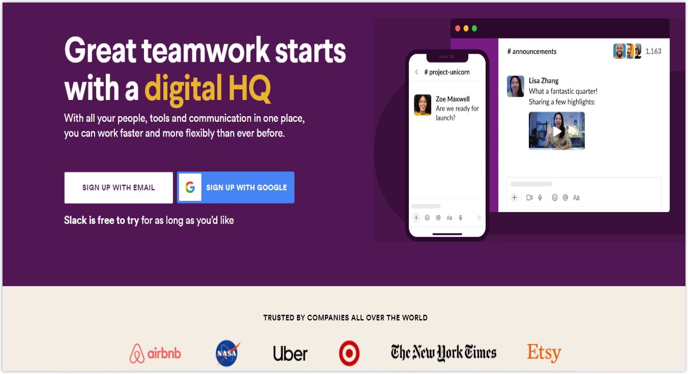
2. Slack
3. Jasper
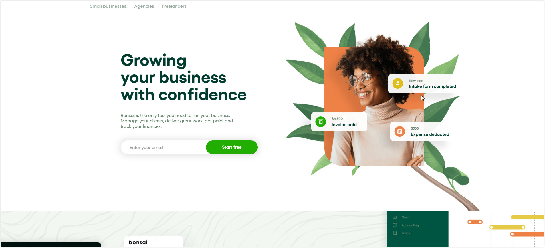
4. Bonsai
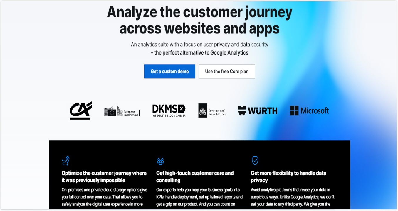
5. PIWIK
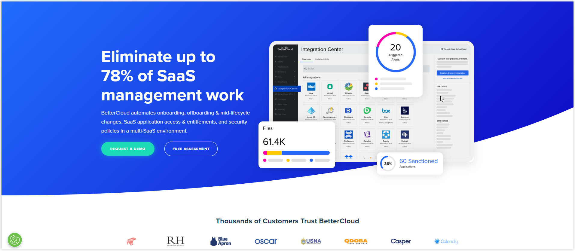
6. BetterCloud
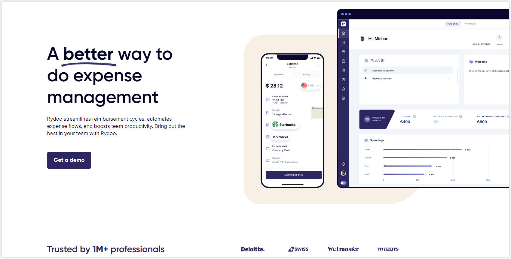
7. Rydoo
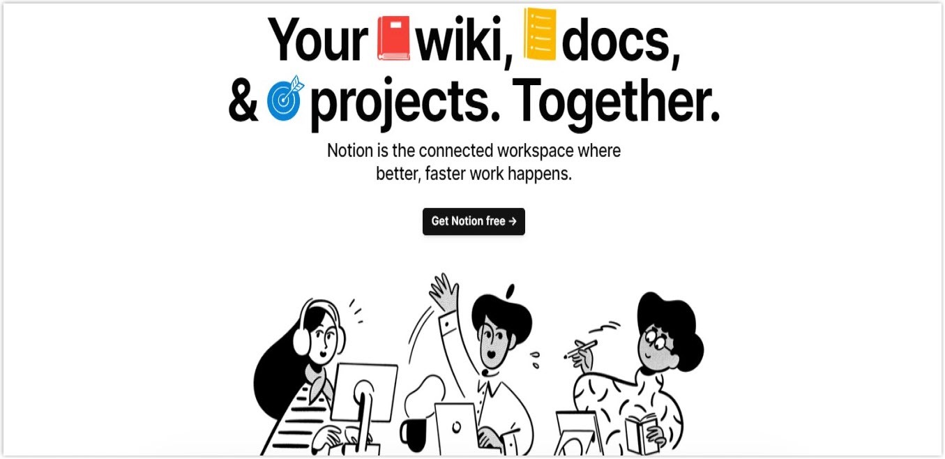
8. Notion
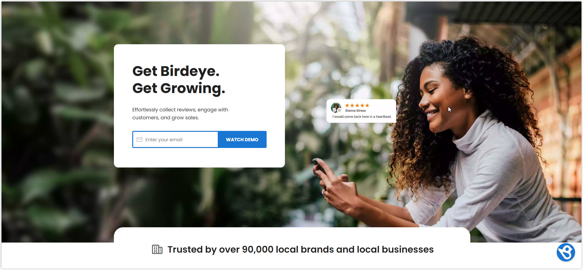
9. Birdeye
10. Zapier
11. Typeform
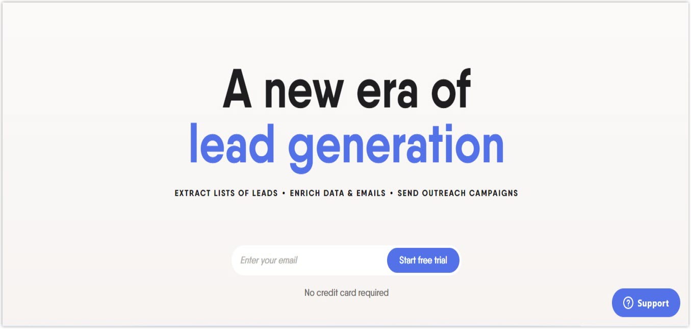
12. Phantom Buster
13. Tableau

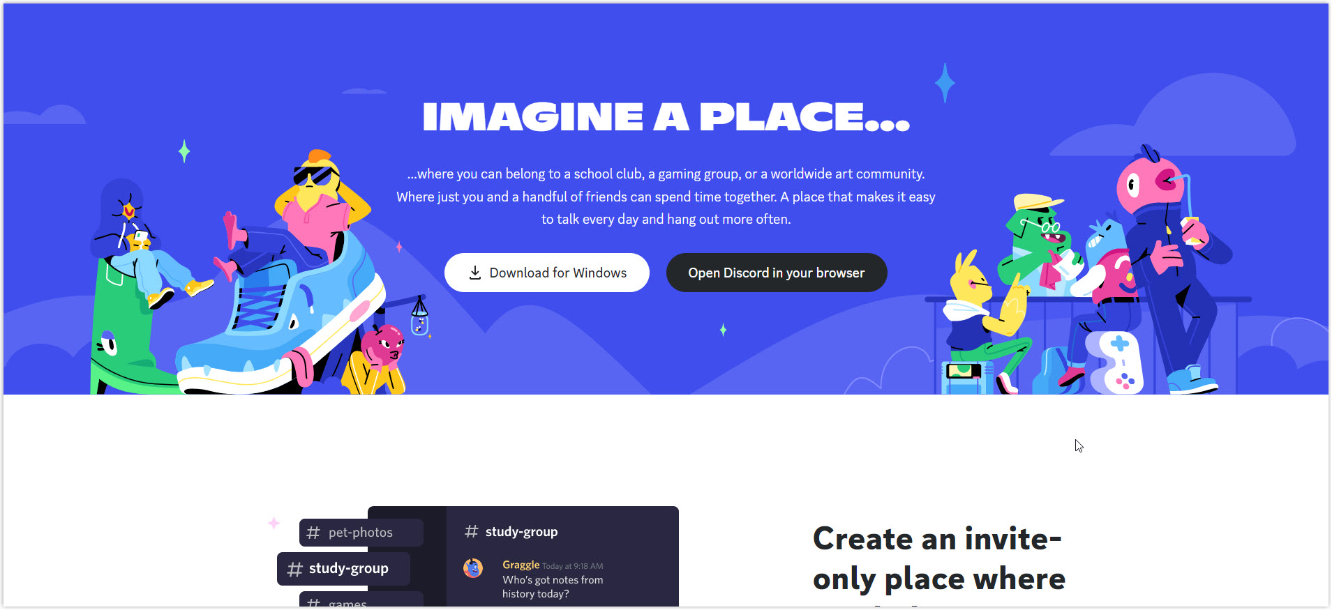
14. Discord
15. Asana
16. Lattice
17. Figma
18. FullCircl
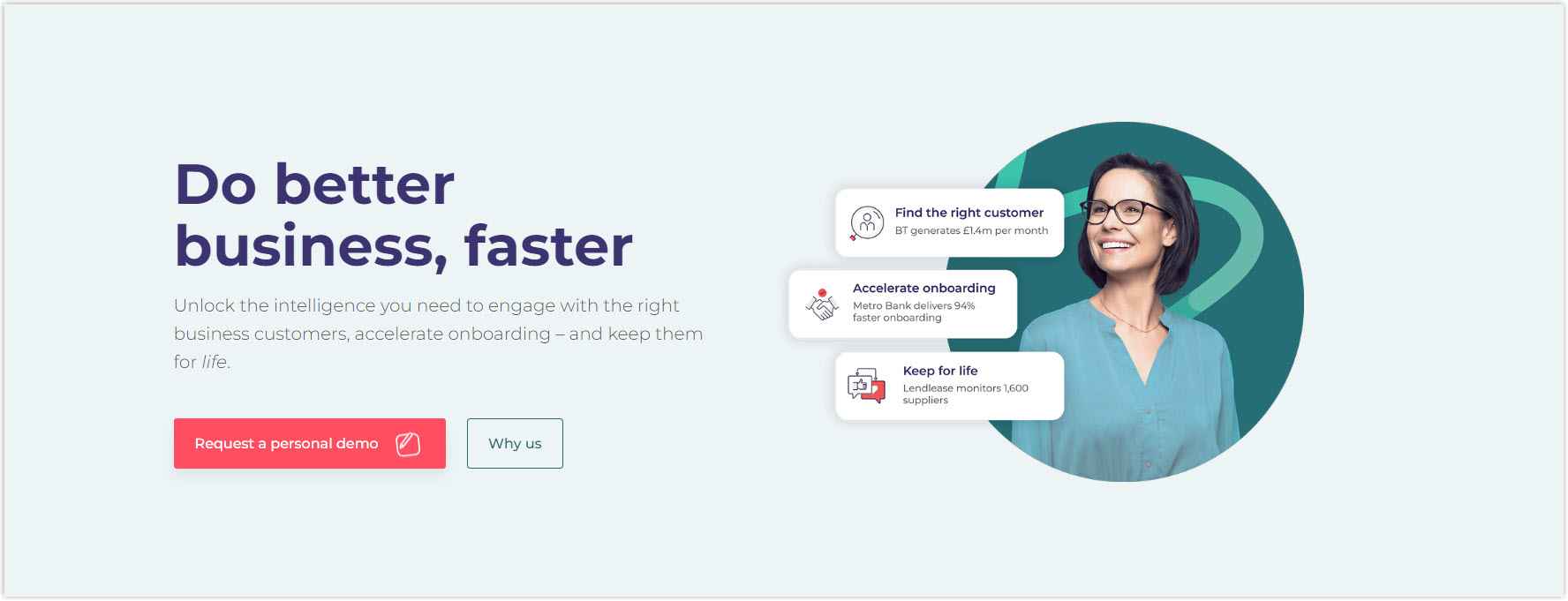
19. MemberStack
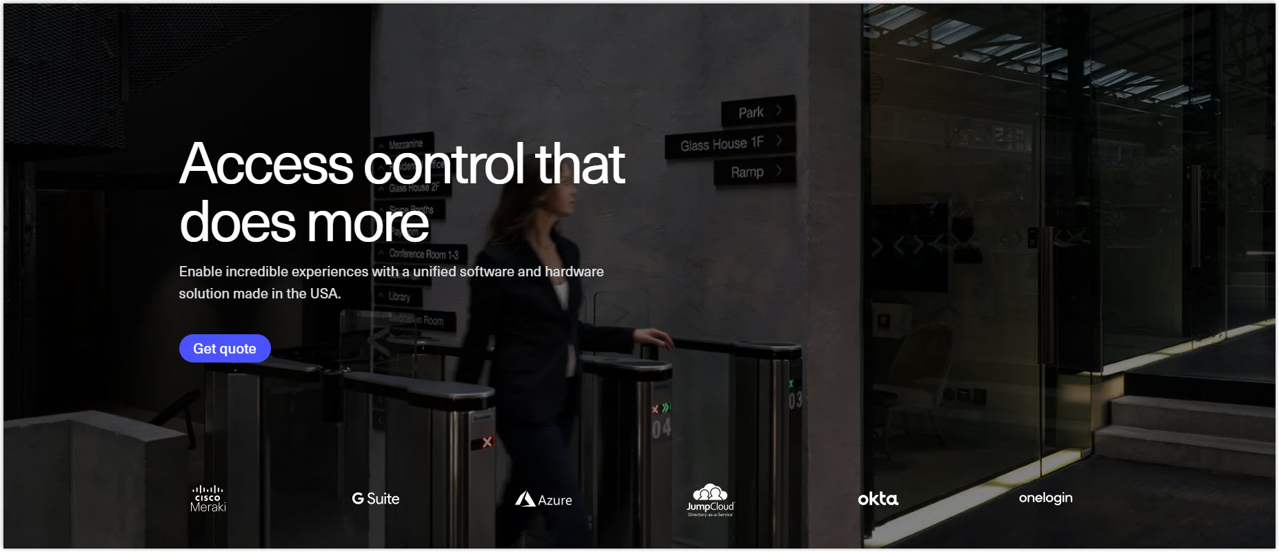
20. Kisi
Wrapping Up
With all the necessary information above, I believe you’ve overlooked what needs to be done to design an appealing hero section design to encourage visitors to stay longer and eventually convert. Remember to smartly apply all the given practices while optimizing, as this crucial element can determine your website’s success.
Now, if you’re a Magento store owner planning to build a unique and high-converting website, consider Page Builder from Magezon, an Adobe trusted partner. With a user-friendly drag-and-drop interface and powerful diverse features, you can easily design or redesign any style whenever you want without relying on developers or designers.
More Magento extensions are also available to create all necessary pages and elements for your website. Don’t worry if you’re not good with coding because these extensions are the solution.
 Magezon Blog Help Merchants Build Comprehensive eCommerce Websites

