Looking for the most outstanding medical website design but don’t know where to begin? We’re here for you. Check out our top medical practice sites below for ideas on building a website to make appointments, setting up an information portal for medical issues, or selling medical supplies to customers and other businesses.
When creating a good medical website, there are specific web design components that you must take into account. The greatest healthcare sites typically display authority, safety, and reliability, increasing the trust of their users (patients and potential patients).
Based on these criteria, we listed some of the best medical website design inspirations that will give you an idea of how to make your website look professional. Moreover, in this article, you can find helpful tips for creating your healthcare website design.
Table of contents
25+ Inspiring Medical Website Design Examples
1. Disc Sports & Pain Center
The first example on our list is The Disc Sports & Pain Center. This medical website design is simple. It employs interactive videos to reach its target audience, people who play sports.
Disc Sports & Pain Center makes it easy for patients based on their website setup. The great use of whitespace and blue color is particularly notable, creating an impression of friendliness and calm. The website’s style makes it possible to place various ad copies, which is also perfect for lead generation.
2. Icarus
Next on our list of the best medical website design examples is Icarus. This layout provides a distinctive full-screen experience and an appealing design with simple navigation to impress visitors. This well-designed site offers the visitor a straightforward layout and makes it simple to display images and videos.
3. Integrated Podiatry Clinic
Another distinctive medical website design is the Integrated Podiatry Clinic. The site stands out from other medical websites because it employs bold, large fonts and minimalistic, modern elements. Such minimalist websites assist in promoting relaxation in the patient.
The website’s layout caters to patients’ needs for comfort, which is another way it serves the needs of its target demographic. Most importantly, because its design includes clear navigation options, the user interface is also easy to learn.
4. Nudge Psychology
The Nudge Psychology website is too excellent to be left off our list of best medical website design examples; it is full of brilliant copywriting and thoughtful design components. Visitors are warmly welcomed by the dynamic backdrop of high-quality images such as boulders, lakes, and other picturesque scenes.
A straightforward navigation menu at the top of the page lists the various “nudges” that the practice provides. If you don’t like clicking through menus, you can still learn everything you need to know about Nudge Psychology by simply scrolling down the page.
Furthermore, this site also does a great job of boosting customers’ trust by showing several outstanding awards at the beginning. The information about the doctors, including qualifications and working experience, is also provided after the practice’s services, which helps enhance the client’s reliability.
5. Weber Facial Plastic Surgery
The Weber Facial Plastic Surgery website is one of the best medical website design examples for its functionality. Anyone who visits the website can simply access the blog for interaction, details about the services the practice offers, and the patient portal, where they may learn about upcoming appointments and their current medical condition.
One of the most unique elements of this website is the stories about Dr. Weber integrated with the review of customers, especially with the detailed services which help visitors easily navigate.
6. Carson Tahoe Health
The healthcare website design for Carson Tahoe Health is also at the top of our list. The page uses colors to represent hospitality, a simple layout, and creative videos to make browsing exciting and enjoyable. Combining muted core colors, photos with color overlays, simple forms, and multi-colored icons dramatically add to a good user experience.
The Carson Tahoe website is also easy to navigate by assisting clients in locating the closest medical facility and directions to get there.
7. Mount Sinai
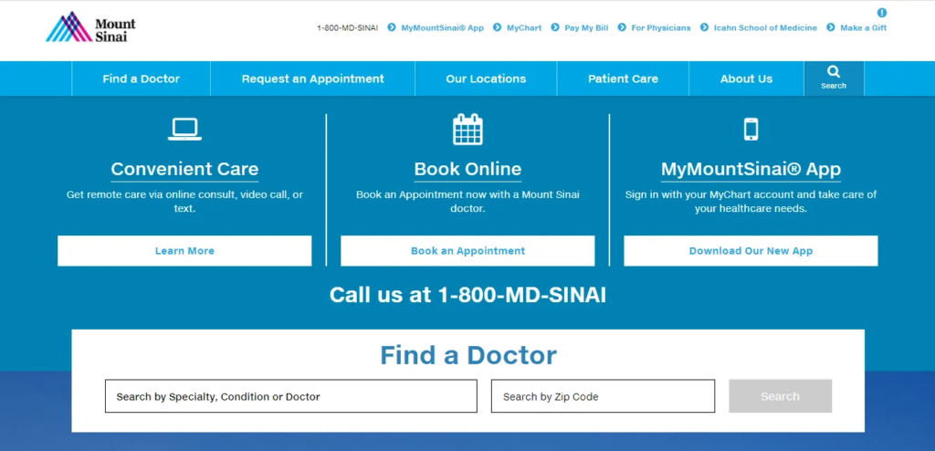
Another inspiration for any medical website design is the Mount Sinai website. This website experiments with a blue background to create a soothing atmosphere for its visitors. On the other hand, as you all know, white is frequently linked to hospitals and medical, so they combine the whitespace to inform visitors of what to expect on the site.
In addition to its excellent use of color, this good medical website has a simple user interface to navigate and understand, allowing visitors to discover what they are searching for as soon as possible. This includes things like finding a doctor and making payments.
8. Bates Dental
The dental practice Bates Dental website is lustrous, modern, and appealing to patients of all ages. The Bates Dental website’s home page has a huge image of the stunning office interior. It looks simple but harmonious and focuses on providing full details about the clinic’s services.
In addition, the doctor’s introduction is also highlighted, and there are customer reviews below. Following that, one of the website’s biggest advantages is its ease of making a payment or scheduling an appointment.
9. Kingswest Dental
Even the most dental-phobic person might feel at ease and at peace before getting their teeth done, thanks to the serene blue background of the Kingswest Dental website. Kingswest Dental did a fantastic job building an appealing and useful website.
This medical website design stands out for its educational information scroll on the home page. In addition, there are several navigation options for current or potential patients to access the abundance of information, making the site more outstanding.
10. Ann & Robert H. Lurie Children’s Hospital of Chicago
The Ann & Robert H. Lurie Children’s Hospital of Chicago, one of the most prominent children’s hospitals in the Midwest, has an excellent website for anyone interested in learning more about their services. Without using many words, the images of kid patients that welcome you as soon as you land on the home screen describe the hospital.
Besides clear and easy-to-understand options on the navigation menu, the site displays various hospital achievements on the front page, giving it more credit.
11. Arise MD
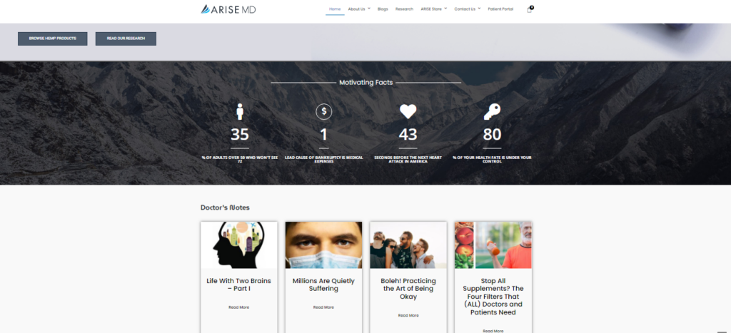
Another medical website design on our list is Arise MD. With a simple and straightforward navigation menu, visitors easily search for the site’s information and services. On the home page, there is a section for patients’ feedback that can enhance the potential client’s trust in the clinic.
Our favorite feature of the website is how it simultaneously encourages users to make positive changes in their lives in the blogs area and promotes the practice’s services.

Try FREE Magezon Page Builder!
Easily create your engaging Magento pages in any style whenever you want without relying on developers or designers, just by drag & drop.
12. Rush University Medical Center
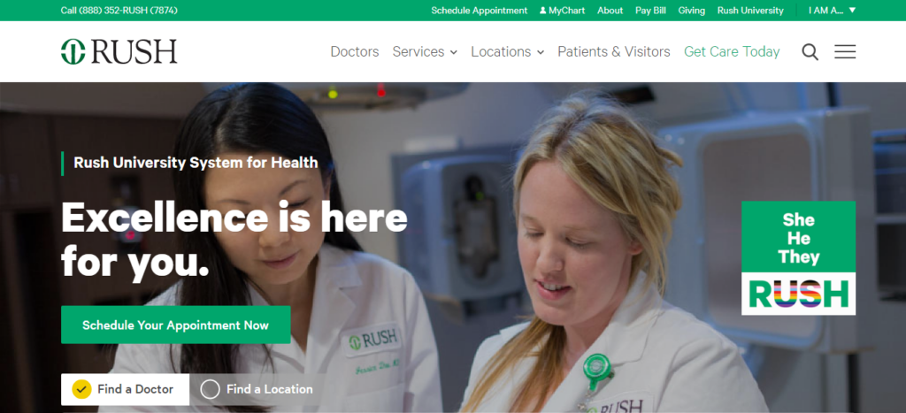
Rush University Medical Center, a hospital and physician network in Chicagoland, provides the best care to those in need in the community. You are urged to begin your road to better health as soon as you click on the Rush homepage by making an appointment or looking for a doctor who can fulfill your needs.
Due to its clarity, simplicity, and accessibility to users of all ages, the Rush University Medical Center website is considered one of the best healthcare website designs. One special thing I like about this website is its delicacy when showing the text “He/She/They” and the rainbow color on the letters, which means anyone who comes to Rush is equal.
13. St. Clair Dental
St. Clair Dental stands out among other medical practice website designs due to its bold, modern, one-of-a-kind design. Pictures of bright, smiling people all over the website are what you can get if you book an appointment here.
On top of that, the home page’s vibrant color sliders and the graphic icons that indicate where visitors can find out more about the dental services they require are some of our favorite features of the St. Clair Dental website.
14. Johns Hopkins Medical Center
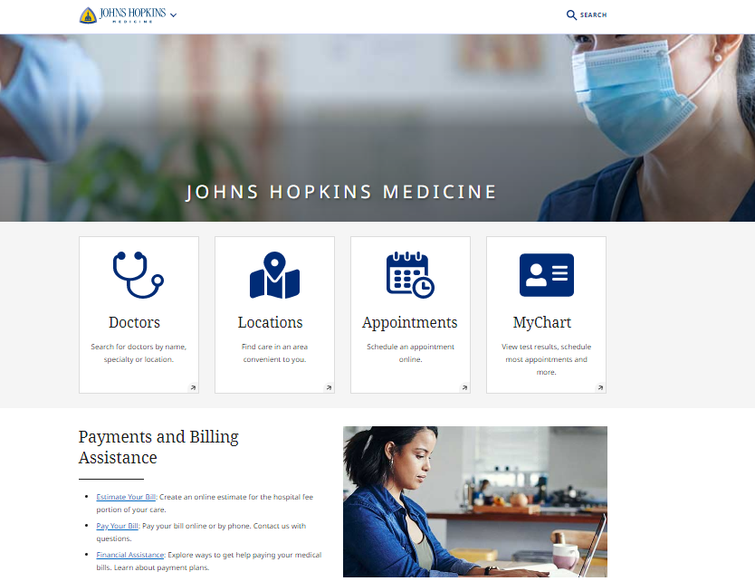
Johns Hopkins Medical Center is another example of your medical website inspiration. You may readily get details about the center and the wide range of services from the home page. Like many other hospital websites, it provides access to patient care information and a patient portal. This site’s highlight is its simplicity and visual design, making its navigation functions easy to implement.
15. Memorial Sloan Kettering Cancer Center
There are three drop-down menus below the photo slider to make it convenient for visitors to use on the Memorial Sloan Kettering Cancer Center’s landing page: Make An Appointment, Find A Location, and Find A Doctor. Furthermore, this traditional-themed website, which features a blue and white color scheme, is simple to use and provides several ways for visitors to get in touch with the center.
Additionally, this medical website design has a straightforward navigation bar that allows users to easily look for information about the specific cancer types and diagnoses the center treats. In the same way, people can look for surgical solutions to learn more about whether or not it is a treatment they want or need to consider. These little details set this website out as one of the best.
16. Hope Therapy Center

A medical facility called The Hope Therapy Center focuses on giving patients in Valencia, California, individual, teen, and couples therapy. This medical website design features a light layout suitable for California’s balmy weather. The well-designed website makes it simple for patients of any age to use and navigate.
Additionally, it provides articles and blog entries that visitors can read about who the center serves and which therapy is employed to promote interaction. Hope Therapy Center is another healthcare website design on our list because it combines functionality and aesthetic appeal under a single URL.
17. Oculistica Mastropasqua
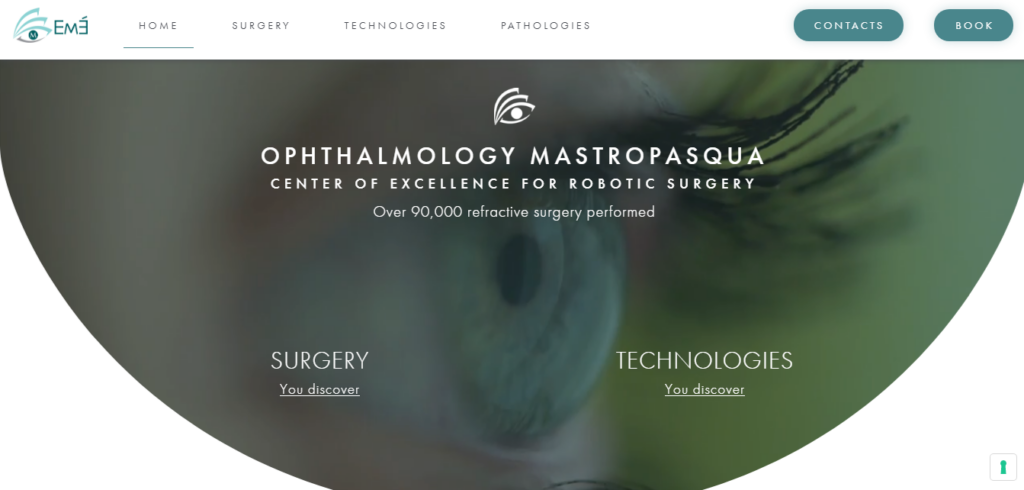
Another medical website inspiration for you is Oculistica Mastropasqua. It is exciting and unique that the video is displayed in a shape of an eye, which can tell what the practice focuses on. This strategy usually entertains visitors, piquing their curiosity in more of your content. But fascinatingly, the video has no negative impact on how quickly the website loads.
Well-timed animations, mouse hover effects, and outstanding user-friendliness is further noteworthy aspects of the Oculistica Mastropasqua medical website design.
18. Flatiron Health

Next on our list is Flatiron Health. No matter what kind of content is on the website, the parallax scrolling effect in this healthcare website design keeps online navigation interesting and never dull. Moreover, Flatiron Health strikes a balance between being stylish and being out of the ordinary, ensuring they do not go over the line.
Their sleek and simple design blends in with the stylish homepage layout; this tactic is often used to encourage users to explore more of your website. In general, Flatiron Health’s website appears professional and credible, capable of capturing users’ interest at first glance.
19. Cleveland Clinic
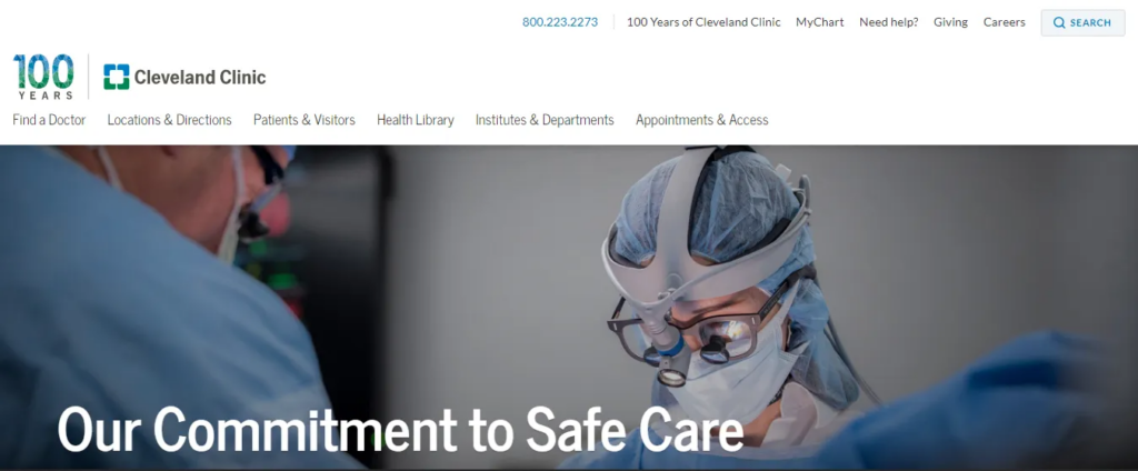
Cleveland Clinic has the same white and blue color scheme as Mount Sinai’s medical website. However, unlike Mount Sinai, it has a bit of green added to it to make a calming appearance and immediately draw visitors to its website. Additionally, green represents wellness, growth, and good health.
It is important to pay attention to the Cleveland Clinic’s typography. It gives the website a professional and reassuring appearance that would persuade potential patients that they are in the care of trustworthy and reliable medical experts.
20. Grunenthal Health

The Grunenthal Health website comes in last on our ranking of the top websites for medical practices. This website has an incredibly straightforward and minimalistic style that seamlessly blends whitespace and textual information to keep readers engaged.
The website’s light-gray solid backdrop, also used in the header and footer sections, encourages users to investigate other pages more thoroughly. The medical website design for Grunenthal Health shows that minimalism in design doesn’t mean boredom and dullness.
21. Mayo Clinic
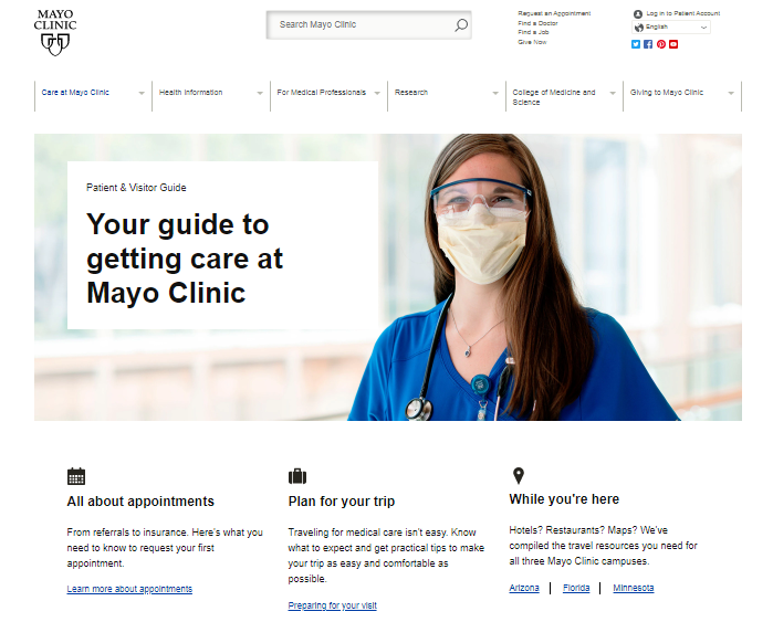
One of the world’s most well-known hospitals and clinics is Mayo Clinic. Visitors may immediately access the section they are searching for without having to browse around and sift through all of the tabs at the top of the page, thanks to simple-to-use buttons and an appealing color scheme on the homepage.
22. Lanham Neuro Psychology
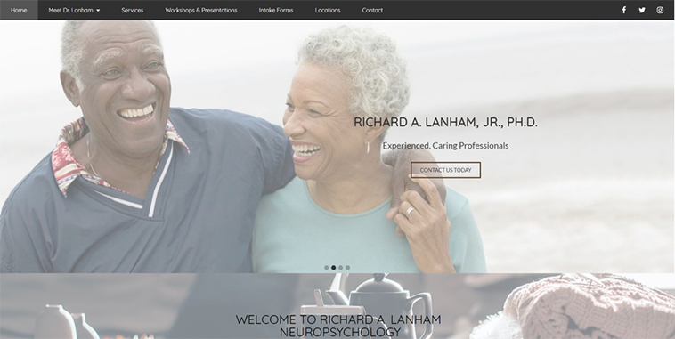
Like other sites above, Lanham Neuro Psychology has a stunning website. Translucent images cover every screen, along with the captivating stories below to inform visitors about the practice’s services and persuade them to contact Lanham if they require neuropsychology.
Lanham Neuro Psychology was chosen as one of the best healthcare website designs because of its ability to make an intimidating and confusing subject appear warm and approachable.
23. Northwestern Medicine
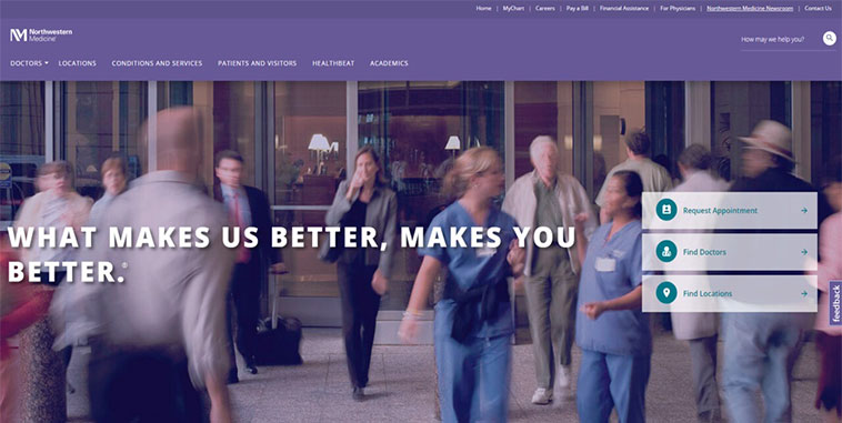
Northwestern Medicine provides care to people in a wide range of communities, so much information can be displayed. But this medical website comes up with an excellent design. Everyone can find a doctor, make an appointment, or get any other information they may need thanks to the straightforward navigation and simple call-to-action buttons on its home page.
Moreover, their unique color scheme, a combination of white and purple, which represents royalty and bravery, makes them stand out from other medical practice website designs and ensures potential patients that they are committed to providing high-quality care and delivery.

Try FREE Magezon Page Builder!
Easily create your engaging Magento pages in any style whenever you want without relying on developers or designers, just by drag & drop.
24. Concord Hospital
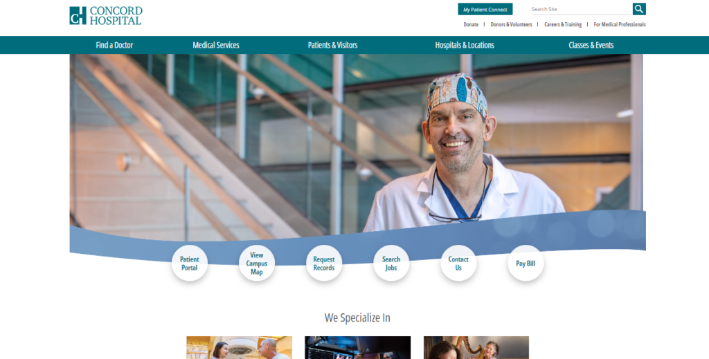
Concord Hospital comes next on our list. Many fantastic photos on Concord Hospital’s website give the user the impression that the staff members would be delighted to assist them. They feature obvious CTAs and a user-friendly site with a search bar.
Additionally, they list their expertise with preview content that benefits the user and gives them a choice to learn more.
25. Altru Health System
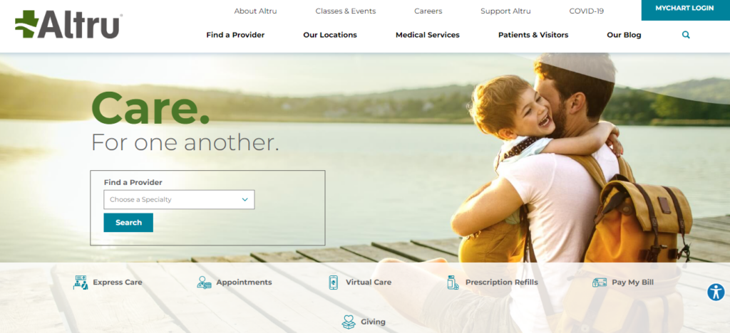
Altru is a highly responsive, award-winning website featuring a slideshow, hero image, and flyout menus that add to the overall message. They also give potential patients ways to learn more and integrate their blog feed into their homepage.
For instance, they can choose an express location, virtual care, and walk-in pediatric care. Compared to the rest of the information on their page, the diversity of helpful CTAs stands out.
26. Anna Family Healthcare
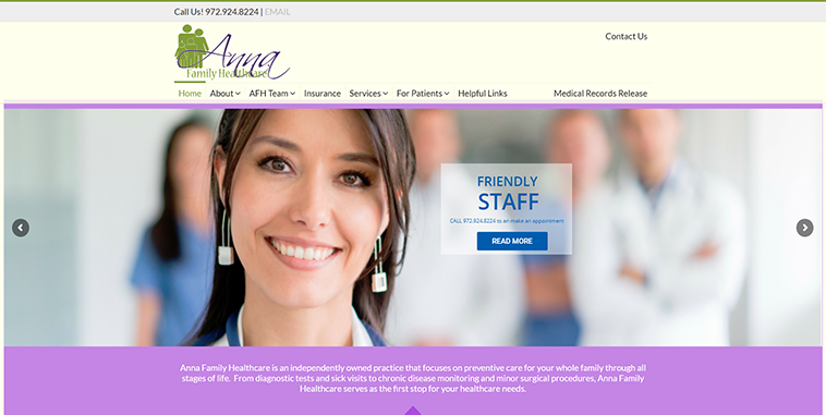
Anna Family Healthcare is another best medical website design that is well-designed and user-friendly. Patients of the practice can quickly access information about their care, search for essential information about the course, and download any forms or paperwork needed for their next appointment by using the simple buttons in the navigation bar at the top of the homepage.
Overall, there are many excellent medical website designs, so how do you build a good website like that? Then, look at our medical website design tips below to easily create your brilliant medical website.
11 Useful Tips for Your Medical Websites Design
- Select the appropriate CMS (Content Management System) that:
- Utilizes editable templates and layouts to make designing simple.
- May quickly edit your live web pages from your website’s front end
- Edits and place photos on your web pages as a design
- Ensures that all users of your website can access it
- Prepares for mobile devices
- Provides features that are specialized to the healthcare industry, like private patient sites or job postings
- Make sure your website is compatible with mobile devices by:
- Optimizing your homepage
- Including a hamburger menu for navigation
- Allowing users to click and call
- Create a user-interactive website by:
- Building interactive forms
- Adding call-to-action buttons
- Developing a patient portal
- Share useful information through:
- Blog posts
- A Q&A Section
- Patient Reviews
- Make your website simple to use with the following:
- A well-crafted menu
- Clear call-to-action buttons
- Employ appealing imagery by:
- Including unique pictures and videos
- Placing visual components in a deliberate manner
- Enriching your educational materials
- Keep the consistency to build your brand by:
- Color scheme
- Font
- Images
- Boost load speed by:
- Resizing images appropriately
- Limiting the number of redirects
- Minifying the code
- Ensure web accessibility in:
- High-contrast colors
- Large text
- Alternative (alt) text for links and images
- Provide precise contact details such as:
- Phone number and email
- Directions to your practice’s facility
- Online scheduling tool (if you schedule appointments online)
- Offer secure, password-protected patient resources by:
- Encouraging people to change their passwords frequently
- Ensuring you’re utilizing a fast, PCI-compliant payment processor if your online tools enable patients to pay bills
- Educating your team on HIPAA and the necessity of protecting patient privacy and data security
Conclusion
To summarize, your website design strategy must highlight your work and provide visitors with accurate information. Visitors to your website are probably interested in making a purchase, scheduling an appointment, or learning more when they arrive. As a result, you could think it would be wiser to pick a layout that makes it simple to show content and a navigational path on your website.
If you are a Magento merchant and don’t know which extension to build your website, consider Page Builder from Magezon. As a trusted Adobe partner, we have satisfied thousands of customers with a vast collection of drag-and-drop extensions, helping you create a high-converting and unique store in minutes.
Don’t take my words for granted; see how your website can be with Magezon Page Builder and what others say about us:
 Magezon Blog Help Merchants Build Comprehensive eCommerce Websites

