Pricing tables are graphical representations of information used on websites to display the benefits of buying a product or service. It is one of the most important pages of your website.
A pricing table is one way to drive conversions to your website and is a crucial part of the sales funnel to show off your products and services. But many business owners don’t know how to design an effective pricing page that converts visitors into customers.
There is no doubt that the pricing & plan are helpful for shoppers, but they are sometimes overwhelming. With so many choices, it’s hard to narrow down which items you want and how much they cost. It doesn’t have to be that way, though! With these 50+ stunning pricing table examples on websites, you’re sure to find inspiration for your design.
Table of contents
What Is a Pricing Table?
A pricing table is an arrangement of numbers or words representing different price points. It helps retailers, restaurants, or other businesses establish the prices they offer for a specific product. Overall, a cost table shows the details of products, services, or product packages sold.
By using a pricing list, visitors can view the current cost of your product without having to scroll down all of your content.
Why Do You Need a Pricing Table for Your Website?
Pricing & plan is one of the most common elements of any e-commerce website, but it might not be something you’ve thought about. Indeed, it can seem like an afterthought, but this piece of your website shouldn’t be overlooked.
To grow your e-commerce business or sell digital products online, you should have a pricing list on your website because of the reasons below:
- First, it tells your customers what your prices are. While the main value of having a pricing section on your website is to give customers an idea of how much they can expect to pay for your products or services, it is also a great tool to help market your business or brand.
- Second, it helps customers make purchasing decisions. Pricing tables allow potential customers to quickly and easily compare your products or services with the competition. This can help them decide which company is best in terms of price, quality, or both.
- Third, it can be very effective at increasing sales. It’s important to keep a pricing sheet up to date as time goes on so that you’re not sending customers the wrong message about the value of your products or services.
- Fourth, it can help remind customers of your products or services. While you don’t want your pricing section to be the only reason visitors come to your website, it should be part of the overall marketing message so that it doesn’t get completely overlooked.
- Fifth, your buyers are looking for pricing information. Customers interested in purchasing something online will typically look at the cost before comparing features.
- Sixth, it can enhance reliance. Pricing information with an affordable and competitive price puts the consumer at ease since it creates trust in your business and conveys a sense of professionalism and quality. As a result, you will gain confidence and credibility among your target audience, which means more sales.
- Seventh, a pricing list can inspire people. An old saying in marketing states: “People don’t buy products; they buy better versions of themselves”. Therefore, the more you can reveal about your product or service, the more people are likely to be inspired, make buying decisions, and become customers.
- Eighth, it shows comparisons. It is easier for customers to compare different offers when they’re placed at one table. A pricing list tells consumers every detail of what’s on offer, including how much they will have to pay, so comparison shopping is quicker and easier.

Try FREE Magezon Page Builder demo today
Easily style every aspect of Magento website the way you want without relying on developers or designers. Just by drag & drop.
Tips for Making Pricing Tables
If you are thinking about setting up pricing & plan on your website, take some time to think about the content of the different cells. What’s needed in each cell? Price? Description? Offer? And what format is most suitable — currency, percentage, or something else?
To help you out a little bit with this task, we’ve put together this blog post with some more tips on making a great pricing scheme!
1. Pricing
Reduce Repetition of the Word “Price”
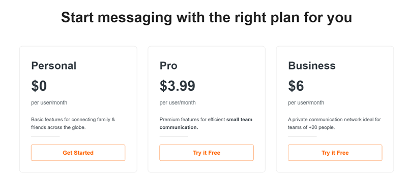
Avoid using the word “price” as much as possible. Instead, use “the cost of a health club membership” or “what you’ll pay for your furniture in one year.” Likewise, think about the word most closely relates to what you are selling and use it instead of price.
Apply Pricing Psychology to Your Pricing Table
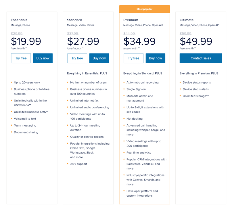
Consider the psychological effect of round numbers and prices ending in “.99” when pricing your items. Research has shown that these two strategies can be used to increase sales. For example, selling a dress for $90 may be more effective to sell the $90 clothing at $89 than selling it at $91.
Sort Prices in Descending Order
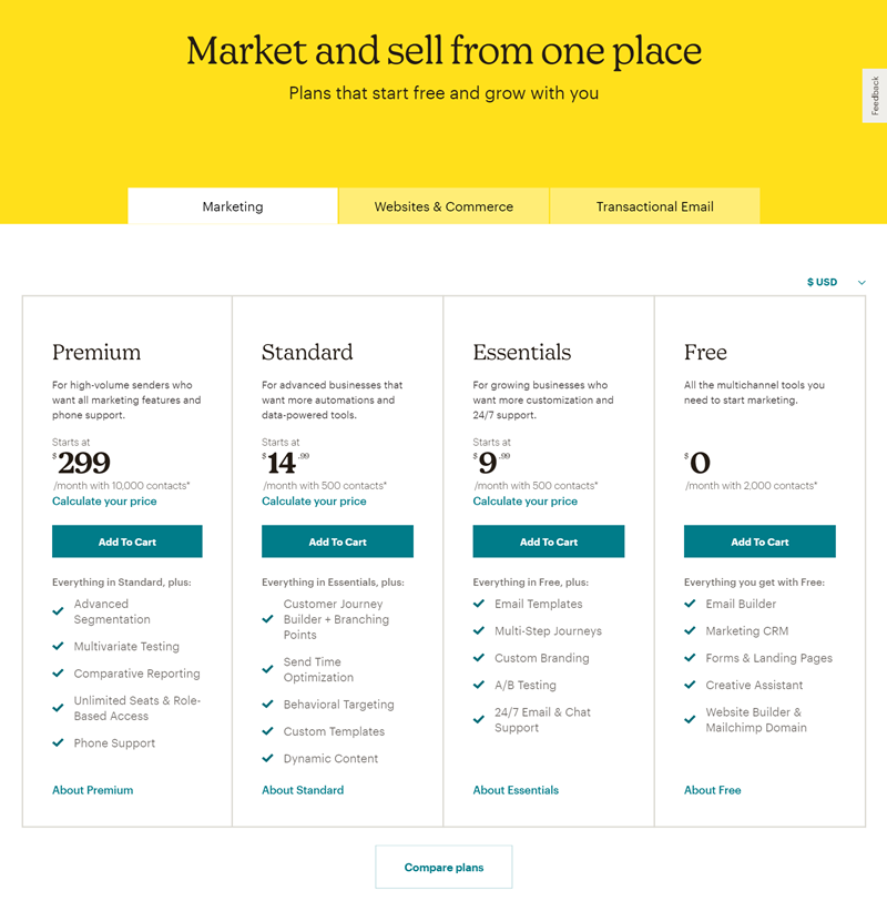
Placing products in descending order based on quantity is usually a better option because prices are more stable. This means that the product with the highest price will be listed first, and the lowest-priced item will be at the bottom. In addition, some people find it easier to compare prices between items because prices are similar.
2. The Interface of the Pricing Table
Keep It Simple and Clear
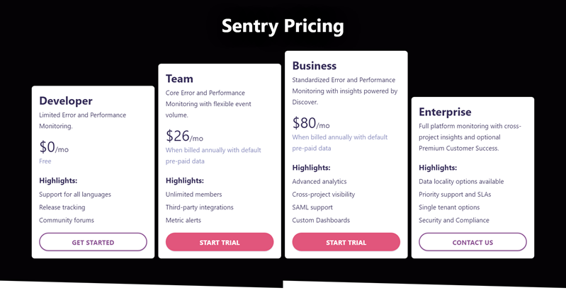
The pricing list should be straightforward, and always make sure that it is explained in clear language. If you have too much information in the layout, customers will find it hard to decide which plan is right for them. Again, always remember that customers want an easy-to-read table without any unnecessary information and details.
It is a common mistake for web designers to use colors and fonts that are hard to read to customers. Instead, you should use easy-to-read fonts, including serif or sans serif font, to create a pricing table that is readable to customers.
Create an Easy-to-use Pricing Table
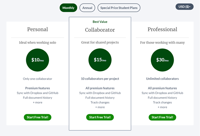
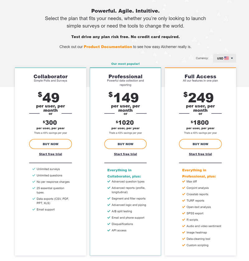
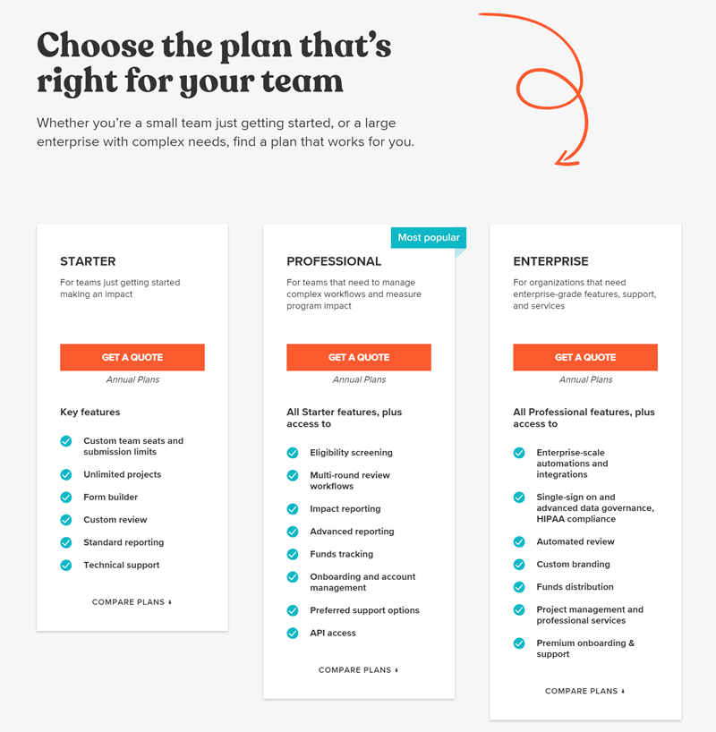
The price table on your website should have a clear layout that can be easily read. If you have many plans, it is best to put them in columns and rows to make it easier for customers to compare prices without getting confused.
Make Your Pricing Table Attractive and Creative
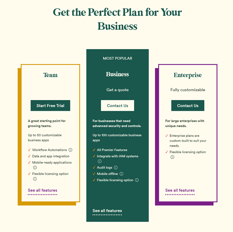
Make sure the pricing plan is eye-catching and looks professional with good-looking graphics. A good pricing layout should have the company’s name, logo, contact information, and plans in bold font. In addition, numbers and mathematical formulae should be placed at the table’s base for easy understanding.
Using different animations, images, and colors, you can make your pricing design more fun and enjoyable. In addition, you can include your logo or any other vital images in it.
Make Sure Your Pricing Table Is Responsive
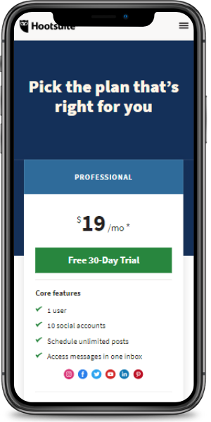
Always remember that your website should be both mobile and tablet-friendly. It is crucial to ensure that your website is easy to navigate and read from mobile devices. This lets users view all the content and easily navigate your site.
Add a Call-to-Action Button to Your Pricing Table
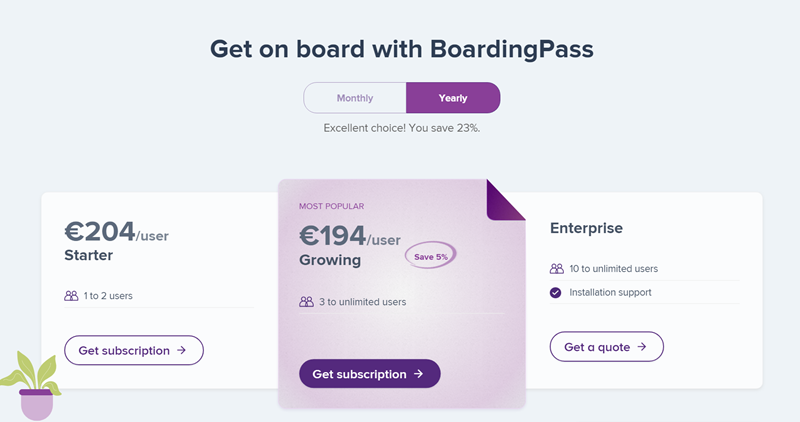
You should include a call-to-action button on the pricing layout of your website so that customers can get in touch with you once they decide to buy anything. This will help you reduce your site’s bounce rate and increase the conversion rate.
Use Special Symbols
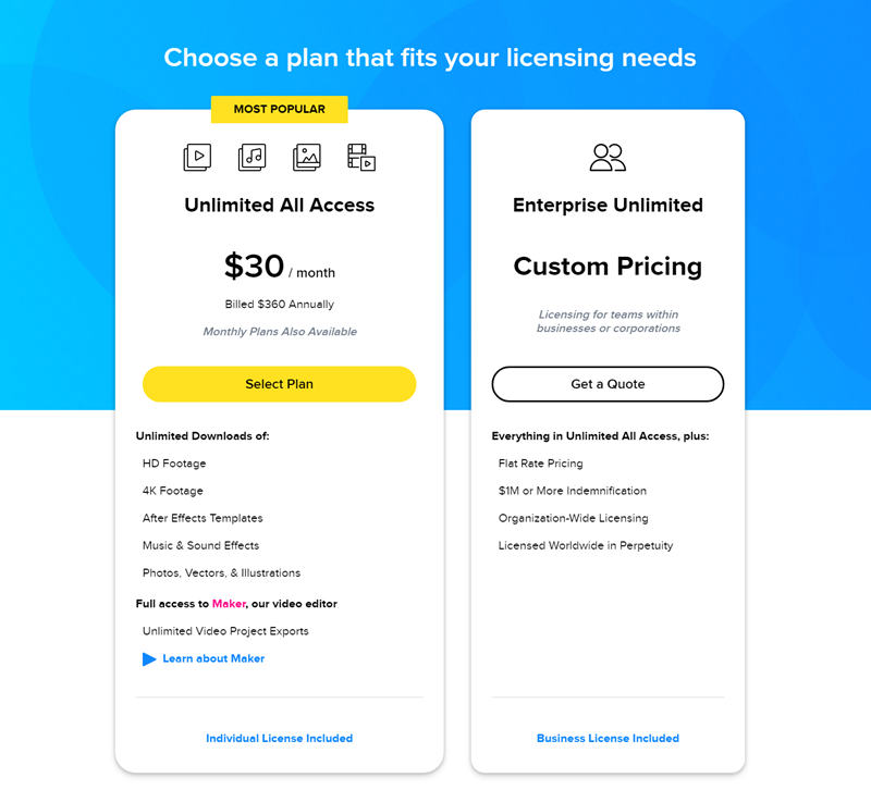
You may use strikethroughs for absent features. For example, if a pricing plan does not include a specific feature, it should be crossed with a single line. Or use bullets for particular features if you want to give the customer an in-depth description of what the product or package includes.
Lastly, make sure that you are using descriptions and abbreviations that are well-understood by your target audience.

Try FREE Magezon Page Builder demo today
Easily style every aspect of Magento website the way you want without relying on developers or designers. Just by drag & drop.
3. Add-In
FAQs Section
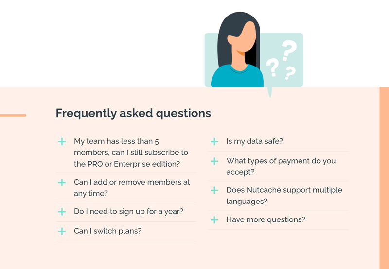
Sometimes, you’ll need to include your customer’s FAQ at the bottom of your pricing layout. For example, a website that sells clothes might want to offer a sale on selected items for customers with brown eyes. It would make sense to place an “eye color” option on the table and a “sale” option to accommodate both possibilities.
Offer Live Chat
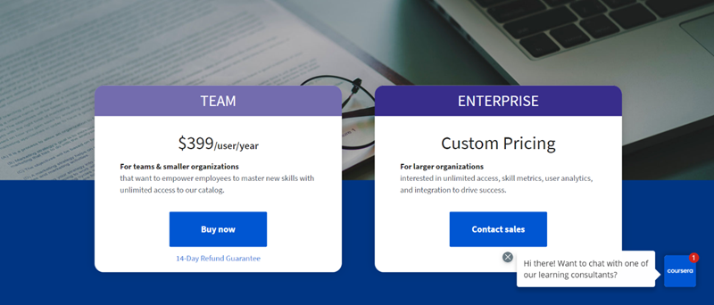
The most obvious way to entice customers is by offering live chat; it’s a fast and easy solution to answer their questions. And people love to chat, so don’t underestimate the power of this option.
A host of benefits comes together in live chat instant communication. Namely, most users are willing to get your answer and do not mind waiting for you as long as you are available.
In fact, they will be impressed that you have answered their question despite it being very early on a Monday morning. In addition, you can add real-time service, which means any information provided is immediately available to the user, no matter how far away they may be.
50+ Gorgeous Pricing Table Examples to Inspire You
1. Gravy
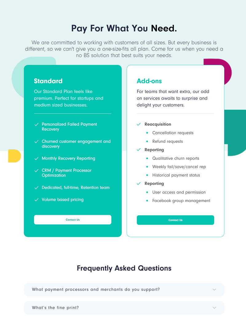
Gravy is one of the typical pricing table examples designed to help the user read data on the website easily with a bright and cool color. Moreover, they have a “Pay for what you need” instead of a “Pricing Table,” creating a relaxing experience for customers when purchasing.
2. Todoist
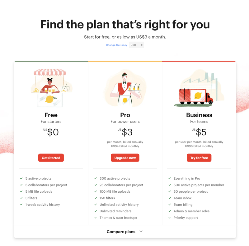
Here pricing is eye-catching and gives a good overview of the pricing structure. It stands out with description pictures on top of the white background. They have divided the pricing list into three parts with checklists and provide free starters’ accounts.
3. Twist
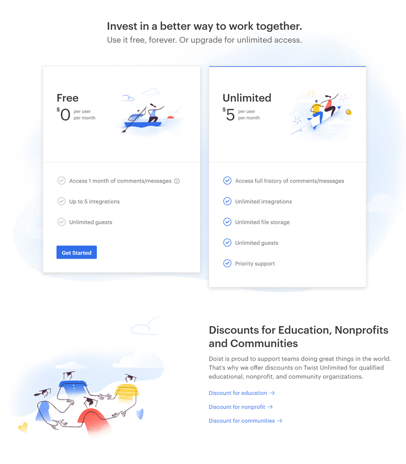
Twist has a descriptive but straightforward pricing layout. For example, “Invest in a better way to work together” is the way they use instead of “Pricing Table.” The background color is white with black text, providing a simple and easily readable font to the eye so that users can read all of the phrasings in one glance.
4. Notion
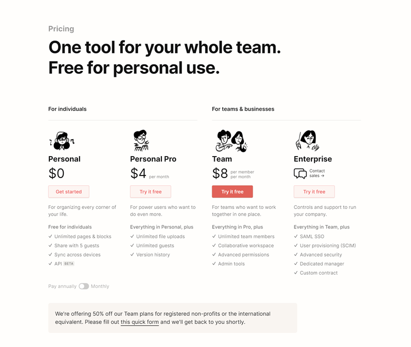
There is nothing more beautiful, simple, and structured than the pricing design of Notion. It is laid on a white background, with stand-out pricing labels and vivid pictures easily viewed. Simple and minimalist design, this layout contributes to modernizing any website.
5. Shift Nudge
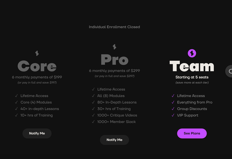
The pricing & plan of Shift Nudge is well organized and clear, with a large header that makes the title of the prices easier to follow. In addition, columns structure it with accurate prices for all tiers for all regions with the same size font in different color codes. They also provide a guarantee to make their business more reliable.
6. Framer
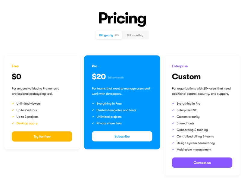
This page has a visually appealing look that distinguishes this website from the others in its category. Aside from that, the text size on the pricing list is not too small and consistent with the overall image. Customers can see what they get for their money regarding price, subscription cost, trial period, and many more.
7. Cometchat
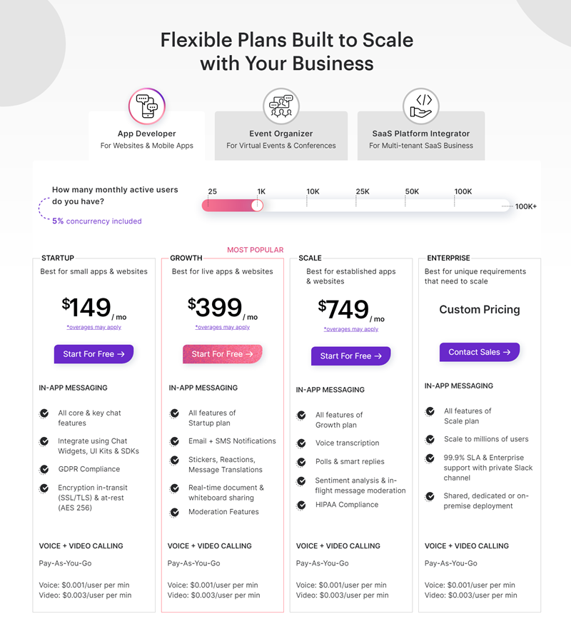
Cometchat is one of the creatively designed pricing table examples, with lovely color combinations on the website drawing viewers to it. Customers can see this table’s relevant information and how much it may cost for these services. In addition, it has all the necessary pricing list features, such as colors, size, font style, price range, and service type.
8. Piesync
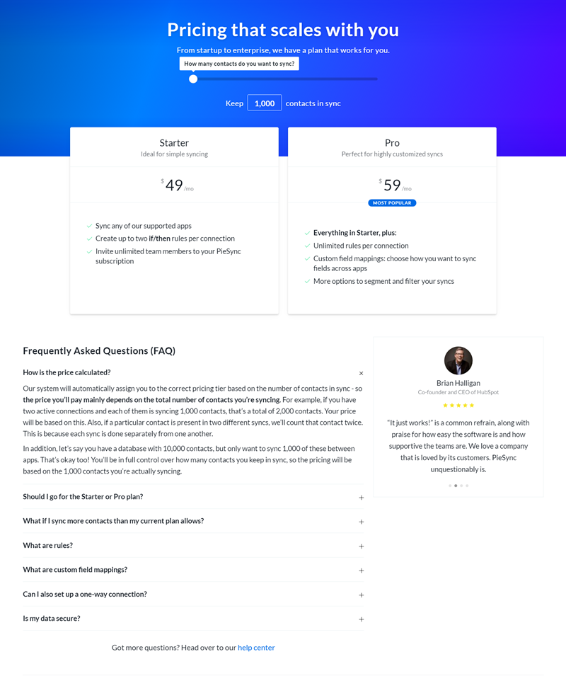
The pricing plan of Piesync is proposed to be uniform, readable, and easy to use. The page is divided into a header, where the headline is creative, and some breadcrumb navigation sits, followed by two content columns. Throughout the site, different navigational styles and designs are unified by blue and white.
9. Biteable
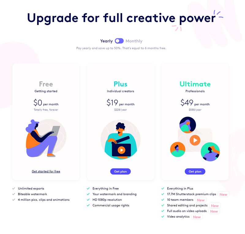
A beautiful pricing layout on Biteable’s website indicates that it is not an accident. It is part of what makes the website so attractive and inviting. The site’s page is created to stir the appetite and is designed to be easy on the eyes with the inspired layout.

Try FREE Magezon Page Builder demo today
Easily style every aspect of Magento website the way you want without relying on developers or designers. Just by drag & drop.
10. Pitch
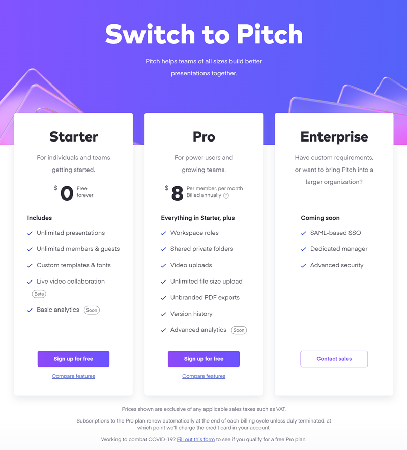
It’s effortless to understand the available options on the website of Pitch because each section of the pricing structure has its unique name and design. The pricing options also contain all the details for each prospect, including its name and description. The first choice is “free” because it is free of cost.
11. Sketch

The pricing design of Sketch on the website is lovely because it is large and easy to read, so visitors know exactly what the website costs. Besides, the colors are bold, bright, and engaging, making it look well-designed. There are also different levels of membership, starting with first-time users.
12. Artlist
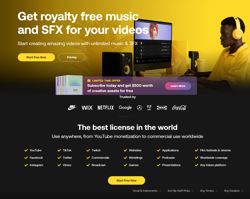
Artlist’s pricing list is the most spectacular on the website, as the design is simple but gives off a sophisticated and elegant vibe. Artlist also does an excellent job of keeping the layout clean and easy to scan. They take advantage of white space on the page and keep all critical information up high where you can easily see it at a glance.
13. Sendinblue
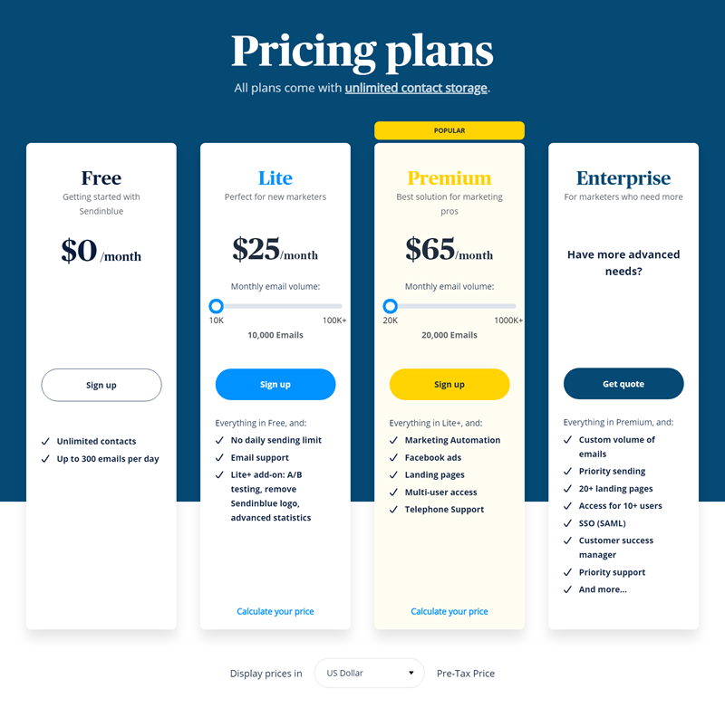
It is an excellent design and a stunning grid on the pricing table layout of Sendinblue’s website. They make the whole website seem more professional and better looking; the format is user-friendly and has every single package available, which helps customers find the right plan for their needs.
14. Topol
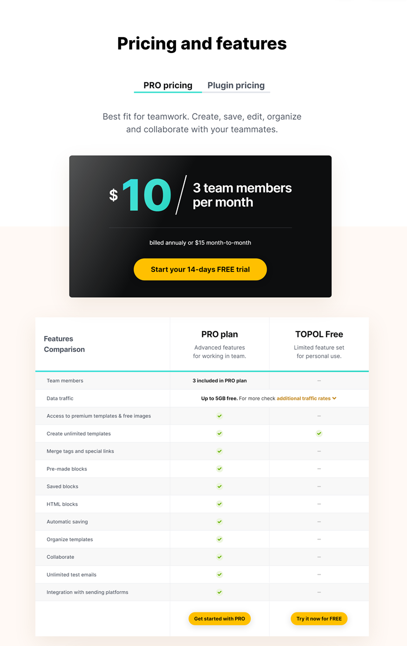
Topol’s pricing page has been designed to create a distinctive, luxurious, modern, chic look for the website with its neat rows of typography. It has been composed using black text on a white background to create a monochromatic effect with limited colors available.
15. ClickUp
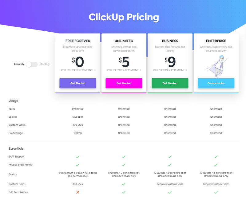
The pricing list of ClickUp is beautiful because it is clean and clear – no clutter or extraneous information to distract from essential information like price and expiration date. The price is also clearly marked and separated from the other information so that the user can easily identify what information is most important to them.
16. Culture Amp
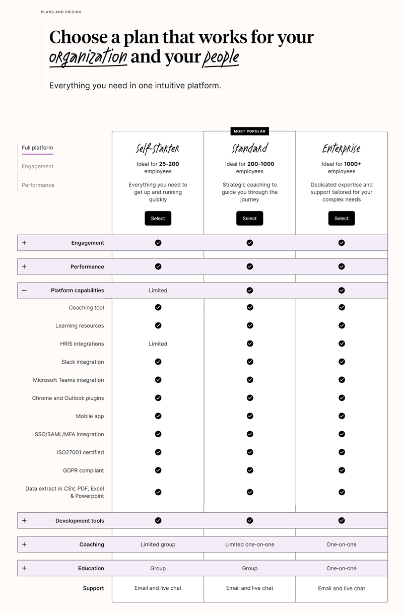
On Culture Amp’s website, the pricing & plan has an elegant black font against a white and grey background. Its simplicity makes it engaging and readable, with easy colors on the eyes, and not overwhelming. In addition, the font is perfectly set with attractive animations.
17. Remo
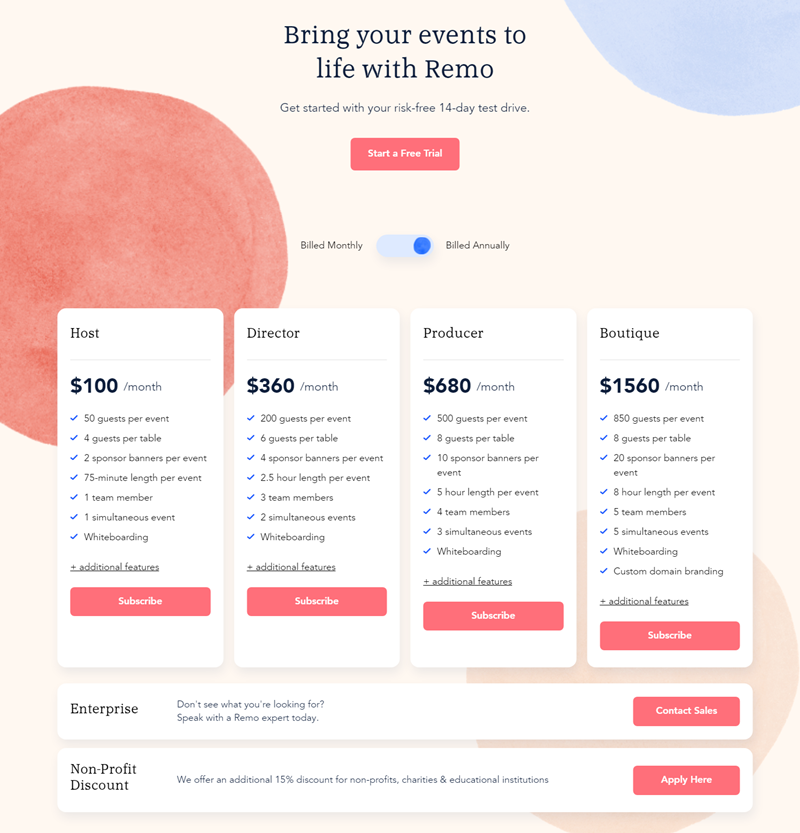
Remo demonstrates a simple design in their pricing layout, but not one that is overly simplistic as some can be. The color palette feels cohesive from top to bottom and works well together, so there isn’t any sense that one part was not considered with all other aspects.
18. MongoDB
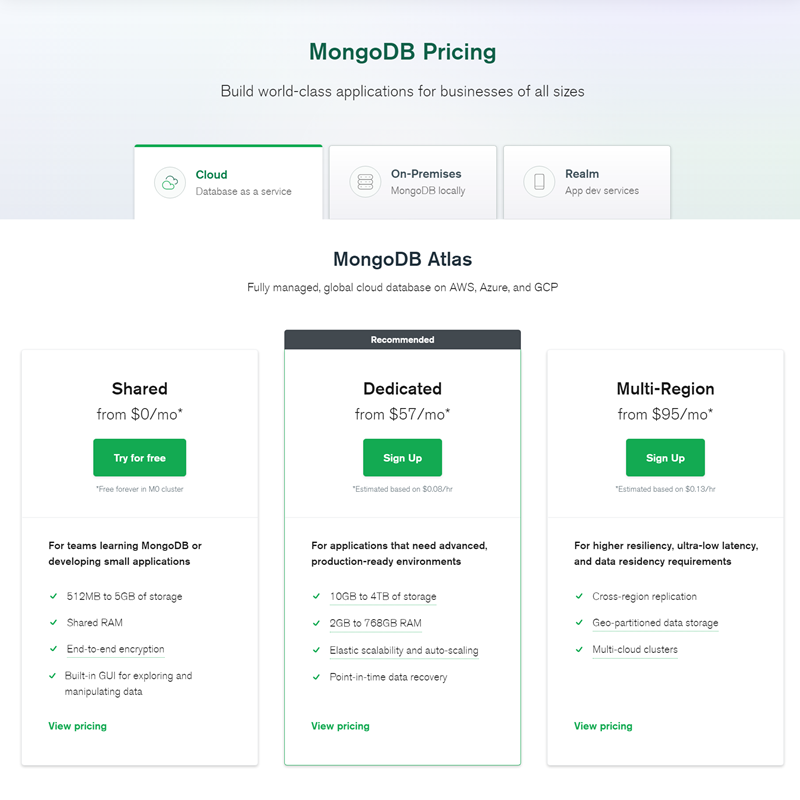
Customer-friendly pricing information is presented on the MongoDB website. The design and style of this table are beautiful because it contains all essential elements such as the logo, text, information about different product types and prices, and service features.
19. Docker
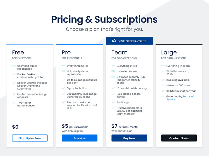
Docker’s pricing design is an excellent example of a standardized format that any website owner should adopt. By using this format, the table shows key information understandably. It also displays how all products are listed and their price once, unlike other tables on the site where you need to mouse over different tabs or scroll down to find out information.
20. Heap
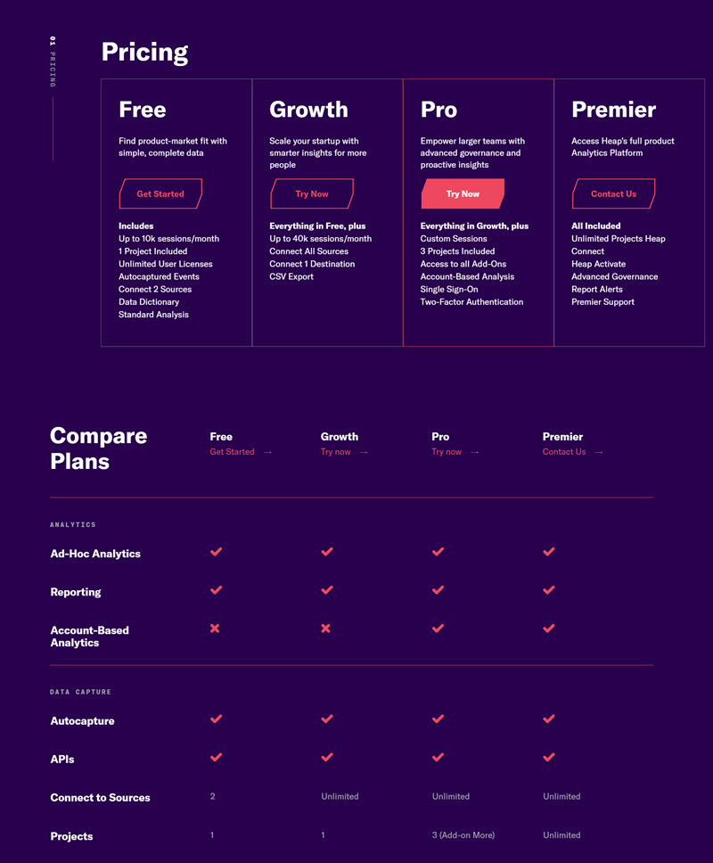
The pricing packages of Heap on the website are clean and straightforward. With an aesthetically pleasing design, they make it simple to read. At the same time, Heap’s pricing list efficiently utilizes white space, so it doesn’t feel cramped or busy like most other pricing table examples.
21. OptinMonster
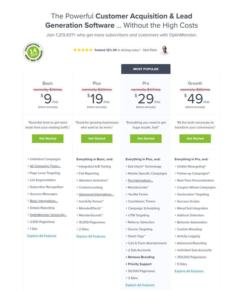
OptinMonster’s neat and clean pricing page lets you see the features available for each package. It’s simplistic and lays out everything clearly to help customers decide which package is for them and quickly compare the packages from different categories.
22. Soundstripe
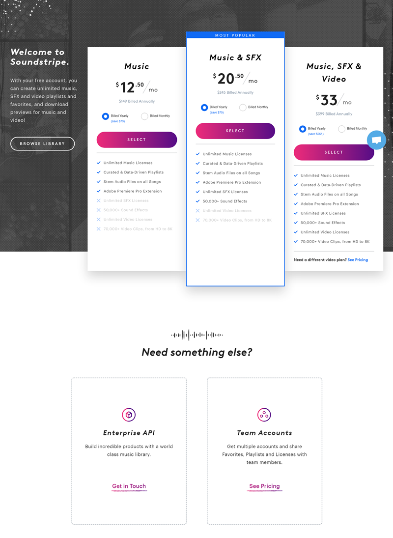
Soundstripe’s website has a gorgeous pricing table grid. It is symmetrical with white background and black text, showing what the company has to offer and communicating its value. Ultimately, the price list of Soundstripe is a practical visual communication tool driven by smart 3D design.
23. Jump Story
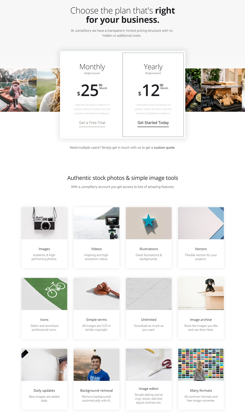
Jump Story’s pricing page is a very well-designed piece of information. It allows the customer to quickly see how much it will cost them compared to competitors and provides a clear view of the prices and features on their site. The design is immaculate, with a mix of simplicity and sophistication.
24. Elastic
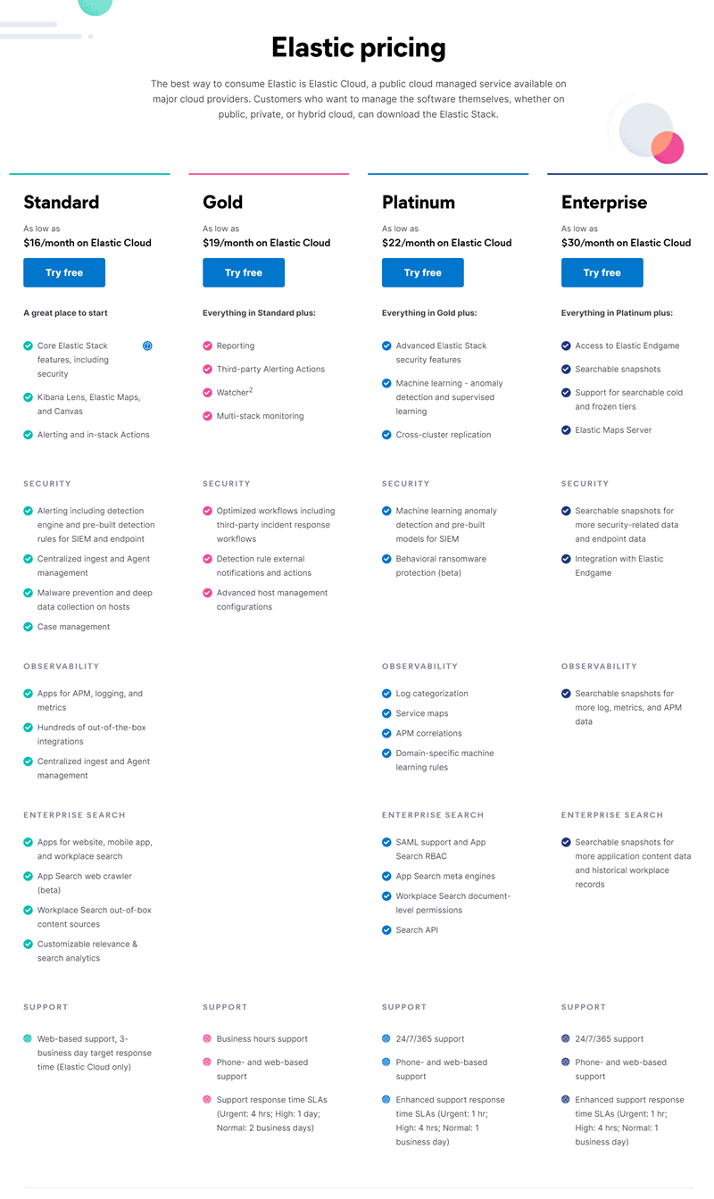
The table is planned to see all the features for each tier to decide which price point fits your needs. This is one of the pricing table design examples that does use bullet points to highlight different sections of their product offering. Ultimately, it still manages to convey everything they offer at an easy glance.

Try FREE Magezon Page Builder demo today
Easily style every aspect of Magento website the way you want without relying on developers or designers. Just by drag & drop.
25. Vcita
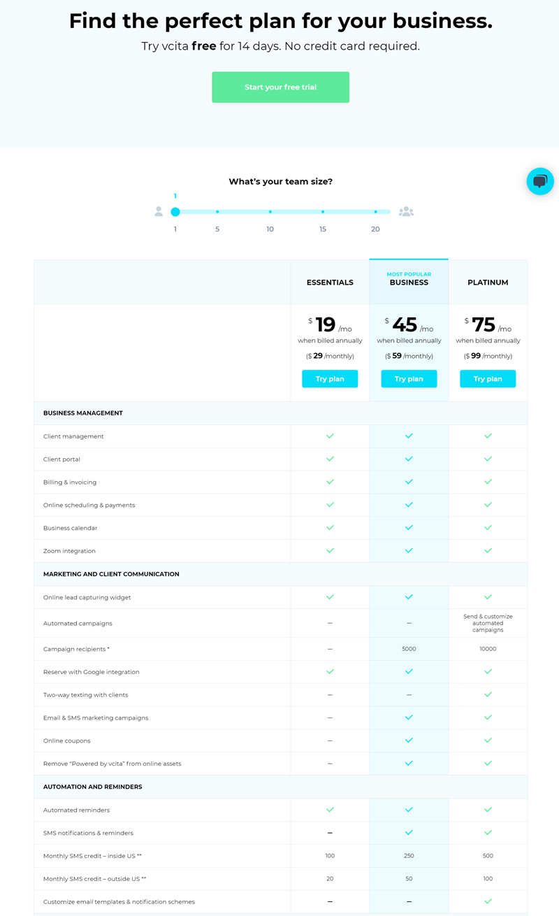
The colors used in the table are soft and blend nicely with the background, giving a relaxing look to Vcita’s site. In the table, it’s simple to visually see how much things cost and compare what items are less than what else. Pricing pages should always be created to be user-friendly, and Vcita has done just that.
26. DocSend
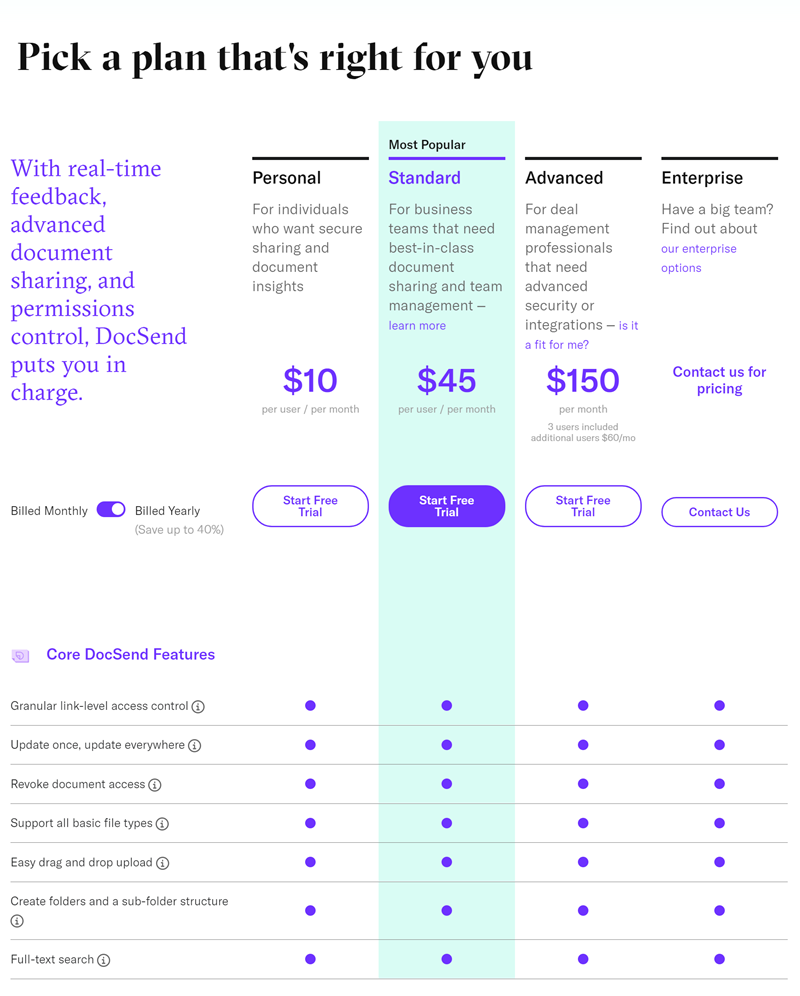
The pricing layout of DocSend is an excellent example of a minimalistic design. It has a clean and clear look with nothing unnecessary. This particular pricing list method is excellent because it doesn’t distract people from looking at the graph with too many colors. Moreover, it highlights the most popular plan.
27. Autopilot
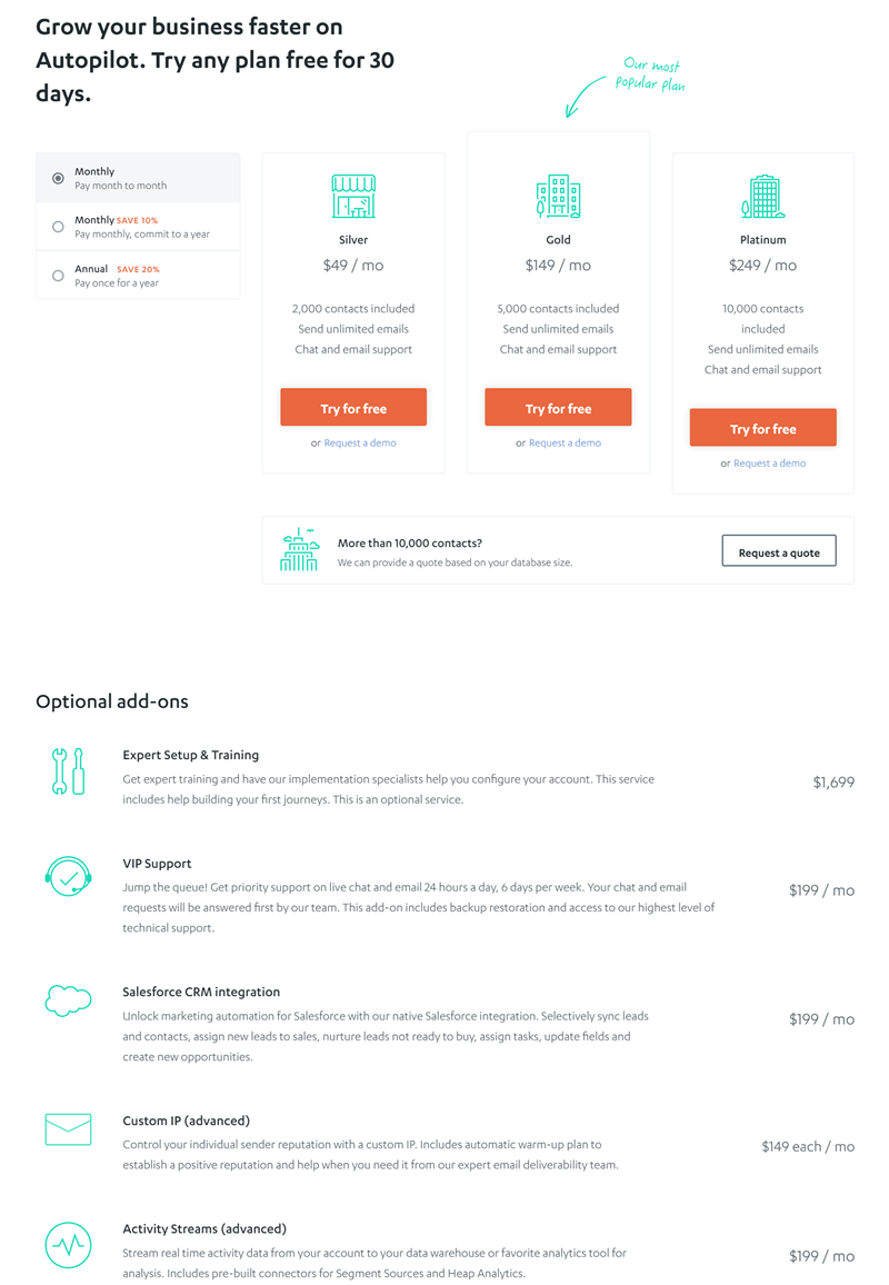
Autopilot’s pricing table examples on its website are well-designed. It is easy to see the prices without hidden charges or tricks. The colors add a touch of life to this website and are very pleasing to the eye. Additionally, the white background is simple but good enough for your daily browsing.
28. Crisp
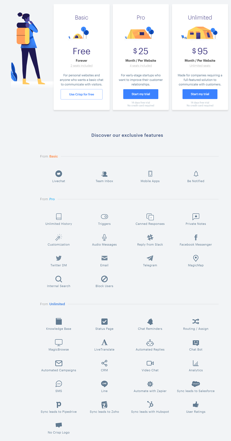
The Crisp on the website has an attractive pricing grid with artistically designed and illustrated colorful icons on a white canvas. It is appealing to the eye because it attracts a customer’s attention, increases interest in purchasing, and allows customers to browse shopping for goods at reasonable prices.
29. Bigcommerce
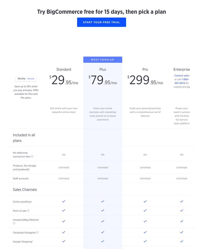
Bigcommerce’s pricing table inspiration is clean and well organized. The price for each item is displayed, in addition to the variations. The Bigcommerce pricing page highlights product descriptions individually and allows the customer to explore the product more closely before purchasing.
30. Hotjar
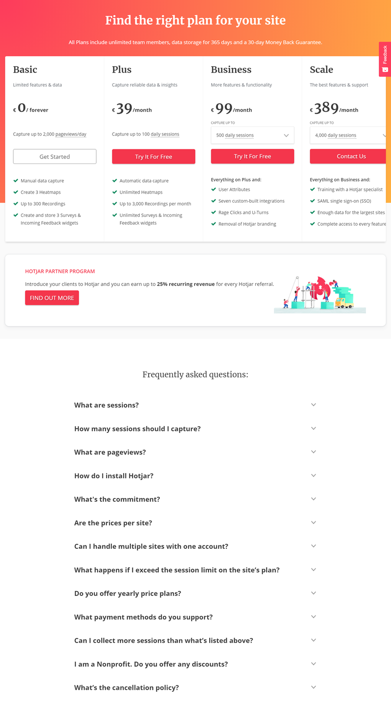
In addition to being beautiful, the Hotjar pricing & plan has a lot to offer. It is not very long, well-structured, and has a nice color scheme. Furthermore, it contains all information: the date of pricing and the various options you have to choose from to start a plan with an actual price and validity duration.
31. Pluralsight
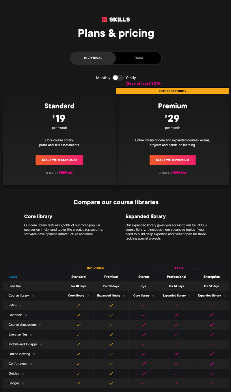
Pluralsight’s website features an attractive pricing scheme. This is because it uses a color gradient that works well with its website layout and contrasts the background color, making the text more visible. The design also has much white space and clean but still easy-to-read typography.
32. Ahrefs
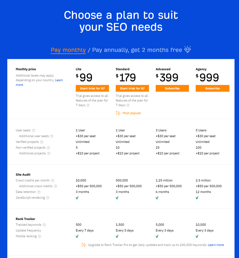
A great example of graphic design is the pricing menu on Ahrefs’ website. This one has a clean, minimalistic design that is well-suited for such a complex product. Contrasting colors and elegant fonts add subtle style to this table. However, the most eye-catching part of the table is the prices themselves: they are all on one line and span from the lowest to the highest.
33. Carto
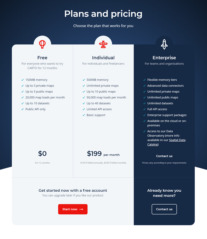
It is easy to understand and creates an elegant balance between information and design. The background color of Carto is muted and light blue, and the font used for the numbers is manageable. Additionally, the creation of the table makes it clear at just one glance how much each package costs and what you’re getting in return for your money.
34. Mixpanel
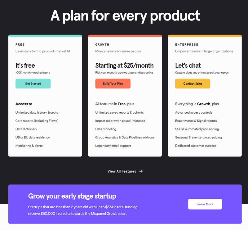
It is a pleasure to view Mixpanel’s pricing section on the website, which is elegant and sleek. Compared to the usual way of presenting the pricing data, Mixpanel is more creative and attractive with its simple design. The layout of the price table is neat, clean, and organized, giving out a fresh look.

Try FREE Magezon Page Builder demo today
Easily style every aspect of Magento website the way you want without relying on developers or designers. Just by drag & drop.
35. Strapi
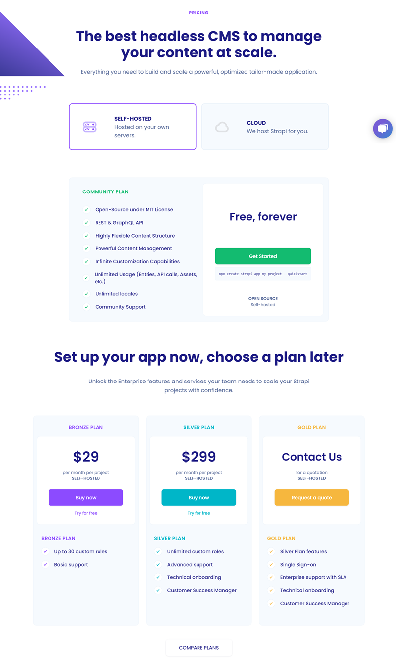
A striking feature of Strapi’s website is its pricing list, which does not look like any other pricing page. It has a modern, fluent design that’s visually appealing for users and functional. The colors are scattered in different directions all over the page, creating a distinctive layout that makes the items on the table stand out.
36. Algolia
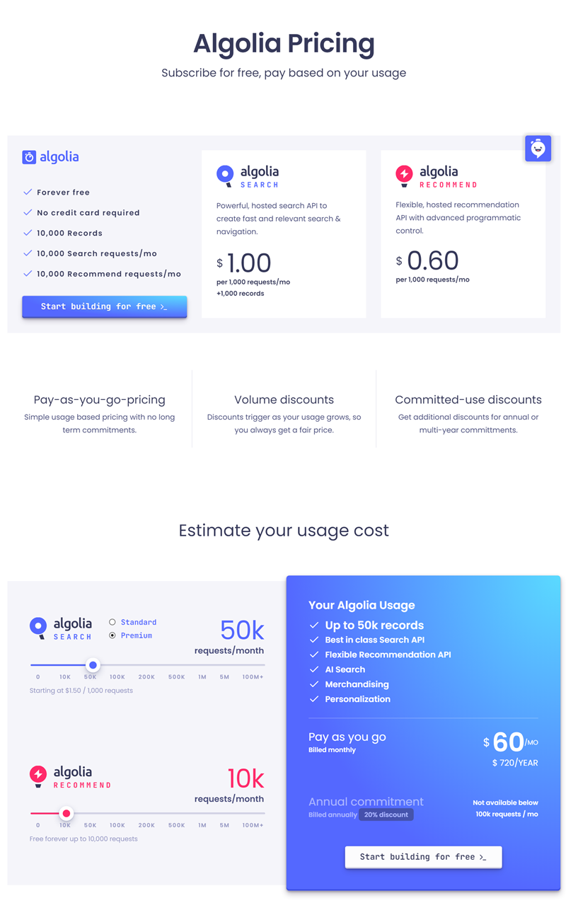
Designed beautifully, Algolia’s pricing page has a smooth and clean layout that is simple to follow, with dynamic features like pop-ups that let you learn more about what you’re looking at quickly. It captures the essence of what the website offers. The colors give off a professional vibe while remaining simple enough for new users to grasp soon.
37. 15five
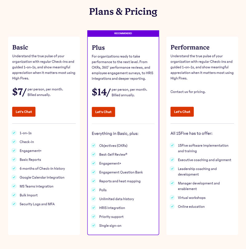
The whole design of the 15five pricing layout is also appealing for users because it seems mild in overall look, but it has a lot of information about their products in its detailed view. In addition, they’re clean and uncluttered, with a color scheme of light pink, red and blue to help convey the message of each offer.
38. Campaign Monitor
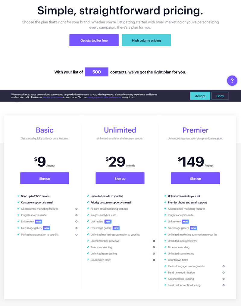
Beautiful is a good word for a Campaign Monitor because the design is not too flashy or too plain. It can show all the pricing tiers, and customers don’t have to scroll down a lot to see them. Moreover, visitors can easily see the price difference with this table without reading everything on the details page, which would take more time.
39. Vidyard
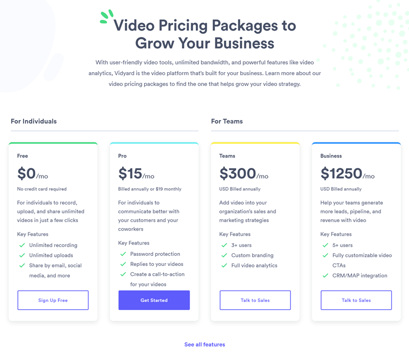
In Vidyard’s pricing part, the website displays information in a very creative and appealing way. When you see it, you can tell at a glance what the site is about and how much something costs. This allows visitors to find what they are looking for without visiting multiple pages of an e-commerce website or struggling with mediocre product descriptions.
40. Airtable
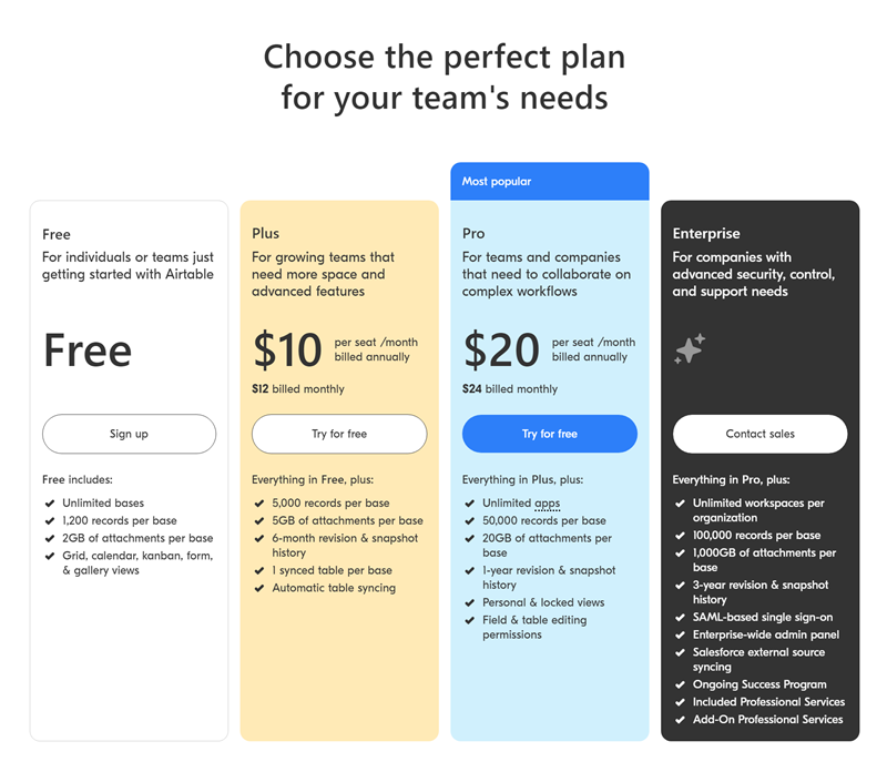
The pricing plan of Airtable is a pretty one because it indicates that the company focuses on the design and usability of its website. They have created a table with a clear arrangement, without any clutter, to convey that the pricing plans are quick.
41. Sign Up Genius
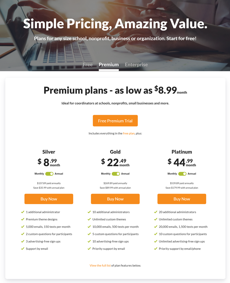
Sign Up Genius has a lovely pricing picture on its website. It has a colorful layout with comic-like, effective, versatile illustrations. The design is unique and eye-catching; it can be portrayed as attractive and professional. And the plans provide useful information and aesthetic value to the website it’s on.
42. Lokalise
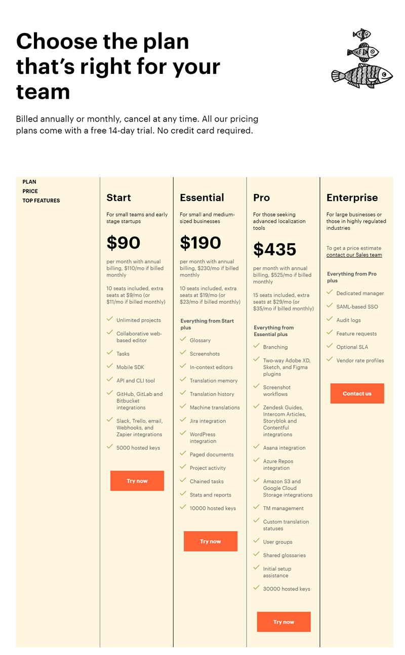
The pricing & plan of Lokalise on the website is beautiful because it has a layout designed in a way that is easy to understand what each feature would cost. In addition, the table relies on an applied color theory, making the design pop and very welcoming to the eye.
43. Nutshell
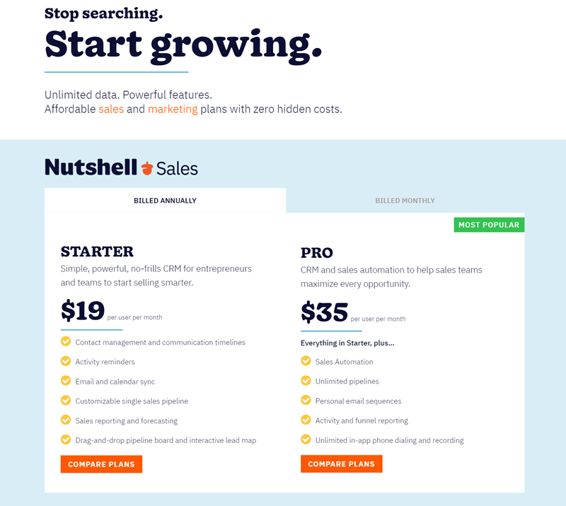
The pricing information of Nutshell is user-friendly and straightforward, which makes it effortless for customers to find the products they want ease. The site has just the right amount of color and design to create a modern feel while still being simple. In addition, all of the information is presented in a way that is easily understood by consumers, such as using descriptive text.

Try FREE Magezon Page Builder demo today
Easily style every aspect of Magento website the way you want without relying on developers or designers. Just by drag & drop.
44. Front
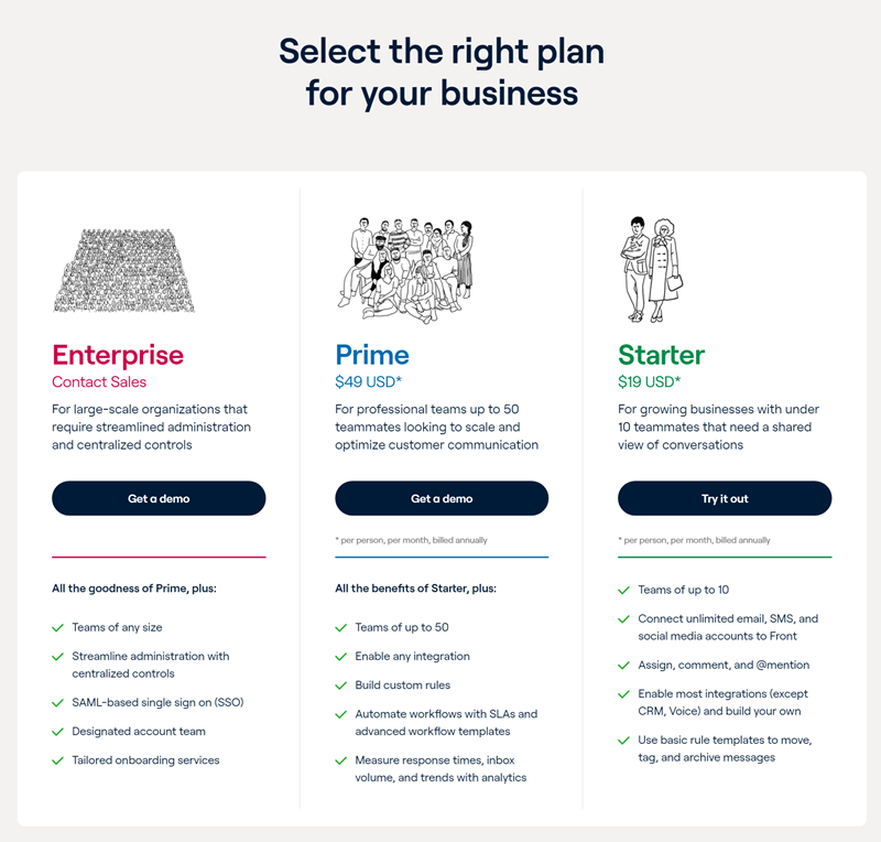
The pricing layout of Front is not at all the same as others. However, it is beautiful and designed to make you want to buy products and services from them. It also provides a clear overview of features offered in plans. This is particularly helpful when customers need to compare prices against other websites or even current workplace rates.
45. Cloudinary
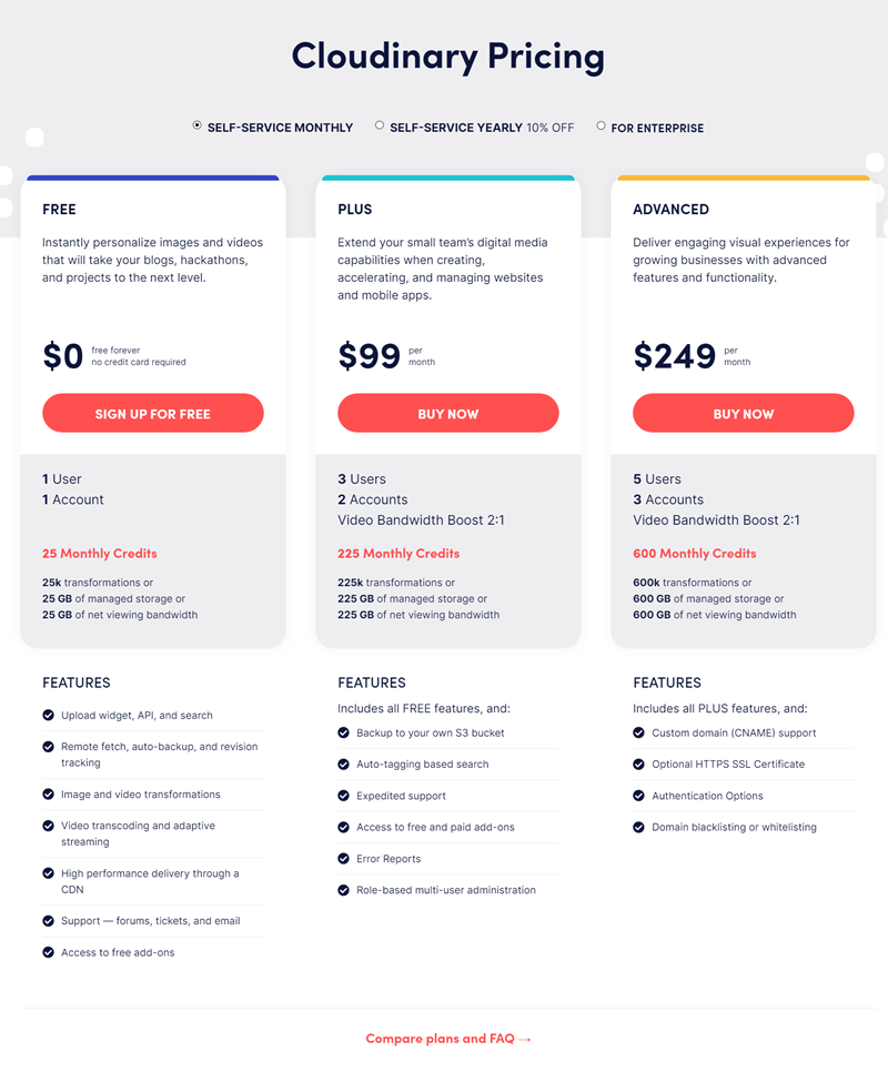
Cloudinary’s website is built and functional in terms of the pricing scheme. It makes it easier for customers to see prices and compare options. More clearly, a lot of thought has gone into the design of this table. Most importantly, the table provides a logical vertical flow from left to right and is fully responsive, so it will look great on any device.
46. DataCamp
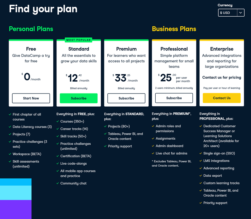
It is attractive to look at the pricing page of DataCamp because it is well-designed with a clear layout, labeled headings, and color schemes that are pleasant to the eye. In addition, making choices for course packages is mere, intuitive, and enjoyable.
47. Toggl Plan
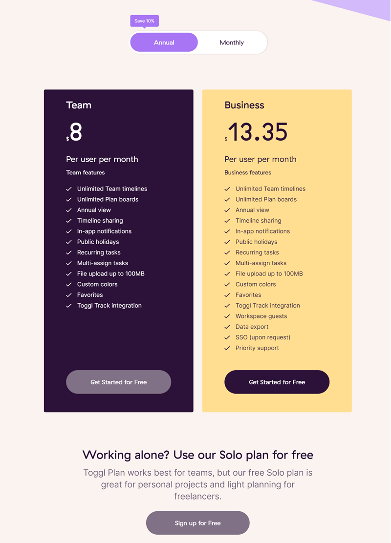
On the website of Toggl Plan, you can see a stunning pricing table design. It is relaxing to understand and follow, the colors are soothing, and there is just enough information to get an idea of what the plan entails. The pricing page’s simplicity, clarity, and incredible ease of use have made it so that almost everyone can immediately grasp everything.
48. Gusto
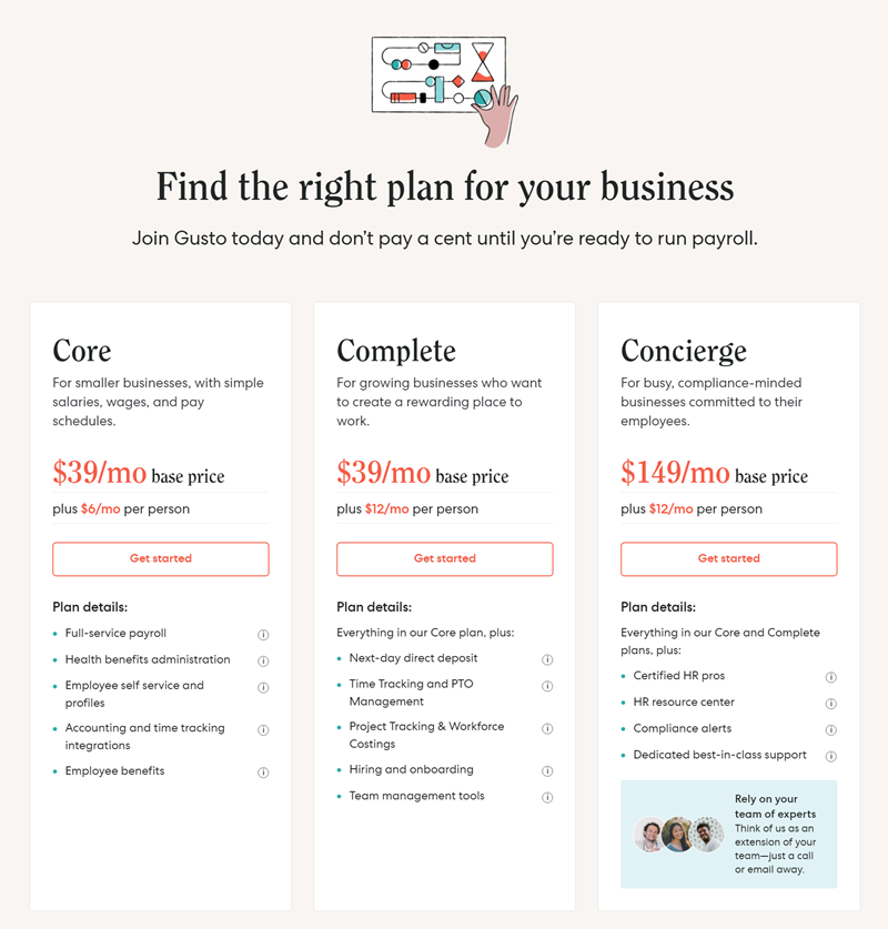
The plan page of Gusto is an example of a pricing table that is perfect for any website. The color scheme makes plans easier to differentiate and highlights the special benefits of these particular packages.
49. Sumo Logic
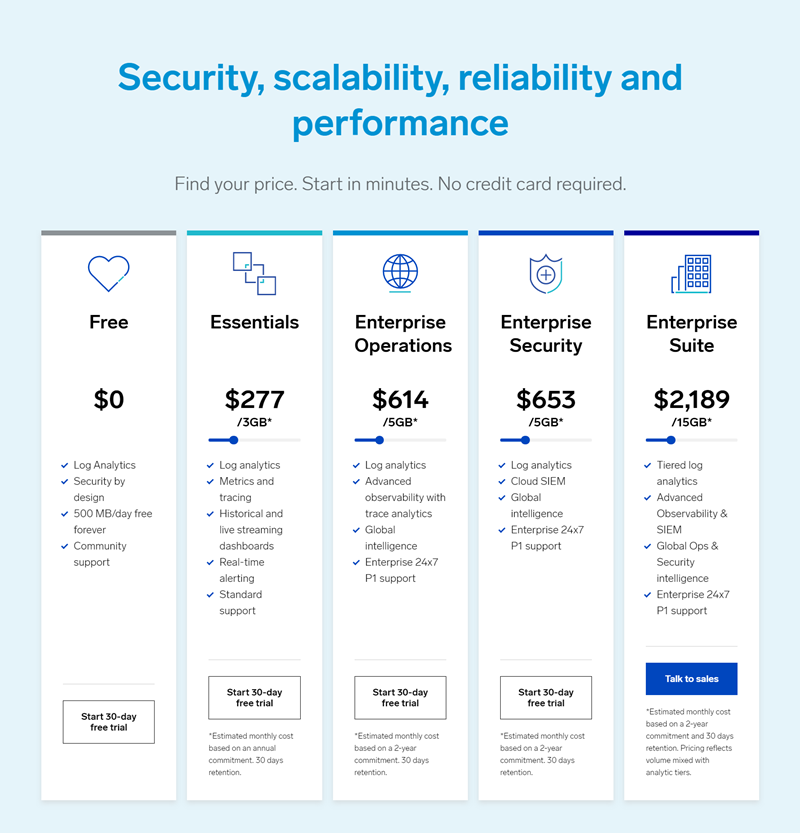
Sumo Logic’s pricing list is appealing because it provides a smooth flow of information that makes it easy to understand. It is stunning how well-organized the page is and aesthetically pleasing at the same time. Furthermore, this table allows users to see the functions of Sumo Logic clearly with concise descriptions and visible numbers, as well as benefits, features, and current prices.
50. Gitlab
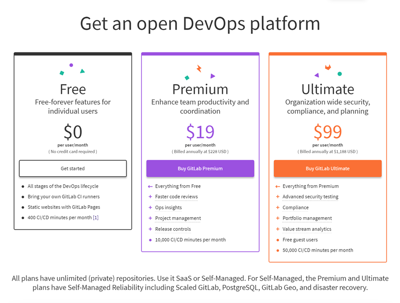
On the website, Gitlab provides a visual representation of its pricing. This is because it uses various colors and shapes to draw your attention from the rest of the page. In addition, the table has helpful information on pricing and features, such as how much time it takes for a free trial.
51. Elementor
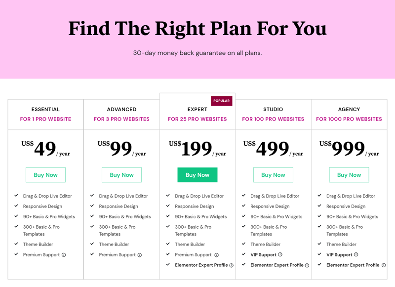
Elementor are example of sophisticated and beautiful pricing templates. The elements in the table are varied and well-thought-out. Moreover, there’s a good balance of white space on both sides of each row, creating an intentional emptiness that draws your eyes to the text.
Conclusion
In conclusion, when designing a pricing table for a website, there are many factors to consider. But ultimately, the most important thing to remember is that these tables are meant for your customers – so you need to make them attractive and easy to read. So make sure that your text is clear and easy to understand, and use appropriate graphics (somewhat related to the topic) as needed.

Try FREE Magezon Page Builder demo today
Easily style every aspect of Magento website the way you want without relying on developers or designers. Just by drag & drop.
 Magezon Blog Help Merchants Build Comprehensive eCommerce Websites


