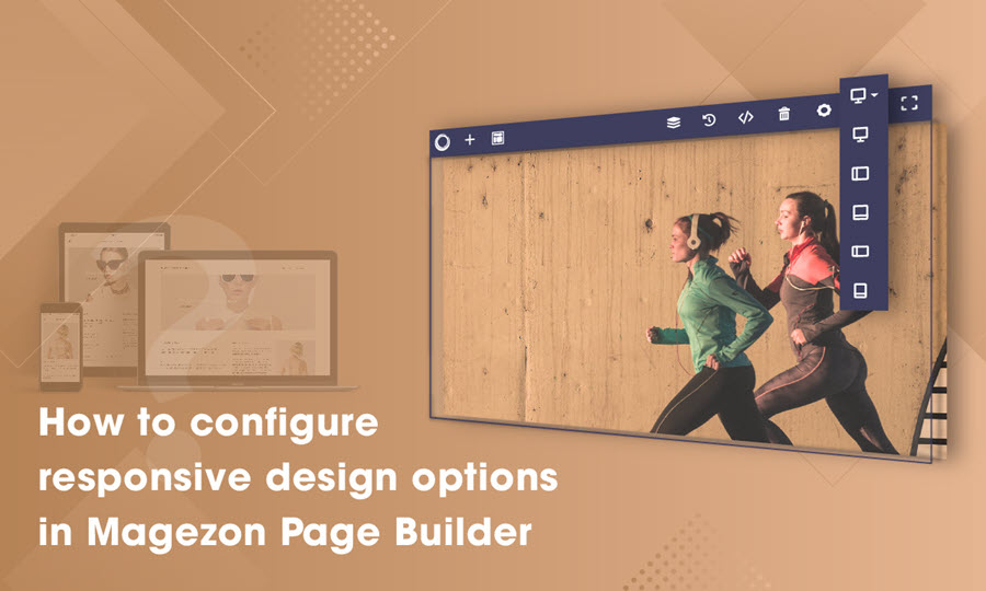
The ever-changing world of technology has brought us the pervasiveness and diversity of high-resolution devices. Consequently, it is important for Magento web designers/builders to consider creating a web page that fits all types of devices. In this tutorial blog, we will talk about how to configure responsive design options in Magezon Page Builder. We assume that you all have a certain knowledge about responsiveness in Magezon Page Builder for Magento, in case you don’t, visit our blog “Create Stunning Sites with Magento Responsive Page Builder“. Let’s dive straight into it!
Table of contents
Configure Responsive Design Options in Magezon Page Builder
Typically people need a responsive design for their webpage because of the need for changing CSS box value for different device resolutions or setting background images on each screen. To understand this concept better, take a look at the examples below:
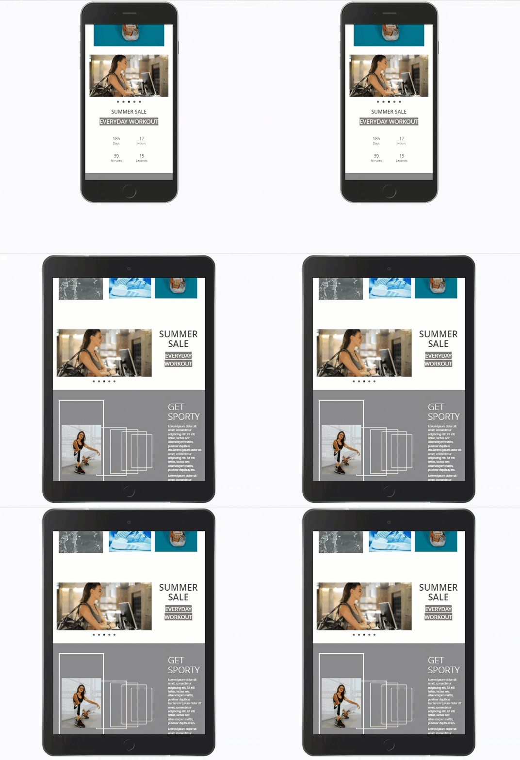
Different CSS box value on devices
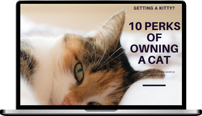

Different background images on devices
Normally when you customize design options of an element, our builder automatically sets the “device type” dropdown to “all”, which means the design options you make will be applied for all types of devices.
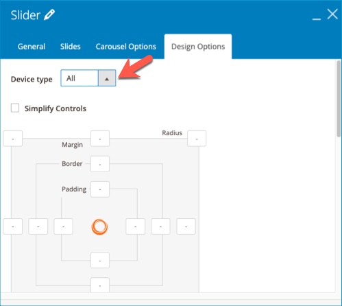
We automatically set the changes for all devices
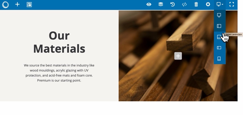
To apply different design options for different devices, choose “custom” and select the screen you want to customize. We give you 5 options, which are desktop, tablet landscape, tablet portrait, mobile landscape and mobile portrait.
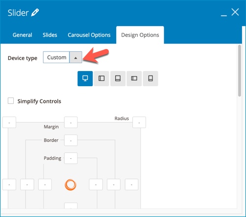
Note: Any design options added to a bigger screen size gets inherited by the smaller ones. The values will be the same for all smaller screens unless you specify something else for them. For example, if you set the element margin value for desktop to 100 and do nothing to the rest of the devices, they will inherit that 100 value. Continuously you add 50 to the element margin value of tablet portrait, mobile landscape and mobile portrait will inherit that 50 value.
Hide & Show Elements on Different Devices in Magezon Page Builder
What to do if I don’t want to show the elements on some devices? In this case, I’ll customize the “hide on” options.
In the element General setting tab, select any devices you want to hide:
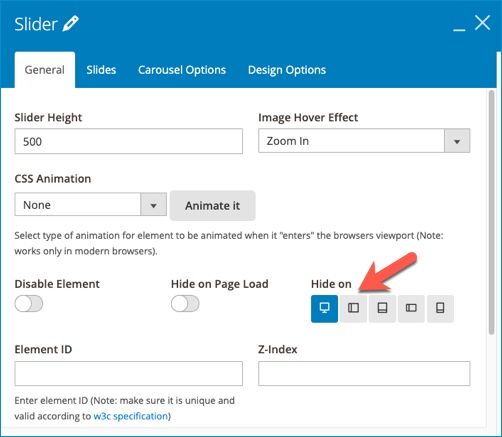
Note: If you hide an element on a device, you can’t see the element on this device’s view. To make it appear and customize, choose the device’s view that allows you to show the element.
Conclusion
We hope that after reading this blog you get your mind opened and can use the knowledge to build a responsive Magento website with our Magento CMS Page Builder. If you love our Magezon Page Builder tutorial series, visit us to read more. Feel free to leave us some comments or questions in the comment section below.
Try FREE Magezon Page Builder demo today
Easily create beautiful, engaging Magento website in any style whenever you want without relying on developers or designers. Just by drag & drop.
 Magezon Blog Help Merchants Build Comprehensive eCommerce Websites

