 Magezon Blog Help Merchants Build Comprehensive eCommerce Websites
While visiting a website which looks terrible on the mobile device, what will you do next? Maybe you should leave for somewhere else. Thus, using a responsive page builder can help you prevent that risk.
It’s successful to attract customers to visit your site. However, having them leave means your website didn’t look friendly enough mobile devices. This is considered a huge problem.
This article, we gonna tell you about the responsive website’s definition and how it helps your sale. Plus, we also give you some tips creating one in Magento – using a responsive page builder, like Magezon Page Builder.
Table of contents
What is a Mobile Responsive Website?
To be simple, a mobile responsive website is a site that fits all the common mobile devices nowadays (a smartphone, a tablet, or a desktop computer, portrait or landscape). It has to automatically adjust the layout of the site to match when the screen sizes are changed.

A mobile phone screen is smaller than a tablet’s, and the tablet is smaller than a desktop or laptop computer screen. Thus, when your customers change their device, you must be ready to chase them with your beautiful layout no matter how big the screen is. Yet, get your site fully responsive right away!
Learn more: Responsive controls in Magezon Page Builder
What Can a Responsive Magento Website Help?
First, it will re-arrange your content and navigation bar automatically. Thus, they fit well into a smaller screen and even look pretty.
The navigation bar is usually wrapped into a tab and always comes with a hamburger icon. Hence, it’s accessible when you tap on that button.
Second, a responsive website lets your customers see the desired content quickly with the clear navigation bar adjusted. Not all, the content can be displayed big enough to read instead of being in the size of ants. And your customers used to bear the feeling of reading tiny letters with wide-opened eyes. Such a terrible experience!

Content sections now are arranged into the vertical side. No need to use a magnificent to read the content as all of them are now so visible and easy to read. Just use the finger to slide down for further information.
So, in general, what a mobile responsive website can do, is to automatically do re-arrange the complicated columns of your site into a vertical one. Thus, the text size is at least legible on a smaller screen. As a result, the responsive website can absolutely help to improve your visitors’ user experiences.
How to Build a Responsive Website in Magento?
If you are a Magento developer, it’s not too difficult for you to code up a site of mobile responsiveness. However, 90% of readers here have no coding skill, so don’t be so hard on yourself.
What to do now?
If you are owning a business on Magento platform and have no idea about this at all, your best choice is to find a good Magento Page Builder.
Don’t be too worry, tons of Magento 2 Page Builders out there which can help create stunning responsive pages with no technical knowledge.
They are almost easy to use with intuitive drag and drop editor. Thus, a newbie like you can create amazing pages easily.
They can deal with all the technical stuff like SEO optimization, Cache supported, engaged Lazy Load technique, etc. All the things you have to do is to insert the images and content of your wish. Drag and drop the items. See the result right away!
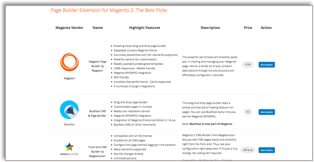
Maybe we will not just talk like that. We offer you a special list of Top best stunning Magento Page Builder as below. Come and compare yourself.
How to Create Responsive Websites With Magezon Page Builder?
Magezon Page Builder takes care of your website responsive design. Every single element of the editor is fully responsive that fits all the screen sizes. The responsive design is available within the Design Options Tab.
Magezon Page Builder lets you configure your layout on the 5 most common device types:
- Desktop;
- Tablet landscape;
- Tablet portrait;
- Mobile landscape;
- Mobile portrait.
In order to configure Responsive Option, you shoud:
Navigate to the element that needs to configure. In the Design Options tab, choose ‘Custom’ value of the ‘Device type’ field. Select device type to be activated for your layout. Then configure that layout the way you want.
When it comes to important element like Columns, it gets own Responsive Options Tab. As guided in the video, you can easily change the width of columns in each type of device. Not all, decide which can be presented in each device just by ticking on the boxes.
Elements like Rows and Columns vastly affect the whole layout. Thus, calculate and decide the number of columns and rows to be displayed wisely.
In a Nutshell
A website with mobile responsive function can vastly enhance your SEO as well as your sale. If you are not really good at code, finding an appropriate Magento extension that assists you while building site is a wise choice.
Consider a Magento Page Builder that can really help? Take a short look through Magezon Page Builder, it will not let you down!

Try FREE Magezon Page Builder demo today
Easily create beautiful, engaging Magento website in any style whenever you want without relying on developers or designers. Just by drag & drop.


