 Magezon Blog Help Merchants Build Comprehensive eCommerce Websites
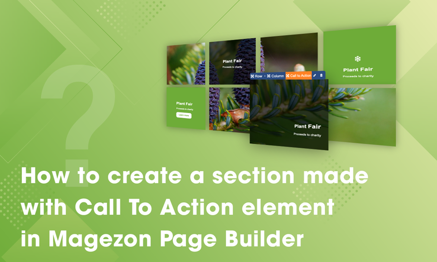
We all know that call to action is the heart of increasing website’s conversions from average to exceptional in form of an interactive box. However, making the most of call to action element to create a truly spectacular section is not an easy task. In this tutorial blog, we’d like to instruct you how to produce one with Magezon Page Builder. Let’s dive straight into it!
Table of contents
What Is Call to Action Element in Magezon Page Builder?
Call to action is a box that contains text, a button, an image and effect that enable your web to drive interaction and conversions. Magezon Page Builder gives you endless design options to customize your call to action freely. This tutorial will take the example from our Call to Action element and let you know how to create a similar one.
Create a Section Made with Call to Action
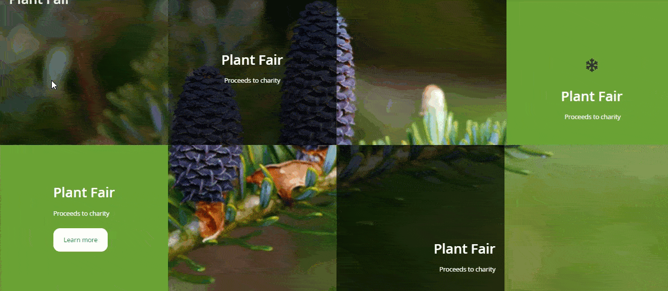
First of all, to make an one-of-a-kind section, it’s crucial to set an one-of-a-kind layout, right? Our section is made from 2 rows and each row is divided into 3 columns. To make things clear, I’ll number the columns so that you guys can easily follow the steps.
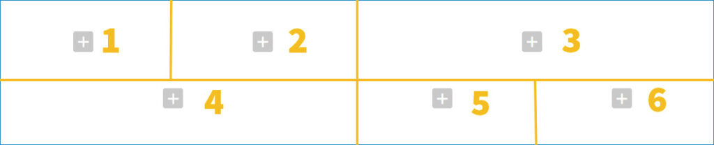
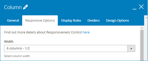
For the column 1, 2, 5, 6, set the “column responsive options” to ¼. To the the rest that is column 3 and 4, we’ll change their “column responsive options” to ½.

Set responsive options for column 1, 2, 5, 6.
Set responsive options for column 3, 4.
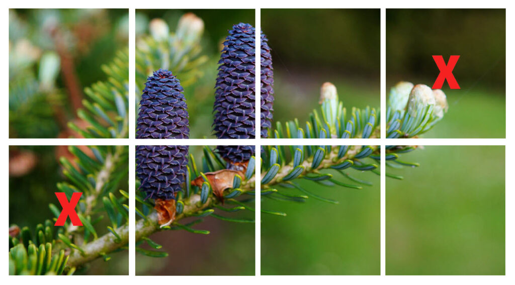
In addition, it can’t go without having a stunning image. I’ll get my image cut into 8 parts, then remove the top right corner and the bottom left corner.
Now, we’ll go into more detail about the setting of each column.
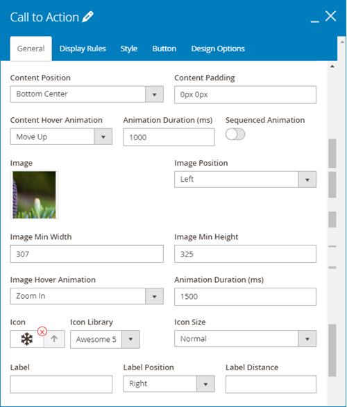
1. Column 1
General setting tab:
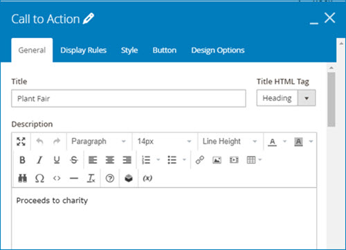
Type title and description
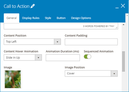
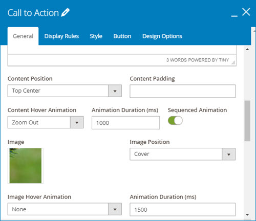
The content will appear on the top left position of the call to action, add some hover effect by choosing “Slide in up” in the content hover animation field. Toggle “sequenced animation” so that each element of the call to action content will show up sequentially.
Next, upload an image by uploading it from your device or selecting the existing one from your media gallery. Then, choose “cover” image position
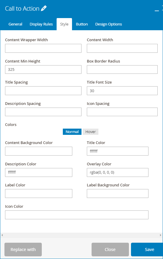
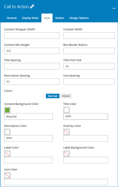
Style setting tab
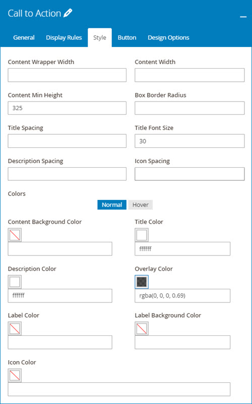
Set 325 value for content min height, 30 title font size. Adjust description color, title color and overlay color like the image below
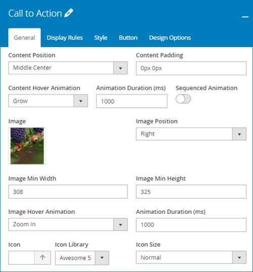
2. Column 2
Because the others are duplicated from column 1, I just change some settings of them. (Except for column 3 and 4)
General setting:
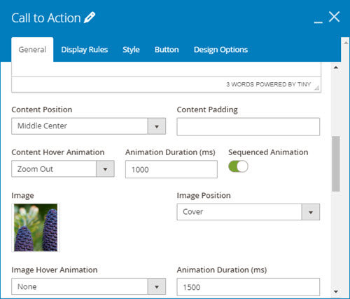
Change content position to Middle center and Content Hover Animation to Zoom out. Then insert a new image.
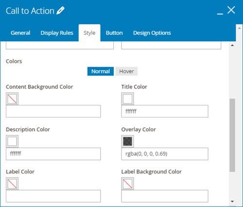
Style setting:
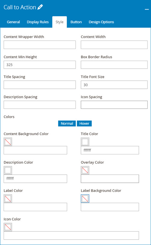
Change the overlay color of this call to action like this image
Similarly, we adjust value of column 5 and 6 like these settings below
3. Column 5
General setting:
Style setting:
4. Column 6
General setting:
Style setting:
5. Column 3
General setting:
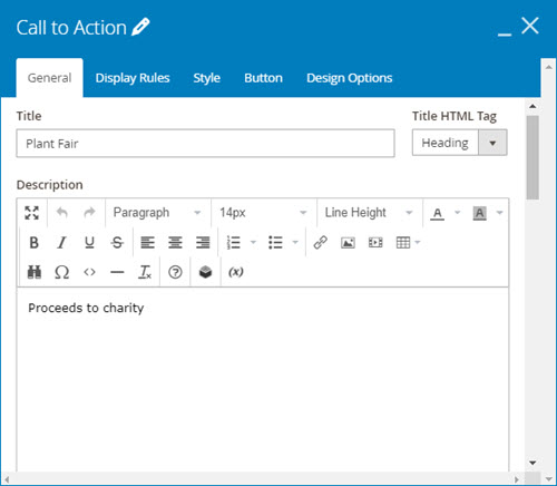
Type title and description for the call to action
Then customize the setting like the image below:
Style setting:
The thing that makes column 3 and 4 unique is that we use other types of image position. For example, the image position of column 3 is no longer “cover” like all above. We set it to left so that our call to action will have a different look.
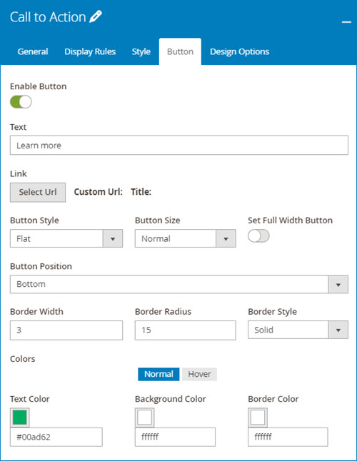
6. Column 4
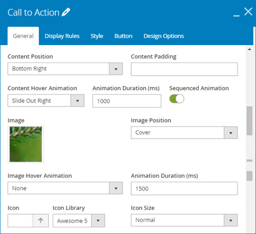
I’ll duplicate column 3 for column 4 and then adjust its settings.
General setting:
Customize the general setting like the image below
Style setting: Do nothing to the style setting because it’s the same as those of column 3
Using a button to get more web conversions is a good idea, so in column 4, I’ll toggle “ enable button” and add some changes to it.
Button setting:
Finally, don’t forget to save and see your great job.
| Learn more about Magezon Page Builder elements: Get to Know CSS Icon Box in Magento 2 Page Builder Open Source Magento 2 Page Builder Accordion: Benefits and Configurations How to Create an Image Gallery in Magezon Page Builder |
To Wrap It up
We hope that after reading this tutorial you can create a section with call to action element which can bring your page layout to life with more interactions. Interested in our Magezon Page Builder tutorial blog? Visit to read more. Feel free to leave us some comments in the comment section below.

Try FREE Magezon Page Builder demo today
Easily create beautiful, engaging Magento website in any style whenever you want without relying on developers or designers. Just by drag & drop.


