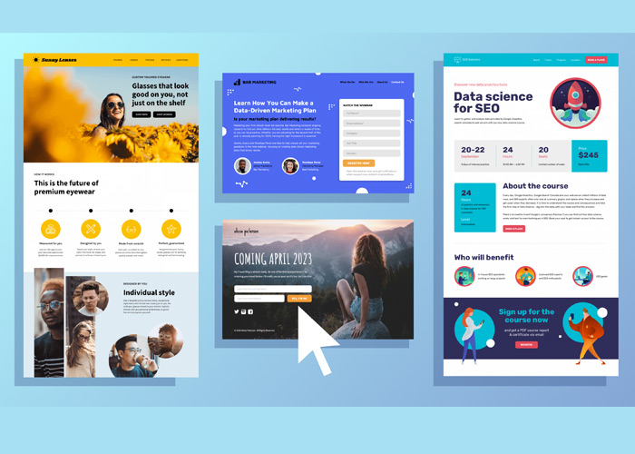
As you already know, landing pages are one of the most important components of a digital marketing strategy. When visitors click a link, usually an advertisement, the landing page is their first destination. The visitor’s action on a landing page influences the conversion rate. Therefore, choosing the proper types of landing pages will significantly affect your campaign’s success.
A landing page’s main objective is to convert website visitors into sales or leads. However, not all landing pages are the same in design or purpose. There are different types of landing pages, and each has particular advantages based on the final aim. In this article, I’ll walk you through 19 types of landing pages. This may help you determine which landing page type is best for your marketing campaigns.
| Learn everything about the landing page: Pt.1: A Beginner’s Guide to Landing Page for Website |
Table of contents
19 Types of Landing Pages
1. Squeeze Landing Page
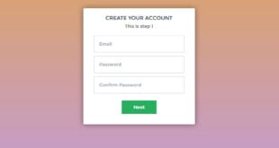
A squeeze page, a specific landing page type, aims to obtain the user’s email address. These pages contain gated content or ask for your email address to receive a newsletter, e-book, or other content offers. You can also use this landing page format to arrange an appointment for open home inspections or consultations.
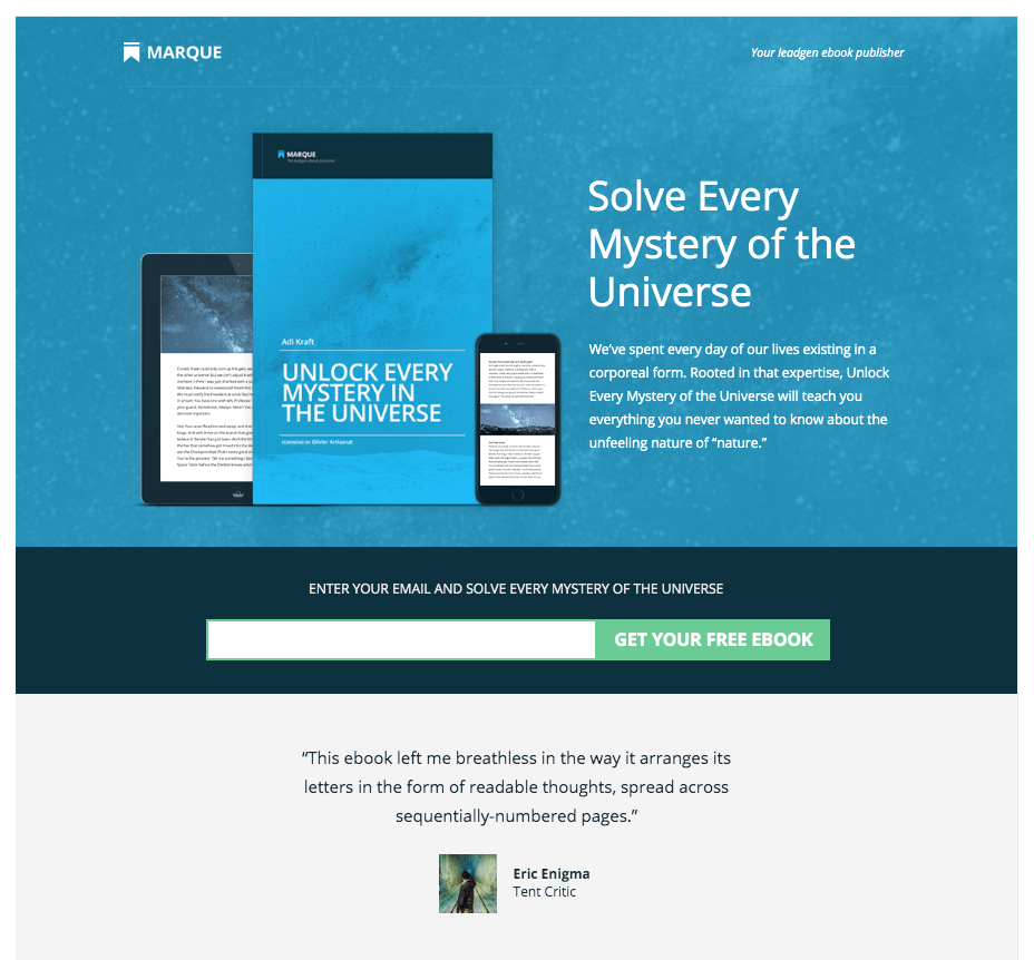
Make sure your squeeze page is clear, and the CTA is alluring enough to persuade site visitors to submit their email addresses. Look at our example above; you can see an exact copy near an appealing Dialog box where users can enter their information. All eyes are drawn to the e-book because it is clean and neat.
2. Splash Landing Page
Typically, the main goal of these types of landing pages isn’t lead generation. Splash pages are simply the welcome page before any other page on your website. When users click on social networking or content links, a splash page, asking them about verifying their age, is frequently displayed instead of the homepage.
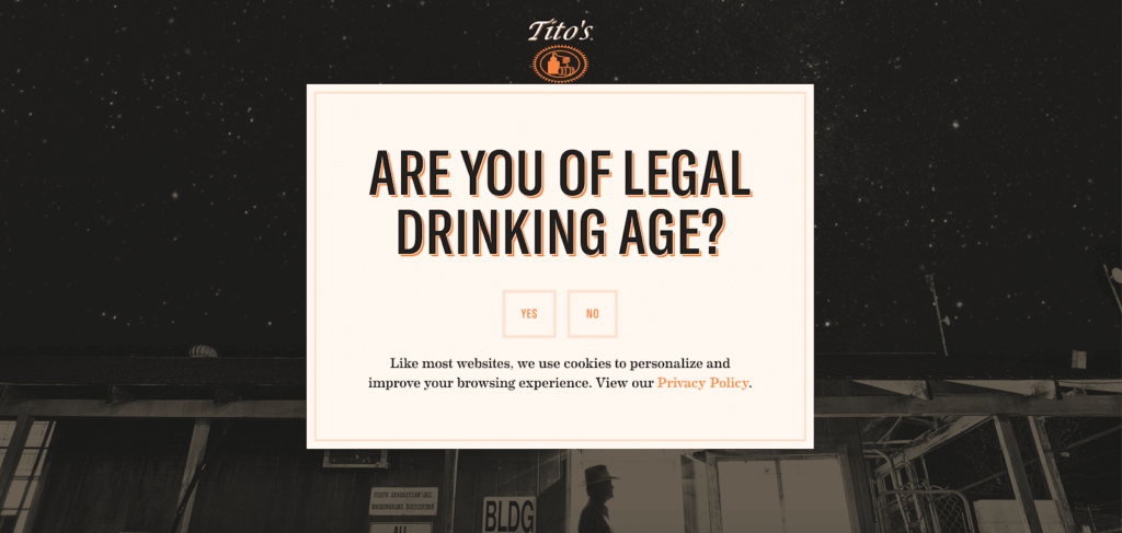
A typical splash page contains a little text, a background image, and, most importantly, a link to the main website. Check out Tito’s Vodka example for a better understanding.
You can ask visitors a yes-or-no question, like this one, for age verification, or you can ask them to enter their birthdays. The backdrop image fits with the wine page. The design utilizes Tito’s Vodka’s logo, brand colors, typography, and overall Texas-but-make-it-classy vibe.
3. Lead Generation Landing Page
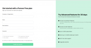
Contrary to splash pages, a lead generation landing page collects much more information. These landing pages gather data such as the name, email address, company name, job title, and industry of site visitors. The general objectives of your sales and marketing teams and the customer’s place in the funnel usually dictate this.
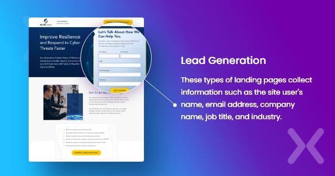
A great headline highlighting your service’s advantages should be incorporated when creating a landing page for lead generation. Use a captivating CTA and a direct request for the precise user information you require, similar to our SYSUSA example, to qualify the lead.
4. Video Landing Page
As the name implies, the major feature of this landing page type is a video. Because there aren’t any play/pause buttons, site users are obligated to watch it until they reach a particular point.
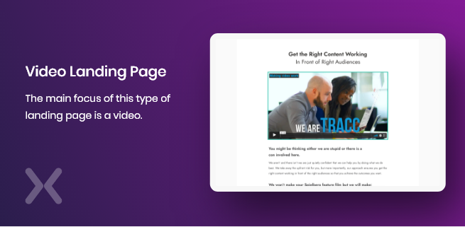
Make sure the content on this page accurately represents your offer to sell it. As a result, specific video genres perform more effectively on landing pages than others.
The four primary types of videos are as follows:
- Explainers: They clearly explain how your services meet the customer’s demand.
- Promo videos: Like trailer teasers, they provide viewers a sneak peek at what they might experience if they submit the required form.
- Product demos: By showing your product in action, these videos highlight its benefits.
- Testimonial videos: The reliability of your company is increased by the positive testimonials of happy consumers and previous clients who have used your service or product.
To learn what should be on this landing page format, look at our sample from TRACC. They combined two highly effective marketing strategies by adding a Testimonial from the creative director and a brief Explainer video. Along with a form, a FAQ section, and a list of affiliate brands, there is also a creative text that matches the videos’ content.
5. Click-Through Landing Page
A click-through landing page gives site visitors a thorough summary of an offer to persuade them to visit the conversion focus page. As an illustration, click-through often pages direct users to a lead capture or sales-oriented website. These landing pages are great for winning over customers and increasing traffic.
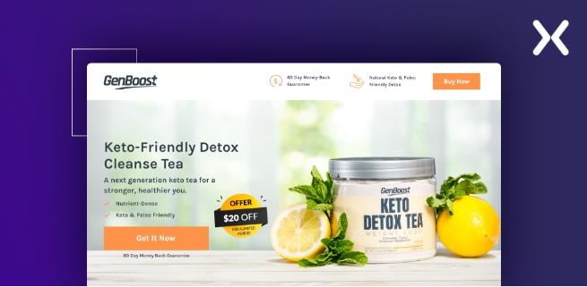
You should provide all the advantages and features of your good or service with a CTA button asking the user to join. Look at the GenBoost website’s click-through page, which promotes its new keto detox tea.
The product is the main focus of the screen, luring potential customers to click the orange CTA button. Other essential information, like a 60-day money-back guarantee, is presented, which adds to the attraction.

Try FREE Magezon Page Builder!
Easily create your engaging Magento pages in any style whenever you want without relying on developers or designers, just by drag & drop.
6. Sales Landing Page
This landing page type is typically positioned close to the bottom of the funnel. Rather than simply providing information, the objective is to persuade potential consumers to make the purchase. The goal of a sales page is to encourage the user to purchase your product using testimonials, quotes, videos, and CTAs. These pages might be quite long because they are meant to resemble direct mail sales letters.
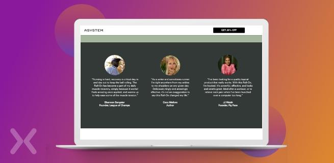
A sales landing page should be simple and attractive because its primary goal is to make sales. Look closely at the ASYSTEM sample. The sales page’s color scheme fits the item, highlighting the brand.
They have not only some testimonials but also an official certification and an in-depth product review. All of this raises the likelihood that someone will make a purchase.
7. Advertorial Landing Page
The goal of these landing page categories is to pique the curiosity of potential customers. Since the content on advertorial pages is closely related to the native channel, they are excellent for warming up cold traffic. Therefore, the reader can benefit from the advertorial page and be motivated to buy even before they reach the sales page.
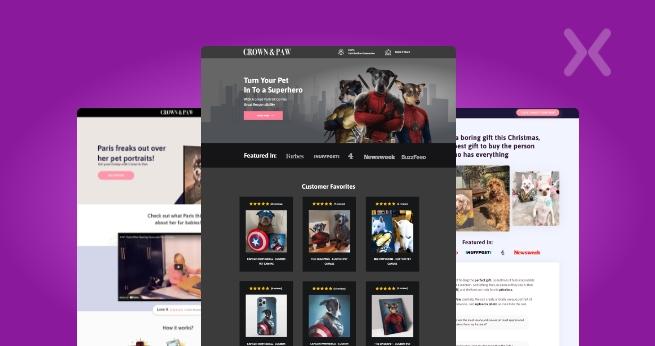
They received assistance from the agency they utilized to perfect their layout. As a result, along with several lovely images of adorable animals, the page also had essential information like consumer feedback.
8. Lead Magnet Landing Page
A lead magnet is an advantageous offer you make to potential clients in exchange for their contact details, such as their name and email address. This landing page type is great for promoting that offer.
In addition to webinar registration, lead magnet landing pages may also offer newsletters and coupons or discount subscription forms.
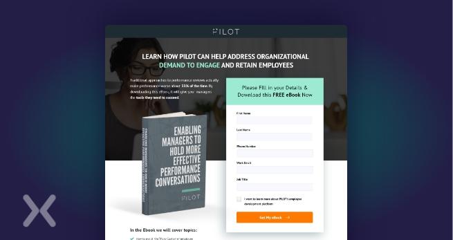
Mainly, e-books create excellent lead magnets. As our example shows, it is clear that these types of landing pages don’t require any additional complexity.
All you need is a brief book summary, a stunning cover image, and a straightforward form that just requires the most basic information.
9. Pre-Launch Landing Page
You’re going to release a fantastic new product, but you’re not quite ready to reveal everything it offers. The pre-launch landing page can help with this. Pre-launch landing pages, often known as “Coming Soon” sites, are helpful in obtaining early sign-ups or creating a specific target audience to be followed later on.
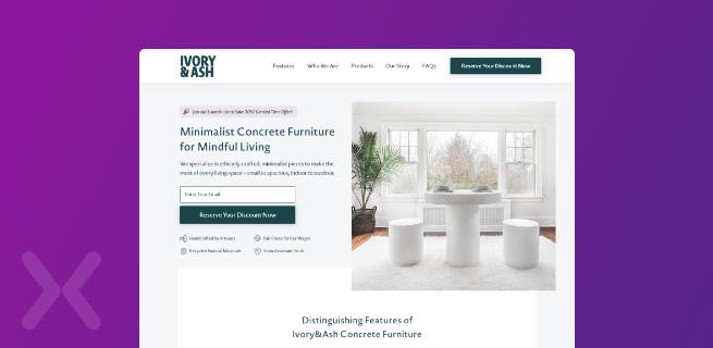
Like Ivory & Ash, you can tease your offer with a CTA and an eye-catching product description. Additionally, any interested potential buyer can enter their email address and be notified when the product is available; having an email list set up before your page starts will assist your future promotional strategies to succeed.
10. Thank You Page
Thank you pages are an excellent approach to building connections with new leads. It’s the page a customer is directed to after submitting a form or making a purchase. Don’t pass up the opportunity to obtain further interaction because they are already interested in your good or service. Consider adding additional offers or prizes to make your “Thank You” page more than just a one-liner.
Additionally, these landing page categories might be employed for the following commercial objectives:
- Offering a promo code
- Inserting a link to your blog
- Inviting the user to sign up for your social media network
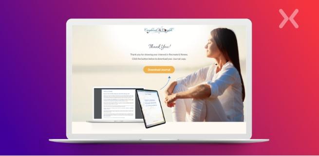
The thank-you page has the power to either move a lead down the funnel or develop a relationship. Our example shows that there are numerous ways to achieve this. Recreate & Renew not only offers words of appreciation but also an opportunity to obtain a copy of their Journal. It’s a stylish fix for a landing page that would otherwise be brief.
11. Unsubscribe Page
This landing page format is still a crucial component of email marketing, even though you won’t focus your campaign around it. Customers must be able to unsubscribe without difficulty from the page with ease.
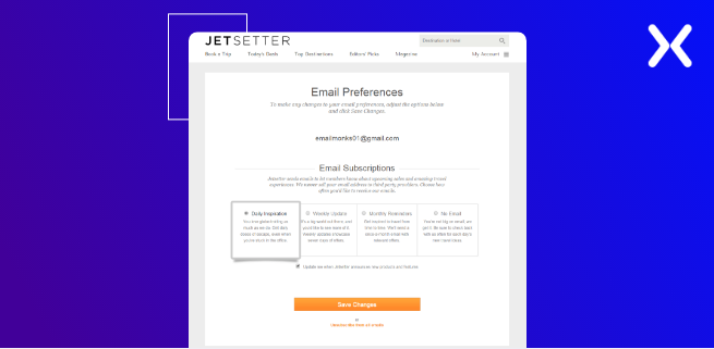
Still, there are some methods to persuade visitors to stay. For instance, you could allow them to change the settings, so they only receive a certain amount of newsletters and other similar content.
These landing pages can also be used to promote your goods or services one last time. Further, just as in the Jetsetter example, you can link to different sections of your website. Try asking them to at least follow you on social media if they are still persistent on canceling.
12. Referral Landing Page
You know you’ve succeeded when a client or customer wants to refer you to their friends and colleagues. For this reason, you require a representative referral landing page if you want to increase your word-of-mouth purchases.
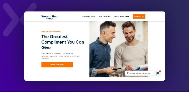
Unfortunately, referrals aren’t generally available to the public, so you must limit your sharing to reliable sources. However, they’re fantastic at generating high-quality certified leads.
Our example from Wealth Hub Australia is a typical approach in terms of layout. The page is maintained straightforwardly with a visible CTA, intriguing language, and an enjoyable graphic component.

Try FREE Magezon Page Builder!
Easily create your engaging Magento pages in any style whenever you want without relying on developers or designers, just by drag & drop.
13. 404 Landing Page
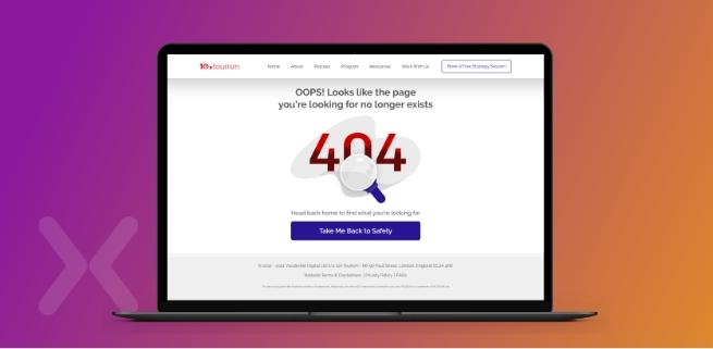
Despite being an error page, “404” can still be beneficial. A good 404 landing page can be used to further develop your brand. It can be entertaining if you include jokes, an interactive element, or just some eye-catching images.
A CTA button that directs site visitors back to the primary conversion page is also included in our example. It serves a purpose and offers a chance to make purchases. In the end, you want to distract the user from the bothersome problem and encourage them to explore the website more thoroughly.
| Learn more about 404 page: 404 Page Not Found Errors: The Ultimate Guide |
14. “Get Started” Landing Page
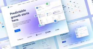
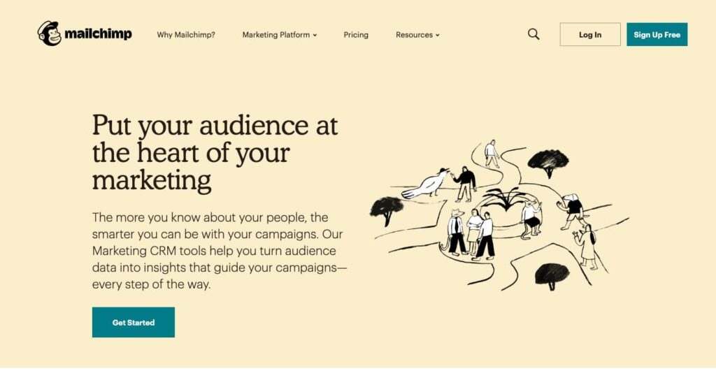
Your offer should prominently be on a “Get Started” landing page. Take a look at this website from Mailchimp, which outlines their main advantages: technologies that transform audience data into campaign-guiding insights.
Interested already? Fantastic, a “Get Started” button is there. Do you need more appeals? The specifics are revealed as you navigate down a landing page filled with features and advantages.
15. “Coming Soon” Page
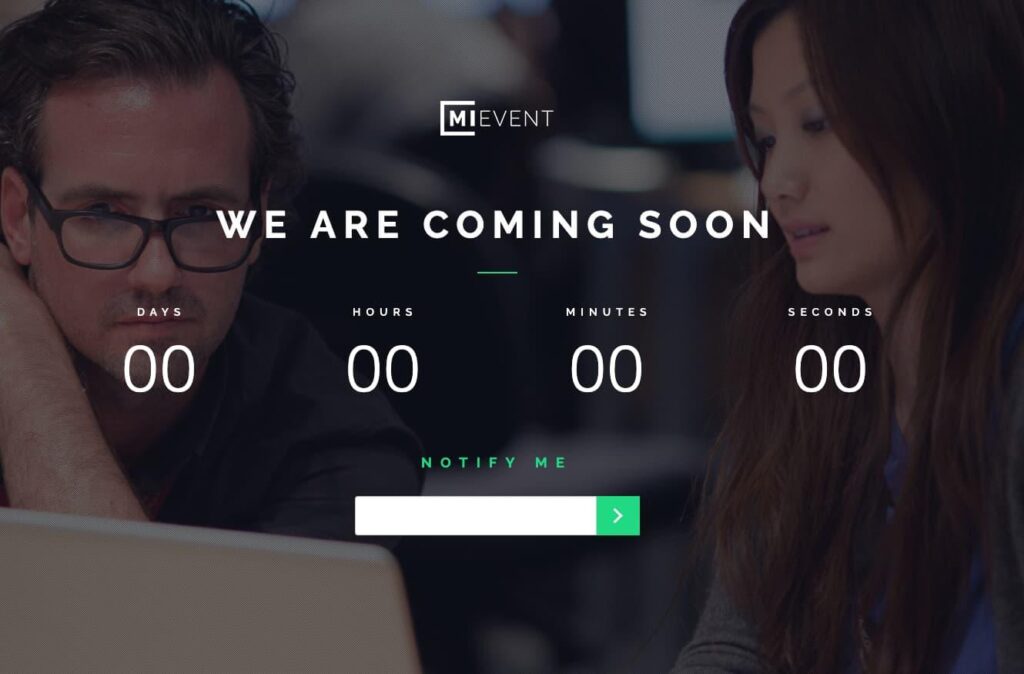
A simple “Coming Soon” page is another landing page type that can help you when you’re not ready to unveil the complete offer for a thrilling new product.
Tease your offer, give a launch date if you have one, and include a CTA that requests their email address in exchange for an email reminder when your product or service is available.
16. Pricing Page
You might think about directing customers to your pricing landing page if you’re introducing new pricing or product tiers. Regardless, your pricing page must be among your website’s most well-optimized pages. Take the Wistia example, which concisely describes their three tiers of packages and provides access to further details or to gets started.
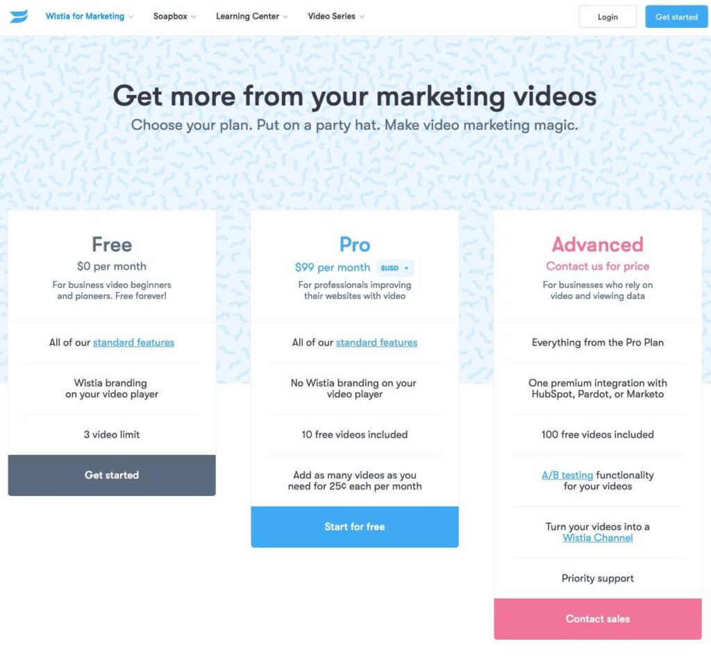
But the two boxes that come immediately after a list of features and before a carousel of customer reviews are what I adore about their pricing page. They provide customized callouts for interested parties whose requirements might not match one of the three generic pricing templates.
If even those extra CTAs are ineffective for you, scroll to the bottom of the page to see a CTA that invites users to “Choose your own adventure.”

17. “About Us” Landing Page
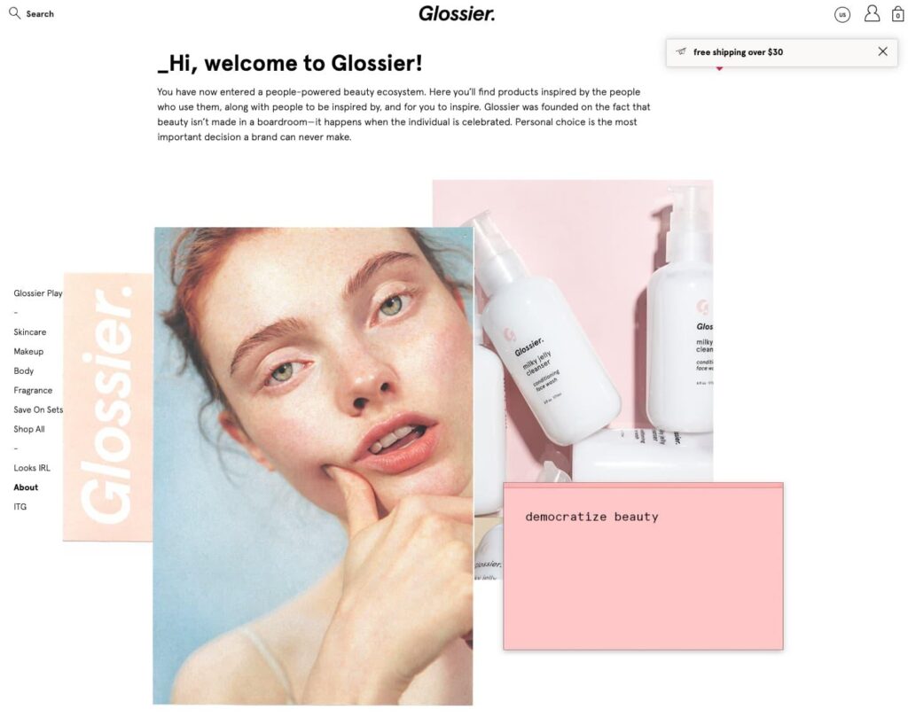
Your “About Us” page doesn’t need to lead nowhere. Create a lead-generating page along with this landing page. Here’s an illustration from the makeup company, Glossier.
They give the viewer plenty of information on their “About Us” page about their history, vision, and mission, but they also clarify how to proceed. A reminder (along with links) to shop, follow, email, and join the company is provided at the bottom of the page. An email subscription offer is also included.
18. Event Landing Page
If you use the event landing page template, consider putting a countdown to the event date and videos or pictures from previous events you’ve hosted. You can do this to offer visitors a taste of the event or make them feel they would miss out if they didn’t sign up. Additionally, ask simply for the most crucial registration details to enhance your submission rate.

19. Login Landing Page
Another common landing page type among internet users is the login page. It’s a web page where visitors must log in with their username, email address, and password.
Many companies feature a specific login page with just a login form. However, you may not know that you can use this area to give users more value.
Take a look at this WPForms example.
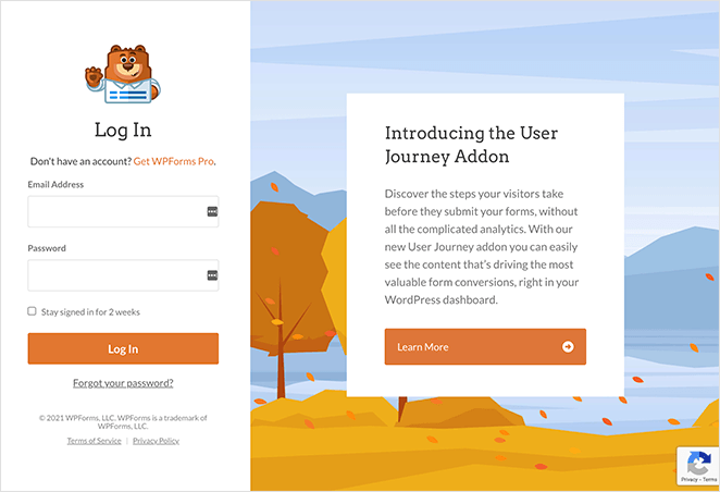
A section exposing users to a new WPForms function is next to the login form, along with a hyperlink to learn more. Because many people may be unaware of this update, it’s a perfect approach to inform them of a location WPForms knows they’ll visit.
On your login page, you can also use this space in the following ways:
- Highlighting certain features
- Giving upgrades discounts
- Promoting collaborative products
Make sure your offer applies to your users.
How to Choose the Right Type of Landing Page for Your Campaign?
Now that you are knowledgeable about the landing page type, how can you decide the best among the landing page categories for your campaign?
The answer is dependent, but to start, consider these:
- What marketing targets do you wish to accomplish with this landing page type?
- How are your competitors achieving these goals?
- What are your customers’ goals when they land on this page?
- What is the first thing to draw your visitors to this page (i.e., what action or motivation brought them here)?
- After viewing this page, what do you want your audience to do?
Consider whether the landing page should be short or long in form. For example, for more minor services and straightforward CTAs, landing page categories like Squeeze, “Unsubscribe,” and “Thank You”are preferable. On the other hand, long-form pages are designed for big consumer requests and more detailed offerings. When choosing different landing pages, it’s a good idea to look at your rivals’ pages, especially if they already have a well-established web presence.
Finally, each website is not required to have one landing page. Using different landing pages in your marketing campaign will always be more profitable. So that you’ll have a higher chance of increasing the conversion rates in that way.
Conclusion
The “one size fits all” landing page is no longer adequate for generating leads. So this article may be helpful for you to select from different types of landing pages to fit your campaign goals and sales funnel. Being aware of the most common types of landing pages, you will be better able to make the best choices for your business needs.
If you are a Magento merchant and don’t know which extension to build your website, consider Page Builder from Magezon. As a trusted Adobe partner, we have satisfied thousands of customers with a vast collection of drag-and-drop extensions, helping you create a high-converting and unique store in minutes.
Don’t take my words for granted; see how your website can be with Magezon Page Builder and what others say about us:
 Magezon Blog Help Merchants Build Comprehensive eCommerce Websites

