There are several formats for people to display their content in captivating ways, yet sometimes they may be confused with tons of choices. Especially if you are a newbie with Magento in general and Magezon Page Builder in particular, hard it might be for you to make the most of an element appropriately. For example, when it comes to Magento 2 Page Builder Accordion, there will be some questions in your mind, like “what is this Magento CMS Page Builder element?”, “How can I use it?”, “which element will be suitable for this section of my page?”, on and on.
Being in Magezon Page Builder newbie’s shoes, I know that getting used to creating a webpage from scratch is quite a challenging task. And I cannot avoid making mistakes due to my ignorance of technical knowledge. Therefore it’s vital to deeply understand Magezon Page Builder elements before using them.
In this blog, I would like to share with you all about Accordion element, then give a few tried-and-true steps to create one in Magento CMS Page Builder. Let’s get going!
Table of contents
What is Accordion?
In terms of Accordion definition, I think no one can put it better than Wikipedia:
“The Accordion is a graphical control element comprising a vertically stacked list of items, such as labels or thumbnails. Each item can be “expanded” or “collapsed” to reveal the content associated with that item. There can be zero expanded items, exactly one, or more than one item expanded at a time, depending on the configuration.
The term stems from the musical accordion in which sections of the bellows can be expanded by pulling outward.”
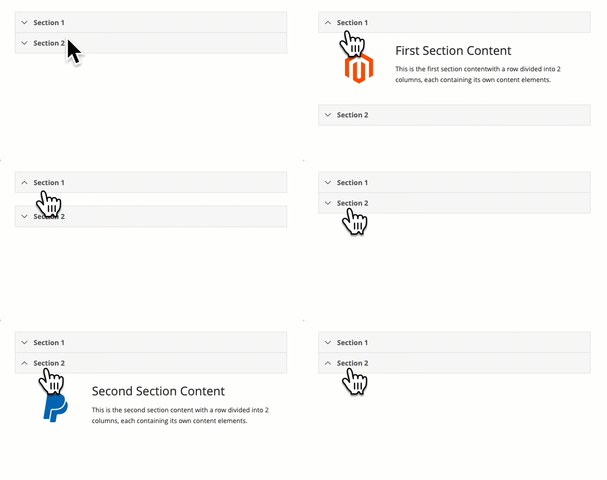
In brief, Accordion is a section that shows the heading/label of your contents, the other information only appears when viewers click span. That means it’s the viewers who decide to see the content or not.
Common UX Issues With Accordion
Nothing in this world is absolutely perfect, either is Accordion. Below is the list of problems with the elements that users may have.
1. Page Designer’s Issues
- Accordion may hide useful content of your page, you must rely on the readers to take action. In case that’s the important information viewers must know, there is no need for an accordion.
- Increase interaction cost: inviting your visitors to engage with your site is always one of the page owner targets. However, the requirement of over-clicking doesn’t mean it’s a good sign of web interaction. In fact, clicking each heading to see a whole paragraph, click 10 times to see 10 answers to questions… are such wasted interactions.
2. Page Viewer Issues
- Problems with printing out contents: Although we’re living in the era of cutting edge technology, some printers still do not recognize information hidden inside the Accordion. So it’s important to take consideration when printing out documents.
- Causing viewer annoyance: As mentioned above, over-clicking is not only a disadvantage to web owners but only a problem with viewers. Viewers will find it hard to access the information and then may leave your page.
That’s it. It’s undeniable that Accordion causes a few problems for users, right? Still, the Magento 2 page builder accordion is one of my favorite elements in Magezon Page Builder because of the following reasons.
Benefits of Using Accordion
1. Avoid Messed-up Content

Everyone knows that the heart of a killer FAQ page is Accordion. All people have to do is grouping various FAQs of a similar nature together and putting them into an Accordion. By that way, both web owners and users can easily present and find their desired content. The more questions/question groups of the FAQ page, the more effective this way is. So why not keep your webpage neatly organized with the help of Accordions?
2. Avoid Causing Information Overload

An extra-long page of words is likely to make readers drowning in the ocean of (undesired) knowledge. How to consolidate and style it in a way that makes sense to readers? In this case, an Accordion could be a nightlight that will sweep away all of your fears and concerns. Just showing your label/heading so that your readers can easily scan and skim the information they are looking for.
3. Avoid Overlinking

Another way to tackle the problem of an extra-long page is by distributing your content in other subpages. But imagine, what would you do if there were 50 questions on your FAQ page, equal to 50 subpages needed? I think it’s not a good idea for your site structure. Search engines like Google set a limit for the number of links you are allowed to insert. Overlinking sometimes can cause being penalized by Google, and of course, it’s not good for SEO. Accordion perfectly matches this way. Put the details inside the hidden part of Accordion and no more worrying about the requirement of overlinking.
4. Save Vertical Space for Your Page

Research shows that while viewers spend 80% of their attention on the information above the page fold, only 20% of it is distributed to the content below the fold. Assume that a paragraph is 7-sentence-long, including a heading. I will use Accordion to display just the heading, then I can save around 6/7 the length of my page. As a result, my above the fold is able to display more of my core content, which increases the chance of keeping viewers stay at the page.
5. Suitable for Small Viewport Sizes

Small screen size devices are indispensable to us nowadays as its portability function. Optimizing web page to be mobile-friendly is crucial to every web designer. However, a small screen means your page will be longer, and your viewers need to make effort to scroll down. What happens if they are tired of scrolling your page? They will leave it for sure. Content hidden in an Accordion helps you to decrease the page length and your viewers can explore your content with ease
I think that’s enough. Now let’s explore how to create and customize Accordion in Magento cms page builder!
IV. Configure Magento 2 Mage Builder Accordion
In the Magento CMS Page Builder element list, choose Accordion element.
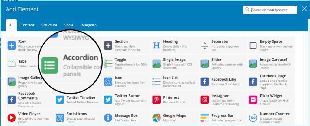
Each section comes with a title and the main content that can be created by using 50+ Magezon Page Builder elements.

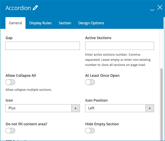
You can set active sections on page load and control collapsible options which allow all sections to be opened/closed at one time or only one section to be opened at a time.
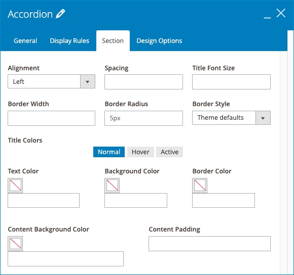
The element gives you flexibility to customize your accordion’s appearance with icons, font size, color, border and more.
| Learn how to Use Other Magezon Page Builder elements: Magento Image Carousel: Create With Magezon Page Builder How to Add Box-Shadow CSS in Magezon Page Builder How to Create Call to Action Section in Magezon Page Builder |
Over to You
Now it’s your turn to do a bunch of great things with Magento 2 page builder accordion and use it the right way. Hoping that you like it after reading our blog. Don’t hesitate to leave us your ideas in the comment section and visit us to read more about Magezon Page Builder tutorial.

Try FREE Magezon Page Builder demo today
Easily create beautiful, engaging Magento website in any style whenever you want without relying on developers or designers. Just by drag & drop.
 Magezon Blog Help Merchants Build Comprehensive eCommerce Websites

