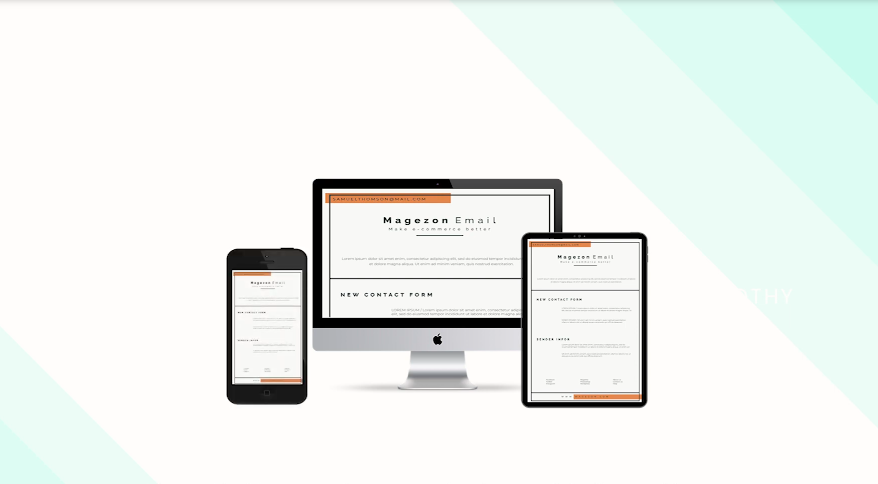
When creating a web page, along with a brilliantly designed theme, people also take into account the responsiveness of the page. The term “responsive design” is even more important to email templates than ever because of the device diversity. Magento 2 store owners now need a product that not only allows them to create and customize eye-catching email templates but also responsively well designs these templates in no time.
In this blog, I’ll offer a deep explanation about responsive Magento email design in Magento 2 Email Builder. No more further ado, let’s get started!
1. What is a responsive web design?
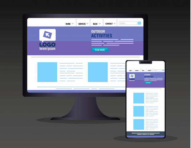
First of all, I thought a short explanation from Wikipedia may be in order.
“Responsive web design (RWD) is an approach to web design that makes web pages render well on a variety of devices and window or screen sizes. Recent work also considers the viewer proximity as part of the viewing context as an extension for RWD. Content, design and performance are necessary across all devices to ensure usability and satisfaction.”
All in one, it’s the intelligent use of CSS queries to make sure your layout, image, and text block look rational in almost all types of devices.
2. How Responsive Magento Email Design Matters
Today we have many device types with their unstoppable development of size and resolution. That means users are likely to read our emails by any of them. So here are the reasons why people should take the responsiveness into consideration when creating an email template:
- Official statistic says that 52% of official communication is done over emails
- According to Litmus survey, 42% of emails are read on mobile.
- Small fonts, narrow columns, and broken layouts are common issues when we shift reading emails from desktop to mobile.
3. How Responsive Email Design Looks in Magento 2 Email Builder
Besides the intelligent responsiveness function, in each element’s design option setting, Magento 2 Email Builder also offers the device type field that enables you to customize your email to have its best viewability in all devices.

Try FREE Email Builder demo today
Create any Magento transaction email templates that match your web design and theme. Without time-wasting, of course, no coding skills needed.
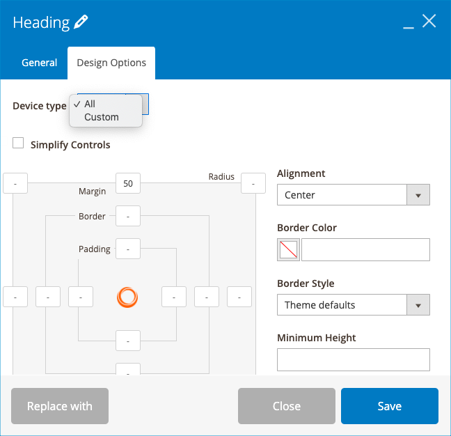
If you choose custom, there are 5 screens for you to customize your email look, they are desktop, tablet landscape, tablet portrait, mobile landscape, and mobile portrait.
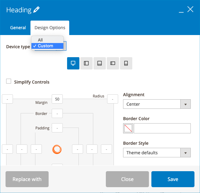
Finally, browse through the examples below to get a taste to the wide range of responsive design that Magento 2 Email Builder brings:

Iphone X

Black Berry Z30
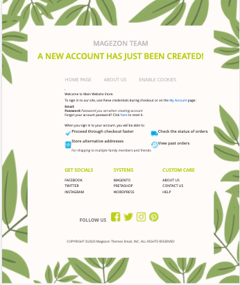
Galaxy Note 3
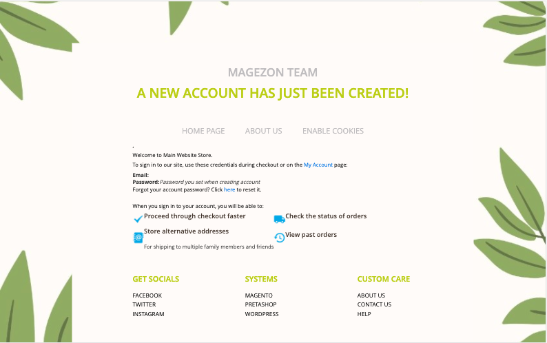
Laptop with HiDPI screen
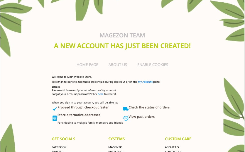
Laptop with MDPI screen
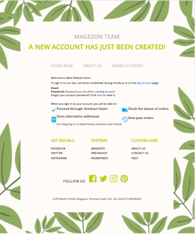
Ipad
Conclusion
We hope that this post has opened your knowledge about responsive Magento email design in Magezon Email Builder. If you find our blogs helpful, do not forget to turn on your notifications because we’ll be back with lots of amazing posts. Feel free to leave your questions in the comment section below.

Try FREE Email Builder demo today
Create any Magento transaction email templates that match your web design and theme. Without time-wasting, of course, no coding skills needed.
 Magezon Blog Help Merchants Build Comprehensive eCommerce Websites


