Magezon Page Builder is a set of powerful tools that empower you to convert your ideas into a reality without the need for coding skills. With tons of amazing features, it seems that there are endless topics to talk about the extension. So in this tutorial, I’m thrilled to introduce you how to reorder content of a row in 2 devices. In other words, it’s the art of using the column responsive options.
Note: In regard to Magezon Page Builder column responsive options, we have provided you with fully comprehensive instruction. Take a look to dig deeper.
So no more further ado, let’s get started!
Table of contents
Default Display Rules of Columns in a Row On Desktop and Mobile Portrait
Jack is the owner of an online store selling organic vegetables and fruits. He uses Magezon Page Builder for Magento to design and build his landing page based on the Magento platform. Everything seems to be perfect until he checks the responsiveness on all devices and notices that in the mobile portrait viewport, the images are displayed in an undesirable way.

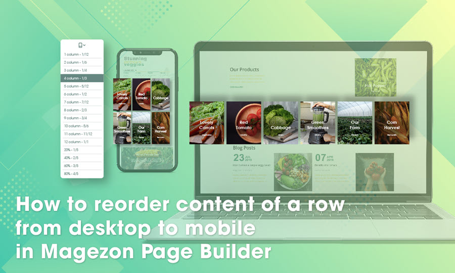
There are 6 images on desktop viewport…

…but just 1 image in a row on mobile portrait viewport.
This row on desktop viewport shows 6 images, but on mobile viewport, each image covers a separate row. That means on mobile view, Jack has 6 rows for 6 images. He thinks this layout is not attractive enough and it would be more compelling if there are 3 images in a row on the mobile view.
Typically, that’s the default display rules of Magezon Page Builder, and the order will not change unless he specifies something else for it. Whether or not Jack can reorder content of a row from desktop to mobile view with our drag and drop page builder? The answer is right below!
Custom the Number of Displayed Columns in a Row on Desktop and Mobile Portrait
The column responsive options of Magezon Page Builder allow users to display the number of columns in a row at will. In this case, Jack just needs to change some backend settings of the row.
Assume that a row is divided into 12 parts, the number of columns displayed in a row depending on how many parts they make up of. In this case, if Jack doesn’t change anything, on the mobile portrait viewport, each image (column) will automatically account for 12 parts. So the image will cover the whole row. Therefore, in the column width settings of mobile portrait, Jack must change column width of all columns into ⅓ (4 parts) in order to show 3 images in a row on mobile view.
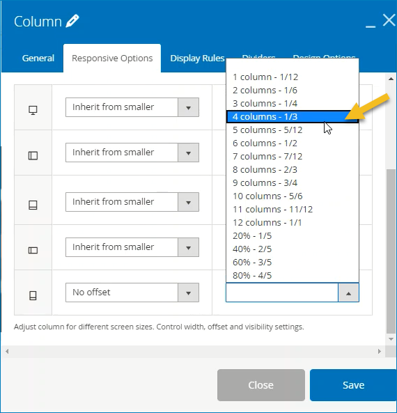
Change the column width setting for mobile portrait view into ⅓
Now save and see the result!

Do not forget to save and see the result!
| Learn more: How to Configure Responsive Design Options in Magezon Page Builder Full Height Page With Magezon Page Builder: Sample and Instructions How to Reverse Column Order With Magezon Page Builder |
Conclusion
Above is our tutorial blog teaching you how to display your content of a row on different devices at will. We hope that after reading it you can open your mind and find it easy to use our Magento CMS Page Builder. Visit us to read more of the Magezon Page Builder series.

Try FREE Magezon Page Builder demo today
Easily create beautiful, engaging Magento website in any style whenever you want without relying on developers or designers. Just by drag & drop.
 Magezon Blog Help Merchants Build Comprehensive eCommerce Websites

