Magezon page builder offers a wide range of features to build a web page. In this post, we will introduce another useful feature called Full height.
Explore and see what it is and how to use it!
Table of contents
Full Height Row Feature and Example
1. Full Height Row Feature
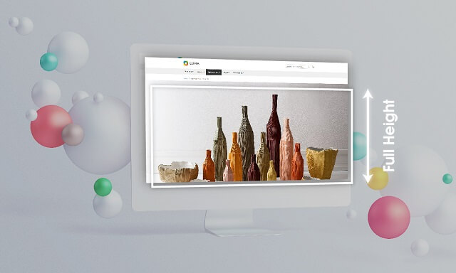
Full height offers an option to make your rows height equal to the screen height. Therefore, the viewer will have a visible reading space and remove any distraction. With Magezon page builder, you can easily set height without any coding skill.
2. Example of Full Height Row Feature
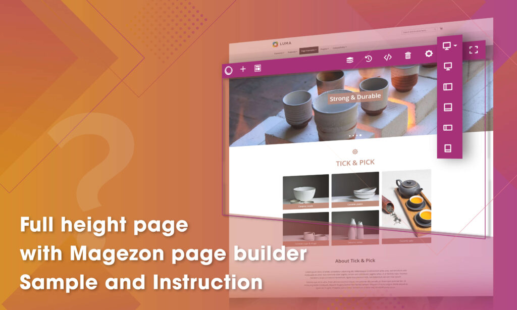
With Magezon page builder, we created a full height page called Tick & Pick. This is an ecommerce website selling Vietnamese handmade ceramics. The ideas on this page are displayed logically from the heading banner to product category, producer information, promotion, and testimonial. Especially, to make the site become more attractive we blend full height with bags of elements such as image carousel, single image, parallax effect.
How to create a full height page
1. How to Set Full Height Row
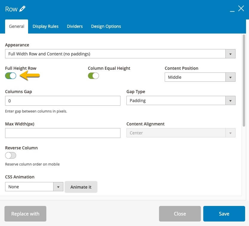
This very first step is very simple but essential to build an eye catching page. Remember to turn on the button “Full Height Row” in the Magezon page builder setting interface.
2. Combine Full Height Row With Other Elements
We created a sample page called Tick & Pick. It’s evidence that illustrate full height row is a flexible feature as you could integrate with many other elements such as full width row, heading and text block, button, etc. to create a perfect web page.
Let’s imagine the first time you come into a webpage, first impressions decide whether you stay on the page or not. That’s why we used a Slider with a full height row to create a delightful section for our sample page Tick & Pick. Slider becomes larger, therefore the site will engage more viewer to stay on.

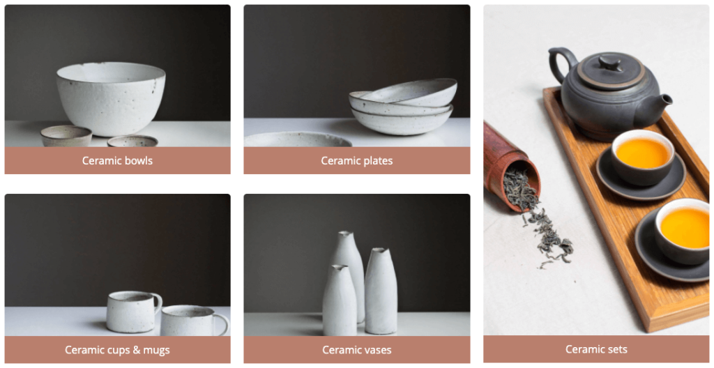
By utilizing the large space of full height row, you will have unlimited layout options for Single image. Don’t forget to add Zoom In hover effect to make the images more lively. See our result!
Visual effect is a factor to make success for an ecommerce page. Parallax is one way to make that success. In this case, we mix the parallax effect with full height and full width to widen the viewport. In addition, you can add more elements such as Single image, Text block, Call to action button,… on that background. As a result, the images and text can grab more attention from the viewer.

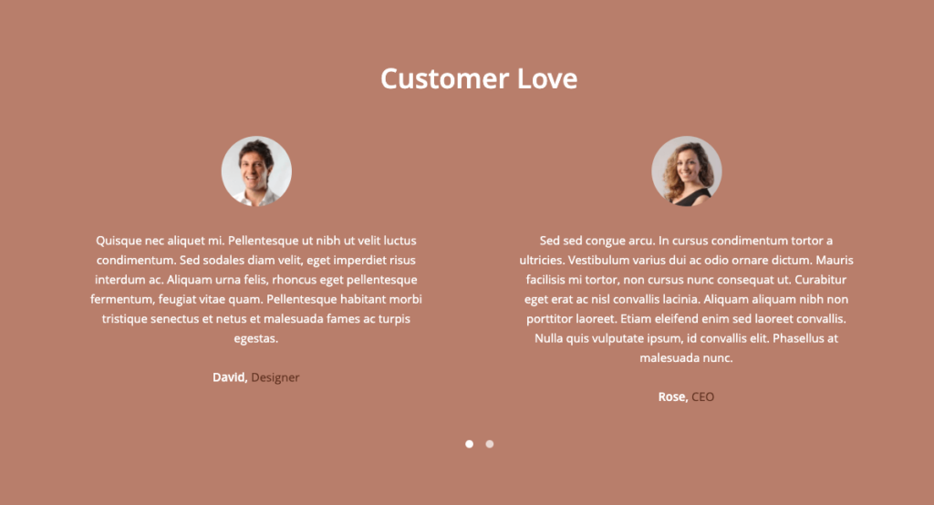
Above we provided three ways to blend full height row with Slider, Single Image, Parallax effect. Furthermore, use your creativity and you can take full advantage of full height feature with other elements. For example, we use Testimonial to show the customers reactions. It looks beautiful, right?
| You may also like: Spacing Columns by Gap Type and Column Gap in Magezon Page Builder How to Create Equal Height Columns in Magezon Page Builder How to Create Multiple Columns in Magezon Page Builder |
To Sum up
Full height row is a small feature of Magezon page builder but it can make incredible changes if you know the tricks. If you want to get more useful tips for your site, don’t hesitate to visit our Magezon Tutorial Blog. Feel free to leave us some comments on the section below.

Try FREE Magezon Page Builder demo today
Easily create beautiful, engaging Magento website in any style whenever you want without relying on developers or designers. Just by drag & drop.
 Magezon Blog Help Merchants Build Comprehensive eCommerce Websites

