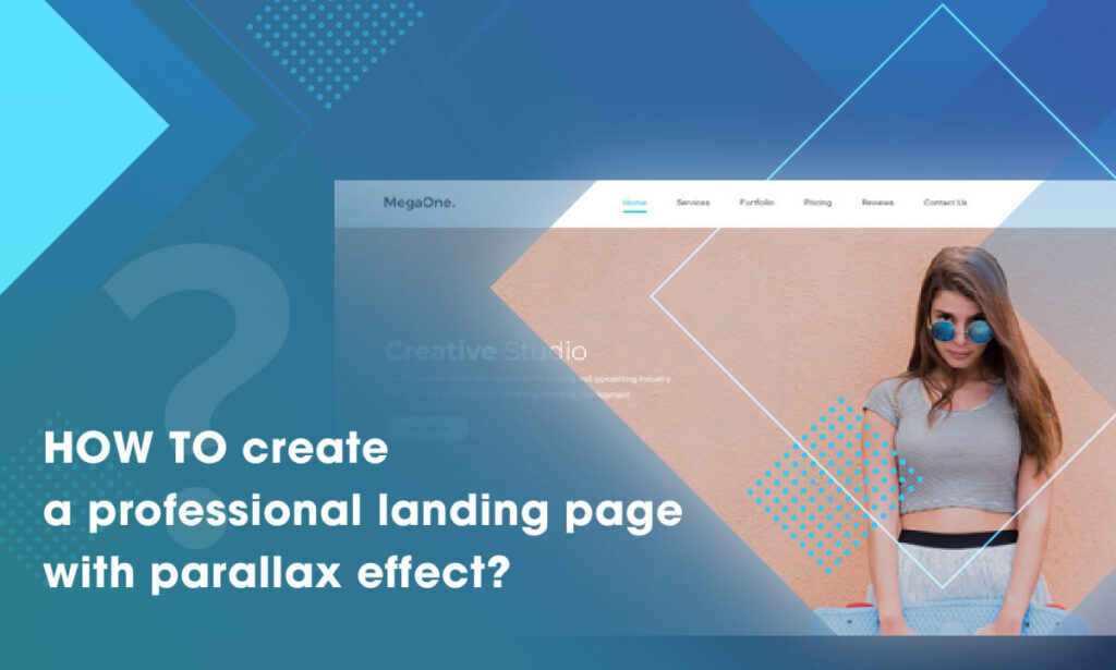
Have you ever surfed the internet and by chance you see a landing page with parallax effect that makes you overwhelmed? Are you curious about how to create a web page like that on your Magento website?
When it comes to parallax effect, we thought you probably have some basic knowledge about how to add the effect to your web page, but sometimes the result does not meet your expectations. Therefore, our today blog article will provide you a fully comprehensive instruction of adding amazing parallax effect on Magento website with Magezon Page Builder. Just read the blog and you’ll realize that making your Magento sites looks more professional is no longer a challenging task.
Before getting started, let’s take a look at our page example. It looks gorgeous with interesting visual effects, doesn’t it? We’ll go into details about the key features and elements of it right below.
Table of contents
| Get to know about Parallax effect: What Is Website Parallax Effect? (Pros & Cons + Best Plugins) 45+ Awe-Inspiring Parallax Effect Website Example How to Add Parallax Background in Magezon Page Builder |
I. Making the Most of Amazing Parallax Effects
1. Parallax Effect, Icon and Heading Element – A Perfect Combination

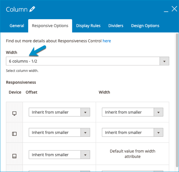
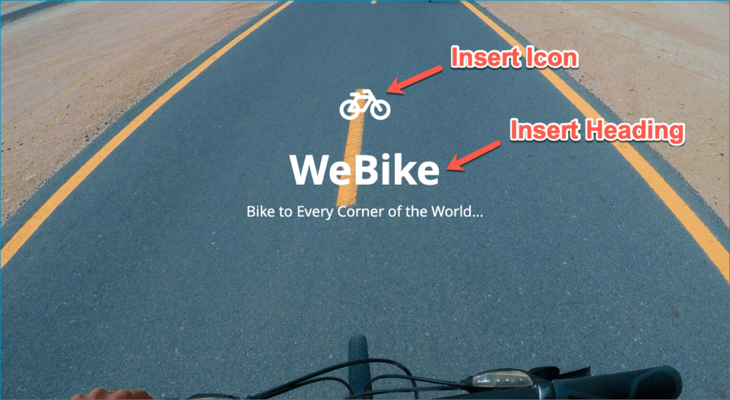
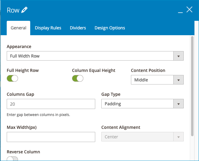
We all understand that the parallax effect is a type of row/column background. It’s okay if we keep the row/column empty with the image background parallax effects only, but the illusion of depth will be more precise when we scroll the row/column containing other elements such as heading, text block, or icon. In this case, above the fold is a full-width row with an image background parallax effect that invites visitors to engage with the site.
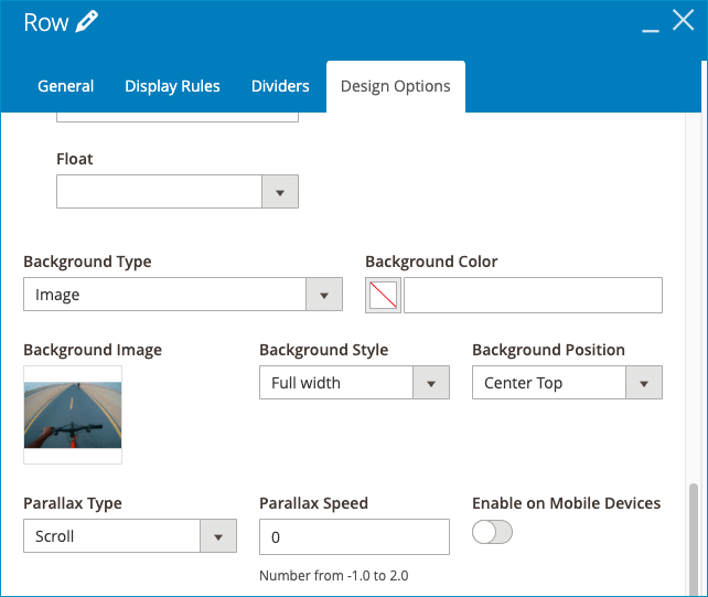
If you do not know about how to creat and customize parallax effect, read more about how to customize parallax effect.
2. An Extraordinary Layout Is Needed
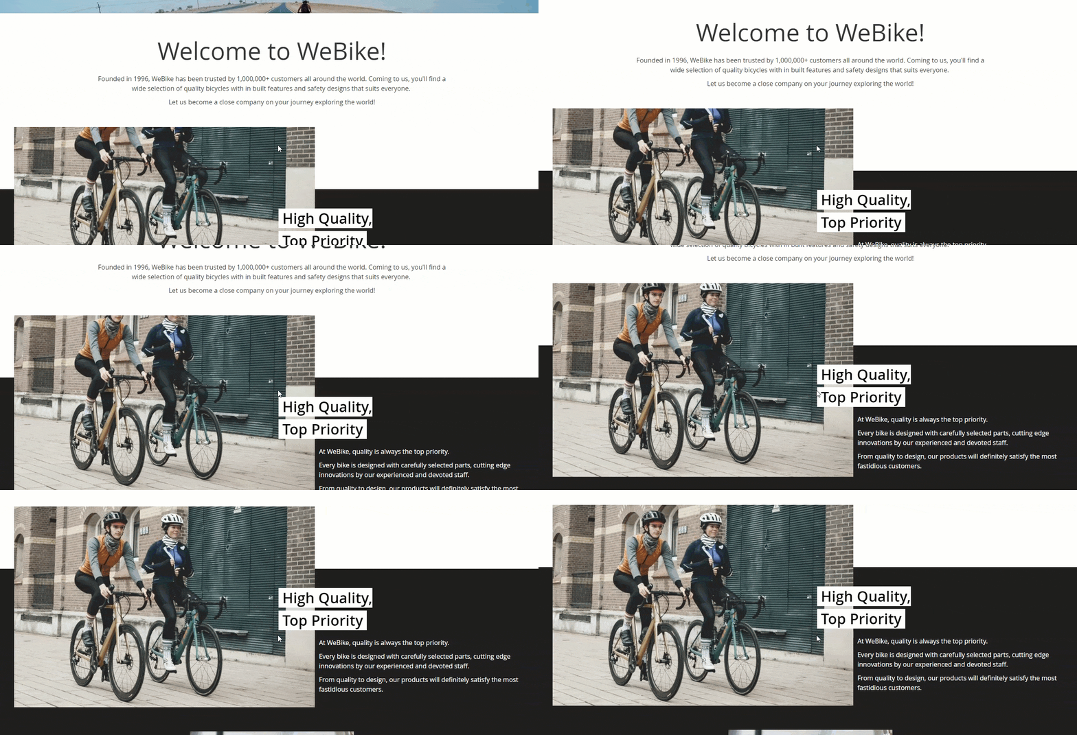
Normally, we create a layout with multiple columns and elements that strictly follow a vertical or horizontal line. What about a layout in which columns and elements look like one is overlapping the others? Consequently, the illusion of depth and dominance is surely enhanced. The key to this is as easy as pie. You just need to adjust the margin parameter of elements you want into a negative number. The smaller the number is, the more the element seems to invade others.
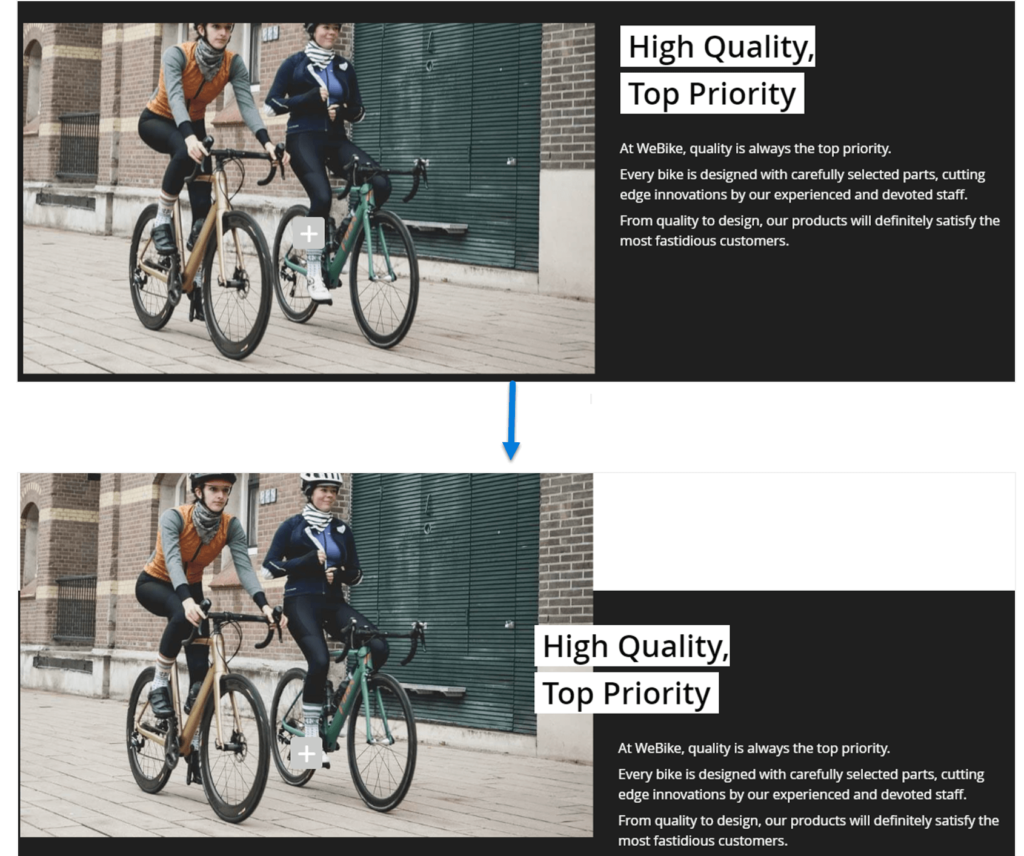
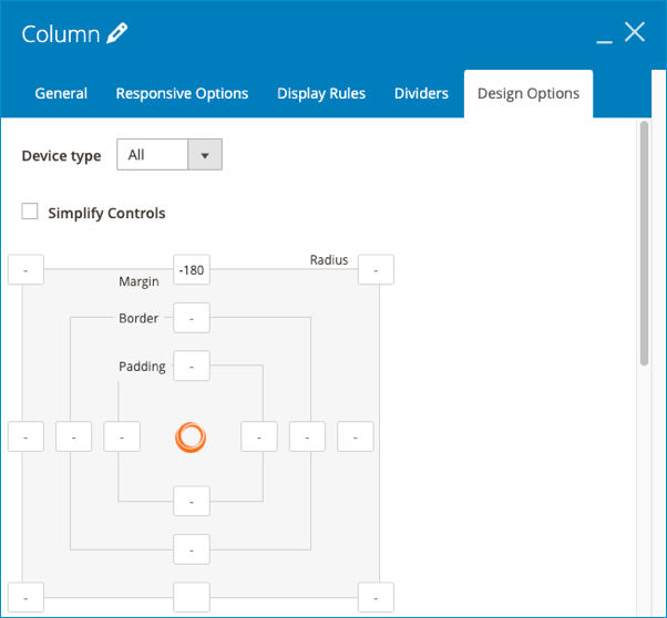
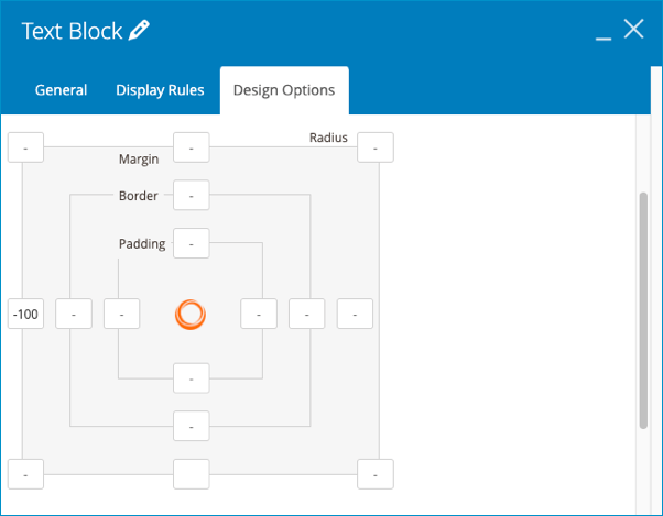
3. Mouse Parallax Effect

Do you notice that in the tab “design options”, other than background parallax effect we also offer a toggle called mouse parallax? Turning it on means that when you hover your mouse on the background, the image would look like it’s floating on the water surface. Great!
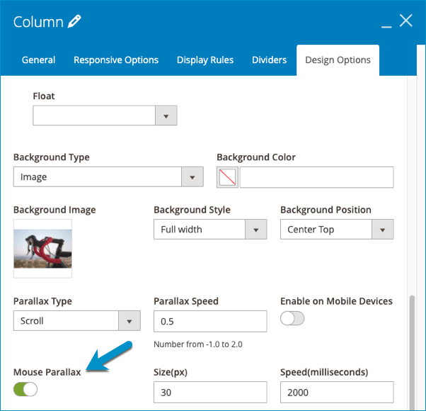
4. Using A Video Background. Why Not?
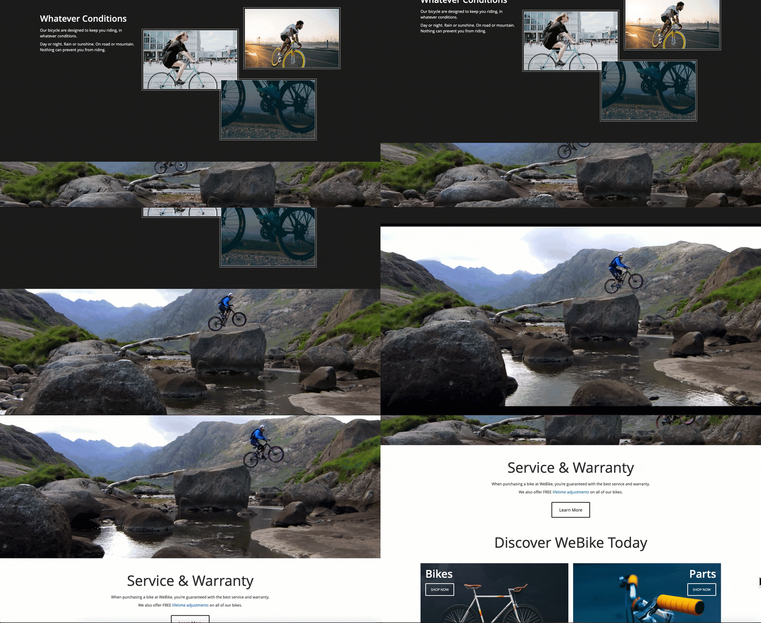
Parallax effects draw visitor’s curiosity and keep them think about what will be next due to a wide range of effect types. It’s kind of obvious that the image background parallax effect makes your sites vivid with a 3D illusion of depth. However, it could be more attractive if we replace an image background with a video background parallax effect, and the visitors absolutely can’t take their eyes off the page.
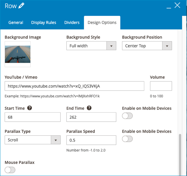
II. Other elements to create the landing page
It can’t go without saying that parallax effect is the game-changer for the creation of a landing page, yet there are still a bunch of great things contributing to the success of a page so let’s find out what they are.
1. Button
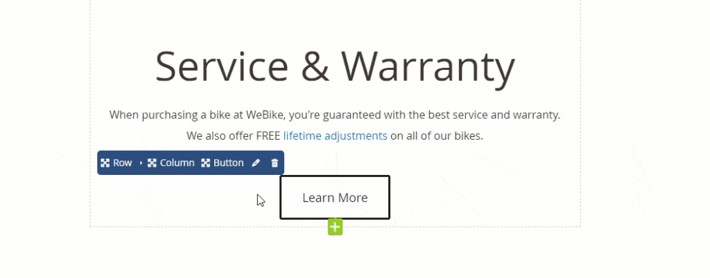
Isn’t the final purpose of a web page to make customers click on something and engaged more? As a result, it’s important to add an eye-catching button that grabs viewer’s attention and encourages them to interact with you.
2. Call to Action

You can display your product categories in a charming way and get a high chance of more conversion rates by taking advantage of the call to action element.
The Wrap
In short, the parallax effect feature of Magezon Page Builder has made creating stunning landing pages on Magento website easier than ever before. If you have a thing for our Magezon Page Builder tutorial blog post series, visit us to read more. Please feel free to leave us some questions in the comment section below.

Try FREE Magezon Page Builder demo today
Easily create beautiful, engaging Magento website in any style whenever you want without relying on developers or designers. Just by drag & drop.
 Magezon Blog Help Merchants Build Comprehensive eCommerce Websites

