 Magezon Blog Help Merchants Build Comprehensive eCommerce Websites

What happens when you want to sell a house with an overgrown yard, driveway fissures, and a broken front door? Are there any offers? Now, consider your homepage similar to a house’s curb appeal. It’s the first thing visitors see when visiting your website, and you want to impress them immediately. That is when you need to learn the eCommerce homepage best practices.
But it’s not just about looks. You need your homepage to help your customers convert as well. As previously stated, a damaged entrance door, as well as an inaccessible driveway, deter potential purchasers from ever considering the sale. The same is true for your website’s homepage.
People cannot or will not convert unless you make it attractive enough and make the conversion simple and intuitive. Understanding the vital things eCommerce homepage best practices include is the first step in gaining more customers.
Table of contents
Benefits of a Well-Designed Homepage
A simple homepage design invites your audience to your site, informs them of what you want people to do next, and encourages them to further explore your site.
You can add some details to your basic homepage, but you don’t want to make it messy and eventually have to remove it. Always start with the fundamentals.
Ask yourself questions before designing your eCommerce homepage to have all the necessary information.
- What needs to appear on your homepage?
- What can your visitors expect?
- Which elements should you focus on?
1. Making Your Target Audience Become Familiar With Your Company
A website visitor will find your homepage first. With all that in view, you must make an excellent first impression.
If you have an eCommerce homepage, it should convey your company’s beliefs, unique selling proposition (USP), and mission effectively, hence, attracting more potential customers.
2. Enhancing Your Website’s User Experience
Remember that customers come to your website with a specific goal in mind. They might want to look at your product range, read your blogs, or see whether you offer a specific type of service.
In any case, you would want to direct them to the correct page, and your home page design needs to do just that; it should provide intuitive navigation and a sense of how the website moves.
3. Increasing Conversions
You need your visitors to convert, but they won’t until there is motivation and a smooth converting process. For example, your database will remain empty if you want an email list but can’t help visitors find a signup form.
Another method for increasing conversions is to create a great first impression for your homepage. Visitors will remember your homepage if you can make their visit to your website memorable. Although you may not make a sale today, the possibility that they will return days or weeks later to purchase from you is higher now.
4. Increasing Brand Recognition
You have included your brand image and messaging on every website, but visitors must get through your homepage first. This is when you must pay much attention to the design of your homepage, as it serves as the portal to the remainder of your website.
- What problems can your customers solve using your products?
- How can your customers’ personal and professional lives be improved with your products?
Your logo, tagline, and purpose should be at center stage. In fact, you should include a form and statement at the top of your website’s homepage, preferably in bold size, to give your visitors an idea of what you do:
State right away what you can do to the customers.
Try FREE Magezon Page Builder!
Easily create your engaging Magento pages in any style whenever you want without relying on developers or designers, just by drag & drop.
25+ Ecommerce Homepage Design Best Practices
1. Show Your Customers Lots of Product Categories
The homepage of a website should include as many product categories as possible.
You may have learned that the eCommerce homepage best practice highlights the most popular and profitable products; it is necessary to give other product kinds some attention since they help provide your consumers with an overview of the full site.
Apple is a great example if we’re talking about product categories.
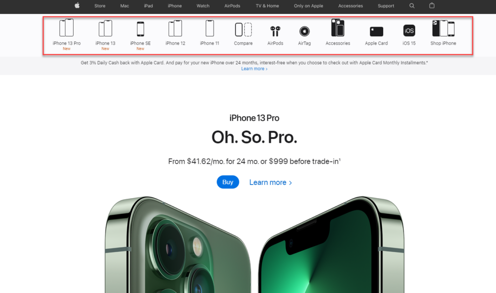
As you can see, Apple places the categories right at the top of the page for customers to navigate easily.
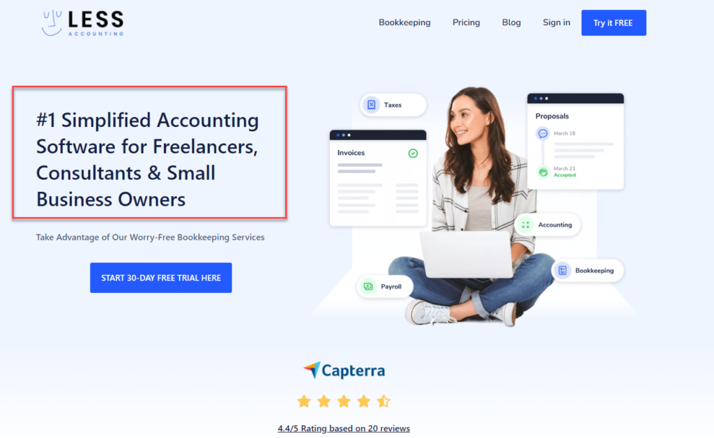
2. State Your Value Proposition Clearly
To stand out from competitors, your eCommerce website must have a unique selling proposition (also known as a USP). In other words, customers must be able to know what you’re selling right away.
Below is the LessAccounting website, which shows clearly its value proposition:
3. Have No More Than 12 Categories
One of the most consistent eCommerce user experience (UX) homepage best practices is to make it simple for visitors to locate the product category pages they’re looking for.
Think about your category navigation bar as your website’s table of contents. Here are some pointers you should start with:
- To make it easier to see, place the category navigation bar horizontally at the top of the page or vertically on the left.
- Include only a few categories or customers will be unable to find what they want. 5 to 12 top-level categories are the best.
- State the categories clearly so that customers can understand them. You can get more specific for each category, but don’t forget to include a special offers subsection (as Nike did in the example below).
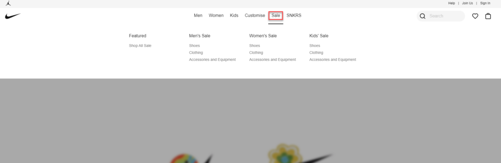
You can also consider having a drop-down menu (like Nike above) for your categories bar since it helps visitors go straight to the category or subcategory they choose. However, if you want to make the most out of it, don’t include more than two levels in your drop-down menus. In other words, your visitors won’t get lost.
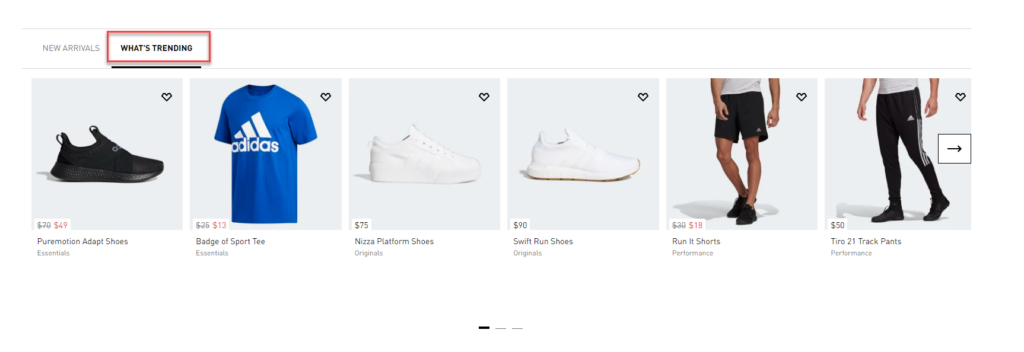
4. Include a Prominent Search Bar That Autocompletes
A search bar is compulsory for any eCommerce website homepage. Visitors will most likely use the search box to find what they are looking for more than any other site features.
If you can make the search bar effective, then introducing a search bar can increase conversion by up to 50%. Unfortunately, finding exactly what your customers want is not easy as it seems. On average, 34% of all searches provide no relevant results.
Your search software should be able to recommend related products to improve results. Also, include an autocomplete feature. You can look at the Nike eCommerce website homepage design below for inspiration.
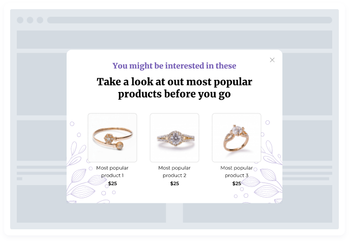
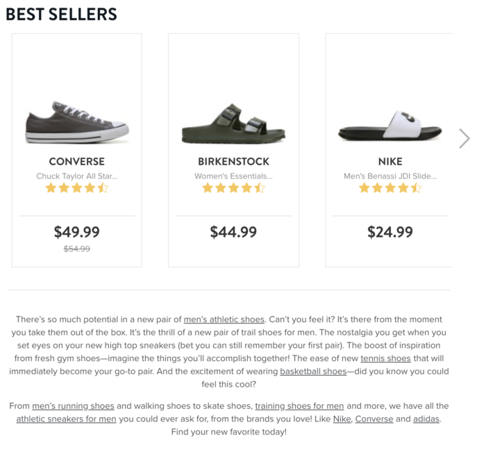
5. Highlight Popular Items
If you can show your most popular items, your customer will more likely find the products they’re interested in. Moreover, you should highlight your bestseller for each product category if you have various product types.
A/B tests can determine which “homepage-featured products” result in the most conversions. These can be displayed as “trending” merchandise, and the recommended items can be updated as sales change over the year.
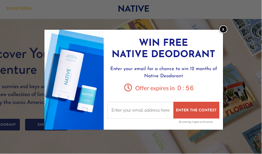
You can also use popups to promote popular products with taglines such as “Check out our popular products before you go.” right before your visitors leave your website.
6. Highlight Special Offers
Price is almost everything an online customer cares about. More than 70% of US internet users believe that discounts influence purchase decisions over the holidays. Therefore, the eCommerce homepage’s best practice is to place special deals and discounts in a prominent location on your homepage.
Another way to bring your customers’ attention to exceptional deals is to: Use popups to draw attention to exceptional offerings. These are more difficult to overlook than a section on the homepage.
7. Personalize Visitors’ Experience
Use high technology to help your customers feel at ease on every web page they visit before they make their purchase decision. In other words, use high technology to personalize your visitors’ experience.
Customers can receive customized item recommendations depending on their:
- Shopping history
- Location
- Search keywords
- Pages viewed, etc
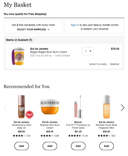
Nordstrom’s eCommerce homepage design with the “recommended for you” section is a great example that you can follow.
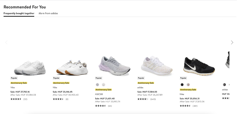
To make it even more prominent, you can also use the pop-up feature to show personalized content based on the visitors’ history.
8. Highlight New Arrivals and Seasonal Items
Highlighting new products is a critical eCommerce homepage best practice because these are the products that customers are looking for. Below is an example from Nike with the Summer collection presented right on the homepage of its website.
Yes, besides the Summer collection, you may notice that there are also the Be True and Father’s Day Gifts collections. Nike has done great in following up with the trend and introducing it to its customers.
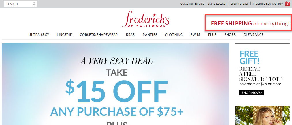
9. Make Your Shipping and Return Procedures Explicit
The shipping and return policies should be clearly stated on the homepage. Especially if you offer free shipping or a stronger return policy than your competitors. This has the potential to greatly increase conversions.
You should place it at the top of the homepage, either on the right or left side.
Frederick’s of Hollywood places their obvious shipping notice next to their logo: at the top of their homepage. They understand that this is what purchasers want to see.
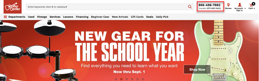
10. Provide Contact Information
Display your company’s address and phone number on the homepage as clearly as possible. This will help your customers contact you as soon as they have problems with their order, in other words, increasing the conversion rate.
An eCommerce homepage’s best practice is to put the phone number at the top and bottom of the page.
You may notice the Guitar Center’s website has a piece of easily accessible contact information in the top right corner of their page (in the bolded font). This makes online buyers feel as secure as those who shop in a Guitar Center store as they know they can call for support anytime.
11. Add Product Images Into Categories
Visitors will look at your categories list right after entering your eCommerce homepage as it gives an overview of your store and of what you’re selling. In this case, images are a great help.
According to Peep Laja of ConversionXL, because you can’t check out things online, “You have to work twice as hard to make your products come alive through amazing photography and design.”
As a result, you should include high-quality photographs that represent your categories.
Consider the following Chanel eCommerce homepage example:
They describe the type of product you will find if you follow one of the links. On the other hand, you might also use thumbnail images for each of your primary categories. Little things like this inspire buyers to move farther down your sales funnel.
12. Set Priorities for SEO
SEO is still as relevant as ever, especially given that 46% of buyers use search engines like Google to conduct product research. Higher rankings in search engine results can lead to more focused visitors to your website.
To get the benefits of SEO, you must optimize your eCommerce homepage design.
You should improve the titles and product descriptions by including your target keyword on every page.
Famous Footwear, for example, improves its on-page SEO by including relevant language and internal links on its category page:
Product category pages like this shouldn’t be overlooked because they have the potential to become high-authority pages that bring more traffic. One more eCommerce homepage best practices to improve your SEO score is to include keywords in customer reviews. Ensure the keywords are long-tail to narrow the search result, and you’re good to go!
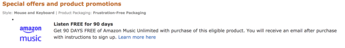
13. Remove Your Homepage Advertisements
On the one hand, ads on your eCommerce homepage can result in more revenue; on the other, they can frustrate your visitors and eventually send them to your competitors. Consider placing ads on your homepage reasonably.
We recommend having a clear strategy to naturally make ads a part of your website.
Amazon, for example, uses adverts on certain products to promote its services:
Ads are fun and easy, but you have other methods to boost your sales. A lead magnet to collect emails is one of them. This tactic is great for gathering emails from potential buyers since it gives them value. However, after having all the emails, remember to make targeted email campaigns to constantly keep them informed and motivated enough to make purchases.
Try FREE Magezon Page Builder!
Easily create your engaging Magento pages in any style whenever you want without relying on developers or designers, just by drag & drop.
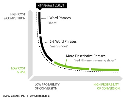
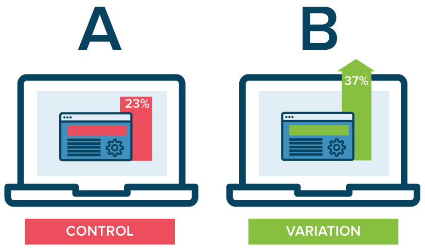
14. Conduct Tests and Assess the Results
Running tests and analyzing the results is an eCommerce homepage best practice that will help you know whether the adjustments you make to your homepage design are helping or not.
In other words, you’ll develop homepage variants and test them. For example, you can modify the layout or image and compare the results to your original design.
Here’s an example of how split testing works to help you understand it:
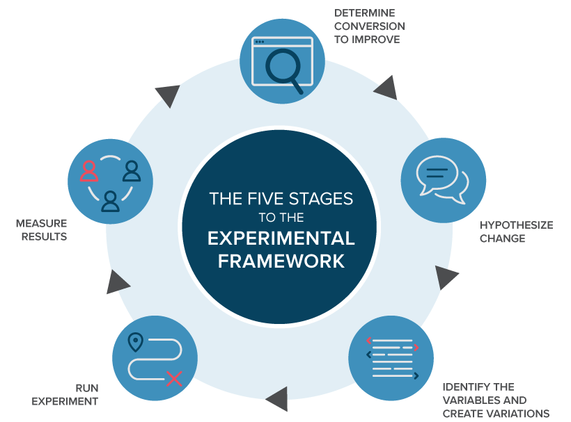
A/B testing enables you to find the ideal design for your eCommerce homepage.
While developing new layouts may seem exhausting, understanding your audience’s preferences can help you determine the correct elements and message. So, don’t hesitate to perform as many A/B tests as possible; you won’t be disappointed.
15. Increase the Speed With Which Your Homepage Loads
The page loading speed of your website relates to how quickly your content loads when a user views a page, and it influences how long a visitor remains on your website. Most visitors will abandon your site if it takes too long to load.
But how quickly should the webpage load? According to research, site visitors will not wait more than 3 seconds for an eCommerce page to load. Slow page loading contributes to page abandonment and kills conversions.
According to a Google study, when page load time grows from 1 to 6 seconds, the likelihood of the user exiting the site (bounce rate) increases by 106%. A poor homepage loading speed is undoubtedly a dealbreaker for many site visitors.
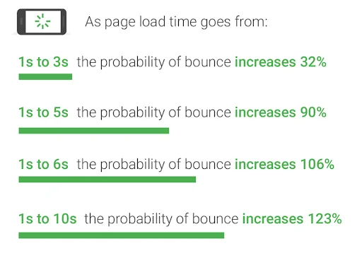
Also, in the same study, it’s said that optimizing your website load time is critical today. If a user’s experience decreases, it might negatively impact an eCommerce site’s sales. When site visitors leave, the potential to engage them and create purchases is lost.
Here are some eCommerce homepage design practices to keep in mind and execute:
- Compressed images: Large image files will slow your page, so use image compression tools to remove extra data.
- Minify HTML: HTML is an element of your homepage and your eCommerce store that might slow down the loading speed of your website. Minification is streamlining your website’s code, such as removing unneeded and redundant code or shortening code whenever possible.
- Turn on browser caching: Any resources and items that load on your site are “remembered” when you enable caching. This allows your homepage to load faster because items like logos and photographs do not need to reload every time.
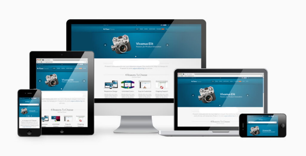
16. Make Your Homepage Mobile-First
With 7.1 billion mobile users worldwide, people increasingly purchase online on their smartphones, tablets, and other mobile devices. Mobile users are making not just internet searches but also mobile eCommerce transactions such as purchasing, paying bills, and booking tickets.
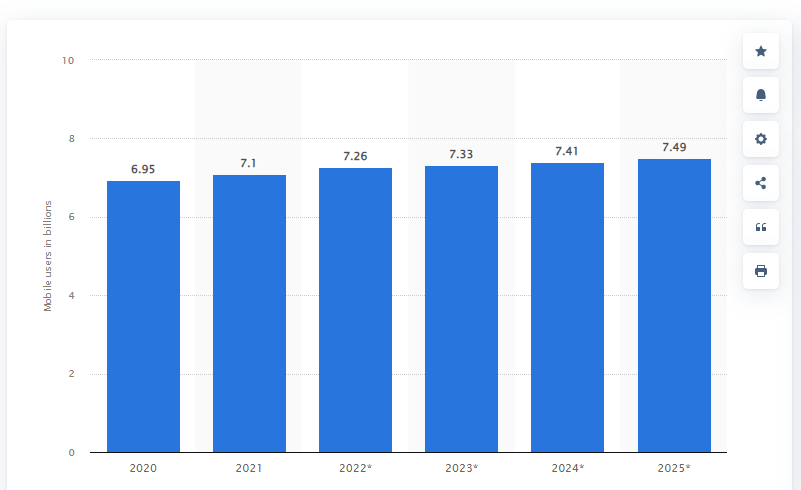
As a result, eCommerce homepages must now take a mobile-first approach to web development.
A mobile-first strategy is creating a website for smaller devices first, then progressing to larger screens. In other words, the purpose of a responsive design is to have on-site items automatically adjusted to fit the different devices’ screens.
On the other hand, the website’s content is also displayed in a user-friendly manner. Visitors don’t need to zoom, pan, resize, or scroll while browsing the page, hence, improving the user experience on the website.
“A responsive site is crucial as people shop online on their mobile devices more than ever. So, it is necessary to make your website responsive as soon as possible.”, said Alex Williams of Hosting Data.
Try FREE Magezon Page Builder!
Easily create your engaging Magento pages in any style whenever you want without relying on developers or designers, just by drag & drop.
17. Make Search and Navigation Simpler
It’s hard for users to navigate your site if it has a complex design. This creates unnecessary clicks and extra steps to find their wanted content. They will give up and move on if they can’t get what they are searching for immediately.
The eCommerce homepage’s best practice is considering what visitors expect and what they find most useful. Remember that they will use the search box and navigation bar more than other elements on your website, so you must make this process as simple as possible.
The design elements must be logical and intuitive, from the placement of the search box to the arrangement of the menu and toolbars. Users should be able to easily browse between pages. This helps create a positive user experience and guarantees they remain engaged while browsing your site.
As a result, consider including a search bar at the top of your homepage menu so that users can easily navigate various products, categories, promotions, event news, and blog pieces on your site.
Moreover, remember to conduct an A/B test on your search bar for the best results. Experiment with various search bar positions and designs to discover which one generates the most conversions.
Of course, for your shop, it’s preferable to base this on your customers’ tastes, which is where the A/B test comes in handy: with actual user data, you’ll know the best method to streamline search and navigation.
18. Make the Most of the Space Above-the-Fold
In website design, the web page area is visible to the user above the fold without scrolling. This idea existed centuries ago when the printing press first appeared.
Because newspapers are printed on enormous sheets of paper, they must be folded and exhibited on newsstands with only the top half of the paper visible. The newspaper industry took advantage of this by placing attention-grabbing headlines, sensational stories, and eye-catching pictures above the fold.
The fold in the context of websites refers to the scrollbar. Below the fold is any content that is not immediately apparent and needs readers to scroll down.
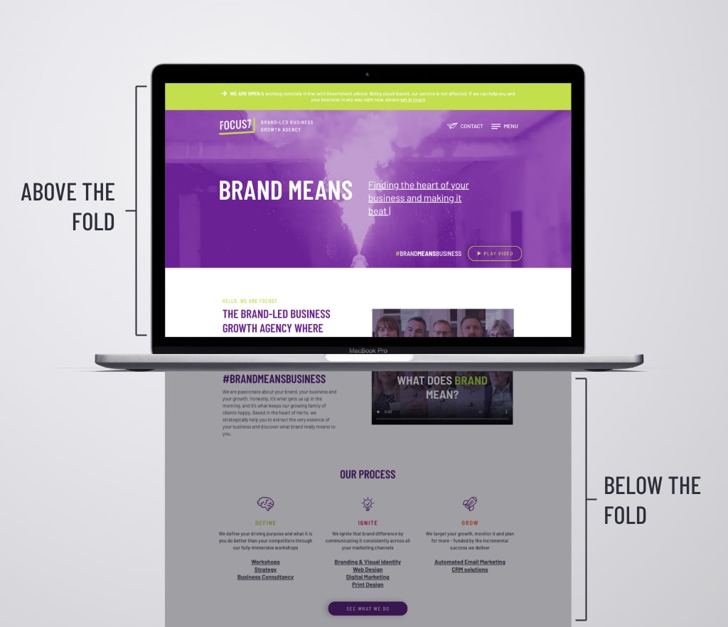
Because not all screens are the same, applying the above-the-fold notion to websites is more complex than applying it to newspapers.
There are no hard and fast rules here, but understanding how the website’s dimensions appear to the user, considering the various screen sizes of devices, is a good starter. To make the most of the area above the fold, provide the most relevant, engaging, and significant content visitors expect to see when they visit your site.
Don’t be afraid to think creatively and outside the box. You may even explore how an entire redesign of your homepage might help you enhance conversions and earn more sales from your store by doing a split URL test.
This way, you may experiment with different above-the-fold elements to discover which one performs best. Experiment with different copies, pictures, and calls to action to determine which homepage design converts the best over time.
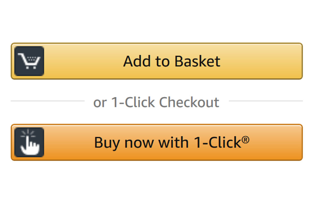
19. Simplify Your Checkout Process
Visitors visiting your website is only the first step in their buying process. Even if they have been added to the cart, you can’t ensure they will continue the transaction.
According to the Baymard Institute, 69.8% of shoppers will abandon their carts. While there are various reasons for cart abandonment, a long and confusing checkout procedure usually takes most of the responsibility.
Creating a fast and user-friendly checkout process improves user experience and increases the conversion rate. In other words, it should be a smooth and seamless process.
Remember to not bombard your customers with too much information and options, as they will be confused and abandon the cart in anger. You must eliminate any unnecessary processes: fewer clicks equal quicker checkouts. Some platforms allow eCommerce stores to implement a two-step checkout process. Amazon offers a 1-click checkout option, making purchases incredibly quick.
20. Make It Simple for Your Consumers to Return
Every company aims to get new consumers and increase repeat purchases from returning buyers. This is when high-quality items and outstanding customer service come in handy. However, a few tactics can keep your customers easier.
Repeat customers help your company generate a consistent stream of money, so remember to give them a reason to return to your shop. Loyalty programs, discounts, free delivery, and special offers can be integrated into your eCommerce site to entice visitors to return more frequently.
Customers will return to your site because of the continual upgrades, not the incentives. If you make purchasing more convenient for them, even with the occasional email reminder, they are more than happy to return.
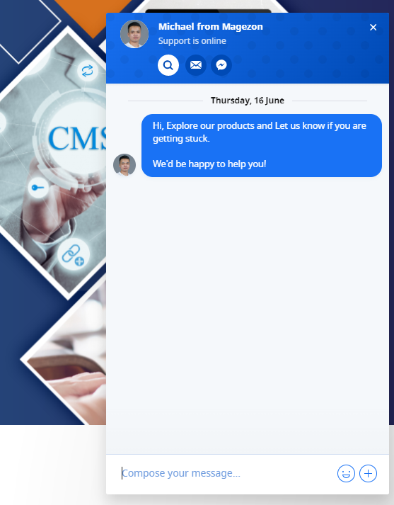
Customers want to be able to reach you quickly if they have questions or complaints. You can make your customer service team available via a live chat feature built into the site. This increases your customer engagement and provides valuable feedback that you can take advantage of.
Customers must have a certain level of trust in your eCommerce site to make an online purchase. They want to know that their data is secure when using your online platform for transacting. You must provide such a guarantee for their comfort.
Customers who can track their orders and delivery are more likely to return to your site. If they are on the site, there is always the possibility that a random product or an offer will catch their attention, providing another opportunity to sell. Moreover, if they can have personalized recommendations and content, they will interact with your brand more.
Push notifications are another technique to keep customers coming back to your website. eCommerce retailers and websites use this new feature to capture customers’ attention and have them return to their sites even if the browser is not currently open.
Set up a push notification opt-in on your homepage so that when a visitor subscribes, they will be notified of any new promotions, discounts, or flash deals your store wishes to provide. And, because push notifications have considerably greater click-through rates than email, you can enhance conversions without worrying about customers missing out.
You should also provide an order summary in detail with an adequate quantity and price so customers know exactly what they’re buying. You should also offer the opportunity to remove products they don’t want and make it simple to return and continue shopping.
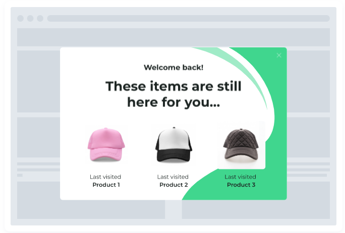
21. Distinguish Between New and Returning Visitors
Customers who return may not appreciate seeing the same display every time. Make sure to show them a new display with each visit.
This information may consist of the following:
- Items previously viewed
- Special discount codes
- New products
- Items related to their browsing/purchase history
- information on the items left in the buyer’s shopping cart
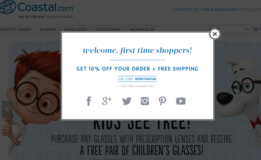
On the other hand, new users should be sent to landing pages that introduce your business or provide discounts, as shown below by coastal.com.
22. Specific Communication With Different Countries
Business owners frequently forget that visitors to their websites come from everywhere worldwide. You don’t want to be one of the cases, right?
Country-specific information should be included on your homepage, allowing visitors to read your site in their local language or have “location-related information” such as shipping availability.
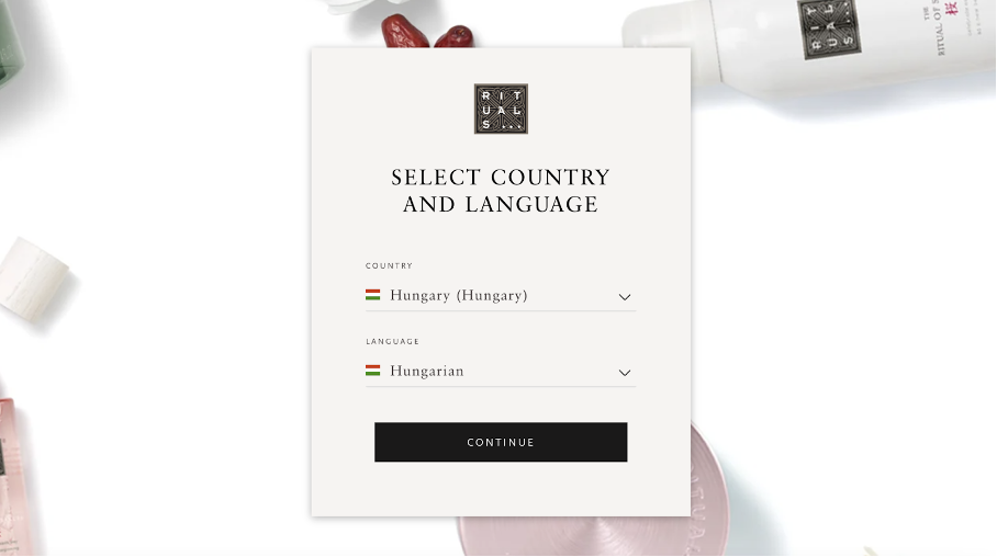
Visitors to rituals.com, for example, are asked to identify their region and preferred language.
23. Show Social Media Icons
Social sellers are 51% more likely to achieve sales quotes, and 31% of B2B professionals believe in social selling to build deeper customer relationships.
Displaying social media icons might help you connect with current customers and reach out to new ones. Users who like a product page will tell their friends and family about it.
You can even stimulate the growth of social proof by having a CTA asking customers to share content on social media. Why? Because people want to know that your website is valuable. Customers will trust you more if you have more fans or followers.
24. Promote Social Sharing
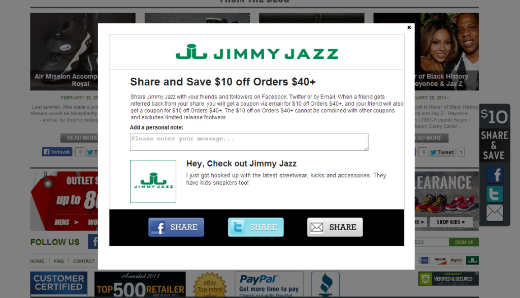
Give your visitors rewards (such as discounts or credit points) if they share your website and items on social media.
Jimmy Jazz is an excellent example of a brand that employs this strategy. They provide users a $10 discount if they suggest someone via social media.
25. Keep Your Design Simple
Simple is always the best; this is the ultimate eCommerce homepage practice you must remember. If you don’t believe it, 84.6% of designers believe that a cluttered website design is the “best” way to send your visitors away.
Buyers don’t want to visit an eCommerce homepage with too much unnecessary information with a messy arrangement. So, do whatever it takes to eliminate the crowded multimedia content and unattractive images.
You can see the Chanel homepage below for inspiration:
26. Use High-Quality Images
You have successfully made a visitor visit your eCommerce homepage but believe me, they won’t read every line on your homepage. 79% of customers report that they just scan a website and don’t read every detail.
What does that static mean? The main characters are the style you apply to your website and its images. Especially when you work in fashion, furnishing, and outdoor business. It’s proved that customers will easily link a poor image to a poor product.
Also, look at the Chanel homepage example above. Did you see how the high-quality images affect your desire to learn more about their products?
27. Show Customer Feedback
Customer feedback means you have actually given value to someone. In other words, it provides potential buyers social proof of your product’s quality and brand.
Take Chownow as an example; they use a wide space on their eCommerce homepage to display their customer testimonial.
Wrapping Up
After a long article, I hope you have achieved some of the best eCommerce homepage practices to make your website more attractive. If our practices helped you or you need any support, please let us know in the comment section.
If you are a Magento merchant and don’t know which extension to build your website, consider Page Builder from Magezon. As a trusted Adobe partner, we have satisfied thousands of customers with a vast collection of drag-and-drop extensions, helping you create a high-converting and unique store in minutes.
Don’t take my words for granted; see how your website can be with Magezon Page Builder and what others say about us:


